
A client once handed me a chip the color of a ripe persimmon and asked for it on her whole dining room. I cut in one corner, stepped back, and we both went quiet. By lamplight it glowed like a clay oven. By the next morning's flat north light it had turned the shade of a rusted mailbox. That gap, between the chip you fall for and the wall you live with, is wider for orange than for any family I paint. Get the undertone right and a good orange paint color brings a low fire no gray will ever match. Get it wrong and you have a basketball court. These are the twelve oranges I trust indoors, sorted soft clay to deep rust, with the undertones and rooms that make each one behave.
This page is one stop in our wider interior paint color families guide, the hub that maps every color family against light and undertone. Here we stay on orange: how a muted terracotta paint differs from a saturated burnt orange wall, why a rust paint sometimes reads brown, and what to put on the trim so none of it turns muddy. If you want the broader palette orange lives in, our look at earthy warm interior paint colors is the companion piece. This article is about choosing the orange itself.
Upload a photo of your actual room and preview any orange under your own light in about 30 seconds, free.
How to read an orange before you buy it
Orange is a secondary color, red plus yellow, and the whole game is which parent is winning. That ratio decides how the wall behaves. Three things to check before you commit to any orange:
- Undertone (the red-yellow split): a red-leaning orange reads as terracotta, brick, or rust and feels grounded. A yellow-leaning orange reads as pumpkin or tangerine and feels louder and more juvenile. Most successful interior oranges lean red and pull a little brown or pink with them.
- LRV (Light Reflectance Value): the percent of light a color bounces back. Saturated oranges run low, roughly LRV 12 to 35, so they swallow light and feel best on one wall or in a room you want to feel enclosed. A pale apricot can climb to LRV 70 and behave almost like a warm neutral.
- Saturation, also called chroma: this is the trap. A high-chroma orange that looks fun on a 2-inch chip turns relentless across a full wall. A muted, dusty, grayed orange is the difference between "designed" and "drive-thru."
My blunt opinion: a pure, bright, high-chroma orange almost never works as a whole-room wall color in a home. It reads commercial and fights every piece of wood and warm white near it. The oranges that earn a place indoors are the ones pulled toward clay, brick, terracotta, or rust. That is the entire shortlist below.
12 orange paint colors that actually work indoors
Here is the working shortlist, grouped from softest to deepest. LRV values are approximate, rounded from manufacturer color data, and meant for planning rather than the paint counter.
| Shade | Approx. LRV | Undertone | Best use indoors |
|---|---|---|---|
| Soft Apricot | 68 | Pink-yellow, very muted | Whole-room in a bright bedroom, behaves like a warm neutral |
| Cantaloupe | 55 | Warm yellow lean | Kids' room or sunroom, needs good natural light |
| Clay Beige | 48 | Orange-brown, grayed | Whole-room warm neutral that flirts with orange |
| Muted Terracotta | 35 | Red-orange, dusty | Living room or office accent, the safest true orange |
| Adobe | 30 | Pink-clay, earthy | Southwest and Spanish-style rooms, plaster looks |
| Pumpkin | 25 | Yellow-orange, bold | Use with caution, reads loud fast, best on a small wall |
| Burnt Orange | 22 | Deep red-orange | One accent wall, mid-century rooms, dining rooms |
| Brick | 18 | Red-brown, muted | Studies, libraries, fireplace walls |
| Paprika | 16 | Red-orange, spicy | Dining rooms and entries that want drama |
| Rust | 14 | Brown-orange, weathered | Moody accent wall, pairs with green and navy |
| Cinnamon | 13 | Brown-red, deep | Cozy dens, reads almost brown in low light |
| Burnt Sienna | 12 | Dark red-brown | Dramatic dining room, near-brown grounding tone |
Sources: Sherwin-Williams, Benjamin Moore, and Behr published color data 2026; The Spruce and Better Homes & Gardens warm-color coverage; designer field reports compiled by FacadeColorizer.
Free AI visualizer. Test terracotta, burnt orange, and rust on your real walls before buying a single sample pot.
Terracotta paint: the orange that earns a whole room
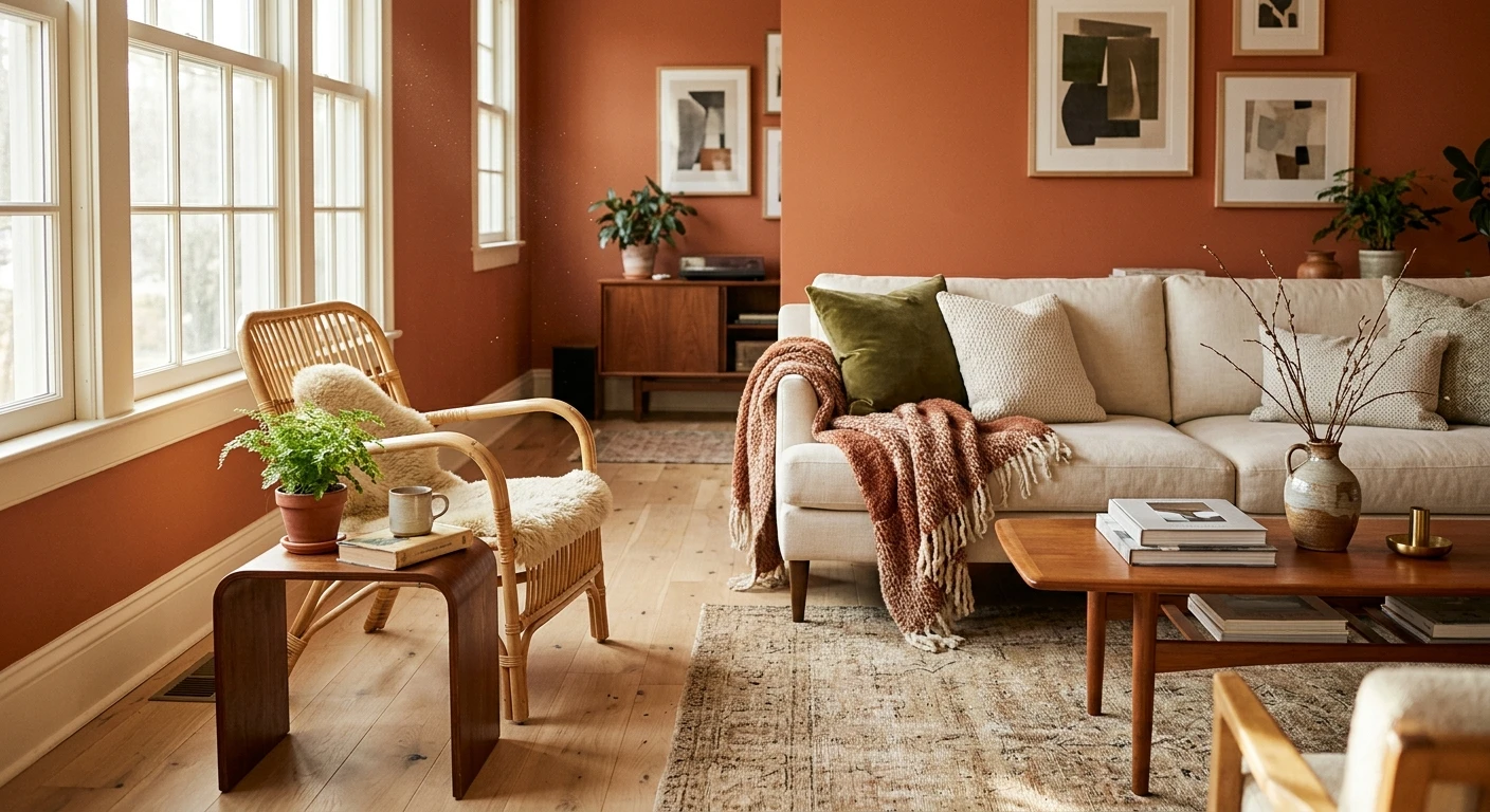
If any orange has gone mainstream as a wall color, it is terracotta, because a true terracotta paint is barely orange at all in the way people fear. It is a dusty red-clay tone with a pink-brown base and a grayed chroma, so it reads as an earth tone first and a color second. That muting is what lets it cover a full living room or bedroom without shouting.
Where terracotta wins: south- and west-facing rooms, where afternoon light deepens it close to baked clay. It loves natural materials, jute, rattan, unfinished oak, linen, and a warm white ceiling. Where it stumbles: a cold north room with blue-ish LED light, where the warmth drains out and the clay reads pink and chalky. The fix is usually a warmer bulb (2700K) and warm white trim, not a different color. Terracotta sits next to the broader palette in our earthy warm interior paint colors guide if you want to build the whole scheme around it.
Burnt orange wall: the mid-century accent that refuses to date
A burnt orange wall is the most requested orange in my notebook, and almost nobody wants it on all four walls. That is correct. Burnt orange is a deep, saturated red-orange around LRV 18 to 25, so it drinks light. On one accent wall it is gorgeous: warm, retro, grounding, the color that anchors a walnut credenza and a leather chair. Spread across a small room, it can feel like sitting inside a pumpkin.
Burnt orange is the signature note of a whole era, so if you are leaning that way, our guide to interior color schemes and how to pair paint colors shows how it sits beside teal, mustard, walnut, and warm white. Pair it with a soft warm white on the other walls, a deep navy or forest green on the textiles, and brass or walnut accents, and it reads collected rather than costume. One field note: burnt orange almost always needs a tinted gray primer and a careful second coat, because deep red-orange pigments are notorious for streaky coverage over white.
See the wall, the trim, and the rest of the room together in one preview, free.
Rust paint: when orange goes nearly brown
Rust paint is where orange crosses into the brown family, and it is my favorite of the group for moody rooms. A good rust is a weathered brown-orange, LRV 12 to 16, with the saturation pulled nearly all the way out. In bright light you read the orange; at night it settles into a deep, warm brown. That dual personality makes rust far more livable on multiple walls than a true bright orange.
Rust pairs beautifully with sage and olive greens, deep navy, and cream. It is a natural fit for a study, den, or dramatic dining room. Because it sits so close to brown, think of it as the warm cousin to the neutrals in our taupe paint colors guide, and the partner greens are mapped in our sage and olive green interior pairings. Where rust fails: a stark, modern, all-white room with cool light, where it reads like a mud smear. Rust needs warmth and natural texture around it to sing.
Trim, ceiling, and pairings for orange walls
Orange lives or dies on what sits next to it. The most common mistake I see is a bright cool white trim slapped against a warm terracotta or rust. The cold contrast makes the orange read dirty and the white read blue. Here is what actually works:
- Warm white trim (essential): a creamy warm white is the only trim I recommend with orange. It shares the orange's warmth and frames it cleanly. See our pick list in warm white paint colors and their undertones.
- Greens for balance: sage, olive, and deep forest green are orange's best friends. They share its earthy, muted register, so they cool the room and make each other look richer without clashing.
- Navy and deep blue: a deep navy on textiles or a single piece grounds a burnt orange or rust and keeps the room from feeling one-note.
- Ceilings: a warm white ceiling keeps the room bright. A stark cool white ceiling over a deep orange amplifies any blotchiness and chills the whole space.
- Avoid: a pure, icy blue-white trim, and avoid pairing two loud oranges in the same sightline. One saturated orange per room is plenty.
For floors and decor, orange flatters warm woods (oak, teak, walnut), brass, leather, and natural fiber, while gray-washed cool floors fight it. To see how orange behaves as one accent in a larger room, the techniques carry over from our top living room paint colors for 2026.
How to test an orange before you commit
A fan-deck chip is the worst way to choose an orange. It reads brighter and flatter than a rolled wall, it cannot show the day-to-night swing from clay to rust, and it hides how much light a low-LRV orange will eat. Two better methods:
- Paint a large swatch: roll a 2-by-2-foot sample (or a peel-and-stick sample) on two different walls and check it mid-morning, mid-afternoon, and at night under your normal bulbs. Watch a deep orange for blotchy coverage, that is your sign it will need a gray primer and a second coat.
- Preview it digitally first: upload a real photo of your room and apply a terracotta, a burnt orange, and a rust before you buy any samples, then narrow three contenders to the one worth painting. Budget context for the full repaint is in our interior house painting cost guide for 2026.
Preview terracotta, burnt orange, and rust side by side on your real walls, free.
Frequently asked questions
What is the best orange paint color for a living room?
A muted terracotta is the safest orange for a whole living room because its grayed, red-clay chroma reads as an earth tone rather than a bright color, so it stays calm across a full wall plane. If you want orange as a feature instead of the whole room, a deep burnt orange on one accent wall, with warm white on the others, gives you the warmth without the room feeling like it is closing in.
Is orange paint hard to work with indoors?
The high-chroma, traffic-cone oranges are genuinely hard and rarely work as a whole-room wall color, because they fight wood and warm white and read commercial. The muted versions, terracotta, brick, rust, and burnt orange, are far more forgiving because they have been pulled toward clay and brown. Choose a grayed, red-leaning orange, pair it with warm white trim, and the difficulty mostly disappears.
What colors go with a terracotta or burnt orange wall?
Greens are the strongest partners: sage, olive, and deep forest green share orange's earthy, muted register, so they cool the scheme and make each other look richer. Deep navy grounds it, cream and warm white frame it, and warm woods, brass, and leather echo its warmth. Avoid a cool icy blue-white next to it, which makes the orange read dirty and the white read blue.
What is the difference between terracotta and rust paint?
Terracotta is a lighter, pink-clay orange (roughly LRV 30 to 35) that reads as a warm earth tone and can cover a whole room. Rust is darker and more weathered (roughly LRV 12 to 16) with enough brown that it nearly reads as a deep brown in low light. Terracotta is the friendlier whole-room choice; rust is the moodier accent or den color.
What trim color goes with orange walls?
A creamy warm white is the only trim I recommend with any orange. It shares the wall's warmth and frames it cleanly, so the orange looks intentional. A stark, cool, blue-white trim is the most common orange mistake: it chills the room, makes the orange read muddy, and makes the white itself look slightly blue.
Preview terracotta, burnt orange, and rust on your actual walls under your own light before buying a single sample.
Disclaimer: Color names in this guide (terracotta, burnt orange, rust, brick, paprika, cinnamon, burnt sienna, and others) are generic descriptive terms, and the LRV values are approximate, rounded from publicly published manufacturer color data for planning purposes only. FacadeColorizer is an independent paint visualization service and is not affiliated with, endorsed by, or sponsored by any paint manufacturer. Color reproduction on screens approximates a physical paint chip; always confirm with a manufacturer sample under your own light before purchase. Sources: Sherwin-Williams, Benjamin Moore, and Behr published color data 2026, The Spruce and Better Homes & Gardens warm-color coverage, designer field reports compiled by FacadeColorizer.
Trademarks mentioned (Sherwin-Williams, Benjamin Moore, Behr, Caparol, Brillux, Sto, Alpina, Valspar, PPG, Glidden, Dulux, Crown Trade, Sandtex, Farrow & Ball, Johnstone's, Leyland) are property of their respective owners. FacadeColorizer is independent and not affiliated with any of them. Nominative fair use under Lanham Act §1125.


