
The first time a client asked me for a purple bedroom, I braced for a lilac nursery. What she actually wanted was a wall the color of dusk: gray, soft, barely violet, the kind of thing you only register as purple when the lamp clicks on. We landed on a muted mauve, and it has aged better than half the grays I painted that year. That is the whole secret to purple paint colors indoors. The bright, saturated ones are a trap. The grayed, dusty, smoky ones are some of the most sophisticated neutrals in the fan deck, and almost nobody reaches for them.
Purple sits between blue and red on the wheel, so its undertone can swing cool (blue-violet, periwinkle) or warm (mauve, plum, aubergine) depending on which neighbor pulls harder. Get that read right and a purple wall is calming and current; get it wrong and it tips into Easter egg or grape soda fast. This explainer is part of our wider interior paint color families guide, and it covers the twelve shades I actually specify, from pale lavender paint up to near-black plum wall paint, plus the rooms and pairings that make each one work.
Upload a photo of your actual room and preview any purple under your own light in about 30 seconds, free.
How purple behaves indoors: the part most guides skip
Purple is the most light-sensitive family I work with. A lavender that looks gray on the chip can flush pink in warm afternoon sun or go flatly blue in a north room. That is because the eye keeps hunting for the dominant neighbor, and your light decides the winner. So before you fall for a name, learn the four undertone lanes:
- Gray-violet (the safe lane): heavily grayed lavenders that read almost neutral. These are the ones you can paint a whole bedroom in without the room turning into a costume.
- Cool blue-violet (periwinkle): purple leaning toward blue. Fresh and a little preppy, but it can feel cold in low light, so reserve it for bright rooms.
- Warm mauve and dusty rose-purple: purple with a brown-pink base. The most flattering on skin and the most neutral-acting purple of all.
- Deep plum and aubergine: low-LRV, dramatic, almost a stand-in for black or navy with extra warmth. Stunning on accents and millwork, risky over a whole small room.
Quick reminder on LRV (Light Reflectance Value), since it matters more here than with most colors. A lavender at LRV 65 keeps a room bright; a plum at LRV 8 will eat light and needs lamps and a south window to look intentional rather than cave-like. Now, the shades.
12 best purple paint colors, by depth
I have grouped these from lightest to deepest. The brand codes are real reference points, but always confirm against a manufacturer chip, because purple shifts more than almost anything else between screen and wall.
| Shade | Approx. LRV | Undertone lane | Best room |
|---|---|---|---|
| SW Lavender Wisp (6552) | 66 | Gray-violet, near neutral | Bedroom, nursery, office |
| BM Lily Lavender (2071-60) | 62 | Soft cool lavender | Bathroom, bedroom |
| SW Potentially Purple (6553) | 52 | Clear gray-violet | Bedroom feature wall |
| BM Hazy Lilac (2115-50) | 48 | Warm mauve | Living room, bedroom |
| SW Mature Grape (6286) | 44 | Dusty mauve-purple | Dining room, study |
| BM Wood Violet (1371) | 34 | Smoky plum | Accent wall, dining |
| SW Dewberry (6558) | 22 | Rich blue-violet | Powder room, accent |
| BM Blackberry (2119-20) | 18 | Deep cool plum | Dining room, library |
| SW Grape Harvest (6285) | 14 | Warm deep plum | Accent wall, study |
| BM Caponata (AF-650) | 11 | Eggplant, brown-purple | Powder room, millwork |
| SW Quixotic Plum (6565) | 9 | Near-black aubergine | Doors, built-ins, accent |
| BM Shadow (2117-30) | 8 | Plum-charcoal, color-of-year staple | Moody bedroom, library |
Sources: Sherwin-Williams and Benjamin Moore published color data 2026; LRV figures are manufacturer values rounded; designer field reports compiled by FacadeColorizer.
Free AI visualizer. Test a light and a deep purple side by side before buying a sample pot.
Lavender paint: the soft end that reads almost neutral
Pale lavender is the gateway purple. At LRV 60 and up, a grayed lavender like Lavender Wisp or Lily Lavender behaves more like a cool off-white with a mood than a true color. In a north-facing bedroom it stays serene and a touch cool; in warm afternoon light it can pick up the faintest pink, which most people love. This is the purple I would put in a calming bedroom without a second thought, and it sits comfortably next to the restful tones in our calming master bedroom paint colors roundup.
Where soft lavender fails: a bright, pure lilac in a kid's room with strong sun. It goes saccharine and dates the space in a year. Stay grayed, stay muted, and the color reads timeless instead of themed.
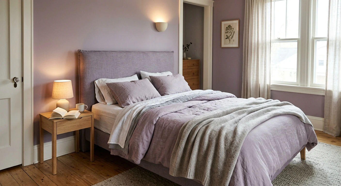
Mauve paint: the grown-up purple that acts like a neutral
If you only try one purple, make it a mauve. Mauve paint is purple with a brown-pink base, which is exactly what strips out the cute and leaves the sophisticated. Hazy Lilac and Mature Grape are the kind of dusty mauve-purples that flatter skin tone, photograph beautifully, and pair with brass and walnut like they were born to. In a dining room a mid-depth mauve feels intimate and a little moody without the commitment of a true dark color.
The trick with mauve is to lean into its warmth, not fight it. Cool white trim can make a mauve wall look slightly muddy by contrast. A creamy white or a putty trim lets the warmth sing. For a deeper look at coordinating warm neutrals around it, our warm greige neutral paint colors guide is the companion read.
See walls, trim, and wood together in one preview, free.
Plum wall paint: drama that still feels livable
This is where purple earns its reputation. Deep shades like Wood Violet, Blackberry, and the near-black aubergines (Caponata, Quixotic Plum, Shadow) are the navy alternative nobody talks about: just as grounding, but warmer and far less expected. Painted on a single accent wall behind a bed, or wrapped around a small dining room with the trim painted to match, plum wall paint reads expensive. On built-ins and interior doors, an eggplant near-black is genuinely one of my favorite millwork colors.
The honest warning: do not wrap a deep plum around a small, dim room with one north window and call it cozy. At LRV 8 to 14 these colors need light to look like a choice rather than an accident. Give them a south or west window, layered lamps, or restrict them to an accent plane. If you want the structure for that single-wall move, our guide on the accent wall color strategy for 2026 covers which wall to pick and where to stop the color.
What pairs with purple: trim, neutrals, and accents
A purple wall lives or dies on what surrounds it. Here is what I reach for, by goal:
- Gray is purple's best friend. A soft greige or warm gray grounds any purple and kills the sweetness. Gray and grayed lavender are practically the same family, which is why they read so calm together. Our colors that go with gray guide maps the exact gray-plus-violet pairings.
- Warm white trim for warm purples. Creamy whites flatter mauve and plum. Save crisp blue-whites for cool blue-violet lavenders, where the cool-on-cool stays clean.
- Brass, gold, and walnut. Warm metals and wood make mid-depth purples look intentional and rich, not bridesmaid.
- A green pop. Sage or olive across the wheel from purple gives a fresh, garden-y contrast that keeps the room from feeling precious.
- Avoid: bright primary purple next to cool gray-blue. The two cool tones compete and the room reads cold and slightly clinical.
For a full coordinated palette built around the family, including ceiling and floor calls, our interior color schemes guide shows how purple sits inside a four-color room plan.
Preview the whole pairing on your real room before you commit, free.
How to test a purple before you commit
Purple punishes the small-chip shopper more than any other family, because the chip cannot show the pink-to-blue swing across a day. Two better methods:
- Roll a large swatch: paint a 12-by-12-inch sample (two coats) on two different walls and check it at mid-morning, mid-afternoon, and at night under your normal bulbs. Watch specifically for the wall flushing pink in warm light or going flat-blue in shade.
- Preview it digitally first: upload a real photo of your room and apply a soft lavender, a mauve, and a deep plum before you buy any samples, so you narrow three contenders to one worth painting. Budget context for the full repaint is in our interior house painting cost guide for 2026.
Preview lavender, mauve, and plum side by side on your actual walls, free.
Frequently asked questions
What is the best purple paint color for a bedroom?
For most bedrooms, a heavily grayed soft lavender (LRV around 60 to 66, such as Lavender Wisp or Lily Lavender) is the safest pick because it reads almost neutral and stays calming under lamp light. If you want more depth or a single accent wall, a dusty mauve like Hazy Lilac gives a grown-up, restful feel without tipping into a nursery look.
Are purple walls hard to live with?
Bright, saturated purples are hard to live with and date quickly, but grayed lavenders, mauves, and deep plums are not. The muted versions behave like sophisticated neutrals. The key is to choose a dusty or smoky purple rather than a pure one, and to pair it with warm white trim and a soft gray or greige so the color stays current.
What colors go with purple paint?
Soft gray and greige are purple's most reliable partners, because they ground the color and remove any sweetness. Warm white or creamy trim flatters mauve and plum, while crisp white suits cool blue-violet lavenders. Brass, gold, and walnut add richness, and a sage or olive green gives a fresh contrast across the color wheel.
What is the difference between lavender, mauve, and plum?
Lavender is a light, often cool gray-violet (high LRV, soft and airy). Mauve is a muted purple with a brown-pink base, warmer and more neutral-acting, ideal for whole rooms. Plum is a deep, low-LRV purple, sometimes leaning toward aubergine or eggplant, best used on accent walls, dining rooms, and millwork where you want drama.
Does purple paint work in a small room?
Light grayed lavender works well in a small room and can even make it feel calm and a little larger. Deep plum and eggplant only work in a small room if it has good natural light or you lean fully into the moody look with layered lamps; in a small, dim, north-facing space a near-black purple can feel cave-like rather than cozy.
Preview lavender, mauve, or plum on your actual walls under your own light before buying a single sample.
Disclaimer: Sherwin-Williams, Lavender Wisp (6552), Potentially Purple (6553), Mature Grape (6286), Grape Harvest (6285), Quixotic Plum (6565), and Dewberry are trademarks of The Sherwin-Williams Company. Benjamin Moore, Lily Lavender (2071-60), Hazy Lilac (2115-50), Wood Violet (1371), Blackberry (2119-20), Caponata (AF-650), and Shadow (2117-30) are trademarks of Benjamin Moore & Co. FacadeColorizer is an independent paint visualization service and is not affiliated with, endorsed by, or sponsored by Sherwin-Williams or Benjamin Moore. LRV figures are manufacturer values rounded for reference. Color reproduction on screens approximates the manufacturer's chip; always confirm with a manufacturer sample under your own light before purchase. Sources: Sherwin-Williams and Benjamin Moore published color data 2026, designer field reports compiled by FacadeColorizer.
Trademarks mentioned (Sherwin-Williams, Benjamin Moore, Behr, Caparol, Brillux, Sto, Alpina, Valspar, PPG, Glidden, Dulux, Crown Trade, Sandtex, Farrow & Ball, Johnstone's, Leyland) are property of their respective owners. FacadeColorizer is independent and not affiliated with any of them. Nominative fair use under Lanham Act §1125.


