
A client once asked me to paint her sunroom "coral, but the grown-up kind." I knew exactly what she meant and how easy it is to get wrong. We taped up three samples on a Saturday morning, and the chip she had fallen for off a tiny fan-deck swatch turned the room into something close to a salmon fillet by noon. The other two, a grayed coral and a soft peach, held their warmth without shouting. She picked the peach, and two years later it is still the room people comment on first. That is the whole truth about coral paint indoors: the right one feels like late-afternoon light caught on a wall, the wrong one feels like a tropical hotel lobby. Land the undertone and the LRV, and coral is one of the most welcoming colors you can roll.
Coral is not one color, it is a family that runs from the palest peach to a deep, brick-leaning salmon. This guide walks through ten interior shades worth your time, with real LRV numbers, the rooms where each one earns its place, and the trims and accents that keep coral from tipping into kitsch. This piece is one branch of our wider interior paint color families guide. If your tastes lean softer and you want the pale end as a true backdrop, our warm white paint colors guide is the natural neighbor, since a soft peach behaves much like a warm near-neutral; if you want more punch, our best red paint color ideas cover the warmer, bolder end of the spectrum.
Upload a photo of your actual room and preview any coral or peach under your own light in about 30 seconds, free.
What "coral" actually means in a paint can
Coral sits where pink, orange, and red overlap. Strip it down and you get a warm hue with red and yellow both present, which is why it reads pink in some light and orange in others. How much gray or brown the chemist dropped in is what separates a sweet peach from a moody terracotta-coral. A few terms worth keeping straight:
- Peach paint: the palest, softest end. High LRV (often 65 plus), more yellow than red, reads as a warm near-neutral. This is coral with the volume turned down.
- True coral: the mid-tone, the one most people picture. Balanced red and orange, LRV usually 35 to 50, clean and bright without being neon.
- Salmon paint: a pinker, slightly grayed coral. It carries more red and a touch of brown, so it feels softer and a little dustier than a clean coral.
- Terracotta-coral: the deep, earthy end. Brown and red dominate, LRV drops into the 20s and 30s, and the color grounds a room instead of brightening it.
The takeaway: when someone says "coral," ask which one they mean. A peach and a terracotta-coral are technically cousins, but they do completely different jobs in a room. Most regret comes from picking a saturated mid-coral when what the space actually wanted was a soft peach.
10 coral paint colors worth considering, by depth
Here is the working list I keep coming back to, sorted from the lightest peach to the deepest terracotta-coral. LRV figures are manufacturer values, rounded, so treat them as a guide to depth rather than gospel:
| Color | Brand / code | LRV (approx) | Reads as |
|---|---|---|---|
| Peach Blossom | BM 005 | 71 | Soft pastel peach, near-neutral warm |
| Pristine | BM OC-75 | 68 | Barely-there peach-cream for whole rooms |
| Sockeye | SW 6630 | 52 | Light, friendly peach-coral |
| Quite Coral | SW 6614 | 45 | Clean mid-coral with energy |
| Smoky Salmon | SW 6331 | 42 | Grayed, dusty salmon, the grown-up option |
| Coral Reef | SW 6606 | 40 | The classic true coral, warm and balanced |
| Coral Bells | SW 6593 | 38 | A pinker, salmon-leaning coral |
| Coral Gables | SW 6606 family | 34 | Deeper salmon-coral for saturated rooms |
| Persimmon | SW 6339 | 26 | Deep red-coral, bold and grounding |
| Cavern Clay | SW 7701 | 22 | Earthy terracotta-coral with brown depth |
Sources: Sherwin-Williams and Benjamin Moore published color data 2026; designer field reports compiled by FacadeColorizer.
My honest opinion: the two that disappoint most often are Quite Coral and Coral Bells in north-facing rooms. Gorgeous in a sunny space, but in cool, flat light they can go chalky and a touch artificial, the paint version of a stage blush. If your room is cool or dim, drop to a grayed salmon like Smoky Salmon, or go all the way to Cavern Clay, which gains character in low light.
Free AI visualizer. Test a peach, a true coral, and a terracotta side by side before buying a single sample pot.
How coral behaves in different light
No warm color swings harder by light than coral. The same gallon can read peachy and soft in one room and almost salmon-red in another. Here is what to expect before you commit:
| Indoor light | How coral reads |
|---|---|
| South-facing (bright, warm) | Coral's best stage: clean, glowing, and friendly without going neon |
| West-facing (warm afternoon) | Deepens toward salmon-orange in late sun, can feel intense by 5 p.m. |
| East-facing (cool after noon) | Warm and rosy in the morning, calmer and slightly grayer by afternoon |
| North-facing (cool, indirect) | Risk zone: clean corals can read chalky or pink; pick a grayed or earthy coral instead |
| Artificial light at night | Warm 2700K bulbs make coral cozy and rich; cool 4000K bulbs flatten and pink it |
Sources: Sherwin-Williams and Benjamin Moore color data 2026; The Spruce warm-paint coverage; designer field reports compiled by FacadeColorizer.
One quirk to flag: coral photographs warmer and more saturated than it lives, the opposite problem from a greige. If you shop off Pinterest, assume the real wall lands a half-step softer and a touch lighter than the photo promised. Good news, but plan for it.
Best rooms for coral paint
Coral is a social color. It flatters skin tones and lifts a mood, which is why it lands best in rooms where people gather or pass through rather than rooms meant for deep focus. Here is where it consistently works:
Powder rooms and small baths
This is coral's secret weapon. A saturated mid-coral or a deep salmon in a windowless powder room turns a forgettable closet into the most memorable spot in the house, and the flattering warmth makes everyone look good in the mirror. For more dramatic small-space ideas, our dramatic powder room paint colors roundup shows how coral sits next to other bold picks.
Dining rooms
A coral or terracotta dining room reads warm, appetizing, and a little festive, exactly the mood you want around a table. Cavern Clay in particular makes a dinner party feel candle-lit even at noon. To see how it compares with the season's other dining tones, our elegant dining room paint colors for 2026 is a good map.
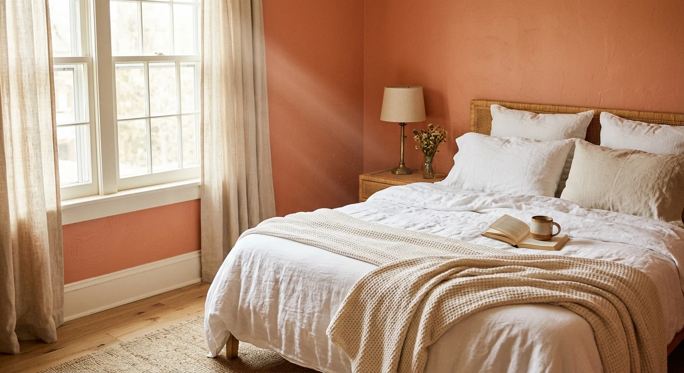
Sunrooms, nurseries, and soft bedrooms
For the pale end of the family, a soft peach makes a gentle, sunny bedroom or nursery without the flatness a pale yellow can bring. It reads as a warm neutral that just happens to glow. If you want to compare peach against the cooler restful options for sleep spaces, our calming master bedroom paint colors guide puts it in context.
Where to think twice
I would not run a bright mid-coral through an open-plan main floor, and I would keep clean corals out of a home office or a cool north-facing room. Coral is a spice, not a base. Used on every wall of a large connected space it stops feeling cheerful and starts feeling like a theme. Save it for an accent wall or a single room and let a calm neutral carry the rest of the floor.
Trim, ceiling, and decor pairings for coral
Coral lives or dies on what sits beside it. Get the partners right and it looks designed; get them wrong and it slides toward beach-house cliche. The rules I follow:
- Warm white trim (most harmonious): SW Alabaster (SW 7008) or BM White Dove keeps coral looking expensive. Their soft cream bias flatters the warmth instead of fighting it.
- Green is coral's best friend: sage, olive, and deep forest are the complementary partners that make coral read intentional rather than sweet. A coral powder room with a sage vanity is a near-foolproof combination.
- Navy and charcoal ground it: a deep blue or near-black on built-ins or a lower wall steadies a bright coral and gives it gravity.
- Avoid: a stark blue-white like SW Extra White directly next to coral. The cool contrast can make the coral read pinker and slightly artificial.
- Metals and wood: unlacquered brass, warm oak, and rattan reflect warmth back and bring out coral's best. Cool chrome and gray-washed floors flatten it.
For the deeper terracotta-corals, lean into the earthiness: clay, cream, and warm wood read like a Santa Fe courtyard rather than a tropical resort. If you want to build a room around a single coral wall, our accent wall color strategy piece covers exactly where that wall lands best.
See walls, trim, and floor together in one preview, free.
How to test coral before you commit
Coral is the single worst color to judge from a fan-deck chip. A small swatch reads cleaner and brighter than a rolled wall, and it cannot show you the swing from peachy morning to salmon evening. Two methods that actually save you a repaint:
- Paint a large swatch: roll a 12-by-12-inch sample (or a peel-and-stick sample) on two walls, then look at it mid-morning, mid-afternoon, and at night under your normal bulbs. Cut in a clean edge so the color is not muddied by the old wall behind it, and watch the late-day intensity in a west room especially.
- Preview it digitally first: upload a real photo of your room and apply a peach, a true coral, and a grayed salmon before you buy any samples, narrowing the field to the one worth a second coat. Pricing context for the full repaint is in our interior house painting cost guide for 2026.
Preview a soft peach against a deeper salmon, side by side, free.
Frequently asked questions
What is the difference between coral, peach, and salmon paint?
They are points on the same warm spectrum. Peach is the palest, with more yellow and a high LRV (often 65 plus), so it reads as a soft warm neutral. True coral is the mid-tone, balanced red and orange at LRV 35 to 50, clean and bright. Salmon is a pinker, slightly grayed coral with more red and a touch of brown, so it looks dustier and softer than a clean coral.
Does coral paint work in a north-facing room?
It can, but choose carefully. North light is cool and flat, and a clean mid-coral like Quite Coral can go chalky or read pink there. A grayed salmon such as Smoky Salmon, or an earthy terracotta-coral like Cavern Clay, actually holds up better in low light and gains depth where a brighter coral would look artificial. Adding 2700K bulbs helps put the warmth back.
What colors go with a coral wall?
Warm white trim (SW Alabaster or BM White Dove) keeps coral looking expensive, and green is its natural complement: sage, olive, or deep forest calm the warmth instantly. Navy and charcoal ground a bright coral, while unlacquered brass and warm oak flatter it. Avoid a stark blue-white trim like Extra White, which can make coral read pinker and slightly artificial.
Is coral a good color for a whole room or just an accent?
Both, depending on depth. A soft peach is gentle enough for a whole bedroom, sunroom, or nursery because it behaves like a warm neutral. A bright mid-coral is better saved for one room (a powder room or dining room) or a single accent wall, since running it across a large open-plan space tends to feel like a theme rather than a backdrop.
What is a good earthy coral paint color?
Cavern Clay (SW 7701) is the go-to terracotta-coral, with brown depth and an LRV around 22 that grounds a room instead of brightening it. Persimmon (SW 6339) is a deeper red-coral for an even bolder, saturated look. Both read like sun-baked clay and pair beautifully with cream, warm wood, and green, giving a Southwestern warmth rather than a tropical one.
Preview any peach, salmon, or terracotta-coral on your actual walls under your own light before buying a single sample.
Disclaimer: Sherwin-Williams, Coral Reef (SW 6606), Quite Coral (SW 6614), Sockeye (SW 6630), Coral Bells (SW 6593), Smoky Salmon (SW 6331), Cavern Clay (SW 7701), Persimmon (SW 6339), Alabaster (SW 7008), and Extra White are trademarks of The Sherwin-Williams Company. Benjamin Moore, Peach Blossom (005), Pristine (OC-75), and White Dove are trademarks of Benjamin Moore & Co. FacadeColorizer is an independent paint visualization service and is not affiliated with, endorsed by, or sponsored by Sherwin-Williams or Benjamin Moore. Color reproduction on screens approximates the manufacturer's chip; always confirm with a manufacturer sample under your own light before purchase. LRV figures are manufacturer values, rounded. Sources: Sherwin-Williams and Benjamin Moore published color data 2026, The Spruce warm-paint coverage, designer field reports compiled by FacadeColorizer.
Trademarks mentioned (Sherwin-Williams, Benjamin Moore, Behr, Caparol, Brillux, Sto, Alpina, Valspar, PPG, Glidden, Dulux, Crown Trade, Sandtex, Farrow & Ball, Johnstone's, Leyland) are property of their respective owners. FacadeColorizer is independent and not affiliated with any of them. Nominative fair use under Lanham Act §1125.


