
I cut in a client's stairwell with Sherwin-Williams Worldly Gray (SW 7043) last spring, and she stopped me on the second coat to ask if I had grabbed the wrong can. On the chip it had looked like a plain warm gray. On a full wall, in her north-facing entry, it had quietly turned into something softer and a little taupe. That is the whole story of this color in one sentence: it behaves nothing like its tiny paint chip, and the question people keep typing, spelled a dozen ways, is whether Worldly Gray is warm or cool, and which rooms it actually flatters. The answer rides almost entirely on your light. Here is how it reads indoors.
Quick orientation before the deep dive. Worldly Gray has a published LRV of 57 and a hex approximation of #CCC4B8 (RGB 204, 196, 184). That is a light, warm greige (gray plus beige) carrying a soft taupe undertone. It is a touch deeper and a shade warmer than the famous Agreeable Gray, which is exactly why people who find Agreeable too pale or too gray keep landing here. This profile is one stop in our wider Sherwin-Williams interior paint colors guide, and it is the indoor companion to our SW Worldly Gray 7043 exterior guide: that one covers the color on siding and facades, while this one stays on interior walls, rooms, undertones, and pairings. They are complementary, not duplicates.
Upload a photo of your actual room and preview SW Worldly Gray under your own light in about 30 seconds, free.
Worldly Gray at a glance: the numbers that matter
Before opinions, here are the verifiable specs straight from the Sherwin-Williams color library. These are the values you can take to a paint counter:
| Spec | Worldly Gray SW 7043 |
|---|---|
| SW number | 7043 |
| LRV (Light Reflectance Value) | 57: light enough to keep a room open, low enough to feel grounded |
| Hex / RGB (approx) | #CCC4B8 / 204, 196, 184: red highest, blue lowest, the signature of a warm neutral |
| Color family | Light warm greige (gray plus beige), with a quiet taupe lean |
| Undertones | Warm taupe-beige primary, with a faint green-gray that surfaces in cool, shaded light |
| Tint base | Mixed in Extra White or a light base; a deep base reads muddy and misses LRV 57 |
The takeaway from those numbers: Worldly Gray is not a true gray. At LRV 57 with a warm taupe undertone, it leans a little more beige than Agreeable Gray (SW 7029) and clearly warmer than a cool gray such as Repose Gray (SW 7015). It belongs to the same warm-neutral family covered in our greige paint colors guide, and that quiet taupe is exactly what lets it travel from room to room without clashing with wood and stone.
Is Worldly Gray warm or cool? The undertone, decoded
Worldly Gray is a warm color. People who call it cool are usually reacting to one of two things: a north-facing room or a stark white trim sitting right next to it. Here is what is happening underneath.
The taupe-beige base is dominant in most light. But Worldly Gray also carries a whisper of green-gray, the same softening pigment you find in many designer greiges. In warm or balanced light that green-gray stays invisible and the wall simply reads as a soft warm taupe-gray. In cool, indirect light (a north room, an overcast Tuesday, deep shade), the warm wavelengths get subtracted from the room and the residual green-gray steps forward. That is when Worldly Gray can look a touch flatter or greener than the chip promised. It does not turn blue or lavender the way some grays do, which is exactly why painters trust it.
Watch out for one quirk. Worldly Gray photographs lighter and grayer than it lives. So if you are choosing from Pinterest photos alone, assume the real wall will land a half-step warmer and a touch deeper than the image suggests. The stairwell up top is the perfect example: the chip said gray, the second coat said greige.
| Indoor light | How Worldly Gray reads |
|---|---|
| South-facing (bright, warm) | Soft warm greige, its most flattering and inviting read |
| West-facing (warm afternoon) | Leans clearly toward warm taupe in late-day sun |
| East-facing (cool after noon) | Warm and golden in the morning, balanced greige by afternoon |
| North-facing (cool, indirect) | Flatter and cooler; the faint green-gray can surface |
| Artificial light at night | Warm 2700K bulbs read cozy and taupe; cool 4000K bulbs read grayer and crisper |
Sources: Sherwin-Williams SW 7043 color data 2026; The Spruce neutral-paint undertone coverage; designer field reports compiled by FacadeColorizer.
Free AI visualizer. Test Worldly Gray on your real walls before buying a single sample pot.
Best rooms for Worldly Gray
Light, warm, and quietly taupe all at once, Worldly Gray is one of those colors you can run through a whole floor plan without any single room pushing back. Here are the spaces where it consistently earns its keep:
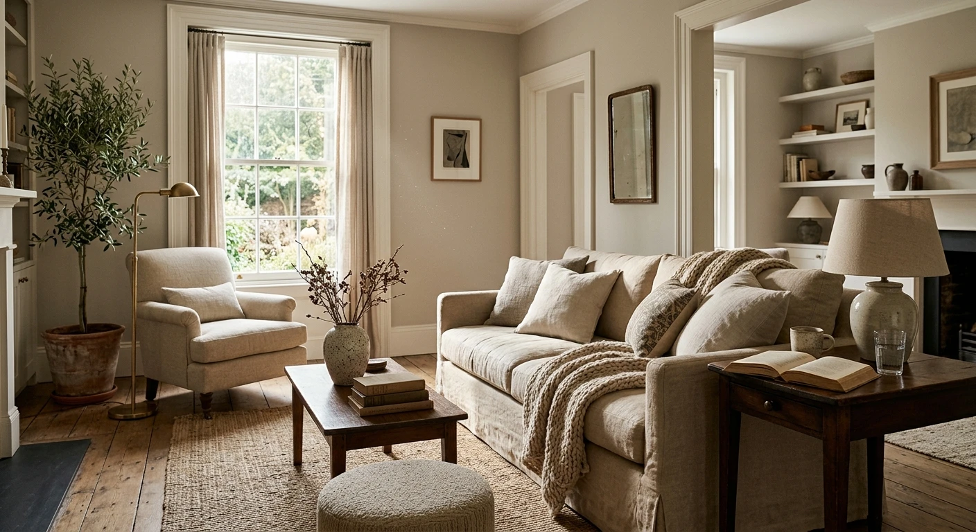
Open-plan living rooms and great rooms
This is Worldly Gray's home turf. On a large connected wall plane it reads as a calm, warm backdrop that lets furniture, art, and wood tones do the talking. Pair it with warm-white trim and an oak or walnut floor and the room reads collected rather than builder-grade. For more whole-room schemes built around warm neutrals, see our top living room paint colors for 2026.
Primary bedrooms
Worldly Gray makes a restful bedroom because the warmth keeps it from feeling cold at night under lamp light, while the slightly lower LRV makes it feel a little more enveloping than a paler greige. Think calm, grown-up retreat rather than baby's room. If a bedroom is your project, our guide to calming master bedroom paint colors shows how it sits next to other restful neutrals.
Kitchens and on cabinetry
On kitchen walls Worldly Gray plays beautifully with white, cream, and natural-wood cabinets, and its taupe lean is forgiving against stone and quartz that tip warm. It also works as a cabinet color when you want something softer than a true gray but more grounded than off-white. The trick: keep your countertop undertone in mind, warm taupe walls fight a cold blue-gray quartz.
Where to think twice
Small, dim, north-facing rooms with no warm light source are where Worldly Gray can fall flat and read slightly drab. A windowless powder room or a basement under cool LEDs mutes its warmth and pushes the green-gray forward. There, a warmer beige or simply a warmer bulb (2700K) rescues it. If you want a lighter, slightly grayer alternative for those spaces, our Agreeable Gray undertones guide covers the closest sibling.
Trim, ceiling, and decor pairings
A greige body color lives or dies on what sits next to it. Get the trim right and Worldly Gray looks intentional; get it wrong and it can look dingy or, paired with the wrong white, suddenly green.
- Warm trim (most harmonious): SW Alabaster (SW 7008, LRV 82) is the designer default. Its soft cream bias flatters Worldly Gray's warmth instead of exposing it. This is the safe, cohesive pick for traditional and transitional rooms.
- Crisp trim (cleaner, cooler): SW Pure White (SW 7005, LRV 84) gives a brighter, more current edge and pulls Worldly Gray slightly toward its gray side. Best for modern spaces and black-window homes.
- Avoid: a stark blue-white like SW Extra White next to Worldly Gray. The cool contrast can make the walls read green-gray and slightly dirty by comparison.
- Ceilings: a clean warm white (or the trim color) keeps the room bright. A heavy cool-white ceiling over Worldly Gray amplifies any cool-light flatness.
- Floors and decor: warm oak, white oak, walnut, rattan, and natural linen reflect warmth back onto the walls and bring out the taupe. Cool gray-washed floors do the opposite and can leave the room feeling flat.
For accents and millwork drama, a warm near-black such as SW Iron Ore or SW Tricorn Black on doors and built-ins reads sophisticated against the soft greige. The same logic applies to hardware: aged brass and bronze warm it further, while polished chrome and black matte pull it toward its cooler gray side.
See walls, trim, and floor together in one preview, free.
Worldly Gray vs the colors people confuse it with
Almost every Worldly Gray search ends in a comparison. The three that matter most indoors:
- vs SW Agreeable Gray (SW 7029): Agreeable is lighter (LRV 60) and a hair more gray, with a cleaner cream undertone. Worldly is slightly deeper, warmer, and more taupe. Choose Agreeable when you want the brighter, safer whole-home neutral; choose Worldly when you want a touch more depth and earthiness. Side by side they are clearly cousins.
- vs SW Repose Gray (SW 7015): Repose is cooler and reads as a true gray with a quiet violet-brown undertone. Worldly is the warmer, more greige of the two. Pick Repose when you want gray to stay reading as gray, pick Worldly when you want warmth and a taupe softness. Our Repose Gray undertones guide compares them in detail.
- vs SW Mega Greige (SW 7031): Mega Greige is noticeably darker and more beige-brown. Worldly Gray is lighter and keeps more of its gray identity, making it the more flexible whole-room option.
Spelling note: worldly grey, worldly gray sw 7043, and worldly gray sherwin williams all point to this same SW 7043.
How to test Worldly Gray before you commit
A 3-inch fan-deck chip is the number-one reason people pick a greige that disappoints: it reads lighter and grayer than a rolled wall and cannot show the undertone shift across a day. Two better methods:
- Paint a large swatch: roll a 12-by-12-inch sample (or a peel-and-stick sample) on two different walls and check it mid-morning, mid-afternoon, and at night under your normal bulbs. Watch for that cool-light flatness in any dim corner, and look for the taupe to bloom in warm afternoon sun.
- Preview it digitally first: upload a real photo of your room and apply Worldly Gray (plus a warmer and a cooler alternative) before you buy any samples, narrowing three contenders to one worth painting. Pricing context for the full repaint is in our interior house painting cost guide for 2026.
Preview Worldly Gray against a warmer and a cooler neutral, side by side, free.
Frequently asked questions
Is Worldly Gray warm or cool?
Worldly Gray (SW 7043) is a warm color. It is a light greige with a dominant taupe-beige undertone and only a faint green-gray that surfaces in cool, indirect light. In most rooms it reads as a soft warm taupe-gray; in a north-facing or dimly lit space it can look slightly flatter or greener, but it never turns blue or lavender the way some true grays do.
What is the LRV of Worldly Gray?
Worldly Gray has a Light Reflectance Value of 57 on the Sherwin-Williams color data, with a hex approximation of #CCC4B8 (RGB 204, 196, 184). That makes it a light warm greige: bright enough to keep a room open, but with enough depth to feel grounded rather than washed out like a high-LRV off-white.
What are the best rooms for Worldly Gray?
Open-plan living rooms, primary bedrooms, and kitchens (on walls and as a cabinet color) are where Worldly Gray shines, because its warmth and taupe lean flatter wood and stone together. It is least reliable in small, windowless, or north-facing rooms with only cool light; a warmer beige or a 2700K bulb helps there.
What trim color goes with Worldly Gray?
SW Alabaster (SW 7008) is the most harmonious trim because its soft cream bias flatters Worldly Gray's warmth. SW Pure White (SW 7005) is the crisper, slightly cooler option for modern rooms. Avoid a stark blue-white like Extra White next to it, which can make the walls read green-gray and dingy by contrast.
Is Worldly Gray warmer than Agreeable Gray?
Yes, slightly. Worldly Gray (SW 7043, LRV 57) reads a touch deeper and warmer with more of a taupe lean, while Agreeable Gray (SW 7029, LRV 60) is lighter and a hair more gray. They are close cousins; pick Worldly for a little more depth and earthiness, and Agreeable for the brighter, safer whole-home neutral.
Preview SW Worldly Gray on your actual walls under your own light before buying a single sample.
Disclaimer: Sherwin-Williams, Worldly Gray (SW 7043), Agreeable Gray (SW 7029), Repose Gray (SW 7015), Mega Greige (SW 7031), Alabaster (SW 7008), Pure White (SW 7005), Extra White, Iron Ore, and Tricorn Black are trademarks of The Sherwin-Williams Company. FacadeColorizer is an independent paint visualization service and is not affiliated with, endorsed by, or sponsored by Sherwin-Williams. Color reproduction on screens approximates the manufacturer's chip; always confirm with a manufacturer sample under your own light before purchase. Sources: Sherwin-Williams SW 7043 Worldly Gray color data 2026, Sherwin-Williams SW 7029 Agreeable Gray and SW 7015 Repose Gray color data 2026, The Spruce neutral-paint undertone coverage, designer field reports compiled by FacadeColorizer.
Trademarks mentioned (Sherwin-Williams, Benjamin Moore, Behr, Caparol, Brillux, Sto, Alpina, Valspar, PPG, Glidden, Dulux, Crown Trade, Sandtex, Farrow & Ball, Johnstone's, Leyland) are property of their respective owners. FacadeColorizer is independent and not affiliated with any of them. Nominative fair use under Lanham Act §1125.


