
You tape a sample of Sherwin-Williams Perfect Greige (SW 6073) to the living room wall expecting a safe, forgettable taupe, and instead it does something more interesting: it warms the whole room without going yellow, and depending on the hour it can flash the faintest lilac. That soft violet whisper is the reason Perfect Greige has stayed on designers' short lists for more than a decade. It is a true greige, a gray-and-beige blend, but it sits warmer and deeper than the cooler grays that crowded the 2010s, which is exactly why it is having a second moment now.
This profile is for the homeowner already leaning toward Perfect Greige: what its undertones actually do, the published LRV and hex, the rooms it flatters, the trim that frames it, and how it differs from the SW colors people cross-shop against it. It is one of the warm neutrals in our wider Sherwin-Williams interior paint colors guide, and you can see where it lands among the year's favorites in our best interior paint colors for 2026 roundup.
Upload one photo and preview SW Perfect Greige under your room's actual light in about 30 seconds, free.
The numbers behind Perfect Greige SW 6073
Before you trust a fan-deck chip, trust the published data. These figures predict how the color behaves on a wall far better than a 2-inch sample under store light. They come from the Sherwin-Williams color tools:
| Spec | Value |
|---|---|
| SW code | SW 6073 Perfect Greige |
| HEX (screen approximation) | #BCB1A4 |
| RGB approximation | 188, 177, 164 |
| LRV (Light Reflectance Value) | 38 |
| Hue family | Warm greige with a taupe base and a soft violet undertone |
| Closest SW cousins | Mega Greige (SW 7031), Colonnade Gray (SW 7641), Accessible Beige (SW 7036) |
Sources: Sherwin-Williams SW 6073 Perfect Greige color data, retrieved 2026; designer field notes on greige undertones.
The LRV of 38 is the spec people underestimate. That is a genuine mid-tone, not a pale almost-white. It reflects far less light than the airy greiges everyone defaults to, like Agreeable Gray at LRV 60, which means Perfect Greige reads as a real color with weight and coziness rather than a neutral that disappears. In a bright, well-windowed room it stays warm and inviting; in a dim room it can dip toward a deeper mushroom or even read close to a soft brown after dark. If you want a similar greige with more lift and reflectance, our profile of SW Agreeable Gray covers the lighter, cooler end of the same family.
The undertones: taupe with a violet whisper
Greige is defined by which way it leans, and Perfect Greige leans warm. Its dominant cast is a soft taupe, the brownish-gray that keeps it from ever feeling cold. The trait that sets it apart from the pack, though, is a subtle violet undertone underneath. It is not a purple paint by any stretch, but that whisper of violet is what stops Perfect Greige from going dull or muddy the way a flat brown-gray can, and it is the secret to why the color flatters skin tones and furniture so easily.
- The taupe read. In balanced or warm daylight, Perfect Greige settles into its intended self: a warm, grounded greige that reads as a sophisticated neutral with no obvious color name.
- The violet read. Under cool, indirect light, the violet base surfaces and Perfect Greige can pick up a faint lilac or mauve cast. Some people love this; others find it unexpected. It is the read that most often surprises buyers.
- The mushroom read. In low or warm artificial light, the depth takes over and the color drops toward a richer taupe or soft mushroom brown, cozier and darker than the daytime version.
The takeaway: Perfect Greige is a warm color that hides a cool secret. If you want to keep it firmly warm and taupe, lean warm with everything around it (bulbs, woods, trim). If you happen to like the violet side, a north room and cooler bulbs will coax it out. Because the undertone shifts with orientation, the direction your room faces matters more than for a flatter neutral, as our interior color families guide explains.
| Room orientation | Daylight character | How Perfect Greige reads |
|---|---|---|
| South-facing | Warm, abundant midday light | Warmest, most balanced taupe-greige, very inviting |
| West-facing | Cooler by day, very warm at sunset | Slightly violet midday, glowing warm taupe late afternoon |
| East-facing | Warm early sun, neutral later | Warm taupe in the morning, settling toward gray-taupe by afternoon |
| North-facing | Cool, indirect, no direct sun | Coolest read; the violet undertone shows most clearly here |
Sources: American Institute of Architects daylight reference; Sherwin-Williams SW 6073 color data; designer field notes on greige undertones.
Color temperature: 2700K versus 4000K bulbs
Artificial light moves Perfect Greige as much as the sun does, and because it is a deeper greige (LRV 38), bulb choice shows up clearly on the wall after dark:
- 2700K warm white (the most common home bulb): pushes Perfect Greige toward its taupe and mushroom side. The room reads cozy and grounded, ideal for living rooms and bedrooms, but in a dim space it can deepen close to a soft brown.
- 3000K soft white: a good middle ground that keeps the greige warm without dragging it too dark, a safe default for open-plan spaces.
- 4000K cool white / neutral: drains some warmth and lets the violet base step forward; use it deliberately if you like the cooler read, but avoid it if you want the classic warm taupe.
A practical rule: because Perfect Greige already runs warm and fairly deep, most rooms look best with 2700K to 3000K bulbs. Save 4000K for task areas, and never judge the color under the cool 4000K-ish lighting of a paint store, which flattens the warmth you bought it for.
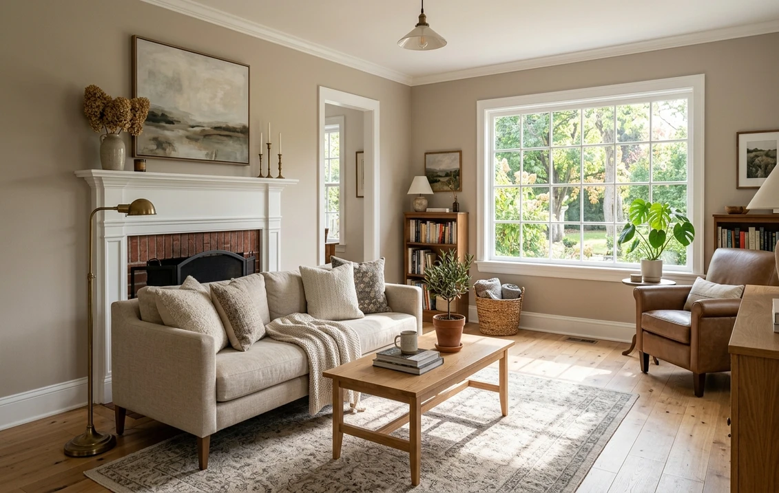
The rooms Perfect Greige was made for
Perfect Greige earns its keep in rooms where warmth and a little depth are welcome. The mid-tone LRV makes it a poor choice for a tiny windowless space, but a strong one wherever you want a grounded, lived-in feel:
- Living and family rooms: its sweet spot. The warm taupe creates a cocooning, transitional backdrop that flatters both gray and brown furniture and lets wood tones glow.
- Bedrooms: the depth that makes it tricky in small spaces is an asset here, producing a restful, hotel-like envelope, especially with warm bulbs.
- Dining rooms: the soft violet base reads as quietly elegant by candle or warm light, dressier than a plain beige.
- Open-plan main floors: a popular whole-home greige because it bridges warm and cool decor and pairs with almost any flooring. For the budget side of a full repaint, our interior house painting cost guide covers what to expect.
Where to be careful: small bathrooms, dim hallways, and basements with little natural light, where LRV 38 can feel heavy and the color can slide toward brown. In those spaces, a lighter greige like Agreeable Gray (LRV 60) or Accessible Beige (LRV 58) usually serves better. Our profile of SW Accessible Beige walks through that lighter, beigier alternative.
Free AI visualizer: test Perfect Greige in a living room or bedroom before you buy a sample.
Trim, ceiling, and coordinating colors
With a mid-tone greige, the trim choice decides whether the room feels crisp or muddy. Because Perfect Greige is fairly deep, a clean white trim gives it the contrast it needs:
- Best all-around trim: Sherwin-Williams Pure White (SW 7005, LRV 84). Bright and only faintly warm, it gives Perfect Greige crisp definition and keeps the greige reading clean rather than dingy. The default designer pairing.
- For a softer, warmer scheme: SW Alabaster (SW 7008, LRV 82). A creamy white that lowers the contrast and leans the whole room warmer, good in a cozy bedroom.
- Avoid: a stark blue-white trim, which can drag Perfect Greige's violet undertone forward and make it look slightly mauve.
- Ceiling: a flat white keeps the room open and bright, important when the walls already sit at a deeper LRV.
- Coordinating colors: for a darker in-family step, SW Mega Greige (SW 7031) or a soft black like SW Tricorn Black (SW 6258) on a door anchors the scheme. A muted blue-green like SW Oyster Bay (SW 6206) makes a calm accent.
For decor, Perfect Greige flatters warm woods (oak, walnut), aged brass and oil-rubbed bronze, cream and oatmeal textiles, and soft black accents. It also plays well beside cooler greiges and gentle blues, so it flows easily into a whole-home palette. The pillar Sherwin-Williams interior paint colors guide maps out which neutrals coordinate across rooms.
Perfect Greige vs the colors people cross-shop
Perfect Greige has three near-twins shoppers line up against it. Knowing the differences saves a wrong sample and a repaint:
- vs SW Agreeable Gray (SW 7029, LRV 60): the most common comparison, and the two are quite different despite both being greige. Agreeable Gray is significantly lighter and cooler, a true gray-leaning greige with no violet, and it disappears into a room as a soft neutral. Perfect Greige is deeper, warmer, and more taupe, a color you notice. Choose Agreeable Gray for an airy, safe backdrop; choose Perfect Greige when you want warmth and a bit of depth.
- vs SW Mega Greige (SW 7031, LRV 37): the closest in depth, with nearly identical LRV. Mega Greige is the warmer, more straightforwardly taupe-brown of the two, with less of the violet undertone, so it reads a touch earthier and more predictable. Perfect Greige has that cooler violet base that gives it a slightly more refined, less rustic feel. They are close enough that you should sample both side by side.
- vs SW Colonnade Gray (SW 7641, LRV 50): lighter than Perfect Greige and cooler, with a green-gray undertone rather than violet. Colonnade Gray reads as a calmer, more clearly gray greige and never goes mauve. Pick Colonnade Gray if Perfect Greige feels too warm or too dark, or if the violet flash bothers you.
The short version: among these four, Agreeable Gray is the lightest and coolest, Colonnade Gray sits in the middle leaning green-gray, and Perfect Greige and Mega Greige are the deeper warm pair, with Perfect Greige carrying the distinctive violet whisper. If you want to compare how Sherwin-Williams greiges hold up against Benjamin Moore's, our Sherwin-Williams vs Benjamin Moore interior comparison covers finish and coverage differences.
How to test Perfect Greige before you commit
Perfect Greige is exactly the kind of color a small fan-deck chip misleads you on. Its undertone shifts and its mid-tone depth mean the chip, viewed under cool store light near 4000K, can look flatter and cooler than the warm taupe you get at home, while hiding how much darker it reads after sundown. The reliable method is a large peel-and-stick sample taped to two different walls, one near a window and one in a darker corner, then checked mid-morning, mid-afternoon, and after dark under your own bulbs. Watch specifically for the violet flash on the north or dimmest wall, since that is the read most likely to change your mind. The faster, no-paint first pass is a digital visualizer: upload a photo of the room and apply Perfect Greige beside a lighter alternative (Agreeable Gray) and a warmer one (Mega Greige) to see which way your light pulls it, ruling out the colors that were never going to work before you buy a single sample.
Preview Perfect Greige beside a lighter and a warmer greige under your real light, free.
Frequently asked questions
What undertones does SW Perfect Greige have?
Perfect Greige (SW 6073) is a warm greige with a dominant taupe base and a soft violet undertone underneath. The taupe keeps it warm and grounded, while the faint violet stops it from looking flat or muddy. Under warm light it reads as a balanced warm taupe; under cool or north light the violet can surface as a slight lilac cast; in dim or warm artificial light it deepens toward mushroom brown.
What is the LRV of SW Perfect Greige?
Perfect Greige has a Light Reflectance Value of 38, a genuine mid-tone. It reflects far less light than popular lighter greiges such as Agreeable Gray (LRV 60), so it reads as a real color with depth and coziness rather than a near-white neutral. That depth makes it excellent in well-lit living rooms and bedrooms but heavy in small or dim spaces.
Is Perfect Greige warmer than Agreeable Gray?
Yes. Perfect Greige is noticeably warmer and deeper than Agreeable Gray. Agreeable Gray (SW 7029, LRV 60) is a lighter, cooler, gray-leaning greige with no violet undertone that recedes into a room. Perfect Greige (SW 6073, LRV 38) is a warmer, taupe-leaning greige with a violet base and more visual weight. Choose Agreeable Gray for an airy backdrop and Perfect Greige for warmth and depth.
What trim color goes with Perfect Greige?
Sherwin-Williams Pure White (SW 7005, LRV 84) is the most reliable trim pairing. It is bright and only faintly warm, giving the deeper greige crisp contrast and keeping it reading clean rather than dingy. For a softer, warmer look, SW Alabaster (SW 7008) lowers the contrast. Avoid stark blue-white trim, which can pull Perfect Greige's violet undertone forward and make it look mauve.
See SW Perfect Greige under your real light, beside a lighter and a warmer greige, before you buy.
Disclaimer: Sherwin-Williams and SW 6073 Perfect Greige are trademarks of The Sherwin-Williams Company. Benjamin Moore and Behr are trademarks of their respective owners. FacadeColorizer is an independent paint visualization service and is not affiliated with, endorsed by, or sponsored by Sherwin-Williams, Benjamin Moore, or Behr. Screen color approximates the manufacturer's sample; always confirm with a physical sample before purchase. Sources: Sherwin-Williams SW 6073 Perfect Greige color data 2026, Sherwin-Williams Pure White SW 7005, Alabaster SW 7008, Agreeable Gray SW 7029, Mega Greige SW 7031, and Colonnade Gray SW 7641 color data, and designer field notes on greige undertones.
Trademarks mentioned (Sherwin-Williams, Benjamin Moore, Behr, Caparol, Brillux, Sto, Alpina, Valspar, PPG, Glidden, Dulux, Crown Trade, Sandtex, Farrow & Ball, Johnstone's, Leyland) are property of their respective owners. FacadeColorizer is independent and not affiliated with any of them. Nominative fair use under Lanham Act §1125.


