
Sherwin-Williams West Highland White (SW 7566) is the warm white people reach for when crisp whites feel cold and beiges feel too colorful. It is not a stark, blue-leaning white and it is not a creamy buttercream either. It sits in between: a soft, hazy white with a gentle yellow-cream cast that makes a room feel calm and lived-in rather than clinical. That in-between quality is exactly why it works so well on walls, and also why a fan-deck chip can fool you, because next to a true white it suddenly looks like a soft tan.
This profile is for the homeowner deciding whether West Highland White belongs on their walls: how its undertones behave, the published LRV and hex, the rooms it flatters, and the trim and decor that keep it reading clean instead of dingy. It is one of the soft warm whites in our wider Sherwin-Williams interior paint colors guide, and you can see how it stacks up against other whites in our best white paint for walls roundup.
Upload one photo and preview SW West Highland White under your room's actual light in about 30 seconds, free.
The numbers behind West Highland White SW 7566
Start with the published data; these figures predict the wall far better than a small fan-deck chip. They come from the Sherwin-Williams color tools:
| Spec | Value |
|---|---|
| SW code | SW 7566 West Highland White |
| HEX (screen approximation) | #EFEAE0 |
| RGB approximation | 239, 234, 224 |
| LRV (Light Reflectance Value) | 81 |
| Hue family | Soft warm white, yellow-cream cast with a faint green-gray softener |
| Closest SW cousins | White Sand (SW 7551), Natural Choice (SW 7011), Shoji White (SW 7042) |
Sources: Sherwin-Williams SW 7566 West Highland White color data, retrieved 2026; The Spruce paint undertone references.
The LRV of 81 is the headline figure. That is a genuine white in the brightness sense: it bounces a lot of light and keeps a room feeling open, but it sits a few points below the brightest off-whites (Alabaster is 82, Pure White is 84). Those few points matter. West Highland White carries enough warmth that it never goes icy, while still being light enough to use wall to wall in a low-light room without closing it in. It is a softer, hazier white than the crisp neutrals; for a brighter, cleaner alternative, our SW Pure White profile shows where a true bright white pulls ahead.
The undertones: warm, but quietly
West Highland White is built on a yellow-cream base, which is the warmth you feel the moment it goes up. But it is not a simple buttery white. There is a faint green-gray softener mixed in that keeps the yellow from reading as gold or sallow. That second note is what gives the color its hazy, slightly grayed quality and stops it from looking like an old cream. The two undertones working together are why it feels so easy to live with: warm enough to be cozy, muted enough to stay sophisticated.
- The warm read. Under direct sun or a warm 2700K bulb, the yellow-cream base comes forward and the wall glows soft and creamy. The version most people picture and the reason they choose it.
- The neutral read. Under balanced or daylight light, the green-gray softener tempers the yellow and West Highland White settles into a calm, almost-white that reads as a sophisticated warm neutral rather than a cream.
- The risk read. Beside a clean, cool white or against bright snow through a window, the warmth gets exposed and it can briefly look tan or yellowish. This is contrast doing the work, not the paint failing; it disappears once the room is finished.
Because it is a warm white rather than a strongly pigmented color, West Highland White shifts less dramatically across the day than a color-shifting neutral does, but the warmth still rises and falls with the light source. Our interior color families guide explains why warm whites behave this way. Typical behavior across the four Northern Hemisphere orientations:
| Room orientation | Daylight character | How West Highland White reads |
|---|---|---|
| South-facing | Warm, abundant midday light | Warmest version, soft and creamy, very inviting |
| West-facing | Cool by day, very warm at sunset | Calm near-white by day, glowing golden cream late afternoon |
| East-facing | Warm early sun, neutral later | Creamy in the morning, settling to a soft neutral by afternoon |
| North-facing | Cool, indirect, no direct sun | Most useful here: the warmth offsets cool light and keeps the room from going gray, never icy |
Sources: American Institute of Architects daylight reference; Sherwin-Williams SW 7566 color data; designer field notes on warm whites.
The standout case is the north-facing room. Cool, sun-starved north light turns most bright whites slightly gray and lifeless. West Highland White's built-in warmth pushes back against that, which is why it is a go-to recommendation for north rooms that need a white but cannot afford to look cold. The flip side: in a very warm, sun-flooded south room with 2700K bulbs everywhere, layering more warmth can tip it toward yellow, so balance your bulbs there.
The rooms West Highland White was made for
West Highland White is a true whole-home white. Its soft warmth makes it forgiving across very different spaces, and it flows well from room to room without jarring:
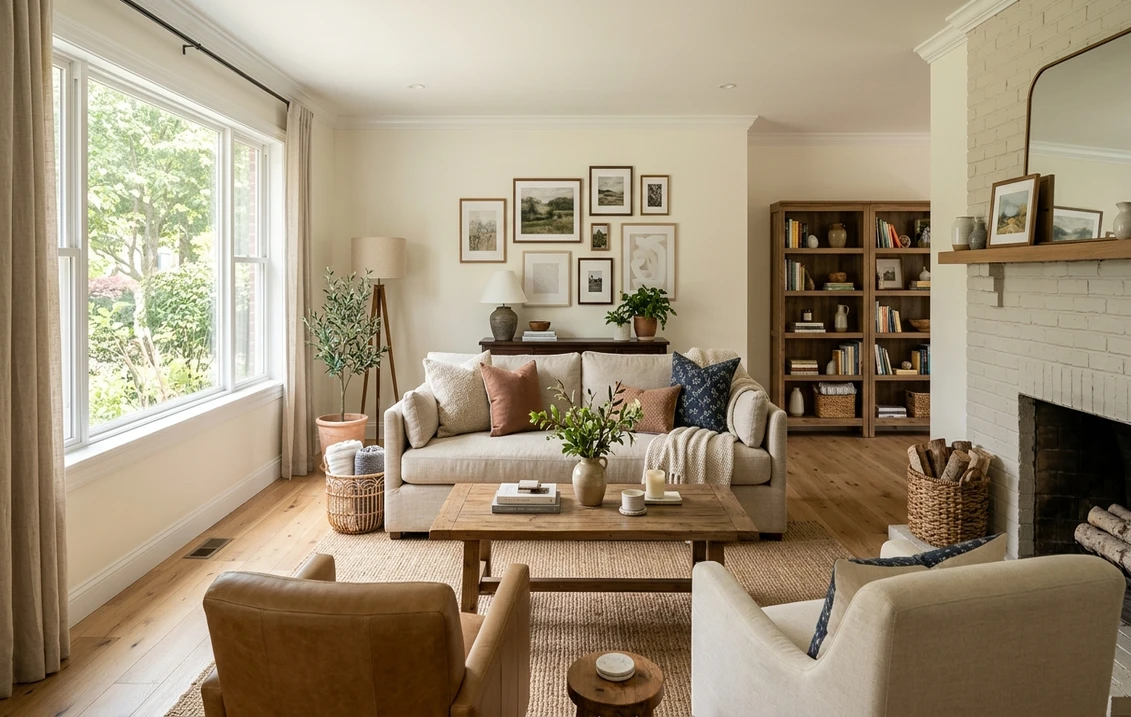
- Living rooms and open-plan main floors: the warmth reads as welcoming and the high LRV keeps large rooms bright. It is a popular whole-house choice precisely because it does not fight with wood floors, fabrics, or art.
- Bedrooms: the soft, hazy quality is restful and layers easily under white, cream, oatmeal, or natural-linen bedding. It feels calm without being cold.
- Kitchens and cabinetry: a strong cabinet color when you want warm white cabinets that read soft and timeless rather than stark. It pairs beautifully with warm wood, brass, and cream stone counters.
- North-facing and low-light rooms: its built-in warmth is the reason designers reach for it where cooler whites would go gray.
Where to be careful: in a bathroom or laundry full of cool 5000K daylight bulbs, the warmth can flatten, so test it under your actual fixtures. And in a room that already has strong yellow-toned oak floors and warm lighting, West Highland White can read more cream than white, which may be exactly what you want or one step too warm. Our interior painting cost guide covers what the repaint should run before you commit a whole floor to it.
Free AI visualizer: test West Highland White in a living room, bedroom, or on cabinets before you buy a sample.
Trim, ceiling, and decor that keep it clean
With a warm white on the walls, the trim decision is the one that makes or breaks the room. Pair West Highland White with a hard, cool white trim and the wall will suddenly look dingy by contrast. The trick is to either use a slightly brighter warm white for crisp definition or go tonal:
- Best all-around trim: Sherwin-Williams Pure White (SW 7005, LRV 84). It is bright and only faintly warm, so it gives clean contrast against West Highland White walls without going icy or making the wall look yellow.
- For a soft tonal scheme: use West Highland White on both walls and trim in different sheens (flat or eggshell walls, satin or semi-gloss trim). The result is a quiet, enveloping room with subtle definition rather than sharp edges.
- For a warmer creamy scheme: SW Alabaster (SW 7008, LRV 82) trim keeps everything in the warm family for a cozy, layered cream look.
- Ceiling: a flat clean white or West Highland White itself works; avoid a hard blue-white ceiling that fights the warm walls.
- Deeper coordinating tones: for accents, built-ins, or an adjoining room, warm greiges and soft greens flow naturally; a black accent (SW Tricorn Black) gives crisp contrast that reads intentional against the warmth.
- Decor and finishes: warm wood, brass, aged bronze, natural linen, rattan, and cream stone all flatter it. Heavy cool grays and stark white-on-white styling drag it toward looking yellow.
To carry a West Highland White scheme into adjoining rooms, soft warm neutrals are the obvious partners; if you want a cooler counterpoint elsewhere in the home, a calm blue-green like our SW Sea Salt profile sits comfortably beside a warm white without clashing.
West Highland White vs its three near-twins
West Highland White lives in a crowded corner of the SW fan deck, and three colors get cross-shopped against it constantly. Knowing the difference saves a wrong sample:
- vs SW White Sand (SW 7551): the closest sibling. White Sand (LRV around 80) is a touch warmer and reads a hair more clearly beige-cream, with a stronger yellow leaning. West Highland White is slightly softer and grayer thanks to its green-gray softener, so it holds the "white" read a little longer. Choose White Sand if you want unmistakably warm and creamy; choose West Highland White if you want warm but still convincingly white.
- vs SW Natural Choice (SW 7011): Natural Choice (LRV around 73) is meaningfully deeper and clearly warmer, often described as a soft off-white or warm greige-tinged white. It reads more like a very pale neutral than a white. West Highland White is brighter and reads as a white first; Natural Choice reads as a soft warm tone first. Pick Natural Choice if you want more visible color and depth on the wall.
- vs SW Shoji White (SW 7042): Shoji White (LRV around 74) is a warm white with a more pronounced greige-beige cast and a touch more depth, sitting between a white and a greige. West Highland White is lighter and reads cleaner and more white, where Shoji White leans more visibly toward soft tan-greige. Choose Shoji White for a cozier, more pigmented warm neutral; choose West Highland White for a softer, brighter warm white.
In short: of these four, Natural Choice and Shoji White have the most visible warm color and read as soft neutrals, White Sand is the creamiest white, and West Highland White is the best balance of genuine brightness with quiet warmth. For the full lineup of warm and cool whites side by side, see our best white paint for walls guide.
Sherwin-Williams or Benjamin Moore?
The most common Benjamin Moore cross-shop for a warm white in this brightness range is White Dove (OC-17), which is slightly cooler and grayer than West Highland White, and Cloud White (OC-130), which is warmer. West Highland White sits roughly between the two: warmer than White Dove, less yellow than a true cream. If you are weighing the two brands on coverage, finish, and how they wear on walls and cabinets, we cover that in the full Sherwin-Williams vs Benjamin Moore interior comparison.
How to test West Highland White before you commit
West Highland White is a textbook color where a 3-inch fan-deck chip misleads, because a small chip against the bright white of the fan deck card exaggerates its warmth and makes it look more tan than it will on a full wall. The reliable physical method is a large peel-and-stick sample (Sherwin-Williams sells one) taped to at least two walls, ideally near both a window and your trim, and checked mid-morning, mid-afternoon, and after dark under your normal bulbs. The faster, no-paint first pass is a digital visualizer: upload a photo of the room and apply West Highland White beside a brighter white (Pure White) and a warmer one (White Sand) to see which way your light pulls it, ruling out the whites that were never going to work before you spend a dollar on samples.
Preview West Highland White beside a brighter and a warmer white under your real light, free: 1 HD render plus 3 variations.
Frequently asked questions
Is West Highland White warm or cool?
It is a warm white. SW 7566 is built on a yellow-cream base with a faint green-gray softener mixed in. Under warm light it reads soft and creamy; under balanced or daylight light the green-gray note tempers the yellow so it settles into a calm warm neutral. It never reads cool or icy, which is why it is a favorite for north-facing rooms where cooler whites would look gray.
What is the LRV of SW West Highland White?
West Highland White has a Light Reflectance Value of 81, with an approximate hex of #EFEAE0. That is a genuinely light white that reflects plenty of light and keeps a room feeling open, sitting just a few points below the brightest off-whites like Alabaster (82) and Pure White (84). The slightly lower LRV plus its warmth is what gives it a softer, hazier feel than a crisp bright white.
What trim color goes with West Highland White?
Sherwin-Williams Pure White (SW 7005, LRV 84) is the most reliable trim pairing: bright and only faintly warm, it gives clean contrast without going icy or making the wall look yellow. For a softer look, use West Highland White on both walls and trim in different sheens for a tonal effect, or SW Alabaster (SW 7008) for a warmer creamy scheme. Avoid a hard, cool white trim, which makes the warm wall look dingy.
How is West Highland White different from White Sand, Natural Choice, and Shoji White?
All four are warm SW whites, but they differ in warmth and depth. White Sand (SW 7551) is creamier and a touch warmer. Natural Choice (SW 7011, LRV around 73) and Shoji White (SW 7042, LRV around 74) are both deeper and read as soft warm neutrals more than whites, with Shoji White showing a greige-beige cast. West Highland White (LRV 81) is the brightest of the group and reads as a genuine white first, with quiet warmth second, making it the best balance of brightness and coziness.
See SW West Highland White under your real light, beside a brighter and a warmer white, before you buy.
Disclaimer: Sherwin-Williams and SW 7566 West Highland White are trademarks of The Sherwin-Williams Company. Benjamin Moore and Behr are trademarks of their respective owners. FacadeColorizer is an independent paint visualization service and is not affiliated with, endorsed by, or sponsored by Sherwin-Williams, Benjamin Moore, or Behr. Screen color approximates the manufacturer's sample; always confirm with a physical sample before purchase. Sources: Sherwin-Williams SW 7566 West Highland White color data 2026, Sherwin-Williams Pure White SW 7005, Alabaster SW 7008, White Sand SW 7551, Natural Choice SW 7011, and Shoji White SW 7042 color data, Benjamin Moore White Dove OC-17 and Cloud White OC-130 color data, The Spruce paint undertone references, and designer field notes on warm whites.
Trademarks mentioned (Sherwin-Williams, Benjamin Moore, Behr, Caparol, Brillux, Sto, Alpina, Valspar, PPG, Glidden, Dulux, Crown Trade, Sandtex, Farrow & Ball, Johnstone's, Leyland) are property of their respective owners. FacadeColorizer is independent and not affiliated with any of them. Nominative fair use under Lanham Act §1125.


