
You wanted a white that did not feel like a hospital corridor, so a paint pro handed you a chip of Sherwin-Williams White Sand (SW 7551). It looks like a quiet, friendly off-white on the card, and that is exactly the point: White Sand is a soft warm white with a faint greige whisper, the kind of color that makes a room feel finished and calm rather than blank and cold. The catch is the name. There is a Benjamin Moore color also called White Sand (OC-10), and the two are not the same paint, which trips up more than a few shoppers at the counter.
This profile is for the homeowner deciding whether White Sand SW 7551 is the warm white for their walls: its real undertones, the published LRV and hex, the rooms it suits, how it shifts under different light, the trim that frames it, and how it differs from the two SW off-whites people cross-shop most. It sits among the soft warm neutrals in our wider Sherwin-Williams interior paint colors guide, and you can see where it lands against other 2026 picks in our best interior paint colors for 2026 roundup.
Upload one photo and preview SW White Sand under your room's actual light in about 30 seconds, free.
The numbers behind White Sand SW 7551
Start with the published data; these figures predict the wall better than any fan-deck chip. They come from the Sherwin-Williams color tools:
| Spec | Value |
|---|---|
| SW code | SW 7551 White Sand |
| HEX (screen approximation) | #E3DCCB |
| RGB approximation | 227, 220, 203 |
| LRV (Light Reflectance Value) | 75 |
| Hue family | Warm off-white with a soft greige (beige-gray) base |
| Closest SW cousins | Natural Choice (SW 7011), Shoji White (SW 7042), Aesthetic White (SW 7035) |
| Collection | Part of the SW neutral whites family, often filed near the warm off-whites |
Sources: Sherwin-Williams SW 7551 White Sand color data, retrieved 2026; The Spruce paint undertone references.
The LRV of 75 is the figure that tells you the most. That is a genuine off-white: bright and reflective enough to keep a room feeling open and to bounce daylight around, but a clear step down from a true bright white like SW Pure White (LRV 84) or a stark decorator white at 90-plus. That gap is what stops White Sand from feeling clinical. It has just enough body to read as a warm, soft color rather than a blank wall, which is the entire reason people reach for it over a builder-grade flat white. If you want the brighter, crisper counterpoint to compare against, our SW Pure White profile shows what a higher-LRV white does in the same rooms.
White Sand's undertones, decoded
White Sand is not a pure white with a single dominant undertone; it is a soft off-white built on a warm greige base. Its undertones are gentle, which is what keeps it versatile, but they are present and they show themselves in different light:
- The primary read: soft warm cream. White Sand's dominant character is a low-key warmth, closer to a soft cream than a yellow. It is the warmth that makes the color feel inviting and easy to live with rather than cold.
- The secondary read: a greige whisper. Underneath the warmth sits a faint beige-gray that keeps White Sand from ever tipping into buttery or gold. This greige base is what makes it read as a modern off-white instead of a dated cream, and it is the trait that separates it from a cleaner white like Natural Choice.
- The trap to know: a touch of yellow in warm light. Under a low-Kelvin incandescent or a 2700K bulb, the warmth can amplify and White Sand can pull slightly more yellow than the chip suggests. In a north room with cool daylight, the same paint settles back to a soft, almost putty-like off-white.
Because White Sand is a soft warm neutral rather than a bold hue, it shifts less dramatically than a color-changing chameleon like Sea Salt, but it does move along the warm axis depending on orientation and bulb. Our interior color families guide explains why warm off-whites behave this way. Here is how White Sand typically reads across the four Northern Hemisphere orientations:
| Room orientation | Daylight character | How White Sand reads |
|---|---|---|
| South-facing | Warm, abundant midday light | Glows as a soft warm cream, its most flattering version, never harsh |
| West-facing | Neutral by day, very warm at sunset | Soft off-white by day, warms to a golden cream in late-afternoon sun |
| East-facing | Warm early sun, cooler later | Creamy in the morning, settling to a balanced greige-white by afternoon |
| North-facing | Cool, indirect, no direct sun | Coolest and putty-like; the greige base shows most, warmth is muted |
Sources: American Institute of Architects daylight reference; Sherwin-Williams SW 7551 color data; designer field notes on warm off-whites.
The practical takeaway: White Sand is a forgiving warm white in south and west rooms, where its warmth is an asset. In a north-facing room, it is one of the safer warm whites because the cool light tempers its cream side and the greige base keeps it grounded rather than dingy, where many warmer creams would turn flat. If you specifically want a warm white engineered for north light, our SW Alabaster on a north-facing house guide walks through that exact problem.
The rooms White Sand was made for
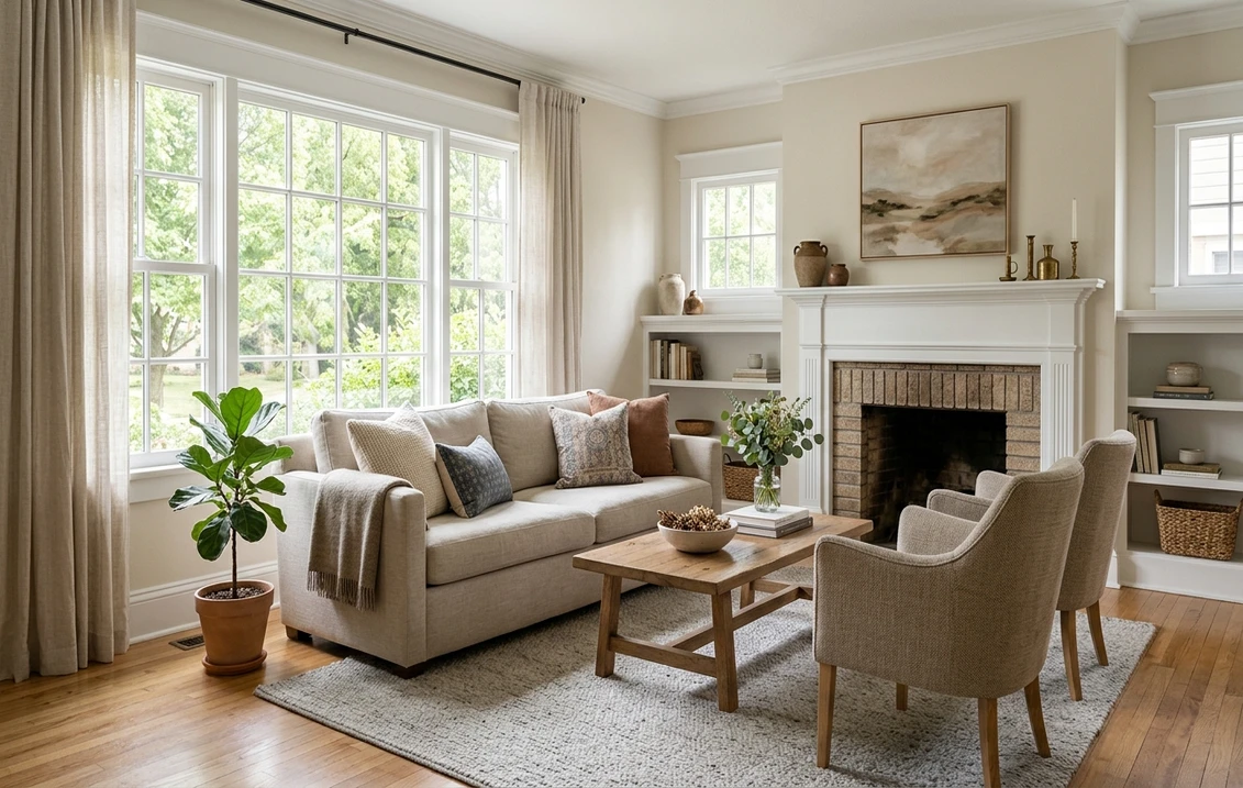
White Sand's whole value is being a warm white that works almost everywhere without drawing attention to itself. It is a true whole-house contender, but it shines hardest in a clear set of spaces:
- Living rooms and open-plan main floors: the LRV of 75 keeps large rooms bright while the warmth makes them feel lived-in. It is an easy backdrop for natural wood, warm metals, and layered neutrals.
- Bedrooms: the soft warmth reads restful and cocooning without going dark. It flatters cream, taupe, and natural-linen bedding and pairs beautifully with light to medium wood furniture.
- Kitchens and cabinetry: on walls it keeps a busy kitchen calm, and on cabinets it reads as a soft, custom warm white against white countertops or warm wood, less stark than a pure decorator white.
- Hallways and transitional spaces: because it is a low-contrast warm neutral, White Sand flows from room to room without jarring transitions, which is why it is a popular whole-home choice.
- Trim and millwork in a warm scheme: some homeowners run White Sand on both walls and trim with a sheen change, for a soft, low-contrast, modern-cottage look.
Where to be careful: in a room with strong warm-white LED downlights and no daylight, White Sand's cream side can compound and start to look yellow, so check it under your actual bulbs. And if your home leans cool and modern with lots of cool gray flooring and stainless, White Sand's warmth can fight the scheme; a cleaner off-white like Natural Choice may sit better. When you are budgeting the repaint, our interior house painting cost guide covers what a whole-house warm-white job typically runs.
Free AI visualizer: test White Sand in a living room, bedroom, or on cabinets before you buy a sample.
Trim, ceiling, and decor that frame it
Because White Sand is itself an off-white, the trick is choosing a trim that has enough contrast to look intentional without going so stark it makes White Sand look dirty. The safest paths:
- Best brighter trim: Sherwin-Williams Pure White (SW 7005, LRV 84). A clean white with only a faint warmth, it gives crisp, modern contrast against White Sand walls without reading icy. The most popular pairing.
- For a warmer, softer scheme: SW Alabaster (SW 7008, LRV 82). A creamy white that keeps trim and walls in the same warm family for a gentle, low-contrast cottage look.
- Tone-on-tone trim: run White Sand on trim too, in a satin or semi-gloss against eggshell walls, for a seamless soft-modern envelope. Subtle, calm, and very forgiving.
- Ceiling: a flat bright white keeps the room feeling tall and lets the walls' warmth read. Avoid a yellow-tinged ceiling white, which can drag the whole room warm.
- Deeper coordinating tones: for contrast or an accent, a warm greige like SW Accessible Beige or a soft black like SW Tricorn Black (SW 6258) on a door or window grille reads crisp and modern against White Sand.
- Decor and finishes: natural and white oak, rattan, warm brass and aged bronze, cream and oatmeal textiles, and warm-toned stone all flatter White Sand. Heavy cool grays and blue-toned LEDs can make it look dull.
To pair White Sand with a warm greige in adjoining rooms for an easy open-plan flow, the natural partners are SW's greiges; our profiles of SW Accessible Beige and SW Agreeable Gray both flow naturally beside a warm off-white like this one.
White Sand vs the SW off-whites people cross-shop
White Sand sits in a crowded part of the SW deck, and a couple of near-twins get sampled right alongside it. Knowing the difference saves a wasted quart:
- vs SW Natural Choice (SW 7011): the closest cross-shop. Natural Choice (LRV around 73) is a cleaner, more neutral off-white with less obvious warmth and a softer, less yellow undertone. White Sand is the warmer, slightly creamier of the two; Natural Choice is the safer pick if your lighting is already warm or your decor leans cool. Choose White Sand for cozy warmth, Natural Choice for a more neutral, fail-safe off-white.
- vs SW Shoji White (SW 7042): a step deeper and greiger. Shoji White (LRV around 74) carries noticeably more visible gray and a slightly muddier, more complex warm undertone, which makes it read as a true greige-white rather than a soft cream. White Sand stays cleaner and brighter on the wall; Shoji White feels a touch more layered and grounded. Our full SW Shoji White profile breaks down where its extra gray helps and where it hurts.
- vs SW Aesthetic White (SW 7035): Aesthetic White is a slightly grayer, cooler-leaning off-white. If White Sand reads too warm or too yellow in your light, Aesthetic White is the cooler half-step that holds whiter without going stark.
The big one to flag: Benjamin Moore also sells a White Sand (OC-10), and it is a different paint, a soft warm off-white in BM's formula, not the SW color. If a designer or contractor just says "White Sand," confirm whether they mean SW 7551 or BM OC-10 before anyone opens a can. We untangle how the two brands differ in formula, coverage, and finish in our Sherwin-Williams vs Benjamin Moore interior comparison.
How to test White Sand before you commit
Off-whites are the most deceptive colors to sample, because their undertones only show in context, beside your trim, your floors, and your light. A 3-inch fan-deck chip under store fluorescents will tell you almost nothing about whether White Sand will look creamy, putty, or faintly yellow on your wall. The reliable physical method is a large peel-and-stick sample (Sherwin-Williams sells one) taped beside your trim and existing whites, checked mid-morning, mid-afternoon, and after dark under your normal bulbs; that night-time view is the one that exposes a too-yellow warm white. The faster no-paint first pass is a digital visualizer: upload a photo of your room and apply White Sand next to a cleaner off-white (Natural Choice) and a greiger one (Shoji White) to see which way your light pulls it, ruling out the ones that were never going to work before you buy a single sample.
Preview White Sand beside a cleaner and a greiger off-white under your real light, free: 1 HD render plus 3 variations.
Frequently asked questions
What are the undertones of SW White Sand?
White Sand (SW 7551) is a warm off-white built on a soft greige (beige-gray) base. Its dominant read is a low-key warm cream, with a faint greige underneath that keeps it from looking buttery or dated. In warm light, especially under 2700K bulbs or in a south or west room, it can pull slightly more yellow; in cool north light it settles to a putty-like soft off-white where the greige base shows most. It is warm but never gold.
What is the LRV of SW White Sand 7551?
White Sand has a Light Reflectance Value of 75. That makes it a true off-white: bright and reflective enough to keep a room feeling open and bounce daylight around, but a clear step below a bright white like SW Pure White (LRV 84). That gap is exactly what keeps White Sand feeling soft and warm rather than stark, while still reading clearly as a light, airy color.
What is the difference between White Sand and Natural Choice?
Both are SW warm off-whites, but White Sand (SW 7551) is the warmer and slightly creamier of the two, while Natural Choice (SW 7011) is cleaner and more neutral with less obvious warmth and a softer, less yellow undertone. Choose White Sand when you want cozy warmth on the walls; choose Natural Choice as the more fail-safe off-white if your lighting is already warm or your decor leans cool.
Is SW White Sand the same as Benjamin Moore White Sand?
No. They share a name but are different paints. SW White Sand is SW 7551, a warm off-white with a greige base. Benjamin Moore's White Sand is OC-10, a separate soft warm off-white in BM's formula. If anyone just says "White Sand," confirm whether they mean the Sherwin-Williams code or the Benjamin Moore one before buying, because the two will not match exactly on the wall.
What trim color goes with White Sand?
SW Pure White (SW 7005, LRV 84) is the most popular trim pairing: a clean white with a faint warmth that gives crisp, modern contrast against White Sand walls without reading icy. For a softer, low-contrast scheme, SW Alabaster (SW 7008) keeps walls and trim in the same warm family. You can also run White Sand on trim in a higher sheen for a seamless tone-on-tone look.
See SW White Sand under your real light, beside a cleaner and a greiger off-white, before you buy.
Disclaimer: Sherwin-Williams and SW 7551 White Sand are trademarks of The Sherwin-Williams Company. Benjamin Moore and Behr are trademarks of their respective owners. FacadeColorizer is an independent paint visualization service and is not affiliated with, endorsed by, or sponsored by Sherwin-Williams, Benjamin Moore, or Behr. Screen color approximates the manufacturer's sample; always confirm with a physical sample before purchase. Sources: Sherwin-Williams SW 7551 White Sand color data 2026, Sherwin-Williams Natural Choice SW 7011, Shoji White SW 7042, Aesthetic White SW 7035, Pure White SW 7005 and Alabaster SW 7008 color data, Benjamin Moore White Sand OC-10 color data, The Spruce paint undertone references, and designer field notes on warm off-whites.
Trademarks mentioned (Sherwin-Williams, Benjamin Moore, Behr, Caparol, Brillux, Sto, Alpina, Valspar, PPG, Glidden, Dulux, Crown Trade, Sandtex, Farrow & Ball, Johnstone's, Leyland) are property of their respective owners. FacadeColorizer is independent and not affiliated with any of them. Nominative fair use under Lanham Act §1125.


