
Benjamin Moore White Sand (OC-10) is one of those off-whites that homeowners pick because the chip looks like a clean, safe white, then they get nervous the moment it dries on the wall and the warmth shows up. That is the whole story of this color in one sentence: it is not a bright white at all. White Sand is a soft, sandy, slightly beige off-white, and once you understand that it is essentially a pale putty-toned neutral wearing a white name, every decision about it gets easier. I have specced it most often in open-plan living rooms and primary bedrooms where the owner wanted "white walls but cozy," and that is exactly the brief it answers. Here is how it actually behaves indoors, with the numbers that matter and the two near-twins you need to rule out first.
Quick orientation before the deep dive. White Sand OC-10 carries a published LRV of about 79 and a hex approximation of #E9E2D3 (RGB 233, 226, 211). That puts it firmly in soft off-white territory: bright enough to keep a room open and welcoming, but well below the 88 to 92 LRV of a true bright white, so it never glares. The undertone is a warm sand beige, with the faintest yellow-gold that surfaces in strong sun. This profile is one stop in our wider Benjamin Moore interior paint colors guide, and it sits next to the brighter neutrals covered in our off-white paint colors guide. One thing to clear up immediately: this is Benjamin Moore White Sand, which is completely different from the Sherwin-Williams color of the same name (SW 6131), a darker tan. Same name, different brand, different color. This page is only about the BM OC-10.
Upload a photo of your actual room and preview BM White Sand under your own light in about 30 seconds. Free: 1 HD render plus 3 variations.
White Sand OC-10 at a glance: the numbers that matter
Before opinions, here are the verifiable specs straight from the Benjamin Moore Off-White Collection. These are the values you can take to a paint counter:
| Spec | White Sand OC-10 |
|---|---|
| Color number | OC-10 (Off-White Collection) |
| LRV (Light Reflectance Value) | Approximately 79: soft off-white, bright but never glaring |
| Hex / RGB (approx.) | #E9E2D3 / 233, 226, 211 |
| Color family | Warm off-white / sandy neutral |
| Primary undertone | Warm sand beige, with a faint yellow-gold in strong sun |
| Best base / finish | Off-white base; eggshell or matte on walls, satin or semi-gloss on trim |
The takeaway from those numbers: at LRV 79, White Sand is a working off-white, not a bright white. It reflects enough light to keep a room feeling open and airy, but the warm sand undertone gives it body and softness, so walls feel enveloping rather than stark. If you have ever painted a room a high-LRV bright white and found it cold or hospital-like at night, White Sand is the kind of neutral that fixes that problem. The flip side is the obvious risk: against truly bright white trim, that same warmth can read a touch yellow. The whole decision lives in that one tension, and your light decides which way it tips.
Is White Sand too yellow? The undertone, decoded
White Sand is a warm off-white, full stop. Anyone calling it a clean or true white is misreading the chip. But warm is not the same as yellow, and understanding that gap is what separates a room that feels softly sun-warmed from one that looks like aged paper. Here is what is happening underneath.
The dominant undertone is a sandy beige, the gray-tempered warmth that gives the color its name. Underneath that there is a quiet yellow-gold pigment, and it is the loudest in strong, direct sun. In a bright south- or west-facing room at midday, that gold can step forward and the wall can read closer to a soft cream than a neutral sand. In cooler or indirect light (a north room, an overcast day, evening shade) the warmth settles back, the gray in the mix shows, and White Sand reads as a calm, balanced putty-white. Crucially, it never goes pink or peach the way some warm off-whites do, and it has more gray in it than a pure cream, which is exactly why designers reach for it when they want warmth without the dated builder-beige feeling.
Watch out for one quirk. White Sand looks much whiter and cleaner on a 2-inch fan-deck chip than it does as a finished, rolled wall, because the small chip is surrounded by the white card and your eye balances against that. Roll it across a whole room and the warmth amplifies. So if you are choosing from a tiny chip alone, assume the actual wall will land a half-step warmer and softer than the chip promised, especially at night under warm bulbs.
| Indoor light | How White Sand reads |
|---|---|
| South-facing (bright, warm) | Warmest read; the gold steps forward and it can drift toward soft cream |
| West-facing (warm afternoon) | Glows golden in late-day sun, very cozy; its most flattering hour |
| East-facing (cool after noon) | Soft and balanced in morning, settles to a calm putty-white by afternoon |
| North-facing (cool, indirect) | At its most neutral and gray-tempered; warmth recedes, reads as a quiet greige-white |
| Artificial light at night | Warm 2700K bulbs deepen the cozy glow; cool 4000K bulbs flatten it toward a flat soft white |
Sources: Benjamin Moore OC-10 color data 2026; Benjamin Moore Off-White Collection; designer field reports compiled by FacadeColorizer.
Free AI visualizer. Test White Sand on your real walls before buying a single sample pot.
Best rooms for White Sand
Soft, warm, and forgiving, White Sand is happiest in rooms where the goal is comfort and a sense of natural light rather than crisp contrast. It is a whole-home neutral candidate, the off-white you reach for when you want walls to recede and feel cozy. Here is where it consistently earns its keep:
Living rooms and open-plan main floors
This is White Sand's home turf. At LRV 79 it keeps a great room bright and open, while the sandy undertone wraps the space in warmth that bright white cannot deliver. It is forgiving across multiple exposures, which makes it a strong pick for open-concept floors where one color flows from a sunny kitchen into a shaded den. It flatters wood floors, rattan, leather, and warm metals beautifully.
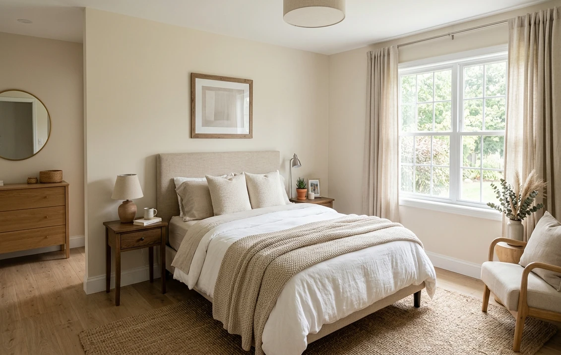
Primary and guest bedrooms
In a bedroom the warm softness reads restful and enveloping, a quiet backdrop that feels calm at night under lamplight rather than stark. It pairs effortlessly with linen, cream bedding, and natural wood. If a soothing bedroom is your project, our guide to calming master bedroom paint colors shows how warm off-whites like this sit next to other restful picks.
Trim, kitchens, and cabinetry in warm homes
White Sand also works as a soft, creamy cabinet or trim color in a home with warm wood tones and golden light, where a stark white would feel out of place. On kitchen cabinets it reads custom and timeless rather than builder-grade. For where it lands among the year's other warm neutrals, our warm white paint colors guide is a useful map of the family.
Where to think twice
A bright, all-day south-facing room with lots of warm wood and golden afternoon sun is where White Sand can tip from soft to overtly yellow-cream. If that room is already warm and you want walls to feel fresh and clean, this is the wrong off-white; reach for a cooler, brighter white instead. White Sand is also a poor match for a strictly cool, modern, gray-and-black palette, where its warmth will fight everything around it. It rewards warm rooms, so do not force it into a crisp contemporary scheme.
Trim, ceiling, and decor pairings
A warm off-white lives or dies on what sits next to it. Get the trim right and White Sand looks intentional and layered; get it wrong and the walls can look dingy or, worse, the trim can make them look distinctly yellow.
- Crisp brighter trim (most flattering contrast): BM Simply White (OC-117, LRV 89) or Chantilly Lace (OC-65) give a clean, brighter edge that lets White Sand read as the soft, warm wall it is. This is the designer move when you want subtle layered warmth without the walls looking yellow.
- Tone-on-tone trim (soft, seamless): BM White Dove (OC-17, LRV 85) keeps things gentle and cohesive, a half-step brighter than the wall for a soft, low-contrast look. Best for cozy bedrooms and traditional rooms.
- Avoid: a very warm, golden antique-white trim next to White Sand. With no cooler reference, the whole room can read yellow and flat. White Sand needs a slightly brighter, cleaner trim to keep it honest.
- Ceilings: a clean brighter white overhead keeps the room feeling tall and fresh; matching White Sand on the ceiling makes a cozy, cocooning effect but can feel heavy in a low room.
- Floors and decor: warm oak, walnut, rattan, brass, aged brass, leather, and linen all flatter the sandy undertone. Very cool gray-blue floors or chrome can clash with the warmth; temper them with warm textiles if you must combine them.
For a soft accent that stays in the same warm world, a greige or muted sage on a built-in or door reads natural and earthy against the sandy walls. If you want a brighter, cleaner companion white for the same scheme, its relationship is covered in our Benjamin Moore Simply White OC-117 review, and the most popular soft trim white in our Benjamin Moore White Dove OC-17 review.
See walls, trim, and floor together in one preview, free.
White Sand vs the off-whites people confuse it with
Almost every White Sand search ends in a side-by-side, because the Off-White Collection is full of sandy neutrals that look identical on a chip. The two that matter most, plus the brand confusion, are below:
- vs BM Bone White (OC-15): the closest neighbor on the strip and the one people most often hold against White Sand. Bone White (LRV around 73) is a touch deeper and reads more golden-cream, with a stronger yellow lean. White Sand (LRV around 79) is lighter and has more gray tempering its warmth, so it reads as a softer sand rather than a true cream. Choose Bone White if you want a cozier, more obviously creamy wall; choose White Sand when you want warmth that still reads close to off-white and reflects more light.
- vs BM Sea Pearl (OC-19): the other Off-White Collection cousin people line up next to it. Sea Pearl is a cooler, more gray-leaning off-white with the faintest green-gray cast; it reads almost neutral and never warm. White Sand is clearly the warmer, sandier of the two. Pick Sea Pearl when you want a soft white that stays cool and quiet in any light, and White Sand when you specifically want that sun-warmed, cozy feeling.
- vs SW White Sand (SW 6131): this is brand confusion, not a near-twin. The Sherwin-Williams color of the same name is a much darker tan, not an off-white at all. They share only a name. If your contractor or app shows a deep beige under "White Sand," you are looking at the SW color, not the BM OC-10 covered here.
Spelling and search note: white sand bm, BM White Sand OC-10, and benjamin moore white sand all point to this same OC-10 in the Off-White Collection.
How to test White Sand before you commit
A 2-inch fan-deck chip is the number-one reason people pick a warm off-white that surprises them: it hides the warmth because it sits on a white card, and it cannot show how the gold blooms across a real day on a real wall. Two better methods:
- Paint a large swatch: roll a 12-by-12-inch sample (or a peel-and-stick sample) on two different walls and check it mid-morning, mid-afternoon, and at night under your normal bulbs. Watch specifically for how golden it goes in your sunniest corner; that corner tells you the truth about whether it reads sand or cream in your home.
- Preview it digitally first: upload a real photo of your room and apply White Sand alongside a cooler and a deeper alternative such as Sea Pearl and Bone White before you buy any samples, narrowing three contenders to the one worth painting. Pricing context for the full repaint is in our interior house painting cost guide for 2026.
Preview White Sand against Bone White and Sea Pearl, side by side, free.
Frequently asked questions
Is Benjamin Moore White Sand warm or cool?
White Sand (OC-10) is a warm off-white with a sandy beige undertone and a faint yellow-gold that surfaces in strong sun. In cool or north light it settles into a balanced, gray-tempered putty-white, but in bright south or west light the gold steps forward and it can drift toward a soft cream. It never reads pink or peach, and it has more gray than a pure cream, but it is firmly a warm off-white, not a clean white.
What is the LRV of White Sand OC-10?
White Sand has a Light Reflectance Value of about 79 on the Benjamin Moore color data, with a hex approximation of #E9E2D3 (RGB 233, 226, 211). That makes it a soft off-white: bright enough to keep a room open and welcoming, but well below the 88 to 92 LRV of a true bright white, so it never glares. The warm undertone gives it body so walls feel enveloping rather than stark.
What are the best rooms for White Sand?
Living rooms, open-plan main floors, and bedrooms are where White Sand shines, because its warm sand undertone wraps the space in cozy light while LRV 79 keeps it open. It also makes a timeless creamy cabinet or trim color in homes with warm wood. It is least reliable in bright all-day south rooms with lots of golden sun, where it can read overtly yellow-cream, and in strictly cool modern gray-and-black palettes, where its warmth fights everything.
What trim color goes with White Sand?
A brighter, cleaner trim like BM Simply White (OC-117) or Chantilly Lace (OC-65) is the most flattering, because the contrast lets White Sand read as the soft warm wall it is instead of looking yellow. For a soft, seamless look, BM White Dove (OC-17) works tone-on-tone. Avoid a very golden antique-white trim, which can leave the whole room reading yellow and flat with no cooler reference.
What is the difference between White Sand, Bone White, and Sea Pearl?
All three are Benjamin Moore Off-White Collection neutrals. Bone White (OC-15) is deeper and more golden-cream than White Sand. Sea Pearl (OC-19) is cooler and gray-leaning, reading almost neutral and never warm. White Sand (OC-10) sits between them: warmer than Sea Pearl but lighter and grayer than Bone White, so it reads as a soft sand rather than a true cream. Note the Sherwin-Williams color called White Sand (SW 6131) is a much darker tan and unrelated.
Preview BM White Sand on your actual walls under your own light before buying a single sample.
Disclaimer: Benjamin Moore, White Sand (OC-10), Bone White (OC-15), Sea Pearl (OC-19), White Dove (OC-17), Simply White (OC-117), and Chantilly Lace (OC-65) are trademarks of Benjamin Moore & Co. Sherwin-Williams and White Sand (SW 6131) are trademarks of The Sherwin-Williams Company. FacadeColorizer is an independent paint visualization service and is not affiliated with, endorsed by, or sponsored by Benjamin Moore or Sherwin-Williams. Color reproduction on screens approximates the manufacturer's chip; always confirm with a manufacturer sample under your own light before purchase. Sources: Benjamin Moore OC-10 White Sand color data 2026, Benjamin Moore Off-White Collection (OC-15 Bone White, OC-19 Sea Pearl), designer field reports compiled by FacadeColorizer.
Trademarks mentioned (Sherwin-Williams, Benjamin Moore, Behr, Caparol, Brillux, Sto, Alpina, Valspar, PPG, Glidden, Dulux, Crown Trade, Sandtex, Farrow & Ball, Johnstone's, Leyland) are property of their respective owners. FacadeColorizer is independent and not affiliated with any of them. Nominative fair use under Lanham Act §1125.


