
Benjamin Moore Grant Beige (HC-83) is the greige people reach for when every other beige has gone too yellow and every gray has gone too cold. It is one of those quietly excellent whole-home colors that does not trend on Pinterest the way Revere Pewter does, but that designers keep specifying because it simply behaves. The recurring worry in every search bar is the same: does Grant Beige look pink? The honest answer is that it can flash a soft rose-gray in the wrong light, and understanding when that happens is the whole game. Here is exactly how this balanced greige reads on real interior walls.
Quick orientation before the deep dive. Grant Beige HC-83 carries a published LRV of about 57 and a hex approximation of #CBBEAB (RGB 203, 190, 171). That places it in light-to-mid greige territory: bright enough to keep a room open, with enough taupe depth that it never washes out to an off-white. Its undertone is a balanced warm taupe, a true marriage of beige and gray, with a faint pink-gray that can surface in cool or low light. This profile is one stop in our wider Benjamin Moore interior paint colors guide, and it sits right next to the warmer, cleaner Benjamin Moore Manchester Tan HC-81 review, the color it is most often confused with.
Upload a photo of your actual room and preview BM Grant Beige under your own light in about 30 seconds, free.
Grant Beige at a glance: the numbers that matter
Before opinions, here are the verifiable specs straight from the Benjamin Moore color library. These are the values you can take to a paint counter:
| Spec | Grant Beige HC-83 |
|---|---|
| Color number | HC-83 (Historical Color collection) |
| LRV (Light Reflectance Value) | Approximately 57: light-to-mid greige, keeps a room bright |
| Hex / RGB (approx.) | #CBBEAB / 203, 190, 171 |
| Color family | Warm greige (balanced beige-gray) |
| Primary undertone | Warm taupe, with a faint pink-gray that shows in cool or low light |
| Best base / finish | Medium tint base; eggshell on walls, satin or semi-gloss on trim |
The takeaway from those numbers: Grant Beige is a genuine greige, the kind that splits the difference between a true beige and a true gray instead of committing hard to either. At LRV 57 it sits a hair deeper than the lightest off-whites, so it holds the wall with a little body rather than disappearing. The taupe is the spine of the color; the pink-gray is the personality that occasionally peeks through. Lean into the warm taupe and Grant Beige is one of the most livable whole-home colors Benjamin Moore makes. Ignore the pink possibility and you can get a surprise in a cool corner. That is the entire decision.
Does Grant Beige look pink? The undertone, decoded
Grant Beige is, at its core, a warm taupe greige, and that is how it reads the overwhelming majority of the time: soft, grounded, a little earthy, neither sweet nor cold. But it does carry a quiet pink-gray pigment underneath the taupe, and that is the source of every "does it look pink?" search. Here is what is actually happening.
In warm light (a south room, a sunny afternoon, a 2700K bulb), the taupe and a whisper of gold dominate, and Grant Beige reads as a clean, cozy mushroom-beige. This is the read most homeowners fall in love with. In cool or weak light (a north room, an overcast day, deep shade, or a crisp 4000K LED), the warm wavelengths drain out of the space and the underlying pink-gray steps forward. It never turns Pepto, but it can soften into a rosy-taupe or a slightly mauve gray. The risk is highest when a strongly cool element sits next to it: a stark blue-white trim, a gray-blue floor, or a wall of north-facing glass will all coax the pink out.
Watch out for one comparison trap. Grant Beige looks markedly warmer and "browner" on a small fan-deck chip than it does as a finished rolled wall. Chips exaggerate the taupe and hide the pink-gray; the real wall, especially across a large surface in mixed light, will land a touch grayer and cooler than the chip promised. So if you are judging from a 2-inch swatch alone, expect the finished room to be a half-step less beige and a half-step more greige than you pictured.
| Indoor light | How Grant Beige reads |
|---|---|
| South-facing (bright, warm) | Warm cozy mushroom-beige, its most flattering read; taupe leads, pink hides |
| West-facing (warm afternoon) | Rich and golden in late sun, then cools toward soft taupe by evening |
| East-facing (cool after noon) | Balanced greige in morning; the pink-gray can surface by afternoon |
| North-facing (cool, indirect) | Greyest and softest; the rosy-taupe is most likely to appear here |
| Artificial light at night | Warm 2700K bulbs deepen the taupe and warmth; cool 4000K bulbs flatten it toward a cooler pink-gray |
Sources: Benjamin Moore HC-83 color data 2026; greige undertone field coverage; designer reports compiled by FacadeColorizer.
Free AI visualizer. Test whether the pink shows up on your real walls before buying a sample pot.
Best rooms for Grant Beige
Warm, grounded, and quietly sophisticated, Grant Beige is a true whole-home greige. It is the color you choose when you want every connected space to flow without the room ever shouting. Here is where it consistently earns its keep:
Open-plan living rooms and great rooms
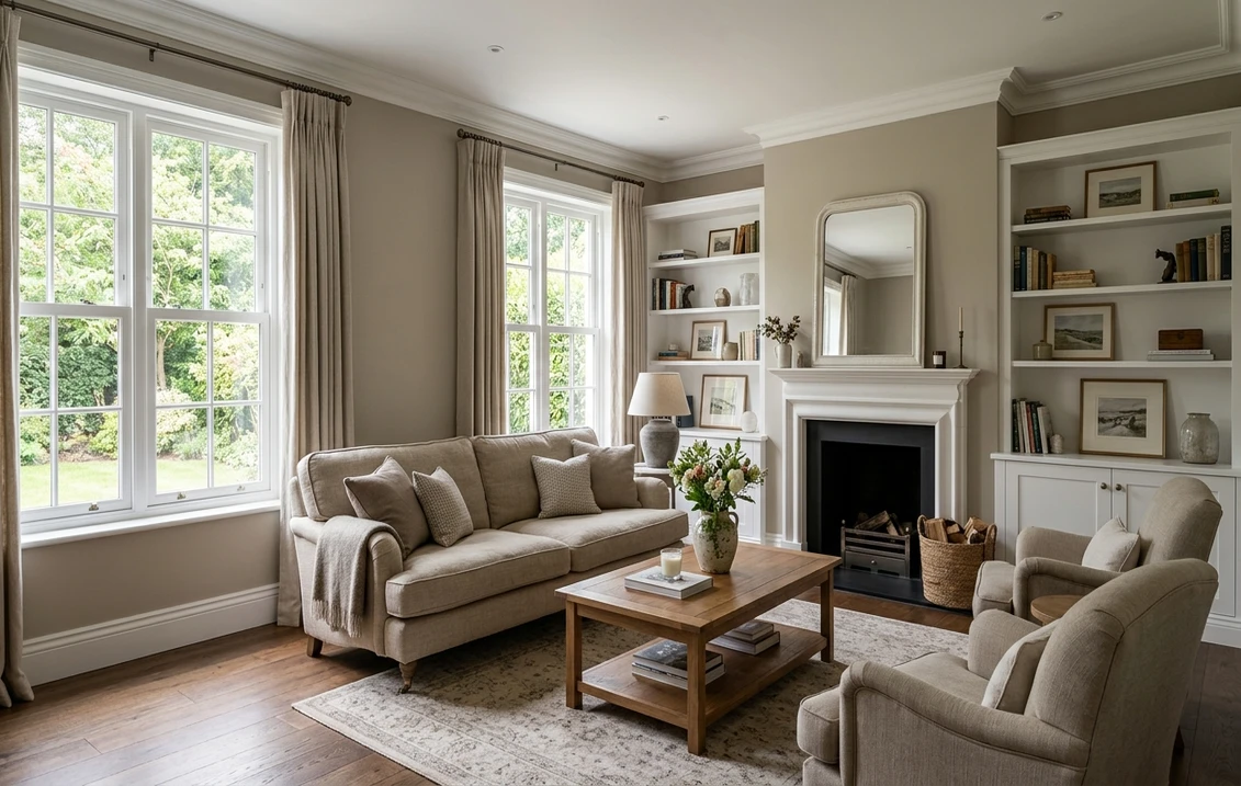
This is Grant Beige's home turf. In a sunny, open living room the warm taupe wraps the space in a cozy, magazine-neutral envelope that flatters wood, leather, stone, and almost any accent color you bring in. Because it sits balanced between beige and gray, it bridges older warm furniture and newer cool-gray pieces, which is precisely why decorators love it for a transitional home. It is one of the easiest greiges to carry across a full open floor plan.
Hallways, stairwells, and whole-home flow
At LRV 57, Grant Beige is bright enough to keep a windowless hallway from feeling dim while having enough body to look intentional rather than builder-blank. It is a superb connector color for a house painted in one neutral, the rare greige that looks deliberate in both the bright front rooms and the darker interior passages. If you are pricing a whole-home repaint, our interior house painting cost guide for 2026 shows what a one-color flow actually runs per square foot.
Warm, restful bedrooms
The taupe warmth makes Grant Beige a genuinely calming bedroom color, the kind that reads like a quiet boutique-hotel neutral against white bedding and natural wood. It is far cozier than a cool gray and far more grown-up than a flat builder beige. Pair it with linen, brass, and pale oak for a restful, layered look.
Where to think twice
A small, dim, north-facing room with cool LED light is where Grant Beige is most likely to flash its pink-gray and read mauve rather than cozy. There, either commit to 2700K bulbs and warm wood to pull the taupe forward, or choose a greige with a more clearly gray (rather than pink-gray) undertone. Grant Beige also wants the right white next to it; a stark blue-white trim will exaggerate the pink and make the warm wall look slightly rosy.
Trim, ceiling, and decor pairings
A warm greige lives or dies on the white you set against it. Get the trim right and Grant Beige looks crisp and intentional; get it wrong and you either flatten the warmth or amplify the pink.
- Soft warm trim (most balanced): BM White Dove (OC-17, LRV 85) is the designer default. Its gentle cream bias sits in the same warm family as Grant Beige, so the trim reads clean without going cold and without dragging the pink forward. This is the safe, cohesive pick for most homes, and it is covered in detail in our Benjamin Moore White Dove OC-17 review.
- Slightly creamier trim (cozier): a warmer white such as BM Simply White can deepen the cocooning effect in a bedroom, though it narrows the contrast, so reserve it for spaces where softness beats crispness.
- Avoid: a stark blue-white like Chantilly Lace next to Grant Beige in a cool room. The cool-warm clash sharpens the pink-gray and can make the walls look faintly rosy. Save the bright cool whites for genuinely cool grays.
- Ceilings: a clean warm white (often the trim color) keeps the room bright while staying in the warm family. A cold blue-white ceiling can read slightly dingy over a taupe wall.
- Floors and decor: warm wood, oak, jute, leather, brass, and cream textiles all flatter Grant Beige and reinforce the taupe. Cool gray-blue flooring or chrome-heavy decor can fight the warmth and tease out the pink, so balance them with warm accents.
For contrast, a deep espresso, olive, or charcoal on a door or built-in reads tailored and grounded against the soft greige walls. If you want to see how Grant Beige relates to its better-known greige cousins, the warmer-leaning Benjamin Moore Revere Pewter HC-172 review is a useful side-by-side, since both anchor a whole-home palette.
See walls, trim, and floor together in one preview, free.
Grant Beige vs the colors people confuse it with
Almost every Grant Beige search ends in a side-by-side, and two greiges in particular get held against it constantly. Here is how to tell them apart for real:
- vs BM Manchester Tan (HC-81): the most common mix-up. Manchester Tan (LRV around 64) is lighter, cleaner, and leans yellow-green; it reads as a bright, sunny tan. Grant Beige (LRV 57) is deeper, more gray, and carries that pink-gray instead of yellow; it reads as a grounded taupe greige. The simplest test: in cool light Manchester Tan can go slightly green, while Grant Beige can go slightly pink. Choose Manchester Tan for a fresher, lighter, more golden room, and Grant Beige when you want more depth, more gray, and a cozier taupe. The full breakdown of the lighter option is in our Manchester Tan HC-81 review.
- vs BM Bleeker Beige (HC-80): the other near-twin, and they live almost next door in the Historical collection. Bleeker Beige is the warmer, more clearly tan-yellow of the pair, reading richer and a touch more traditional. Grant Beige is the grayer, more contemporary sibling with the pink-gray quirk instead of Bleeker's golden warmth. If a room felt too yellow in Bleeker, Grant Beige is the corrective; if Grant felt too cool or rosy, Bleeker warms it back up. They are close enough that you should always sample both on the same wall before choosing.
- vs BM Edgecomb Gray (HC-173): Edgecomb is the cooler, grayer greige with a green-gray lean and slightly less warmth; it tilts more toward gray than beige. Grant Beige tilts the other way, warmer and more taupe. Pick Edgecomb when you want the room to read more gray, and Grant Beige when you want it to read warmer; our Edgecomb Gray HC-173 review maps the cooler end of the family.
Spelling note: BM Grant Beige, Grant Beige Benjamin Moore, and Grant Beige HC83 all point to this same HC-83.
How to test Grant Beige before you commit
A 2-inch fan-deck chip is the number-one reason people pick a greige that disappoints: it overstates the taupe and completely hides the pink-gray that may appear on a full wall in your actual light. Two better methods:
- Paint a large swatch: roll a 12-by-12-inch sample (or a peel-and-stick sample) on two different walls, including your coolest, dimmest corner, and check it mid-morning, mid-afternoon, and at night under your normal bulbs. Watch specifically for whether the pink-gray shows up in that cool corner; that corner tells you the truth about Grant Beige in your home.
- Preview it digitally first: upload a real photo of your room and apply Grant Beige alongside a warmer alternative like Manchester Tan and a cooler one like Edgecomb Gray, narrowing three contenders to the one worth painting before you spend a cent on sample pots. Grant Beige is also a smart, low-pink option in our roundup of the best bathroom paint colors for 2026 when you want warmth without going gold.
Preview Grant Beige against a warmer and a cooler greige, side by side, free.
Frequently asked questions
Does Grant Beige look pink?
Grant Beige (HC-83) is fundamentally a warm taupe greige, but it carries a faint pink-gray pigment that can surface in cool or low light, such as a north-facing room, an overcast day, or a crisp 4000K LED. It never goes truly pink, but it can soften into a rosy-taupe or mauve gray, especially next to a stark blue-white trim or a cool floor. In warm or south light the taupe dominates and the pink stays hidden.
What is the LRV of Grant Beige?
Grant Beige has a Light Reflectance Value of about 57 on the Benjamin Moore color data, with a hex approximation of #CBBEAB (RGB 203, 190, 171). That makes it a light-to-mid greige: bright enough to keep a room open and connected hallways from feeling dim, but with enough taupe depth that it reads as a real greige rather than washing out like a high-LRV off-white.
What is the difference between Grant Beige and Manchester Tan?
Manchester Tan (HC-81, LRV around 64) is lighter, cleaner, and leans yellow-green, reading as a fresh sunny tan. Grant Beige (HC-83, LRV 57) is deeper and grayer with a pink-gray undertone instead of yellow, reading as a grounded taupe greige. In cool light Manchester Tan can go slightly green while Grant Beige can go slightly pink. Choose Manchester Tan for a lighter, more golden room and Grant Beige for more depth and warmth.
What is the difference between Grant Beige and Bleeker Beige?
Bleeker Beige (HC-80) is the warmer, more clearly tan-yellow of the pair, reading richer and more traditional. Grant Beige (HC-83) is the grayer, more contemporary sibling, with a pink-gray quirk instead of Bleeker's golden warmth. If a room felt too yellow in Bleeker Beige, Grant Beige corrects it; if Grant felt too rosy or cool, Bleeker warms it back. They are close enough that you should sample both on the same wall before deciding.
What trim color goes with Grant Beige?
BM White Dove (OC-17) is the most balanced trim because its gentle cream bias sits in the same warm family, so it reads clean without going cold and without pulling the pink forward. A creamier white like Simply White cozies up a bedroom, while a stark blue-white such as Chantilly Lace is best avoided next to Grant Beige in cool rooms, since it can sharpen the rosy undertone.
Preview BM Grant Beige on your actual walls under your own light before buying a single sample.
Disclaimer: Benjamin Moore, Grant Beige (HC-83), Manchester Tan (HC-81), Bleeker Beige (HC-80), Edgecomb Gray (HC-173), Revere Pewter (HC-172), White Dove (OC-17), Simply White (OC-117), and Chantilly Lace (OC-65) are trademarks of Benjamin Moore & Co. FacadeColorizer is an independent paint visualization service and is not affiliated with, endorsed by, or sponsored by Benjamin Moore. Color reproduction on screens approximates the manufacturer's chip; always confirm with a manufacturer sample under your own light before purchase. Sources: Benjamin Moore HC-83 Grant Beige color data 2026, Benjamin Moore HC-81 Manchester Tan and HC-80 Bleeker Beige color data 2026, greige undertone field coverage, designer reports compiled by FacadeColorizer.
Trademarks mentioned (Sherwin-Williams, Benjamin Moore, Behr, Caparol, Brillux, Sto, Alpina, Valspar, PPG, Glidden, Dulux, Crown Trade, Sandtex, Farrow & Ball, Johnstone's, Leyland) are property of their respective owners. FacadeColorizer is independent and not affiliated with any of them. Nominative fair use under Lanham Act §1125.


