
Most of the greiges people fall in love with online are light, airy, and a little timid. Benjamin Moore Pashmina (AF-100) is the opposite kind of greige: a deep, grown-up taupe with a soft gray-green calm running through it, the color you reach for when you want a wall to feel enveloping and quietly luxurious rather than safe and pale. The name fits. Like the cashmere wrap it is named after, Pashmina reads soft, warm, and expensive without ever shouting. The catch, and the question behind nearly every search for it, is the depth: with an LRV near 31 this is a mid-to-deep neutral, and people want to know whether it will feel cozy or cave-like in their room. The answer depends almost entirely on your light. Here is exactly how it behaves indoors.
Quick orientation before the deep dive. Pashmina AF-100 has a published LRV of about 31 and a hex approximation of #948A7E (RGB 148, 138, 126). That puts it squarely in mid-to-deep greige territory: dark enough to feel cocooning and dramatic, but still soft and neutral rather than a true brown or a true gray. It belongs to Benjamin Moore's Affinity collection (the AF prefix), a palette engineered so the colors coordinate effortlessly with one another. This profile is one stop in our wider Benjamin Moore interior paint colors guide, and it sits at the deeper, dressier end of the greige family covered in our guide to the best warm greige shades. Where those overviews map the whole field, this page stays on Pashmina alone: its undertones, its rooms, its pairings, and how it compares to the two taupes people most often mix it up with.
Upload a photo of your actual room and preview BM Pashmina under your own light in about 30 seconds, free.
Pashmina at a glance: the numbers that matter
Before opinions, here are the verifiable specs straight from the Benjamin Moore color library. These are the values you can take to a paint counter:
| Spec | Pashmina AF-100 |
|---|---|
| Color number | AF-100 (Affinity collection) |
| LRV (Light Reflectance Value) | Approximately 31: mid-to-deep neutral, cozy and enveloping |
| Hex / RGB (approx.) | #948A7E / 148, 138, 126 |
| Color family | Deep greige taupe |
| Primary undertone | Warm taupe with a soft gray-green cast; a faint mushroom-brown base |
| Best base / finish | Medium tint base; matte or eggshell on walls, satin on trim and built-ins |
The takeaway from those numbers: Pashmina is a real mid-deep color, not a wash. At LRV 31 it absorbs a meaningful amount of light, which is precisely what makes a room feel wrapped and intimate, and also precisely why it can feel heavy in a dim space. It is roughly half as reflective as a light greige like Revere Pewter (LRV near 55), so it is not a one-for-one swap; think of Pashmina as the dressed-up, dramatic version of that family. The undertone is the whole personality: a warm taupe softened by a gray-green ghost, which is what keeps it from reading as plain mud or plain brown. Lean into the depth in the right room and it looks like a boutique hotel; bury it in a dark room and it can go flat. That tension is the entire decision.
Is Pashmina warm or cool? The undertone, decoded
Pashmina is a warm color at its core, but it is a complicated, layered warm. Calling it simply taupe undersells what is happening: there is a warm mushroom-brown base, a gray that keeps it sophisticated rather than sweet, and a quiet green that surfaces in certain light and gives the whole thing its calm, almost organic feel. Understanding which of those three voices is loudest in your room is everything.
In warm, generous light (a south room, late-day west sun, warm bulbs at night) the taupe-brown warmth leads. The wall reads soft, latte-adjacent, and cozy, and the green ghost all but disappears. This is Pashmina at its most flattering and most expensive-looking. In cool or weak light (a north room, an overcast day, cool LED bulbs) the warmth drains out and the gray-green cast steps forward; the wall can read greener and grayer, occasionally with a faint olive or mushroom tilt. It does not turn pink or purple the way some greiges do, which is part of why designers trust it, but it is a chameleon, and the green is the trait to watch.
Watch out for one quirk specific to deep neutrals like this. Because Pashmina is dark, it is far more sensitive to how much light a room actually gets than a pale greige is. The same color that feels rich and warm in a sunny dining room can feel muddy and gray-green in a north hallway. Always judge it in the actual room and the actual light, never from a chip held under a store's fluorescents, which flatten the warmth and exaggerate the gray.
| Indoor light | How Pashmina reads |
|---|---|
| South-facing (bright, warm) | Soft warm taupe at its best: rich, cozy, latte-like, the green ghost hidden |
| West-facing (warm afternoon) | Glows warmest and deepest in late sun; can look almost chocolate-taupe at golden hour |
| East-facing (cool after noon) | Warm and balanced in the morning, drifts grayer and greener through the afternoon |
| North-facing (cool, indirect) | Coolest and greenest read; the gray-green cast leads and the room feels deeper |
| Artificial light at night | Warm 2700K bulbs bring out the cozy taupe; cool 4000K bulbs push it gray-green and flat |
Sources: Benjamin Moore AF-100 color data 2026; Affinity collection coordination notes; designer field reports compiled by FacadeColorizer.
Free AI visualizer. See whether Pashmina goes green in your light before buying a single sample pot.
Best rooms for Pashmina
Deep, warm, and quietly luxurious, Pashmina is happiest in rooms where you want intimacy and atmosphere rather than bright and airy. It is not the whole-home, every-wall neutral; it is the color you choose when a space should feel like a destination. Here is where it consistently earns its keep:
Dining rooms and formal spaces
This is Pashmina's natural home. A dining room is used most often in the evening under warm light, which is exactly when Pashmina looks richest, and the depth turns a plain box into an enveloping, candlelit, supper-club kind of room. Against crisp white wainscoting or warm wood it reads dressy and intentional. Few greiges flatter a dinner party the way this one does.
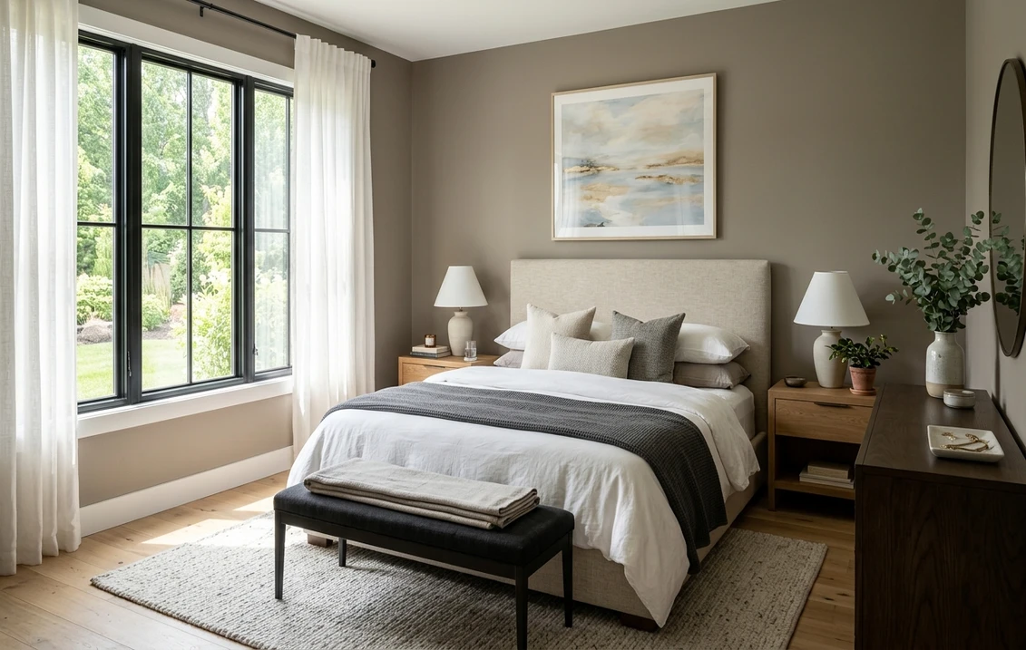
Bedrooms aiming for cocoon-cozy
If you want a bedroom that feels like a sanctuary rather than a sunlit cabana, Pashmina delivers. The warm taupe wraps the room and makes white bedding, linen, and pale wood pop against it. It is a strong pick for a primary bedroom with decent natural or warm artificial light. For how it sits next to other restful, deeper neutrals, our roundup of timeless interior neutral paint colors is a useful map.
Studies, libraries, accent walls, and moody powder rooms
A study or home office painted Pashmina feels focused and serious without the heaviness of charcoal. A small powder room can wear it head to toe and become a jewel box, since you are not trying to make a powder room feel large anyway. It also makes a gorgeous single accent wall behind a bed or a fireplace when the rest of the room is a lighter greige. For where Pashmina lands among the year's grays and gray-leaning neutrals, our complete interior gray paint shade guide helps you place it.
Where to think twice
A small, north-facing room with little natural light and only cool LED bulbs is where Pashmina can tip from cozy to gloomy, and where the gray-green cast takes over. Wrapping a dim, low-ceiling room in it can feel closed-in rather than intimate. If that describes your space and you still want this family, drop down to a lighter greige, add warm 2700K lighting, or keep Pashmina to a single accent wall instead of all four.
Trim, ceiling, and decor pairings
A deep greige needs contrast above it to keep from feeling like a closed box, and the right trim is what makes Pashmina look custom rather than dark-for-dark's-sake. Because it lives in the Affinity collection, it coordinates cleanly, but these are the reels that work hardest:
- Soft warm white trim (most balanced): BM White Dove (OC-17, LRV 85) is the designer default. Its gentle cream bias echoes Pashmina's warmth and gives a high-contrast, cohesive frame that keeps the room from feeling heavy. The safe, beautiful pick for most homes.
- Creamier trim (cozier, more traditional): BM Simply White (OC-117) or a soft Affinity off-white leans warmer still and amplifies Pashmina's latte side, ideal for traditional dining rooms and bedrooms.
- Crisp trim (cleaner, more modern): BM Chantilly Lace (OC-65) gives a bright, modern, slightly cooler edge and lets Pashmina read as the dramatic feature. Best for contemporary spaces; just know it nudges the wall's gray-green forward.
- Avoid: a stark blue-white trim in a north room, which can pull Pashmina's green cast out and make the warm taupe look slightly dull and cold by comparison.
- Ceilings: a clean warm white (often the trim color) keeps the room feeling open above the deep walls. Painting the ceiling the same Pashmina is a high-drama move that works only in rooms with strong light and tall ceilings.
- Floors and decor: warm and medium-toned woods (walnut, oak), brass, brushed gold, cream linen, and rust or olive textiles all flatter Pashmina and reinforce its organic warmth. Cool chrome and icy grays can fight it; temper them with warm wood.
For a lighter companion on adjacent walls or an open floor plan, a soft greige like Revere Pewter steps Pashmina down gracefully so the deep color reads as a deliberate moment rather than a whole dim house. If you are weighing whether to go deep at all, our Benjamin Moore Revere Pewter HC-172 review covers the lighter end of the same gray-green-taupe family in detail.
See deep walls, white trim, and your floor together in one preview, free.
Pashmina vs the colors people confuse it with
Almost every Pashmina search ends in a side-by-side, because deep greige taupes look near-identical on a tiny chip and only separate on a real wall. The three comparisons that matter most:
- vs BM Smokey Taupe (983): the closest twin and the comparison most people are really making. Smokey Taupe is a warmer, browner taupe with more red-brown earthiness and slightly less gray; it reads cozier and a touch more traditional. Pashmina is grayer and more sophisticated, with that telltale gray-green calm that keeps it from feeling rustic. Choose Smokey Taupe when you want pure warm-brown comfort, choose Pashmina when you want the same depth but cooler, dressier, and more modern. Our Benjamin Moore Smokey Taupe 983 review covers that warmer option in full.
- vs BM Revere Pewter (HC-172): not really a twin at all, but constantly compared because they share a gray-green-taupe DNA. Revere Pewter is much lighter (LRV near 55, roughly double Pashmina's reflectance) and reads as a soft, airy whole-home greige. Pashmina is its deep, dramatic cousin: the same family, a much darker member. Pick Revere Pewter for bright, open, every-wall neutrality, pick Pashmina for cocooning rooms and accent moments.
- vs BM Edgecomb Gray (HC-173): Edgecomb is a light, warm greige that leans cleaner and creamier than either taupe. It is the easy, pale, no-risk neutral; Pashmina is the high-commitment, high-reward deep one. They make a beautiful light-and-dark pair in the same home rather than competitors. See our Benjamin Moore Edgecomb Gray HC-173 review for the lighter counterpoint.
Spelling note: BM Pashmina, Pashmina Benjamin Moore, and Pashmina AF 100 all point to this same AF-100.
How to test Pashmina before you commit
With a deep color, a tiny fan-deck chip is more misleading than ever: it cannot show how much light your room loses to the depth, and it exaggerates the gray-green while hiding the warmth. Two better methods:
- Paint a large swatch: roll a generous 2-by-2-foot sample (or two peel-and-stick samples) on different walls, including your darkest corner, and check it mid-morning, mid-afternoon, and at night under your normal bulbs. With a deep neutral the darkest wall tells you the truth: if it still feels warm there, the room can carry Pashmina.
- Preview it digitally first: upload a real photo of your room and apply Pashmina alongside a warmer alternative (Smokey Taupe) and a lighter one (Revere Pewter) before you buy any samples, so you narrow three deep-greige contenders to the one worth painting. Pricing context for the full repaint is in our interior neutral color planning guide.
Preview Pashmina against Smokey Taupe and Revere Pewter, side by side, free.
Frequently asked questions
Is Benjamin Moore Pashmina warm or cool?
Pashmina (AF-100) is warm at its core: a deep greige taupe with a warm mushroom-brown base softened by a gray-green cast. In bright or warm light the cozy taupe leads and it looks latte-like; in cool, weak, or north light the gray-green steps forward and the wall reads grayer and greener. It does not go pink or purple, but it is a chameleon, so the green is the trait to watch in your particular light.
What is the LRV of Pashmina AF-100?
Pashmina has a Light Reflectance Value of about 31 on the Benjamin Moore color data, with a hex approximation of #948A7E (RGB 148, 138, 126). That makes it a mid-to-deep neutral, roughly half as reflective as a light greige like Revere Pewter. It is dark enough to feel cozy and enveloping, which is its charm, but also light-hungry, so it shows best in rooms with decent natural or warm artificial light.
What are the best rooms for Pashmina?
Dining rooms, cocoon-cozy bedrooms, studies and libraries, moody powder rooms, and accent walls are where Pashmina shines, because its depth and warm taupe undertone create an enveloping, boutique-hotel feel. It is least reliable in small, north-facing rooms with little natural light and cool LED bulbs, where it can feel gloomy and the gray-green cast takes over. There, use a lighter greige, warm 2700K lighting, or keep Pashmina to one accent wall.
What trim color goes with Pashmina?
BM White Dove (OC-17) is the most balanced trim: its gentle cream bias echoes Pashmina's warmth and gives a high-contrast, cohesive frame that keeps the deep walls from feeling heavy. Simply White (OC-117) leans cozier and more traditional, while Chantilly Lace (OC-65) gives a crisper, more modern edge. Avoid a stark blue-white in a north room, which can pull out Pashmina's green and make the taupe look dull.
What is the difference between Pashmina and Smokey Taupe?
Smokey Taupe (983) is a warmer, browner taupe with more red-brown earthiness and slightly less gray, so it reads cozier and a touch more traditional. Pashmina (AF-100) is grayer and more sophisticated, with a gray-green calm that makes it dressier and more modern. Both are deep neutrals, but choose Smokey Taupe for pure warm-brown comfort and Pashmina when you want the same depth with a cooler, more refined finish.
Preview BM Pashmina on your actual walls under your own light before buying a single sample.
Disclaimer: Benjamin Moore, Pashmina (AF-100), Smokey Taupe (983), Revere Pewter (HC-172), Edgecomb Gray (HC-173), White Dove (OC-17), Simply White (OC-117), and Chantilly Lace (OC-65) are trademarks of Benjamin Moore & Co. FacadeColorizer is an independent paint visualization service and is not affiliated with, endorsed by, or sponsored by Benjamin Moore. Color reproduction on screens approximates the manufacturer's chip; always confirm with a manufacturer sample under your own light before purchase. Sources: Benjamin Moore AF-100 Pashmina color data 2026, Benjamin Moore Affinity collection coordination notes, Benjamin Moore 983 Smokey Taupe and HC-172 Revere Pewter color data 2026, designer field reports compiled by FacadeColorizer.
Trademarks mentioned (Sherwin-Williams, Benjamin Moore, Behr, Caparol, Brillux, Sto, Alpina, Valspar, PPG, Glidden, Dulux, Crown Trade, Sandtex, Farrow & Ball, Johnstone's, Leyland) are property of their respective owners. FacadeColorizer is independent and not affiliated with any of them. Nominative fair use under Lanham Act §1125.


