
Every few years a homeowner calls me convinced their last "white" turned the room cold and blue, and they want the opposite: a color that makes the whole house feel like late-afternoon sun without screaming yellow. Benjamin Moore Natural Cream (OC-14) is the color I keep reaching for in that conversation. It is a warm, soft cream that sits in the comfortable middle of the off-white spectrum: deep enough to read as a real, hug-you color rather than a builder white, but restrained enough that it never tips into custard or banana. The single question that drives every search for it is the same: how yellow is it, really, and will it look gold in my light? The honest answer depends on your exposure and your trim, and that is exactly what this profile is built to settle.
Quick orientation before the deep dive. Natural Cream OC-14 has a published LRV of about 73 and a hex approximation of #E8DFCB (RGB 232, 223, 203). That puts it in light, soft-cream territory: bright enough to keep a room open and reflective, but a clear step warmer and deeper than a true white. The undertone is a balanced warm yellow, tempered by a gentle gray that stops it from going acid or buttery, with the faintest beige whisper in shade. This profile is one stop in our wider Benjamin Moore interior paint colors guide, and it sits in the same warm-neutral family covered in our roundup of cream and antique white paint colors: that page surveys the whole category, while this one stays focused on OC-14 alone: its undertone, its light behavior, its rooms, and its pairings.
Upload a photo of your actual room and preview BM Natural Cream under your own light in about 30 seconds, free.
Natural Cream at a glance: the numbers that matter
Before opinions, here are the verifiable specs straight from the Benjamin Moore color library. These are the values you can take to a paint counter:
| Spec | Natural Cream OC-14 |
|---|---|
| Color number | OC-14 (Off-White collection) |
| LRV (Light Reflectance Value) | Approximately 73: light, warm, and reflective without going stark |
| Hex / RGB (approx.) | #E8DFCB / 232, 223, 203 |
| Color family | Warm cream / soft off-white |
| Primary undertone | Balanced warm yellow, softened by gray, faint beige in shade |
| Best base / finish | White or light tint base; eggshell or matte on walls, satin or semi-gloss on trim |
The takeaway from those numbers: Natural Cream is a genuine cream, not a white pretending to have a pulse and not a deep tan trying to pass as light. At LRV 73 it sits noticeably below a true white (which lives in the mid-80s) and well above a mid-tone greige, so it keeps a room bright while still wrapping it in warmth. The balanced yellow undertone is the whole identity: it is the warmth people want from a cream, gentled by enough gray that it almost never reads as the dated, builder-grade "antique white" that turns gold under lamplight. Lean into that warmth in the right rooms and the color glows; fight it with an icy white trim and you can expose the yellow. That is the entire decision in one sentence.
Is Natural Cream too yellow? The undertone, decoded
Natural Cream is a warm color, full stop. Anyone selling it as a true neutral off-white is overselling. But warm is not the same as yellow, and understanding the difference is what separates a room that looks honey-soft and inviting from one that looks faintly nicotine-stained. Here is what is happening underneath.
The yellow undertone is dominant, and it is the loudest in warm, abundant light. Riding underneath it is a quiet gray that does the heavy lifting: that gray is exactly what keeps Natural Cream from sliding into the bright, candle-flame yellow of older creams. In south or west light, where warm wavelengths flood the room, the yellow steps forward and the wall reads at its creamiest and most golden, glowing in the best sense. In cool, indirect light (a north room, an overcast morning, deep shade) the warm wavelengths drain out, the gray asserts itself, and Natural Cream calms into a soft, almost putty-warm off-white that barely registers as yellow at all. That range is the color's superpower: it stays warm and friendly in cool rooms where a true white would turn dead and gray.
Watch out for one quirk. Natural Cream reads more clearly yellow on a small chip and in bright product photography than it does as a finished, rolled wall under real lamps and real shadows. A 2-inch chip concentrates the undertone with no room context to balance it. So if the chip looks a touch too yellow at the store, assume the actual wall will land a half-step softer and more neutral, especially in a room with white trim, natural daylight, and furniture to break up the field of color.
| Indoor light | How Natural Cream reads |
|---|---|
| South-facing (bright, warm) | At its creamiest and most golden, glowing and rich; its showiest read |
| West-facing (warm afternoon) | Deepens and warms in late-day sun, can flirt with a soft honey gold |
| East-facing (cool after noon) | Bright and balanced in the morning, settles into a soft cream by afternoon |
| North-facing (cool, indirect) | At its quietest: a soft putty-warm off-white that keeps the room from going cold |
| Artificial light at night | Warm 2700K bulbs deepen the cream toward gold; cool 4000K bulbs neutralize it toward a soft off-white |
Sources: Benjamin Moore OC-14 color data 2026; The Spruce off-white and cream undertone coverage; designer field reports compiled by FacadeColorizer.
Free AI visualizer. Test Natural Cream on your real walls before buying a single sample pot.
Best rooms for Natural Cream
Warm, soft, and forgiving, Natural Cream is happiest in rooms where comfort is the goal and a little glow is welcome. It is the opposite of the crisp cool-white school: it is the color you reach for when you want a space to feel like it has been lived in and loved. Here is where it consistently earns its keep:
Living rooms and family rooms
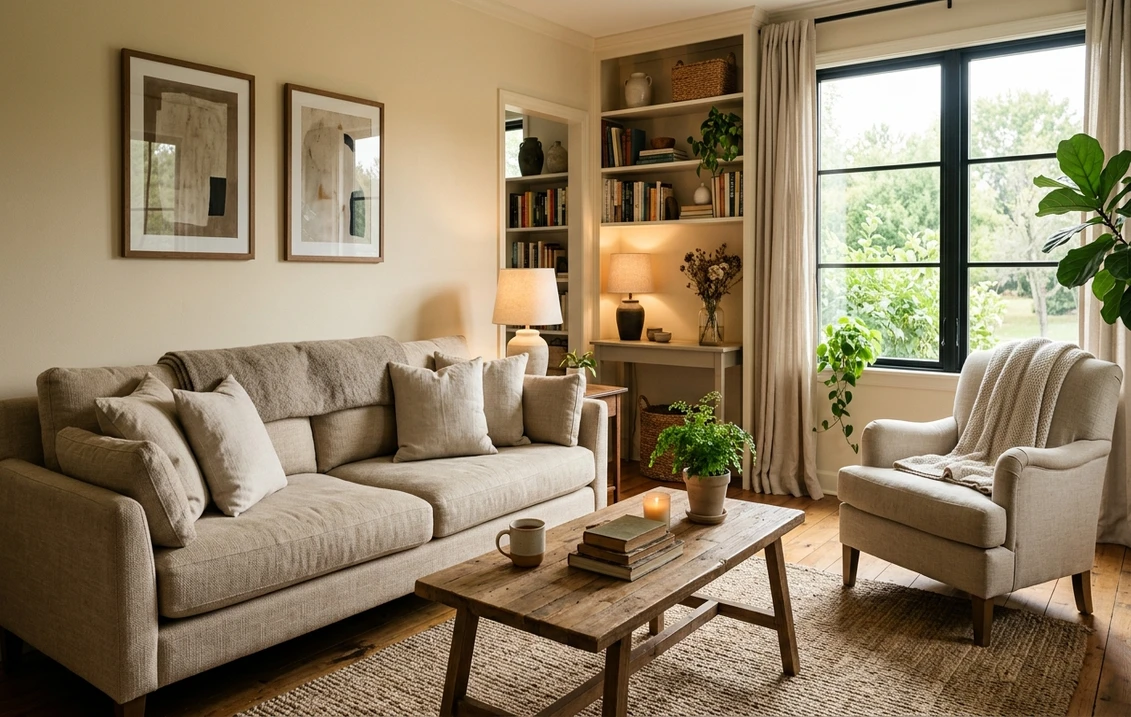
This is Natural Cream's home turf. In a main living space the warm undertone reads instantly cozy against wood floors, leather, and natural fibers, and the LRV 73 keeps the room bright and open rather than dim. It is especially flattering in homes with lots of natural wood trim or honey-oak floors, because it picks up the same warm family without competing. If you want a backdrop that makes warm furniture and traditional decor look intentional rather than dated, this is it.
North-facing rooms that need rescuing
Cool, gray-lit north rooms are where Natural Cream quietly outperforms a true white. A stark white turns flat and bluish in that light; Natural Cream's warm base counters the chill and keeps the space feeling friendly without looking yellow, because the cool light tames the undertone. It is one of the more reliable choices for a dim study, a north bedroom, or a sunless hallway that always felt cold.
Bedrooms and traditional kitchens
In a bedroom the soft cream reads restful and enveloping, pairing beautifully with white bedding, linen, and warm wood. In a kitchen it is a classic above cream or white cabinets and warm countertops, giving the traditional, collected look that pure white can feel too clinical for. For where it lands among the year's broader warm neutrals, our guide to timeless neutral interior paint colors is a useful map.
Where to think twice
A bright, south-facing room you want to feel crisp and modern is where Natural Cream can work against you: that flood of warm light pushes the yellow forward and a contemporary space can read soft and traditional instead of clean. If your goal is cool and current, this is the wrong cream; reach for a more neutral off-white instead, covered in our guide to off-white paint shades and undertones. Natural Cream rewards rooms that want warmth, not rooms fighting to stay cool.
Trim, ceiling, and decor pairings
A warm cream lives or dies on what sits next to it. Get the trim right and Natural Cream looks intentional and layered; get it wrong and it can read either dingy or jarringly yellow by contrast.
- Soft warm white trim (most balanced): BM White Dove (OC-17, LRV 85) is the designer default. Its gentle, slightly creamy white reads crisp against Natural Cream without the cold clash a blue-white creates, giving a soft, harmonious tone-on-tone look that flatters traditional homes. This is the safe, cohesive pick for most rooms.
- Crisper trim (more contrast): BM Simply White (OC-117) or a clean white gives a brighter, more defined edge if you want the trim to pop and the walls to read more clearly as a color. Test it: too icy a white can make Natural Cream look more yellow by comparison.
- Avoid: a hard, blue-leaning bright white like a pure cool white next to Natural Cream. The warm-cool clash exaggerates the yellow in the walls and can make the cream look slightly dirty.
- Ceilings: the trim white carried overhead keeps the room cohesive. A flat builder white above warm cream walls can occasionally read slightly cool, so favor the same soft warm white you used on the trim.
- Floors and decor: honey oak, walnut, rattan, brass, aged bronze, and natural linen flatter Natural Cream and reinforce its collected warmth. Very cool gray-toned floors or stark chrome can fight the cream; temper them with warm textiles, or pick a more neutral off-white instead.
For contrast and depth, a soft sage green, warm navy, or deep bronze on a door, island, or built-in reads grounded and tailored against the cream walls. If you want to see how the soft warm white that pairs with it behaves on its own, its go-to trim partner is covered in our Benjamin Moore White Dove OC-17 review.
See walls, trim, and floor together in one preview, free.
Natural Cream vs the creams people confuse it with
Almost every Natural Cream search ends in a side-by-side with another warm Benjamin Moore neutral. The three that matter most indoors:
- vs BM Ballet White (OC-9): the most common mix-up. Ballet White (LRV about 73) is a lighter, more delicate off-white with a soft greige-pink quietness; it reads as a barely-there warm white. Natural Cream is the same brightness but unmistakably creamier and more yellow, with real warmth on the wall. Choose Ballet White when you want warmth so subtle it almost passes as white; choose Natural Cream when you actually want the room to look cream.
- vs BM Gentle Cream (OC-96): very close cousins that trip people up at the chip rack. Gentle Cream (LRV about 71) is marginally deeper and leans slightly more golden and pure-yellow, with a touch less of the gray that grounds Natural Cream. Natural Cream is the more balanced, gray-tempered of the two and the safer whole-home choice; Gentle Cream is the pick if you want a hair more honey richness and less restraint.
- vs BM Manchester Tan (HC-81): a step beyond cream into warm neutral. Manchester Tan is clearly deeper and leans green-tan rather than yellow-cream, reading as a soft tan greige rather than a glowing cream. Natural Cream is lighter and warmer; Manchester Tan is the move when you want more color depth and less yellow. See its full breakdown in our Benjamin Moore Manchester Tan HC-81 review.
Spelling note: bm natural cream, Natural Cream OC-14, and Natural Cream Benjamin Moore all point to this same OC-14.
How to test Natural Cream before you commit
A 2-inch fan-deck chip is the number-one reason people pick a cream that disappoints: it concentrates the yellow and cannot show how the undertone calms down across a real day on a real wall. Two better methods:
- Paint a large swatch: roll a 12-by-12-inch sample (or a peel-and-stick sample) on two different walls and check it mid-morning, mid-afternoon, and at night under your normal bulbs. Watch specifically for how golden it goes in your warmest, brightest corner; that corner tells you whether the yellow is a feature or a problem for you.
- Preview it digitally first: upload a real photo of your room and apply Natural Cream (plus a lighter and a deeper alternative such as Ballet White and Manchester Tan) before you buy any samples, narrowing three contenders to the one worth painting. Pricing context for the full repaint is in our interior house painting cost guide for 2026.
Preview Natural Cream against a lighter and a deeper neutral, side by side, free.
Frequently asked questions
Is Natural Cream warm or cool?
Natural Cream (OC-14) is a warm color with a balanced yellow undertone softened by gray, plus a faint beige whisper in shade. In bright south or west light the yellow steps forward and it reads at its creamiest and most golden, while in cool, indirect, or north light the gray asserts itself and it calms into a soft putty-warm off-white. It is firmly a warm cream, not a true neutral white, but the gray keeps it from going acid or buttery.
What is the LRV of Natural Cream?
Natural Cream has a Light Reflectance Value of about 73 on the Benjamin Moore color data, with a hex approximation of #E8DFCB (RGB 232, 223, 203). That makes it a light, reflective cream: bright enough to keep a room open and airy, but a clear step warmer and deeper than a true white, which lives in the mid-80s. It reads as a real cream color rather than a near-white.
What are the best rooms for Natural Cream?
Living rooms, family rooms, bedrooms, traditional kitchens, and cool north-facing spaces are where Natural Cream shines, because its warm undertone reads cozy against wood, leather, and natural fibers and rescues dim north rooms that a true white would leave cold. It is least reliable in bright south-facing rooms you want to feel crisp and modern, where the strong warm light pushes the yellow forward; a more neutral off-white is a better fit there.
What trim color goes with Natural Cream?
BM White Dove (OC-17) is the most balanced trim because its gentle, slightly creamy white reads crisp against Natural Cream without the cold clash a blue-white creates, giving a soft, harmonious tone-on-tone look. BM Simply White (OC-117) is a crisper option if you want more contrast. Avoid a hard, blue-leaning bright white, which exaggerates the yellow in the walls and can make the cream look slightly dirty.
What is the difference between Natural Cream and Ballet White?
Ballet White (OC-9) and Natural Cream (OC-14) sit at nearly the same brightness, around LRV 73, but Ballet White is a delicate, barely-there warm white with a soft greige-pink quietness, while Natural Cream is unmistakably creamier and more yellow with real warmth on the wall. Choose Ballet White when you want warmth subtle enough to pass as white, and Natural Cream when you actually want the room to read as cream.
Preview BM Natural Cream on your actual walls under your own light before buying a single sample.
Disclaimer: Benjamin Moore, Natural Cream (OC-14), Ballet White (OC-9), Gentle Cream (OC-96), Manchester Tan (HC-81), White Dove (OC-17), and Simply White (OC-117) are trademarks of Benjamin Moore & Co. FacadeColorizer is an independent paint visualization service and is not affiliated with, endorsed by, or sponsored by Benjamin Moore. Color reproduction on screens approximates the manufacturer's chip; always confirm with a manufacturer sample under your own light before purchase. Sources: Benjamin Moore OC-14 Natural Cream color data 2026, Benjamin Moore OC-9 Ballet White, OC-96 Gentle Cream, HC-81 Manchester Tan and OC-17 White Dove color data 2026, The Spruce off-white and cream undertone coverage, designer field reports compiled by FacadeColorizer.
Trademarks mentioned (Sherwin-Williams, Benjamin Moore, Behr, Caparol, Brillux, Sto, Alpina, Valspar, PPG, Glidden, Dulux, Crown Trade, Sandtex, Farrow & Ball, Johnstone's, Leyland) are property of their respective owners. FacadeColorizer is independent and not affiliated with any of them. Nominative fair use under Lanham Act §1125.


