
There is a specific kind of warm that a buttery cream gives a room, and Benjamin Moore Gentle Cream (OC-96) is one of the most reliable ways to get it without sliding into builder beige or 1990s gold. I have brushed it onto kitchens, hallways, and north-facing bedrooms for clients who said the same thing every time: they wanted a warm white that still felt soft and current, not yellow and dated. Gentle Cream lands almost exactly on that line. It is a light, soft yellow-cream that adds genuine warmth and glow to a space, yet stays restrained enough to read as a sophisticated off-white rather than custard. The fear everyone types into a search bar is the same: will it go yellow on my walls? The honest answer depends on your light and what you put next to it, and that is what this profile is built to settle.
Quick orientation before the deep dive. Gentle Cream OC-96 carries a published LRV of about 71 and a hex approximation of #ECE5D2 (RGB 236, 229, 210). That puts it in light off-white territory: bright enough to keep a room open and reflective, but a clear step warmer and more saturated than a true white like Chantilly Lace. The undertone is a soft, clean yellow with the faintest whisper of beige underneath, which is what gives it that calm, candlelit warmth instead of a sharp lemon. This profile is one stop in our wider Benjamin Moore interior paint colors guide, and it sits naturally alongside our broader look at cream and antique white paint colors for 2026, which maps where Gentle Cream falls among the warmer off-whites.
Upload a photo of your actual room and preview BM Gentle Cream under your own light in about 30 seconds. Free: 1 HD render plus 3 variations.
Gentle Cream at a glance: the numbers that matter
Before opinions, here are the verifiable specs straight from the Benjamin Moore color library. These are the values you can take to a paint counter:
| Spec | Gentle Cream OC-96 |
|---|---|
| Color number | OC-96 (Off-White collection) |
| LRV (Light Reflectance Value) | Approximately 71: light off-white that still reflects plenty of light |
| Hex / RGB (approx.) | #ECE5D2 / 236, 229, 210 |
| Color family | Warm off-white / soft yellow-cream |
| Primary undertone | Soft clean yellow, with a faint beige steadying it |
| Best base / finish | Light base; matte or eggshell on walls, satin or semi-gloss on trim and cabinets |
The takeaway from those numbers: Gentle Cream is a true warm off-white, not a neutral pretending to be one and not a deep antique cream. At LRV 71 it sits well below a bright white (which lives in the mid-80s to low-90s) but well above a mid-tone beige, so it brings warmth and glow without darkening a room. The soft yellow undertone is the entire identity. In the right light and with the right trim it reads as warm, welcoming, and quietly elegant; pushed by warm bulbs and warm wood, it can start to read more clearly yellow. That trade-off is the whole decision, and the rest of this guide unpacks both sides.
Does Gentle Cream go yellow? The undertone, decoded
Gentle Cream is a warm color, full stop. Anyone selling it as a neutral off-white is underselling its yellow. But warm is not the same as gold, and understanding that gap is what separates a room that glows softly from one that looks like aged cream paint. Here is what is happening underneath.
The yellow undertone is dominant and it is the most flattering in clean, balanced light, where it reads as a soft butter-cream rather than anything strident. Riding quietly underneath is a faint beige, the steadying pigment that keeps Gentle Cream from going lemon or acid the way a pure yellow-white can. In bright, cool, or north light, the warm wavelengths in the room get diluted, the yellow calms down, and the wall reads as a gentle, creamy near-white: this is often Gentle Cream at its most refined. In warm south or west light, or under warm incandescent-style bulbs, the yellow is amplified and the wall reads distinctly creamier and more golden. It does not turn green or muddy the way some warm whites do, which is why it has stayed a designer staple, but it will absolutely lean yellower when the light is warm.
Watch out for one quirk that catches people off guard. Gentle Cream looks much paler and whiter on a 2-inch fan-deck chip than it does as a finished, rolled wall. On a full wall the yellow accumulates and deepens, so the painted room almost always reads a half-step warmer and creamier than the chip promised. If you are choosing from a chip alone, assume the real wall will be noticeably more cream than it looks in your hand.
| Indoor light | How Gentle Cream reads |
|---|---|
| South-facing (bright, warm) | Warmest and creamiest; the yellow is amplified into a glowing buttery cream |
| West-facing (warm afternoon) | Rich and golden in late-day sun, then noticeably creamier as the light drops |
| East-facing (cool after noon) | Soft and balanced in morning light, calming toward a gentle near-white by afternoon |
| North-facing (cool, indirect) | At its softest and least yellow; the cool light tames the cream into a clean warm off-white, which is exactly why north rooms love it |
| Artificial light at night | Warm 2700K bulbs deepen it toward custard; cool 4000K bulbs pull it back toward a crisp cream |
Sources: Benjamin Moore OC-96 color data 2026; The Spruce off-white and cream-paint undertone coverage; designer field reports compiled by FacadeColorizer.
Free AI visualizer. Test Gentle Cream on your real walls before buying a single sample pot.
Best rooms for Gentle Cream
Warm, soft, and quietly glowing, Gentle Cream is happiest in rooms where you want comfort and a candlelit warmth rather than crisp coolness. It is not the modern stark white; it is the cream you reach for when you want a space to feel welcoming. Here is where it consistently earns its keep:
North-facing rooms and cool spaces
This is Gentle Cream's secret weapon. North light strips warmth out of a room and makes true whites look gray, dull, or even slightly blue. Gentle Cream pushes back: its yellow undertone replaces the missing warmth, so a chilly north bedroom or office reads soft and inviting instead of clinical. In these rooms the cream is tamed by the cool light into a clean, balanced warm off-white, which is the single best argument for choosing it.
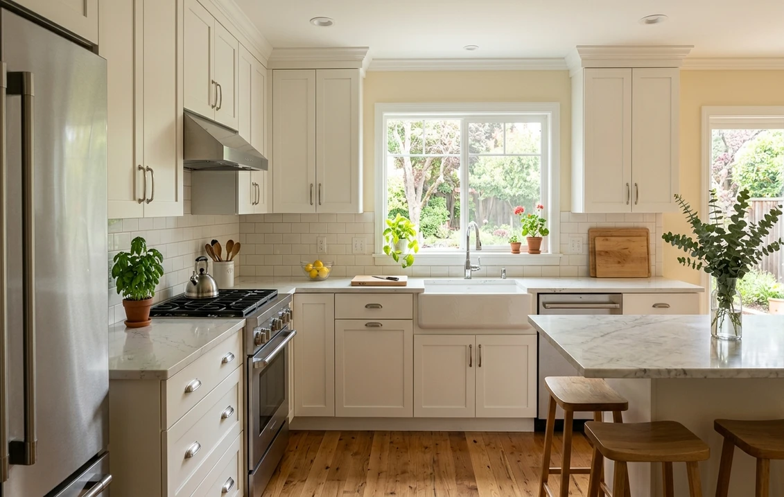
Kitchens and cabinetry
On walls and especially on cabinets, Gentle Cream gives a kitchen that timeless, lived-in farmhouse warmth that pure white can feel too cold for. It flatters natural wood, brass and unlacquered hardware, butcher block, and honed stone, and it hides everyday kitchen grime better than a stark white. If you are weighing warm whites and creams against brighter options for a kitchen, our roundup of white kitchen paint ideas for 2026 shows how a soft cream like this sits next to the crisper picks.
Hallways, living rooms, and traditional spaces
In a hallway or living room with mixed light, Gentle Cream reads as a warm, gracious backdrop that makes wood furniture, oil paintings, and warm metals glow. It is a natural fit for traditional, Colonial, and farmhouse interiors where a cool gray or stark white would feel out of place. For where it lands among the year's other soft off-whites, our guide to off-white paint colors and their undertones is a useful map.
Where to think twice
A bright, sun-flooded south or west room with lots of warm wood and warm bulbs is where Gentle Cream can tip from soft to overtly yellow. There the light is already pushing gold, and the cream piles on more, so a fresh room can read custard. If you want that room to stay crisp, this is the wrong cream; reach for a paler warm white instead, or at minimum balance the room with cool whites, gray textiles, and 3500K to 4000K bulbs. Gentle Cream rewards cool and neutral light, so do not put it where the sun already bakes it gold.
Trim, ceiling, and decor pairings
A warm cream lives or dies on what sits next to it. Get the trim right and Gentle Cream looks intentional and layered; get it wrong and it can read either flat or unexpectedly dingy.
- Crisp white trim (most popular): BM Simply White (OC-117) or Chantilly Lace (OC-65) gives a clean, slightly cool contrast that makes Gentle Cream's warmth read as intentional rather than dated. This crisp-over-cream layering is the safest way to keep the look fresh and current.
- Tone-on-tone warm trim (soft, enveloping): a brighter warm white like BM White Dove (OC-17, LRV 85) keeps the room gentle and cohesive without the sharp contrast. Best for serene bedrooms and traditional rooms where you want low contrast and a soft, layered cream envelope.
- Avoid: a cool gray-white or a blue-leaning white next to Gentle Cream. The warm-cool clash can make the cream walls look yellowed and slightly dirty by comparison, the exact effect people fear.
- Ceilings: a clean crisp white above warms the room without competing. Painting the ceiling the same Gentle Cream can feel cozy in a low-light room but risks looking heavy and yellow in a bright one, so reserve that for small or north-facing spaces.
- Floors and decor: warm oak, walnut, terracotta, brass, rattan, and natural linen all reinforce the creamy warmth. Very cool gray-toned flooring or chrome can fight the yellow; temper it with warm textiles and wood accents.
For contrast and grounding, a soft sage green, a warm taupe, or a deep navy on a door, island, or built-in reads handsome and traditional against the cream walls. If you want a deeper look at how the warmer off-whites relate as a family, its paler near-white sibling is covered in our Benjamin Moore Maritime White OC-5 review.
See walls, trim, and floor together in one preview, free.
Gentle Cream vs the warm whites people confuse it with
Almost every Gentle Cream search ends in a side-by-side with another Benjamin Moore cream. The two that matter most indoors are its closest near-twins, plus one popular reference point:
- vs BM Maritime White (OC-5): the most common mix-up. Maritime White is paler, lighter, and far less saturated, reading as a soft near-white with only a hint of cream, while Gentle Cream is clearly warmer and more obviously yellow. In practice Maritime White behaves like a gentle white that whispers cream; Gentle Cream behaves like a true soft cream. Choose Maritime White when you want a warm white that still reads white in most light, and Gentle Cream when you want the room to read distinctly creamy and glowing. Full breakdown in our Maritime White OC-5 review.
- vs BM Windham Cream (HC-6): the deeper rival. Windham Cream is a historical cream that runs golder, richer, and a step darker, pushing toward an antique buttery yellow with more presence on the wall. Gentle Cream is the softer, lighter, more restrained of the two: where Windham Cream commits to warm gold, Gentle Cream keeps its yellow gentle. Pick Windham Cream for a cozy, traditional, distinctly golden room, and Gentle Cream when you want warmth without the room reading antique. See our Windham Cream HC-6 review for the deeper option.
- vs SW Creamy (SW 7012): Sherwin-Williams Creamy is a popular comparison and a close cousin, also a soft yellow-cream but slightly cleaner and a touch lighter, with marginally less beige steadying it. Gentle Cream reads a hair warmer and creamier. Both are excellent farmhouse whites; the choice usually comes down to which brand your contractor stocks rather than a dramatic visible difference.
Spelling note: gentle cream BM, Benjamin Moore Gentle Cream OC 96, and BM gentle cream paint all point to this same OC-96.
How to test Gentle Cream before you commit
A 2-inch fan-deck chip is the number-one reason people pick a cream that disappoints: it makes Gentle Cream look paler and whiter than it ever appears once rolled, so the finished wall surprises people by reading much more yellow. Two better methods:
- Paint a large swatch: roll a 12-by-12-inch sample (or a peel-and-stick sample) on two different walls and check it mid-morning, mid-afternoon, and at night under your normal bulbs. Watch specifically for how yellow it goes in your warmest, sunniest corner; that corner tells you the truth about whether it will read cream or gold in your home.
- Preview it digitally first: upload a real photo of your room and apply Gentle Cream (plus a paler and a deeper alternative such as Maritime White and Windham Cream) before you buy any samples, narrowing three contenders to the one worth painting. Pricing context for the full repaint is in our interior house painting cost guide for 2026.
Preview Gentle Cream against a paler and a deeper cream, side by side, free.
Frequently asked questions
Is Benjamin Moore Gentle Cream too yellow?
Gentle Cream (OC-96) is a soft yellow-cream, so it does read warm, but it is restrained rather than gold. In bright, cool, or north light its yellow calms into a gentle warm off-white, while in warm south or west light and under warm bulbs the yellow is amplified and it reads distinctly creamier. It only tips toward custard in sun-flooded rooms full of warm wood and warm lighting; in cooler or neutral light it stays a soft, welcoming cream, not a harsh yellow.
What is the LRV of Gentle Cream OC-96?
Gentle Cream has a Light Reflectance Value of about 71 on the Benjamin Moore color data, with a hex approximation of #ECE5D2 (RGB 236, 229, 210). That makes it a light warm off-white: bright enough to keep a room open and reflective, but a clear step warmer and lower than a true bright white in the mid-80s to low-90s, so it adds warmth and glow without darkening the space.
What are the best rooms for Gentle Cream?
North-facing rooms, kitchens and cabinetry, hallways, and traditional living rooms are where Gentle Cream shines, because its soft yellow undertone replaces the warmth that cool light drains away and flatters wood, brass, and natural materials. It is least reliable in bright south or west rooms packed with warm wood and warm bulbs, where the light already pushes gold and the cream can read custard; cooler bulbs and crisp white accents help there.
What trim color goes with Gentle Cream?
A crisp white like BM Chantilly Lace (OC-65) or Simply White (OC-117) is the most popular trim because the cool contrast makes Gentle Cream's warmth look intentional and current. For a softer, low-contrast look, a brighter warm white such as White Dove (OC-17) keeps the room cohesive and enveloping. Avoid a cool gray or blue-leaning white, which can make the cream walls look yellowed and slightly dingy by comparison.
What is the difference between Gentle Cream and Windham Cream?
Windham Cream (HC-6) is a deeper, golder historical cream that pushes toward an antique buttery yellow with more presence on the wall, while Gentle Cream (OC-96, LRV near 71) is lighter and more restrained, keeping its yellow soft. Choose Windham Cream for a cozy, traditional, distinctly golden room, and Gentle Cream when you want genuine warmth without the room reading antique or dated.
Preview BM Gentle Cream on your actual walls under your own light before buying a single sample. Free: 1 HD render plus 3 variations.
Disclaimer: Benjamin Moore, Gentle Cream (OC-96), Maritime White (OC-5), Windham Cream (HC-6), White Dove (OC-17), Chantilly Lace (OC-65), and Simply White (OC-117) are trademarks of Benjamin Moore & Co. Sherwin-Williams and Creamy (SW 7012) are trademarks of The Sherwin-Williams Company. FacadeColorizer is an independent paint visualization service and is not affiliated with, endorsed by, or sponsored by Benjamin Moore or Sherwin-Williams. Color reproduction on screens approximates the manufacturer's chip; always confirm with a manufacturer sample under your own light before purchase. Sources: Benjamin Moore OC-96 Gentle Cream color data 2026, Benjamin Moore OC-5 Maritime White and HC-6 Windham Cream color data 2026, The Spruce off-white and cream-paint undertone coverage, designer field reports compiled by FacadeColorizer.
Trademarks mentioned (Sherwin-Williams, Benjamin Moore, Behr, Caparol, Brillux, Sto, Alpina, Valspar, PPG, Glidden, Dulux, Crown Trade, Sandtex, Farrow & Ball, Johnstone's, Leyland) are property of their respective owners. FacadeColorizer is independent and not affiliated with any of them. Nominative fair use under Lanham Act §1125.


