
There is a specific kind of cream that older homes wear better than almost any modern white, and Benjamin Moore Windham Cream (HC-6) is its poster child. It is a soft, glowing, buttery cream from the Historical Color collection, the kind of color that makes wood floors look richer, brass look intentional, and a north-facing parlor feel a little sunnier than it has any right to. The question that drives almost every search for this color is the same one people ask about every cream: is it too yellow? The honest answer is that Windham Cream is unapologetically warm, and whether that warmth reads as cozy or as dated depends entirely on your light, your trim, and your furnishings. Here is exactly how it behaves on real walls.
Quick orientation before the deep dive. Windham Cream HC-6 has a published LRV of about 62 and a hex approximation of #E9DEC4 (RGB 233, 222, 196). That places it squarely in soft, light cream territory: bright enough to keep a room from feeling heavy, but with enough pigment that nobody will mistake it for a plain white. The undertone is a warm yellow-gold with a faint touch of beige underneath, which is what gives it that honeyed, candlelit quality rather than a sharp lemon yellow. This profile is one stop in our wider Benjamin Moore interior paint colors guide, and it sits inside the larger family covered in our cream and antique white paint colors guide. Those pages map the category; this one stays on Windham Cream itself: its undertone, its light behavior, its best rooms, and how it differs from the two near-twins people confuse it with.
Upload a photo of your actual room and preview BM Windham Cream under your own light in about 30 seconds, free.
Windham Cream at a glance: the numbers that matter
Before opinions, here are the verifiable specs straight from the Benjamin Moore color library. These are the values you can take to a paint counter:
| Spec | Windham Cream HC-6 |
|---|---|
| Color number | HC-6 (Historical Color collection) |
| LRV (Light Reflectance Value) | Approximately 62: light cream, reflects plenty of light |
| Hex / RGB (approx.) | #E9DEC4 / 233, 222, 196 |
| Color family | Warm cream / soft yellow-beige |
| Primary undertone | Warm yellow-gold, with a faint beige base |
| Best base / finish | Light tint base; eggshell or matte on walls, satin or semi-gloss on trim |
The takeaway from those numbers: Windham Cream is a true cream, not an off-white pretending to be neutral. At LRV 62 it reflects almost as much light as a soft white, so it brightens a room without the flatness of a stark white. But the yellow-gold undertone is the whole identity. In the right home it reads warm, gracious, and classic; pushed into a sun-drenched south room with golden afternoon light it can tip toward looking buttery to the point of yellow. That single trade-off, light versus warmth, is the entire decision.
Is Windham Cream too yellow? The undertone, decoded
Windham Cream is a warm color, full stop. Anyone selling it as a clean neutral is overselling it. But warm is not the same as garish, and understanding that distinction is what separates a room that glows like an old library from one that looks like it was painted in 1998. Here is what is happening underneath.
The yellow-gold undertone is dominant, and there is a quiet beige base sitting underneath it that keeps the color from going acid or fluorescent. That beige is the safety net: it softens the yellow toward a creamy, candlelit warmth rather than a sharp custard. In gentle or cool light, the beige grounds the color and Windham Cream reads as a soft, soothing ivory. In strong warm light, the yellow steps forward and the wall reads noticeably more golden. So the color amplifies whatever warmth your light is already adding, which is the opposite of how a cool gray behaves.
Watch out for one quirk that traps people. Windham Cream reads softer and more neutral on a 2-inch fan-deck chip than it does on a finished wall. Once it covers four walls and the light bounces between them, the warmth compounds and the room gets visibly creamier than the chip promised. So if the chip already looks "just a touch yellow" to you in the store, assume the finished room will land a half-step warmer. That is the single most common reason people are surprised by it.
| Indoor light | How Windham Cream reads |
|---|---|
| North-facing (cool, indirect) | At its best: the cool light tames the yellow, leaving a soft, balanced, cozy cream. This is Windham Cream's ideal room. |
| East-facing (cool after noon) | Warm and golden in the morning, settles into a calm cream by afternoon |
| West-facing (warm afternoon) | Glows golden in late-day sun; gorgeous if you want warmth, risky if you do not |
| South-facing (bright, warm) | At its yellowest: all-day warm light pushes it toward buttery gold; sample heavily here |
| Artificial light at night | Warm 2700K bulbs deepen the gold glow; cool 4000K bulbs calm it toward a soft cream |
Sources: Benjamin Moore HC-6 color data 2026; The Spruce cream and warm-white undertone coverage; designer field reports compiled by FacadeColorizer.
Free AI visualizer. Test how golden Windham Cream goes in your real light before buying a sample pot.
Best rooms for Windham Cream
Soft, warm, and quietly golden, Windham Cream is happiest in rooms where you want comfort and a classic, lived-in glow rather than crisp modern coolness. It is not the color for a stark minimalist loft; it is the color for a home that wants to feel gracious. Here is where it consistently earns its keep:
North-facing living rooms and dining rooms
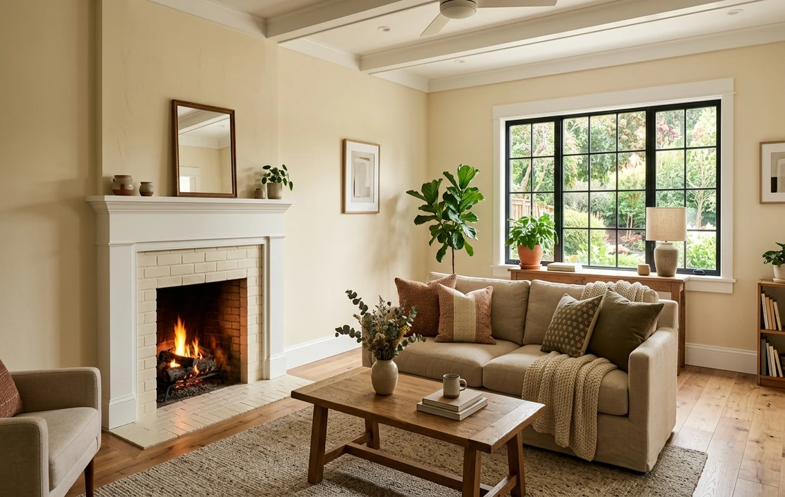
This is Windham Cream's home turf. A north room's cool, flat light drains the life out of most whites and makes them look gray and dingy, but it is exactly the light Windham Cream was built to fix. The warm undertone pushes back against the chill, leaving a room that feels sunlit even on a gray day. In a formal dining room it makes wood furniture, brass, and warm-toned art look intentional and rich. If your north-facing space always feels a little cold, this is one of the most reliable warm picks in our warm white paint colors guide.
Traditional and historic homes
Windham Cream comes from Benjamin Moore's Historical Color collection for a reason: it reads period-correct in colonials, farmhouses, craftsman homes, and any house with substantial trim and crown molding. Against original wood, beadboard, or wainscoting it looks completely at home, and it lets ornate trim do its job instead of fighting it. Pair it with classic millwork and it reads as deliberate heritage rather than dated.
Cozy bedrooms, libraries, and entryways
In a bedroom or study the soft gold warmth reads enveloping and restful, the visual equivalent of warm lamplight. It flatters skin tones, makes leather and wood furniture glow, and pairs beautifully with cream linens and antique rugs. An entryway in Windham Cream sets a warm, welcoming first impression that a cool white never can.
Where to think twice
A bright south- or west-facing room with strong all-day sun is where Windham Cream can tip from cozy to canary. There the warm light stacks on top of the warm pigment and the walls can read distinctly yellow. If you love that golden glow, lean in; if you want those sunny rooms to feel fresh and bright instead of buttery, a cooler off-white will serve you better. Also avoid pairing it with cool gray-blue furnishings, which can make the cream look dingy by contrast.
Trim, ceiling, and decor pairings
A warm cream lives or dies on the white you put next to it. Get the trim right and Windham Cream looks layered and intentional; get it wrong and the wall can look either flat or slightly grubby.
- Soft warm trim (most harmonious): BM White Dove (OC-17, LRV 85) is the natural partner. Its gentle cream bias is warm enough to feel cohesive with Windham Cream while still reading clearly lighter, giving a soft, monochromatic, classic look. This is the safe, traditional pick.
- Crisp trim (more contrast): BM Chantilly Lace (OC-65) is a clean, bright white that gives Windham Cream noticeably more contrast and a fresher, more current edge. Use it when you want the cream to feel deliberate rather than blended, especially in a room with strong architectural trim.
- Avoid: a cool, blue-based bright white next to Windham Cream. The warm-cool clash makes the walls look yellow and slightly dirty by comparison, the single most common pairing mistake with creams.
- Ceilings: a soft warm white (often the trim color) keeps the room glowing. A stark cool ceiling white can fight the walls and make the cream look more yellow than it is.
- Floors and decor: warm wood, especially oak and walnut, brass, antique gold, cream and ivory textiles, and warm reds and greens all flatter Windham Cream. Sage green and warm terracotta are especially classic alongside it. Cool chrome and gray-blue fabrics tend to fight it.
For a deeper look at how the warmest creams behave next to other off-whites, the Swiss Coffee family is a useful reference point, covered in our Swiss Coffee paint guide. And for trim itself, our Benjamin Moore White Dove OC-17 review walks through why it is the default companion white for warm walls.
See walls, trim, and floor together in one preview, free.
Windham Cream vs the warm whites people confuse it with
Almost every Windham Cream search ends in a side-by-side with another Benjamin Moore cream. These are the two near-twins that matter most, plus one popular off-white people cross-shop:
- vs BM Ballet White (OC-9): this is the closest twin and the one people mix up most. Ballet White (LRV about 73) is significantly lighter and far more restrained: it is a barely-there warm off-white with subtle yellow-beige and a faint gray that keeps it neutral. Windham Cream (LRV 62) is deeper, more saturated, and unmistakably more yellow-gold. Choose Ballet White when you want the suggestion of warmth without commitment, and Windham Cream when you actually want a creamy, golden-glow wall that reads as a color, not a near-white.
- vs BM Maritime White (OC-5): Maritime White (LRV about 71) is lighter, softer, and more balanced, a creamy white with a gentle warmth and a whisper of green-gray that keeps it from going yellow. Next to Maritime White, Windham Cream looks distinctly more golden and more present. Pick Maritime White for a soft, versatile, almost-neutral warm white; pick Windham Cream when you want genuine cream depth and a cozier, more traditional feel.
- vs BM Swiss Coffee (OC-45): Swiss Coffee is a creamy off-white with a soft beige-yellow undertone, but it stays closer to a warm white than a true cream. Windham Cream is deeper and more saturated, with the yellow-gold reading clearly stronger. Choose Swiss Coffee for a forgiving warm white that suits most rooms; choose Windham Cream when you want more color and more warmth on the wall.
The pattern is consistent: Windham Cream is the warmest and most saturated of the group. Ballet White and Maritime White are its lighter, more cautious cousins. If you find yourself wishing those two had "a bit more cream," Windham Cream is what you are reaching for.
Spelling note: BM Windham Cream, Windham Cream Benjamin Moore, and Benjamin Moore HC-6 all point to this same color.
How to test Windham Cream before you commit
A 2-inch fan-deck chip is the number-one reason people pick a cream that disappoints: it under-reads the yellow and cannot show how warmth compounds across four walls in a real day. Two better methods:
- Paint a large swatch: roll a 12-by-12-inch sample (or a peel-and-stick sample) on two different walls and check it mid-morning, mid-afternoon, and at night under your normal bulbs. Watch specifically how golden it goes in your brightest, sunniest corner; that corner tells you the truth about whether it reads cozy or yellow for you.
- Preview it digitally first: upload a real photo of your room and apply Windham Cream alongside a lighter alternative such as Ballet White or Maritime White before you buy any samples, narrowing three contenders to the one worth painting. Pricing context for the full repaint is in our cream and antique white paint colors guide.
Preview Windham Cream against Ballet White and Maritime White, side by side, free.
Frequently asked questions
Is Windham Cream warm or cool?
Windham Cream (HC-6) is a warm color with a dominant yellow-gold undertone and a faint beige base that keeps it from going acid. In cool or north light it reads as a soft, balanced cream, but in warm or south light the yellow steps forward and the wall reads distinctly more golden. It is firmly a warm cream, not a neutral off-white, so it amplifies any warmth already in your light.
What is the LRV of Windham Cream?
Windham Cream has a Light Reflectance Value of about 62 on the Benjamin Moore color data, with a hex approximation of #E9DEC4 (RGB 233, 222, 196). That makes it a light cream: it reflects nearly as much light as a soft white, so it brightens a room while still showing clear color and warmth on the wall, rather than washing out the way a high-LRV near-white would.
What are the best rooms for Windham Cream?
North-facing living and dining rooms are where Windham Cream shines, because the cool, flat light tames its yellow and leaves a cozy, sunlit-looking cream. It also suits traditional and historic homes, libraries, bedrooms, and entryways where a warm glow is the goal. It is least reliable in bright south- or west-facing rooms with strong all-day sun, where the warm light can push it toward buttery yellow.
What trim color goes with Windham Cream?
BM White Dove (OC-17) is the most harmonious trim because its gentle cream bias feels cohesive with Windham Cream while still reading clearly lighter, giving a soft, classic look. BM Chantilly Lace (OC-65) is the crisper option when you want more contrast and a fresher edge. Avoid a cool, blue-based bright white, which makes the warm cream walls look yellow and slightly dirty by comparison.
What is the difference between Windham Cream and Ballet White?
Ballet White (OC-9, LRV about 73) is much lighter and more restrained, a barely-there warm off-white with subtle yellow-beige and a faint gray that keeps it near-neutral. Windham Cream (HC-6, LRV about 62) is deeper, more saturated, and unmistakably more yellow-gold. Choose Ballet White for the suggestion of warmth without commitment, and Windham Cream when you want a genuine creamy, golden-glow wall.
Preview BM Windham Cream on your actual walls under your own light before buying a single sample.
Disclaimer: Benjamin Moore, Windham Cream (HC-6), Ballet White (OC-9), Maritime White (OC-5), Swiss Coffee (OC-45), White Dove (OC-17), and Chantilly Lace (OC-65) are trademarks of Benjamin Moore & Co. FacadeColorizer is an independent paint visualization service and is not affiliated with, endorsed by, or sponsored by Benjamin Moore. Color reproduction on screens approximates the manufacturer's chip; always confirm with a manufacturer sample under your own light before purchase. Sources: Benjamin Moore HC-6 Windham Cream color data 2026, Benjamin Moore OC-9 Ballet White and OC-5 Maritime White color data 2026, The Spruce cream and warm-white undertone coverage, designer field reports compiled by FacadeColorizer.
Trademarks mentioned (Sherwin-Williams, Benjamin Moore, Behr, Caparol, Brillux, Sto, Alpina, Valspar, PPG, Glidden, Dulux, Crown Trade, Sandtex, Farrow & Ball, Johnstone's, Leyland) are property of their respective owners. FacadeColorizer is independent and not affiliated with any of them. Nominative fair use under Lanham Act §1125.


