
The first thing people notice about Benjamin Moore Maritime White (OC-5) is that it does not look like the bright, clinical white they pictured. It looks soft, almost like cream poured into milk, with a quiet warmth that makes a room feel lived-in rather than showroom-fresh. That is the whole appeal, and also the whole worry: search Maritime White and the most common question is whether it leans too yellow. I have brushed this one onto bedroom and trim samples for clients who wanted cozy without committing to beige, and the answer is reassuringly consistent. Maritime White is a genuinely warm, creamy off-white, but it is a restrained one. Here is exactly how it behaves on real interior walls, where it earns its keep, and how to keep its yellow side in check.
Quick orientation before the deep dive. Maritime White OC-5 carries a published LRV of about 73 and a hex approximation of #EAE3D2 (RGB 234, 227, 210). That puts it in soft, warm off-white territory: bright enough to keep a room feeling open and airy, but well below the blinding reflectance of a pure white, so it never glares. The undertone is a gentle creamy yellow with a faint sense of warmth underneath, which is what gives it that soothing, candlelit quality. This profile is one stop in our wider Benjamin Moore interior paint colors guide, and it sits alongside our broader look at warm white paint colors and undertones: that one maps the whole warm-white family, while this page stays focused on OC-5 specifically, its rooms, light behavior, and pairings.
Upload a photo of your actual room and preview BM Maritime White OC-5 under your own light in about 30 seconds. Free: 1 HD render plus 3 variations.
Maritime White at a glance: the numbers that matter
Before opinions, here are the values you can take to a paint counter. These are the specs that decide how OC-5 actually performs on a wall:
| Spec | Maritime White OC-5 |
|---|---|
| Color number | OC-5 (Off-White collection) |
| LRV (Light Reflectance Value) | Approximately 73: soft off-white, bright but never glaring |
| Hex / RGB (approx.) | #EAE3D2 / 234, 227, 210 |
| Color family | Warm creamy off-white |
| Primary undertone | Soft creamy yellow, with a whisper of warmth underneath |
| Best base / finish | White base; matte or eggshell on walls, satin or semi-gloss on trim |
The takeaway from those numbers: at LRV 73 Maritime White is clearly an off-white, not a true bright white and not a beige. It reflects enough light to keep a room cheerful and open, but it holds back roughly a dozen points of reflectance compared to a paper-white like Chantilly Lace, and that gap is exactly the softness people feel when they walk in. The creamy yellow undertone is the whole identity. In the right light it reads warm and welcoming; in the wrong light, or next to a cooler white, it can tip toward a faintly buttery cast. Managing that one variable is the entire decision.
Is Maritime White too yellow? The undertone, decoded
Maritime White is a warm white, no question. Anyone calling it a crisp neutral white is misreading the chip. But warm is not the same as yellow, and the difference is what separates a room that feels softly cozy from one that looks like aged ivory. Here is what is happening underneath.
The dominant undertone is a creamy yellow, gentle rather than saturated, with just enough body to keep the color from reading flat. Unlike a true antique white or a builder cream, Maritime White does not carry a heavy gold or tan pigment, so it stays in white territory and does not slide into beige. That restraint is the reason designers reach for it when they want warmth without commitment. The catch is that warm whites amplify whatever warm light hits them. Under incandescent or 2700K bulbs at night, and in strong afternoon sun, the creamy yellow steps forward and the wall can look noticeably buttery. In flat, cool, indirect light the same wall calms down and reads as a soft, milky off-white that barely registers as yellow at all.
Watch out for one quirk specific to creamy whites like this. Maritime White looks far whiter and more neutral on a small fan-deck chip held against a colored surface than it does once it covers an entire wall. Paint a whole room and the yellow accumulates: every square foot reinforces the warmth, so the finished wall reads warmer than the chip ever suggested. If you are judging OC-5 from a two-inch sample alone, assume the real room will land a half-step creamier and softer than you expect.
| Indoor light | How Maritime White reads |
|---|---|
| South-facing (bright, warm) | Warm and glowing; the creamy yellow is happiest here, cozy not garish |
| West-facing (warm afternoon) | Leans most yellow in late-day sun; gorgeous at golden hour, buttery at peak |
| East-facing (cool after noon) | Fresh and soft in morning light, quietly creamy by afternoon |
| North-facing (cool, indirect) | Its calmest, most neutral read; the warmth keeps a cool room from feeling cold |
| Artificial light at night | Warm 2700K bulbs deepen the cream; cool 4000K bulbs neutralize it toward a soft white |
Sources: Benjamin Moore OC-5 color data 2026; off-white undertone coverage; designer field reports compiled by FacadeColorizer.
Free AI visualizer. Test Maritime White on your real walls before buying a single sample pot.
Best rooms for Maritime White
Soft, warm, and forgiving, Maritime White is happiest in rooms where comfort matters more than crisp contrast. It is the white you choose when you want a space to feel welcoming and a little timeless, not stark. Here is where it consistently earns its keep:
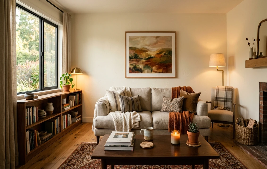
Bedrooms and cozy retreats
This is Maritime White's sweet spot. The creamy warmth wraps a bedroom in a soft, candlelit calm, especially under warm bulbs at night, and it flatters skin tones and bedding far better than a cool bright white. It pairs beautifully with natural linen, oak, rattan, and brass. For a north-facing bedroom that tends to feel chilly, the built-in warmth is a genuine asset rather than a compromise.
Living rooms with traditional or coastal warmth
In a south- or west-facing living room, Maritime White glows. It makes an inviting backdrop for wood furniture, warm-toned art, and layered neutrals, and it reads especially well in traditional, farmhouse, and relaxed coastal interiors. If you want a softer envelope than a stark white, our guide to the best white living room paint ideas shows how warm whites like this one sit next to brighter alternatives.
Kitchens, trim, and cabinetry
Maritime White is a classic creamy cabinet and trim color in warm kitchens, where its soft yellow flatters wood floors, brass hardware, and warm stone. It is the antidote to the cold, blue-white kitchens that already look dated. For where creamy whites land among the year's other options, our roundup of the best white paint for walls is a helpful map.
Where to think twice
A bright, west-facing room flooded with strong afternoon sun is where Maritime White can tip from cozy to overtly yellow, and modern or minimalist interiors that want a crisp, gallery-white edge will find it too soft. If your decor is cool-toned (lots of gray, navy, polished chrome, white marble with gray veining), the creamy undertone can fight those finishes and look slightly dingy by comparison. In those cases a cleaner warm white serves better.
Trim, ceiling, and decor pairings
A creamy white needs careful neighbors. Get the trim right and Maritime White looks intentional and warm; get it wrong and it can read either dingy or like a mistake against a brighter white.
- Tone-on-tone trim (most seamless): the easiest, most elegant approach is to run Maritime White on both walls and trim, varying only the sheen (matte walls, satin or semi-gloss trim). The room feels enveloping and the warmth stays consistent with no jarring contrast.
- Slightly brighter trim (gentle definition): BM White Dove (OC-17, LRV 85) is a touch cleaner and brighter, so it gives subtle crisp definition to trim without going cold against Maritime walls. This is the safe pick when you want trim to register.
- Avoid: a stark, cool paper-white like Chantilly Lace next to Maritime White. The cool brightness makes the walls look yellow and slightly aged by contrast, the exact effect you are usually trying to avoid.
- Ceilings: a soft white or the trim color keeps the room cohesive. A blue-white ceiling over creamy walls reads disconnected, so favor a warm or neutral white above.
- Floors and decor: warm oak, walnut, rattan, brass, unlacquered hardware, and warm stone all reinforce Maritime White's cozy read. Cool gray flooring, chrome, and gray-veined marble can fight the yellow; temper them with warm textiles or choose a cleaner white instead.
For contrast, a soft sage green, warm taupe, or muted navy on a door or built-in reads handsome against creamy walls without clashing with the warmth. If you want to compare the broader warm-versus-cool white decision, our piece on off-white paint colors, undertones, and rooms lays out the trade-offs.
See walls, trim, and floor together in one preview, free.
Maritime White vs the warm whites people confuse it with
Almost every Maritime White search ends in a side-by-side with another off-white. These are the three comparisons that matter most indoors, and the differences are real even though the chips look alike on screen:
- vs BM White Dove (OC-17): the most common cross-shop. White Dove (LRV 85) is noticeably brighter and more balanced, a warm white that leans soft gray-cream rather than yellow. Maritime White (LRV 73) is darker, creamier, and clearly more yellow. Choose White Dove when you want a versatile warm white that still reads clean and works almost anywhere; choose Maritime White when you specifically want more depth, warmth, and a cozier, more traditional feel. They are not interchangeable: Maritime is the warmer, lower-reflectance one. Our White Dove OC-17 review covers it in full.
- vs BM Cloud White (OC-130): Cloud White is a brighter creamy white (LRV near 85) with a softer, more controlled yellow that stays cleaner in warm light. Maritime White is deeper and goes more openly yellow, especially under incandescent bulbs. Pick Cloud White for a creamy white that holds its composure in any light; pick Maritime when you want unmistakable warmth and a little more body. See the full breakdown in our Cloud White OC-130 review.
- vs Navajo White (OC-95): this is the one to be careful with. Navajo White is a heavier, more saturated creamy beige-white that openly reads as a soft tan, the quintessential builder cream. Maritime White is lighter and cleaner: it is warm and creamy but it stays in white territory rather than crossing into beige the way Navajo does. If a room is already feeling dated and yellow, Navajo will deepen that; Maritime White is the fresher, more restrained alternative.
Spelling note: maritime white benjamin moore, BM Maritime White, and Maritime White OC-5 all point to this same Off-White collection color.
How to test Maritime White before you commit
A two-inch fan-deck chip is the single biggest reason people pick a creamy white that disappoints: it under-reads the yellow and cannot show how the warmth accumulates across a whole wall and shifts from morning to lamplight. Two better methods:
- Paint a large swatch: roll a 12-by-12-inch sample (or a peel-and-stick sample) on two different walls and check it mid-morning, in late-afternoon sun, and at night under your normal bulbs. Watch specifically for how yellow it goes in your brightest, warmest corner; that corner tells you the truth about OC-5.
- Preview it digitally first: upload a real photo of your room and apply Maritime White (plus a cleaner warm white like White Dove and a brighter cream like Cloud White) before you buy any samples, narrowing three contenders to the one worth painting. For budgeting the full repaint, our interior house painting cost guide for 2026 has the numbers and a calculator.
Preview Maritime White against White Dove and Cloud White, side by side, free.
Frequently asked questions
Is Maritime White warm or cool?
Maritime White (OC-5) is a warm color with a soft creamy yellow undertone. In bright south light and under warm 2700K bulbs the yellow steps forward and the wall reads cozy and candlelit, while in cool, indirect, or north light it calms down to a soft milky off-white. It never reads as a crisp neutral white, so treat it as a warm creamy white rather than a true white.
What is the LRV of Maritime White?
Maritime White has a Light Reflectance Value of about 73 on the Benjamin Moore color data, with a hex approximation of #EAE3D2 (RGB 234, 227, 210). That makes it a soft off-white: bright enough to keep a room open and cheerful, but roughly a dozen points below a paper-white like Chantilly Lace, which is exactly why it feels softer and never glares.
What are the best rooms for Maritime White?
Bedrooms, traditional and coastal living rooms, and warm kitchens or cabinetry are where Maritime White shines, because its creamy warmth flatters wood, linen, brass, and warm stone and keeps cool north-facing rooms from feeling cold. It is least reliable in bright west-facing rooms with strong afternoon sun, where it can look overtly yellow, and in cool, modern, gray-toned interiors that want a crisp gallery-white.
What is the difference between Maritime White and White Dove?
White Dove (OC-17, LRV 85) is brighter and more balanced, a warm white that leans soft gray-cream and reads clean almost anywhere. Maritime White (OC-5, LRV 73) is darker, creamier, and clearly more yellow. Choose White Dove for a versatile warm white that still looks crisp, and Maritime White when you specifically want more depth, warmth, and a cozier, more traditional feel. They are not interchangeable.
What trim color goes with Maritime White?
The most seamless approach is tone-on-tone: Maritime White on both walls and trim, varying only the sheen so the room feels enveloping. If you want trim to register, BM White Dove (OC-17) is a touch brighter and gives gentle definition without going cold. Avoid a stark cool white like Chantilly Lace, which makes Maritime walls look yellow and aged by contrast.
Preview BM Maritime White on your actual walls under your own light before buying a single sample. Free: 1 HD render plus 3 variations.
Disclaimer: Benjamin Moore, Maritime White (OC-5), White Dove (OC-17), Cloud White (OC-130), Navajo White (OC-95), and Chantilly Lace (OC-65) are trademarks of Benjamin Moore & Co. FacadeColorizer is an independent paint visualization service and is not affiliated with, endorsed by, or sponsored by Benjamin Moore. Color reproduction on screens approximates the manufacturer's chip; always confirm with a manufacturer sample under your own light before purchase. Sources: Benjamin Moore OC-5 Maritime White color data 2026, Benjamin Moore OC-17 White Dove and OC-130 Cloud White color data 2026, off-white undertone coverage, designer field reports compiled by FacadeColorizer.
Trademarks mentioned (Sherwin-Williams, Benjamin Moore, Behr, Caparol, Brillux, Sto, Alpina, Valspar, PPG, Glidden, Dulux, Crown Trade, Sandtex, Farrow & Ball, Johnstone's, Leyland) are property of their respective owners. FacadeColorizer is independent and not affiliated with any of them. Nominative fair use under Lanham Act §1125.


