
The first time a client asked me to roll Benjamin Moore Pale Smoke (1584) on a primary bathroom, she described what she wanted before she ever said the name: "I want it to feel like a quiet spa, not a gray box." That sentence is Pale Smoke in a nutshell. It is a pale, almost-but-not-quite-white gray that carries a soft wash of green with a whisper of blue underneath, and the result reads serene and watery rather than steely. It is the color you reach for when "gray" sounds too cold and "green" sounds too committed. The catch is that pale, low-chroma colors like this one are chameleons: the same gallon can look pure gray on a north wall and clearly minty in a sunny corner. Here is exactly how Pale Smoke behaves on real interior walls, and how to tell it apart from the three near-twins that trip everyone up.
Quick orientation before the deep dive. Pale Smoke 1584 has a published LRV of about 62 and a hex approximation of #CDD3CC (RGB 205, 211, 204). That puts it in the light, airy end of the gray range: noticeably brighter than a true mid-gray, but with enough body to read as a soft color rather than an off-white. The undertone is the whole story: a gentle gray-green with a cool blue note that keeps it from ever going sage or pistachio. This profile is one stop in our wider Benjamin Moore interior paint colors guide, and it sits in the same calm, watery neighborhood we map in our blue-gray paint undertones guide. If you are deciding between several light grays for a whole home, this page stays narrowly on Pale Smoke itself.
Upload a photo of your actual room and preview BM Pale Smoke under your own light in about 30 seconds. Free: 1 HD render plus 3 variations.
Pale Smoke at a glance: the numbers that matter
Before opinions, here are the verifiable specs from the Benjamin Moore color library. These are the values you can take to a paint counter:
| Spec | Pale Smoke 1584 |
|---|---|
| Color number | 1584 (Benjamin Moore Color Preview / classic fan deck) |
| LRV (Light Reflectance Value) | Approximately 62: light and airy, keeps a room open |
| Hex / RGB (approx.) | #CDD3CC / 205, 211, 204 |
| Color family | Pale gray with a green-blue undertone |
| Primary undertone | Soft gray-green, with a cool blue note that surfaces in bright light |
| Best base / finish | Light tint base; eggshell or matte on walls, satin on trim and vanities |
The takeaway from those numbers: Pale Smoke is a colored neutral, not a true gray and not a true green. At LRV 62 it sits a touch lighter and softer than mid-grays like Stonington Gray (LRV near 59), which is part of why it feels so calm and open. The green-blue undertone is its identity. In the right light it reads as a barely-there spa wash; in flat, gray light it can recede almost to a warm-leaning white. Knowing which way it will tip in your room is the entire decision, so let us decode the undertone before anything else.
Is Pale Smoke green or blue? The undertone, decoded
This is the question that fills every search bar for 1584, and the honest answer is: both, but green wins. Pale Smoke is built on a gray-green base with a quieter blue note riding underneath. That blue is what keeps the green from ever turning sage, celadon, or minty-sweet, the way many spa greens do. Think of it as the green of fog over water rather than the green of a leaf. The two pigments take turns depending on the light.
In bright, clean daylight, the green steps forward and the wall reads softly watery, like sea glass that has been left out in the sun. In warm afternoon or incandescent light, the green is gently warmed and Pale Smoke reads as a soft, almost putty-toned pale gray, its most neutral and forgiving face. In cool, indirect, or north light, the blue note wakes up and the color reads cooler and a little more silver-gray, though it never goes icy because the green keeps a sliver of warmth in play. The single most important thing to know: because the chroma is so low, Pale Smoke can also simply disappear into a soft off-white in flat gray weather. If you want to actually see the color, it needs light.
Watch out for one quirk specific to this color. On a small chip and especially on screens, Pale Smoke photographs greener and more saturated than it ever looks rolled on a wall. So if you are choosing from Pinterest alone, assume the finished wall will land a half-step softer, grayer, and more neutral than the image promised, particularly once warm bulbs come on at night.
| Indoor light | How Pale Smoke reads |
|---|---|
| South-facing (bright, warm) | Watery sea-glass green at its most visible and flattering; the green note leads |
| West-facing (warm afternoon) | Warms toward a soft putty-gray; the green relaxes and it reads most neutral |
| East-facing (cool after noon) | Fresh green in morning, cooling toward silver-green by afternoon |
| North-facing (cool, indirect) | Coolest and most silver-gray; the blue note shows, but it stays soft, not icy |
| Flat / overcast light | Can recede toward a pale off-white; the undertone nearly vanishes |
| Artificial light at night | Warm 2700K bulbs mute the green to soft gray; cool 4000K bulbs revive the green-blue |
Sources: Benjamin Moore 1584 Pale Smoke color data 2026; The Spruce undertone coverage; designer field reports compiled by FacadeColorizer.
Free AI visualizer. Test Pale Smoke on your real walls before buying a single sample pot.
Best rooms for Pale Smoke
Pale Smoke is a calming, low-energy color, so it belongs in rooms where you want the temperature dialed down: spaces meant for rest, washing up, and unwinding. It is not a high-drama statement color and it is not the punchy hue you put in a playroom. Here is where it consistently earns its keep:
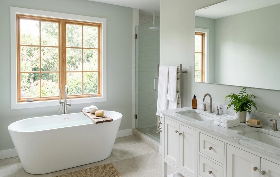
Bathrooms and primary spa baths
This is Pale Smoke's natural home. The green-blue undertone reads genuinely spa-like against white tile, honed marble, and brushed nickel, and at LRV 62 it keeps even a windowless bath feeling fresh rather than closed in. It is softer and warmer than a true cool gray, so a bath in Pale Smoke feels like a retreat instead of a clinic. It is a strong contender in our roundup of the best bathroom paint colors for 2026 for exactly that calm-but-not-cold quality.
Bedrooms built for rest
The same watery quiet that works in a bath makes Pale Smoke a lovely bedroom color. It is restful without being saccharine, and it pairs beautifully with white bedding, natural linen, rattan, and pale wood for a soft, organic-modern feel. Because it is so low in chroma, it stays easy to live with for years rather than reading as a trend. If a calm bedroom is your goal, our guide to calming master bedroom paint colors shows how soft green-grays like this sit next to other quiet picks.
Sunrooms, nurseries, and laundry rooms
In a bright sunroom the green note comes alive and Pale Smoke bridges the indoors to the garden without committing to a real green. In a nursery it is gentle and gender-neutral. In a laundry or mudroom it makes plain cabinetry feel intentional and clean. Anywhere natural light is generous, this color rewards you. For where it lands among the year's other light grays, our interior gray paint shades guide is a useful map.
Where to think twice
A dim, flat-lit room with little natural light is where Pale Smoke can disappoint: with no light to bring out the green-blue, it can read as a slightly dull, indeterminate off-white that looks like you could not decide. It is also not the color for a high-energy kitchen or a dramatic dining room, where its quietness reads as timid. If your room is dark, either lean into warm 2700K bulbs to coax out the soft gray, or pick a color with more body. Pale Smoke needs light to be itself.
Trim, ceiling, and decor pairings (real BM colors)
A pale colored neutral lives or dies on its trim. Because Pale Smoke is green-leaning, a too-yellow cream trim can clash and pull the walls dingy, while the right white makes the color look fresh and deliberate.
- Soft warm-white trim (most balanced): BM White Dove (OC-17, LRV 85) is the designer default here too. Its gentle, near-neutral cream keeps the room soft and cohesive without fighting the green, and the high LRV gives crisp contrast against Pale Smoke's pale walls.
- Crisp clean trim (cooler, fresher): BM Chantilly Lace (OC-65) gives a bright, modern edge that leans into Pale Smoke's spa side. Best in bathrooms and contemporary spaces where you want the green-blue to pop.
- Tonal, color-drenched look: BM Simply White (OC-117) sits warmer; use it when you want trim to nearly melt into the walls for a soft, enveloping spa feel rather than crisp contrast.
- Avoid: a heavy yellow-cream antique white. Against Pale Smoke's green undertone, warm yellow trim can make the walls look slightly muddy and the trim look dated.
- Ceilings: a clean white (often the trim color) keeps the airy feel. To go fully serene, a whisper of Pale Smoke at half-strength on the ceiling wraps a small bath in a soft cocoon.
- Floors and decor: white oak, pale ash, honed marble, brushed nickel or matte black, and natural linen all flatter the green-gray. Warm brass adds a soft glow against it; very orange-toned wood can fight the green, so temper it with cooler textiles.
For a deeper accent, a muted sage, eucalyptus, or soft slate blue on a vanity or door reads beautifully tonal against Pale Smoke walls, keeping the whole room in that calm spa family. If you want to see how the broader pale-gray family relates, our light gray paint undertones guide places Pale Smoke next to its lighter neighbors.
See walls, trim, and floor together in one preview, free.
Pale Smoke vs the colors people confuse it with
Pale Smoke lives in a crowded corner of the Benjamin Moore fan deck. Three near-twins get held up against it constantly, and getting them mixed up is how people end up with the wrong gallon. Here is exactly how each one differs:
- vs BM Silver Mist (1619): the closest call. Silver Mist is also a pale, soft gray, but it leans more purely blue-gray with far less green in the mix, so it reads cooler, cleaner, and more "silver." Pale Smoke holds a clear green note that makes it warmer and more spa-organic. Side by side, Silver Mist looks like cool water and Pale Smoke looks like fog over a garden. Choose Silver Mist for a crisp, cool bath; choose Pale Smoke when you want that softer, greener, slightly warmer calm.
- vs BM Beacon Gray (2128-60): Beacon Gray is the bluest and the most clearly "gray" of this group, with a distinct cool blue-gray cast and very little green. It reads more like a traditional cool gray. Pale Smoke is paler in feel, greener, and softer, never landing as a definite blue. If you want an unmistakable cool gray that is still light, Beacon Gray is your pick; if you want something that whispers green-spa rather than announcing gray, Pale Smoke wins.
- vs BM Moonshine (2140-60): Moonshine is the chameleon of the bunch, a near-neutral pale gray that flickers between green and gray depending on light but stays more colorless overall. Pale Smoke has more consistent green-blue body, so it commits to a soft color where Moonshine often reads as a barely-there warm gray-white. Choose Moonshine when you want the safest, most disappearing pale neutral; choose Pale Smoke when you actually want to feel that watery green calm in the room.
For two fuller side-by-sides with adjacent BM grays, our Benjamin Moore Gray Owl OC-52 review covers the more neutral green-gray people pick for whole-home use, and our Benjamin Moore Stonington Gray HC-170 review covers the cooler, bluer coastal cousin. Pale Smoke sits between them: greener and softer than Stonington, lighter and more spa-like than Gray Owl.
Spelling note: pale smoke benjamin moore, BM Pale Smoke 1584, and Benjamin Moore pale smoke gray all point to this same color, 1584.
How to test Pale Smoke before you commit
A 2-inch fan-deck chip is the single biggest reason people pick a pale green-gray that disappoints. The chip exaggerates the green and cannot show how the color shifts from watery-green to soft-gray to near-white across a real day on a real wall. Two better methods:
- Paint a large swatch: roll a 12-by-12-inch sample (or a peel-and-stick sample) on two different walls and check it mid-morning, mid-afternoon, and at night under your normal bulbs. Watch specifically for two things: how green it goes in your brightest spot, and whether it disappears to off-white in your dimmest corner. Those two extremes tell you the truth.
- Preview it digitally first: upload a real photo of your room and apply Pale Smoke alongside a cooler option like Silver Mist and a more neutral one like Moonshine before you buy any samples, narrowing three near-twins to the one worth painting.
Preview Pale Smoke against a cooler and a more neutral gray, side by side, free.
Frequently asked questions
Is Benjamin Moore Pale Smoke green or blue?
Pale Smoke 1584 is primarily a gray-green with a quieter cool blue note underneath, so green wins. In bright daylight the green leads and the wall reads watery and spa-like; in cool or north light the blue note shows and it reads more silver-gray; in flat light it can recede toward a soft off-white. It never turns sage or minty because the blue keeps the green muted.
What is the LRV of Pale Smoke 1584?
Pale Smoke has a Light Reflectance Value of about 62 on the Benjamin Moore color data, with a hex approximation of #CDD3CC (RGB 205, 211, 204). That makes it a light, airy color: bright enough to keep a small bathroom or bedroom feeling open, while still carrying enough body to read as a soft green-gray rather than washing out completely to white.
What are the best rooms for Pale Smoke?
Bathrooms and spa-style primary baths, restful bedrooms, sunrooms, nurseries, and laundry or mudrooms are where Pale Smoke shines, because its green-blue undertone reads calm and watery against white tile, marble, and natural wood. It is least reliable in dim, flat-lit rooms with little natural light, where it can fade to a dull off-white; warm 2700K bulbs or a color with more body work better there.
What trim color goes with Pale Smoke?
BM White Dove (OC-17) is the most balanced trim because its soft, near-neutral cream keeps the room cohesive without fighting Pale Smoke's green undertone, while its high LRV gives crisp contrast. BM Chantilly Lace (OC-65) is the cooler, cleaner option for modern baths. Avoid a heavy yellow-cream antique white, which can make Pale Smoke's walls look muddy.
How is Pale Smoke different from Silver Mist, Beacon Gray, and Moonshine?
Silver Mist 1619 is a cooler, more purely blue-gray version with less green, so it reads crisper and more silver. Beacon Gray 2128-60 is the bluest and most clearly "cool gray" of the group, with almost no green. Moonshine 2140-60 is a more colorless chameleon that often disappears to a warm gray-white. Pale Smoke holds the most consistent green-blue body, so it commits to a soft, spa-like green where the others read cooler or more neutral.
Preview BM Pale Smoke on your actual walls under your own light before buying a single sample. Free: 1 HD render plus 3 variations.
Disclaimer: Benjamin Moore, Pale Smoke (1584), Silver Mist (1619), Beacon Gray (2128-60), Moonshine (2140-60), Gray Owl (OC-52), Stonington Gray (HC-170), White Dove (OC-17), Chantilly Lace (OC-65), and Simply White (OC-117) are trademarks of Benjamin Moore & Co. FacadeColorizer is an independent paint visualization service and is not affiliated with, endorsed by, or sponsored by Benjamin Moore. Color reproduction on screens approximates the manufacturer's chip; always confirm with a manufacturer sample under your own light before purchase. Sources: Benjamin Moore 1584 Pale Smoke color data 2026, Benjamin Moore Silver Mist, Beacon Gray, and Moonshine color data 2026, The Spruce undertone coverage, designer field reports compiled by FacadeColorizer.
Trademarks mentioned (Sherwin-Williams, Benjamin Moore, Behr, Caparol, Brillux, Sto, Alpina, Valspar, PPG, Glidden, Dulux, Crown Trade, Sandtex, Farrow & Ball, Johnstone's, Leyland) are property of their respective owners. FacadeColorizer is independent and not affiliated with any of them. Nominative fair use under Lanham Act §1125.


