
Benjamin Moore Cromwell Gray (HC-103) is one of those colors people fall for on a moody trim shot and then panic about the second they hold the chip indoors. Is it gray? Is it green? Is it black in the wrong corner? The short version: Cromwell Gray is a deep, grounded gray with a distinct green-khaki undertone, the kind of dark color that feels architectural and a little British, equal parts library and weathered shutter. It earned its reputation outside on trim, shutters, and front doors, but it has quietly become a favorite for interior accent walls, studies, and cabinetry too. The whole question is whether that green reads as character or as olive sludge in your light. Here is how it actually behaves on a wall.
Quick orientation before the deep dive. Cromwell Gray HC-103 has a published LRV of about 14 and a hex approximation of #4A4F46 (RGB 74, 79, 70). That puts it firmly in deep, dark-gray territory: dark enough to drink light and create drama, but not a true black or charcoal. The undertone is the headline: a muted green that leans khaki and slightly gray-blue depending on the light, which is what separates Cromwell from every brown-leaning or blue-leaning charcoal next to it. This profile is one stop in our wider Benjamin Moore interior paint colors guide, and because Cromwell lives on both sides of the door, it is also a frequent pick in our exterior trim paint colors guide. This page stays indoors: undertones, rooms, pairings, and how to tell it apart from its near twins.
Upload a photo of your actual room and preview BM Cromwell Gray under your own light in about 30 seconds. First HD render plus 3 variations free.
Cromwell Gray at a glance: the numbers that matter
Before opinions, here are the verifiable specs from the Benjamin Moore color library. These are the values you can take to a paint counter:
| Spec | Cromwell Gray HC-103 |
|---|---|
| Color number | HC-103 (Historical Color collection) |
| LRV (Light Reflectance Value) | Approximately 14: a deep, dark gray that absorbs light |
| Hex / RGB (approx.) | #4A4F46 / 74, 79, 70 |
| Color family | Deep green-gray (warm-leaning dark neutral) |
| Primary undertone | Muted green-khaki, with a faint gray-blue cast in cool light |
| Best base / finish | Deep tint base; matte or eggshell on walls, satin or semi-gloss on cabinets and trim |
The takeaway from those numbers: Cromwell Gray is a dark color, but at LRV 14 it sits a notch above the near-black charcoals and a clear notch below true black. That is the sweet spot for a deep color that still shows its undertone instead of reading as a void. The green-khaki is the entire identity. In good light it gives Cromwell a sophisticated, slightly historic depth, like aged bronze or a wax jacket. In poor light it can flatten toward a heavy, undefined dark. Manage the light and you get a stunning, grown-up color; ignore it and you get a black hole. That is the whole decision.
Is Cromwell Gray green or gray? The undertone, decoded
This is the question that fills the search bar, and the honest answer is: both, with green winning most arguments. Cromwell Gray is not a clean neutral gray, and it is not a saturated green either. It is a deep gray that has been pushed toward olive-khaki, the way an old fern green fades when you add a lot of black and a little brown. Calling it simply gray undersells the green; calling it green oversells it. Think of it as a green that behaves like a neutral.
Here is what is happening underneath. The green-khaki undertone is dominant and it is loudest in bright, warm light, where the color warms up and reads clearly olive, almost bronze. As light drops or cools, the green recedes and a faint gray-blue cast can step forward, which is why the same wall can look warm-olive by a sunny window and cool-charcoal in a shadowed corner of the same room. There is no purple or pink lurking, which is why it never goes muddy the way some deep grays do, but the green-to-blue swing across a room is real and you should plan for it.
Watch out for one quirk specific to dark colors like this. On a tiny fan-deck chip Cromwell Gray often reads as a flat dark gray and you will miss the green entirely; the undertone only fully announces itself once it covers a large surface and catches real light. So if you wrote it off as boring from the chip, the painted wall will surprise you with far more olive depth than you expected, especially in a south room.
| Indoor light | How Cromwell Gray reads |
|---|---|
| South-facing (bright, warm) | At its richest: warm olive-bronze, the green undertone fully alive and flattering |
| West-facing (warm afternoon) | Deep and golden-green in late sun; the warmest, most dramatic read of the day |
| East-facing (cool after noon) | Greenest in the morning, then settles into a cooler, grayer green by afternoon |
| North-facing (cool, indirect) | Coolest and darkest; green dims toward a heavy gray-green, can feel cave-like without lamps |
| Artificial light at night | Warm 2700K bulbs revive the olive depth; cool 4000K bulbs gray it out and mute the green |
Sources: Benjamin Moore HC-103 color data 2026; designer field reports on deep green-gray paints compiled by FacadeColorizer.
Free AI visualizer. Test how dark Cromwell Gray reads on your real walls before buying a single sample pot.
Best rooms for Cromwell Gray
Deep, green-leaning, and quietly historic, Cromwell Gray is a statement color, not a whole-house neutral. It rewards rooms where you want enclosure, contrast, and a little gravitas. Here is where it consistently delivers indoors:
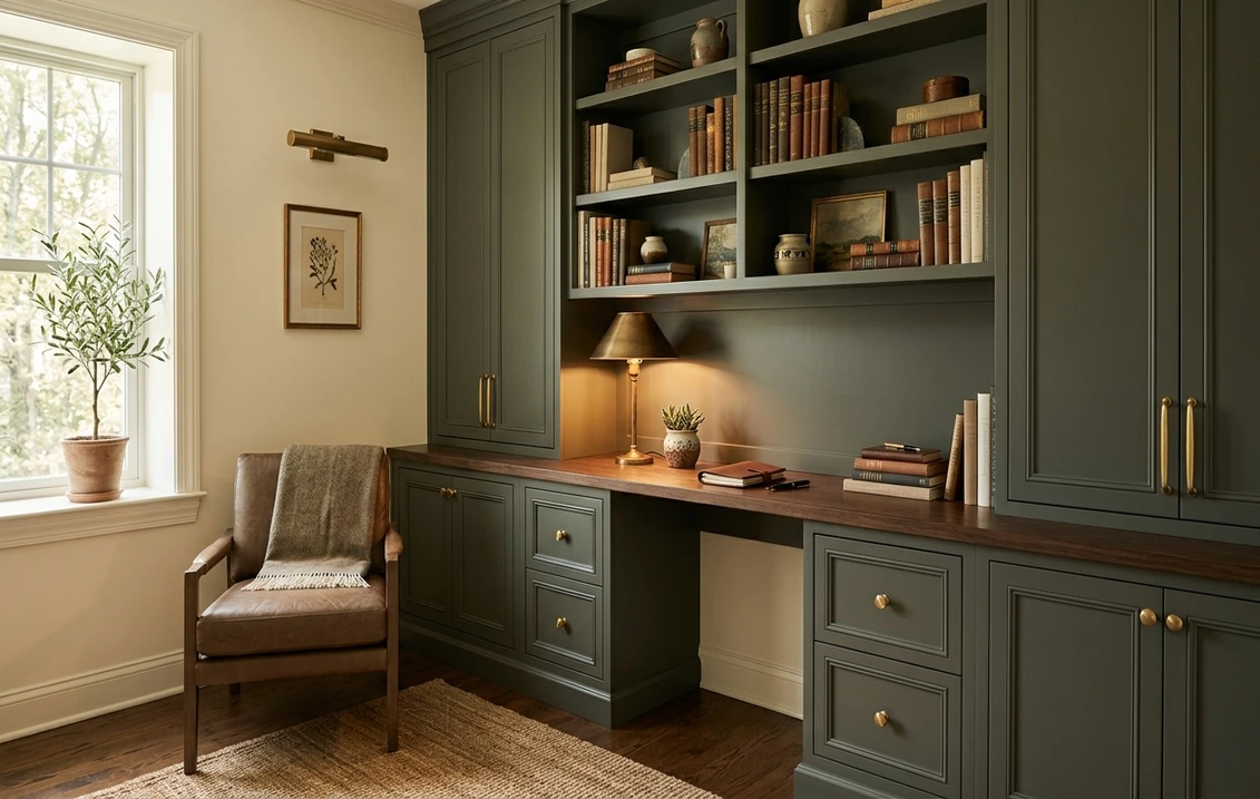
Studies, libraries, and home offices
This is Cromwell Gray's natural habitat. The olive-charcoal depth makes bookshelves, brass hardware, and leather look expensive, and the green undertone reads more bookish and calming than a flat black would. Drenched on all four walls and the trim, it turns an ordinary spare room into a proper study. For how a focused, grounding color helps a workspace, see our roundup of the best home office paint colors for productivity.
Dining rooms going for drama
A dark green-gray dining room reads intimate and elegant by candlelight or a warm fixture, which is exactly the "color drenched" look that is everywhere right now. Cromwell flatters wood tables, white china, and warm metals, and its green softens the heaviness you would get from a true charcoal. If a moody dining room is the goal, our guide to elegant dining room paint colors shows how deep tones like this are used.
Cabinetry, islands, and accent walls
Cromwell Gray is excellent on kitchen islands, lower cabinets, a fireplace wall, or built-ins, where it grounds a lighter room without committing the whole space to dark. Painted on cabinets in satin, the green-khaki gives a warmer, more organic alternative to charcoal. If you are weighing it against true greens for cabinets or millwork, our interior green paint shades guide maps where a green-gray like this fits among more saturated options.
Where to think twice
A small, north-facing room with little natural light and only cool LEDs is the one place Cromwell Gray can backfire. There the green dims, the LRV 14 swallows what little light there is, and the room can feel like a dim box rather than a cozy den. If you love the color but the room is dark, either embrace full enclosure with plenty of warm lamplight, or move Cromwell to cabinets and an accent wall instead of all four walls. It also needs warm 2700K bulbs to stay rich; cool bulbs gray out the very green that makes it special.
Trim, ceiling, and decor pairings
A deep green-gray lives or dies on contrast and warmth. Get the trim right and Cromwell Gray looks like a designer room; get it wrong and it can read either harsh or swampy.
- Soft warm trim (most balanced): BM White Dove (OC-17, LRV 85) is the go-to. Its gentle cream bias frames Cromwell without the stark, almost clinical contrast you get from a bright white, and the warmth echoes the color's khaki side. This is the safest, most cohesive pick for walls plus trim. See our White Dove OC-17 review for how it behaves.
- Drenched (most dramatic): use Cromwell Gray on the trim, walls, and even the ceiling for a full color-drenched study or dining room. With no contrast, the room becomes an enveloping cocoon and the green depth takes over.
- Crisp trim (cooler, sharper): a bright white like BM Chantilly Lace (OC-65) makes Cromwell pop hard and reads more modern, but it can feel a touch cold against the warm green. Best when you want graphic contrast, less so for a cozy room.
- Avoid: a heavy yellow antique-white trim, which can clash with the khaki and make the green look dingy and dated.
- Ceilings: a soft warm white keeps a dark-walled room from feeling top-heavy; or go fully drenched for an intimate den. Avoid a stark blue-white ceiling, which fights the warmth.
- Floors and metals: warm wood (walnut, oak), aged brass, antique gold, and natural rattan flatter the khaki undertone. Cool chrome and very gray floors can drag the green toward cold-charcoal, so balance them with warm wood or brass.
For a high-contrast palette, Cromwell Gray pairs beautifully with a creamy off-white wall and warm wood, letting the dark color act as the anchor. If you want a deeper navy in the same dark-and-handsome family for a different room, our Benjamin Moore Hale Navy HC-154 review covers the most-used deep blue for the same study-and-cabinet jobs.
See walls, trim, and wood floor together in one preview, free.
Cromwell Gray vs the dark colors people confuse it with
Almost every Cromwell Gray search ends in a side-by-side with another deep Benjamin Moore color. The undertone is what separates them, so here are the three comparisons that matter most indoors:
- vs BM Kendall Charcoal (HC-166): the most common mix-up, because both are deep HC grays at a similar depth. The difference is the undertone direction. Kendall Charcoal (LRV around 13) leans warm brown-gray and reads as a true, slightly cozy charcoal with no green. Cromwell Gray leans green-khaki and reads as a deep olive-gray. Side by side, Kendall looks browner and more neutral, Cromwell looks distinctly greener and more outdoorsy. Choose Kendall when you want a safe dark charcoal; choose Cromwell when you specifically want that earthy green character. Our Kendall Charcoal HC-166 review covers it in full.
- vs BM Amherst Gray (HC-167): Amherst is the other near twin and the trickier one, because it also has a green-gray lean. The key difference is value and clarity: Amherst Gray (LRV around 18 to 19) is noticeably lighter and reads as a medium-dark gray with a softer, cooler green hint, while Cromwell Gray (LRV around 14) is darker, warmer, and far more clearly khaki-green. In practice Amherst is the more flexible mid-tone gray for a whole room, and Cromwell is the deeper, moodier statement color. If your swatches look almost identical on the chip, paint both large: Amherst will stay lighter and grayer, Cromwell will go deeper and greener.
- vs BM Hale Navy (HC-154): people cross-shop these two as "the dark dramatic color." Hale Navy is a true deep blue and reads classic and cool; Cromwell Gray reads green-khaki and warmer. Pick Hale Navy for a nautical or traditional study, Cromwell when you want something earthier and less expected.
Spelling note: cromwell grey, BM Cromwell Gray, and Cromwell Gray Benjamin Moore all point to this same HC-103.
How to test Cromwell Gray before you commit
A 2-inch fan-deck chip is the number-one reason people get a dark green-gray wrong: it hides the green and cannot show how much light the color eats in a real room. Two better methods:
- Paint a large swatch: roll a 12-by-12-inch sample (or use a peel-and-stick sample) on two walls, including your darkest corner, and check it mid-morning, mid-afternoon, and at night under your normal bulbs. Watch specifically for how green it reads in sun versus how gray it goes in shadow; that swing tells you whether the room can carry it.
- Preview it digitally first: upload a real photo of your room and apply Cromwell Gray (plus a warmer charcoal like Kendall and a lighter gray-green like Amherst) before you buy any samples, so you narrow three near twins to the one worth painting. It is the fastest way to see how dark the room actually gets.
Preview Cromwell Gray against Kendall Charcoal and Amherst Gray, side by side, free.
Frequently asked questions
Is Cromwell Gray green or gray?
Cromwell Gray (HC-103) is a deep gray with a clear green-khaki undertone, so it is best described as a green-gray rather than a clean neutral. In bright, warm light the green reads strongly and the color looks olive or even bronze; in cool or shaded light the green recedes and a faint gray-blue cast shows, making it read more like a dark charcoal. It never goes purple or muddy, but the green-to-gray swing across a room is real.
What is the LRV of Cromwell Gray?
Cromwell Gray has a Light Reflectance Value of about 14 on the Benjamin Moore color data, with a hex approximation of #4A4F46 (RGB 74, 79, 70). That makes it a deep, dark color that absorbs light, sitting a notch above the near-black charcoals and clearly below true black. At LRV 14 it is dark enough for serious drama but still light enough to show its green undertone instead of reading as a flat void.
What are the best rooms for Cromwell Gray?
Studies, home offices, libraries, moody dining rooms, and cabinetry or accent walls are where Cromwell Gray shines, because its deep green-khaki depth makes wood, brass, and leather look rich and grounded. It is least reliable in small, north-facing rooms with little natural light and cool LED bulbs, where the green dims and the dark value can feel cave-like; warm 2700K bulbs and plenty of lamplight are essential there.
What is the difference between Cromwell Gray and Kendall Charcoal?
Both are deep Benjamin Moore HC grays at a similar depth, but the undertone direction differs. Kendall Charcoal (HC-166, LRV around 13) leans warm brown-gray and reads as a true, neutral charcoal with no green. Cromwell Gray (HC-103, LRV around 14) leans green-khaki and reads as a deep olive-gray. Side by side, Kendall looks browner and safer, Cromwell looks distinctly greener and more earthy.
What is the difference between Cromwell Gray and Amherst Gray?
Both have a green-gray lean, which is why they are confused, but they differ in value and warmth. Amherst Gray (HC-167, LRV around 18 to 19) is noticeably lighter and reads as a medium-dark gray with a softer, cooler green hint, making it the more flexible whole-room color. Cromwell Gray (HC-103, LRV around 14) is darker, warmer, and far more clearly khaki-green, making it the deeper statement color. Painted large, Amherst stays lighter and grayer while Cromwell goes deeper and greener.
Preview BM Cromwell Gray on your actual walls under your own light before buying a single sample. First HD render plus 3 variations free.
Disclaimer: Benjamin Moore, Cromwell Gray (HC-103), Kendall Charcoal (HC-166), Amherst Gray (HC-167), Hale Navy (HC-154), White Dove (OC-17), and Chantilly Lace (OC-65) are trademarks of Benjamin Moore & Co. FacadeColorizer is an independent paint visualization service and is not affiliated with, endorsed by, or sponsored by Benjamin Moore. Color reproduction on screens approximates the manufacturer's chip; always confirm with a manufacturer sample under your own light before purchase. Sources: Benjamin Moore HC-103 Cromwell Gray color data 2026, Benjamin Moore HC-166 Kendall Charcoal and HC-167 Amherst Gray color data 2026, designer field reports on deep green-gray paints compiled by FacadeColorizer.
Trademarks mentioned (Sherwin-Williams, Benjamin Moore, Behr, Caparol, Brillux, Sto, Alpina, Valspar, PPG, Glidden, Dulux, Crown Trade, Sandtex, Farrow & Ball, Johnstone's, Leyland) are property of their respective owners. FacadeColorizer is independent and not affiliated with any of them. Nominative fair use under Lanham Act §1125.


