
The single biggest mistake people make with Benjamin Moore Heather Gray (2138-40) is the name. They read the word heather, picture the soft purple of moorland flowers, and assume they are buying a lavender-gray. They are not. Heather Gray 2138-40 is a medium, earthy gray with a clear green cast, the kind of grounded gray-green that reads like wet stone or dried sage rather than anything mauve. It lives in Benjamin Moore's green color family, not the violets, and once you know that, every decision about light, rooms, and trim gets easier. This page is about the actual color on actual walls: how the green undertone behaves, where the LRV puts it, which rooms suit it, and how it differs from the two colors it is most often confused with.
One crucial clarification before anything else. Heather Gray 2138-40 is not Blue Heather 1620. Blue Heather is a soft, pale blue from a completely different part of the deck, and the two get mixed up constantly because of the shared word. If your paint chip or order says 1620, you have the light blue, not this medium green-gray. Everything below is about 2138-40, the green one. This profile is one stop in our wider Benjamin Moore interior paint colors guide.
Upload a photo of your actual room and preview BM Heather Gray under your own light in about 30 seconds. One HD render plus three variations, free.
Heather Gray at a glance: the numbers that matter
Here are the verifiable specs you can take to a paint counter. The 40 in 2138-40 tells you it sits in the medium band of its tonal column, which matches how it behaves: a real mid-tone, deeper than a typical light gray but well short of charcoal.
| Spec | Heather Gray 2138-40 |
|---|---|
| Color number | 2138-40 (Color Preview collection) |
| LRV (Light Reflectance Value) | Approximately 30: medium depth, absorbs more light than it reflects |
| Hex / RGB (approx.) | #8C8E83 / 140, 142, 131 |
| Color family | Green (a green-leaning gray, not a neutral or blue gray) |
| Primary undertone | Soft green, with a faint gray-taupe steadiness underneath |
| Best base / finish | Medium tint base; eggshell or matte on walls, satin on trim or doors |
The takeaway from those numbers: at an LRV near 30, Heather Gray is a committed mid-tone, not a barely-there backdrop. That depth is its strength and its constraint. It gives walls real presence and a moody, organic calm, but it also drinks light, so it needs either good natural light or a deliberate cozy plan to look its best. The green in the undertone is what keeps it from feeling like a flat industrial gray; it reads more like a soft, weathered greige-green than a cool slate.
Is Heather Gray green, gray, or purple? The undertone, decoded
Heather Gray is a green-gray, and the green is the part you actually see on a wall. Despite the romantic name, there is no meaningful purple in it for interior purposes. What you get instead is a muted, slightly olive green riding inside a medium gray body, the kind of color you would find in lichen, eucalyptus leaves dusted with gray, or river stone. It is desaturated enough to read as a neutral from across a room, but step closer and the green is unmistakable.
The green is loudest in bright, neutral daylight and against clean whites, where the wall reads clearly sage. It quiets down in warm light, where the gray-taupe steadiness comes forward and the color reads grayer and earthier, almost like a soft mushroom-green. There is no blue ghost to worry about, which is exactly what separates it from the cool grays people cross-shop. If you are choosing between this and a cool blue-gray, you are choosing between two opposite temperatures, not two shades of the same idea.
Watch out for one quirk specific to mid-tone greens at this LRV: Heather Gray can shift noticeably between a daytime wall and a nighttime wall. Under warm 2700K bulbs at night it loses much of its green and settles into a deep, soft gray. Under cool LEDs it pushes back toward green and can even hint at a colder, almost teal edge in a north room. The color is stable in its identity but expressive in its mood, so the bulb you live under matters more here than with a pale neutral.
| Indoor light | How Heather Gray reads |
|---|---|
| South-facing (bright, warm) | Its best read: a soft, warm sage-gray with the green gently present and the depth flattering rather than heavy |
| West-facing (warm afternoon) | Warmer and earthier late in the day; the green calms and the gray-taupe comes forward |
| East-facing (cool after noon) | Fresh and clearly green in the morning, then deeper and grayer once the direct light leaves |
| North-facing (cool, indirect) | Greenest and moodiest; can feel dim if the room is small, so best used as a deliberate cocooning color here |
| Artificial light at night | Warm 2700K bulbs drop the green toward soft gray; cool 4000K bulbs push the green back, occasionally toward a cooler teal edge |
Sources: Benjamin Moore 2138-40 color data 2026; green-gray undertone field reports compiled by FacadeColorizer.
Free AI visualizer. Test how green Heather Gray reads on your real walls before buying a sample pot.
Best rooms for Heather Gray
Heather Gray is a moody, grounding mid-tone with a nature-borrowed green, so it shines in rooms where you want depth, calm, and a connection to the outdoors rather than airy brightness. It is not a whole-home light neutral; it is an accent-strength color you can use on full walls when you commit to the mood.
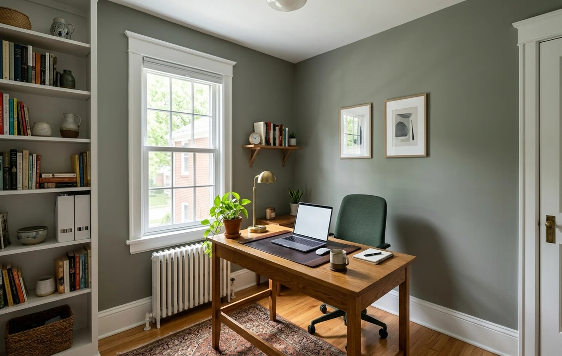
Studies, home offices, and libraries
This is Heather Gray's natural home. The green-gray depth is focusing and quiet without the heaviness of a true charcoal, which makes it excellent behind bookshelves, on a feature wall behind a desk, or wrapping a small study completely. It reads serious and considered, and it photographs beautifully on video calls because it is flattering rather than glaring. For more on color and concentration, see our roundup of home office paint colors for productivity.
Bedrooms that want to feel cocooning
At LRV 30, Heather Gray wraps a bedroom in calm. The green leans restful the way nature tones do, and the medium depth turns a bedroom into a retreat rather than a bright box. It pairs beautifully with white or cream bedding, natural wood, and warm brass. If a soothing bedroom is the goal, our guide to calming master bedroom paint colors shows where a deeper green-gray sits next to lighter picks.
Powder rooms, dining rooms, and accent walls
A windowless powder room is a perfect place to lean into the drama of a mid-tone green-gray, where the lack of natural light becomes a feature rather than a flaw. The same goes for a dining room you want to feel intimate at night, or a single accent wall in a living room where full coverage would be too dark. For how to deploy it on one wall without overwhelming a space, see our accent wall color strategy.
Where to think twice
A small, dark, north-facing room with no good light source is where Heather Gray can tip from cozy to gloomy. At this LRV the wall will not bounce light back, so a cramped, dim space can feel closed in. If you love the color but the room is dark, either reserve it for one wall, flood the room with warm lamps, or step up to a lighter green-gray. It is also a poor choice if you want a bright, expansive, airy feel; this color is about depth, not light.
Trim, ceiling, and decor pairings
A green-leaning mid-tone wants warmth around it. The wrong cool white can make Heather Gray look gray and a little sad; the right soft white lets the green glow.
- Soft warm trim (most balanced): BM White Dove (OC-17, LRV 85) is the designer default and the safest choice. Its gentle cream bias warms the green and gives high-contrast trim without a harsh, clinical edge. This is the pairing I reach for most often.
- Creamy, traditional trim: BM Swiss Coffee (OC-45) or a soft ivory leans into the earthy, organic side of Heather Gray for a warmer, cottage-style look.
- Crisp trim (cooler, more modern): BM Chantilly Lace (OC-65) gives maximum contrast and a sharper edge. Use it for a more contemporary, gallery feel, but know it makes the green read cooler.
- Avoid: a stark, blue-based bright white next to Heather Gray. The cool-versus-green clash can make the walls look muddy and the trim look cold.
- Ceilings: the trim white repeated above keeps things cohesive. In a cozy study or powder room, painting the ceiling the same Heather Gray (a drenched look) deepens the cocooning effect.
- Floors and decor: warm oak, walnut, rattan, brass, and cream linen flatter the green-gray and pull out its earthiness. Black hardware reads tailored against it. Very cool gray flooring can fight the green.
For coordinating wall colors in an open plan, a soft sage like October Mist flows naturally with Heather Gray as a lighter companion, while a warm white keeps adjacent spaces from going too dark. If you want to see how green-gray relates to the wider sage family, our guide to sage green interior shades and pairings is a useful map, and our colors that go with gray guide covers accents.
See walls, trim, and floor together in one free preview.
Heather Gray vs the colors people confuse it with
Heather Gray is a specific thing: a medium, green-leaning gray. Most mix-ups happen because shoppers compare it to colors that are either lighter, cooler, or a different temperature entirely. Here are the three that matter most indoors.
- vs BM Nimbus Gray (2131-50): the most useful comparison. Nimbus Gray is lighter (LRV near 44) and leans toward a soft warm gray with only the faintest green, reading much more like a true neutral greige. Heather Gray is noticeably deeper and far more openly green. Choose Nimbus when you want a light, safe, barely-green gray for whole rooms; choose Heather Gray when you want real depth and an unmistakable sage cast. They are not interchangeable, despite sharing a family.
- vs BM October Mist (1495): October Mist (LRV near 49) is a lighter, gentler sage that wears its green softly and stays airy. Heather Gray is the moodier, deeper sibling with more gray in the mix. Pick October Mist for a soft, light green-gray on full rooms; pick Heather Gray for a grounded accent or a cocooning study.
- vs BM Stonington Gray (HC-170): these are opposites people somehow confuse by name. Stonington (LRV near 59) is a light, cool, blue-gray; Heather Gray is a medium, warm-leaning, green-gray. If you hold them together, one looks fresh and coastal and the other looks earthy and organic. Choose by temperature, not by the word gray.
Spelling and naming note: heather grey, BM Heather Gray, and Heather Gray 2138 40 all point to the same 2138-40, and none of them is Blue Heather 1620.
How to test Heather Gray before you commit
A mid-tone green-gray at LRV 30 is exactly the kind of color a 2-inch chip lies about. The chip cannot show you how dark it reads across a full wall, and it cannot show how the green shifts between day and night. Two better methods:
- Paint a large swatch: roll a generous 2-by-2-foot sample (or a peel-and-stick sample) on at least two walls, including your darkest corner, and check it mid-morning, late afternoon, and at night under your normal bulbs. Watch how green it stays in daylight and how much it deepens after dark; both are part of living with it.
- Preview it digitally first: upload a real photo of your room and apply Heather Gray, plus a lighter alternative like October Mist and a cooler one like Stonington Gray, before you spend a cent on samples. That narrows three contenders to the one worth painting. Pricing context for the full repaint is in our interior house painting cost guide for 2026.
Preview Heather Gray against a lighter sage and a cooler gray, side by side, free.
Frequently asked questions
Is Benjamin Moore Heather Gray green or purple?
Despite the name, Heather Gray 2138-40 is a green-gray, not a purple one. It sits in Benjamin Moore's green color family and reads as a muted, slightly olive sage inside a medium gray body. There is no meaningful violet in it for interior use. Do not confuse it with Blue Heather 1620, which is a separate, much lighter blue color.
What is the LRV of Heather Gray 2138-40?
Heather Gray has a Light Reflectance Value of about 30, with a hex approximation of #8C8E83 (RGB 140, 142, 131). That makes it a committed mid-tone: it absorbs more light than it reflects, giving walls real depth and a moody, grounded feel rather than an airy, bright one. It needs good natural light or a deliberate cozy plan to look its best.
What rooms work best for Heather Gray?
Studies and home offices, cocooning bedrooms, powder rooms, intimate dining rooms, and accent walls are where Heather Gray shines, because its green-gray depth feels focusing and calm. It is less reliable in small, dark, north-facing rooms with no good light, where the LRV near 30 can make the space feel closed in. Warm lamps or limiting it to one wall help there.
What trim color goes with Heather Gray?
BM White Dove (OC-17) is the most balanced trim because its soft cream bias warms the green and gives clean contrast without a clinical edge. Swiss Coffee (OC-45) leans cottage-warm, while Chantilly Lace (OC-65) gives a crisper, cooler, more modern look. Avoid a stark blue-based bright white, which can make the green-gray walls look muddy by comparison.
What is the difference between Heather Gray and Nimbus Gray?
Nimbus Gray (2131-50, LRV near 44) is lighter and reads as a soft, nearly neutral warm gray with only the faintest green. Heather Gray (2138-40, LRV near 30) is noticeably deeper and far more openly green-sage. Choose Nimbus for a light, safe, barely-green gray on whole rooms, and Heather Gray when you want real depth and a clear green cast for an accent or a cozy study.
Preview BM Heather Gray on your actual walls under your own light before buying a single sample.
Disclaimer: Benjamin Moore, Heather Gray (2138-40), Blue Heather (1620), Nimbus Gray (2131-50), October Mist (1495), Stonington Gray (HC-170), White Dove (OC-17), Swiss Coffee (OC-45), and Chantilly Lace (OC-65) are trademarks of Benjamin Moore & Co. FacadeColorizer is an independent paint visualization service and is not affiliated with, endorsed by, or sponsored by Benjamin Moore. Color reproduction on screens approximates the manufacturer's chip; always confirm with a manufacturer sample under your own light before purchase. Sources: Benjamin Moore 2138-40 Heather Gray color data 2026, Benjamin Moore 2131-50 Nimbus Gray, 1495 October Mist, and HC-170 Stonington Gray color data 2026, green-gray undertone field reports compiled by FacadeColorizer.
Trademarks mentioned (Sherwin-Williams, Benjamin Moore, Behr, Caparol, Brillux, Sto, Alpina, Valspar, PPG, Glidden, Dulux, Crown Trade, Sandtex, Farrow & Ball, Johnstone's, Leyland) are property of their respective owners. FacadeColorizer is independent and not affiliated with any of them. Nominative fair use under Lanham Act §1125.


