
I have rolled Benjamin Moore Stonington Gray (HC-170) onto more bathroom and bedroom walls than almost any other gray, and there is a moment I now wait for every time: the homeowner steps in, looks at the wall in afternoon light, and says it looks blue. They are not wrong, and that is exactly the point of this color. Stonington Gray is a light, clean gray with a deliberate cool lean, the kind of gray that reads fresh and a little coastal instead of heavy. The question that fills every search bar is whether that blue makes it too cold for real rooms. The honest answer rides on your light and your trim. Here is how it actually behaves indoors.
Quick orientation before the deep dive. Stonington Gray HC-170 has a published LRV of about 59 and a hex approximation of #C5C7C2 (RGB 197, 199, 194). That puts it in light, mid-range gray territory: bright enough to keep a small room open, deep enough to read as a real gray rather than an off-white. The undertone is a soft blue (with a faint green ghost that shows up in shade), which is what gives it that calm, airy, slightly nautical quality. This profile is one stop in our wider Benjamin Moore interior paint colors guide, and it is the indoor companion to our BM Stonington Gray HC-170 exterior guide: that one covers the color on siding and facades, while this page stays on interior walls, rooms, undertones, and pairings. They are complementary, not duplicates.
Upload a photo of your actual room and preview BM Stonington Gray under your own light in about 30 seconds, free.
Stonington Gray at a glance: the numbers that matter
Before opinions, here are the verifiable specs straight from the Benjamin Moore color library. These are the values you can take to a paint counter:
| Spec | Stonington Gray HC-170 |
|---|---|
| Color number | HC-170 (Historical Color collection) |
| LRV (Light Reflectance Value) | Approximately 59: light mid-gray, keeps a room bright |
| Hex / RGB (approx.) | #C5C7C2 / 197, 199, 194 |
| Color family | Light cool gray |
| Primary undertone | Soft blue, with a faint green that surfaces in shade |
| Best base / finish | Light tint base; eggshell on walls, satin or semi-gloss on trim |
The takeaway from those numbers: Stonington Gray is a genuine gray, not a greige and not a colored gray pretending to be neutral. At LRV 59 it sits right where Gray Owl and many designer favorites live, light enough for cut in around bright trim to stay crisp, deep enough that a second coat builds real presence on the wall. The blue undertone is the whole identity. Embrace it and the color sings in the right rooms; fight it with the wrong trim and it can drift cold. That is the entire decision in one sentence.
Is Stonington Gray too cool? The undertone, decoded
Stonington Gray is a cool color, full stop. Anyone selling it as a true neutral is overselling. But cool is not the same as cold, and understanding the difference is what separates a room that looks crisp and coastal from one that looks like a dentist's office. Here is what is happening underneath.
The blue undertone is dominant, and it is the loudest in clean, bright light. There is also a quiet gray-green ghost riding underneath, the softening pigment that keeps Stonington from going periwinkle or steel. In warm or south light the blue calms down, the green ghost relaxes, and the wall reads as a soft, almost silvery gray. In cool, indirect light (a north room, an overcast morning, deep shade) the warm wavelengths drain out of the room and the blue marches forward: that is the moment the wall looks distinctly bluer and a touch cooler than the chip promised. It does not turn purple or muddy the way some grays do, which is why pros trust it, but it will absolutely lean blue when the light is cool.
Watch out for one quirk. Stonington Gray reads more clearly blue in photographs and on a small chip than it does as a finished, rolled wall under real lamps. So if you are choosing from Pinterest alone, assume the actual wall will land a half-step softer and grayer than the image, especially once warm bulbs come on at night.
| Indoor light | How Stonington Gray reads |
|---|---|
| South-facing (bright, warm) | Soft silvery gray, its calmest and most flattering read |
| West-facing (warm afternoon) | Warmer and grayer in late-day sun, the blue recedes |
| East-facing (cool after noon) | Fresh and balanced in morning, leans clearly bluer by afternoon |
| North-facing (cool, indirect) | At its bluest and coolest; lean into it as a feature, not a bug |
| Artificial light at night | Warm 2700K bulbs soften the blue toward gray; cool 4000K bulbs push it crisper and bluer |
Sources: Benjamin Moore HC-170 color data 2026; The Spruce gray-paint undertone coverage; designer field reports compiled by FacadeColorizer.
Free AI visualizer. Test Stonington Gray on your real walls before buying a single sample pot.
Best rooms for Stonington Gray
Light, clean, and quietly blue, Stonington Gray is happiest in rooms where freshness is the goal and a little coolness is welcome. It is not the safe whole-home greige; it is the gray you reach for when you want a space to feel crisp. Here is where it consistently earns its keep:
Bathrooms and powder rooms
This is Stonington Gray's home turf. The cool blue undertone reads spa-clean against white subway tile, marble, and chrome, and the LRV 59 keeps even a windowless bath from feeling closed in. Pair it with crisp white trim and it looks like a hotel bathroom rather than a builder special. It is one of the most-requested grays in our roundup of the best bathroom paint colors for 2026 for exactly this reason.
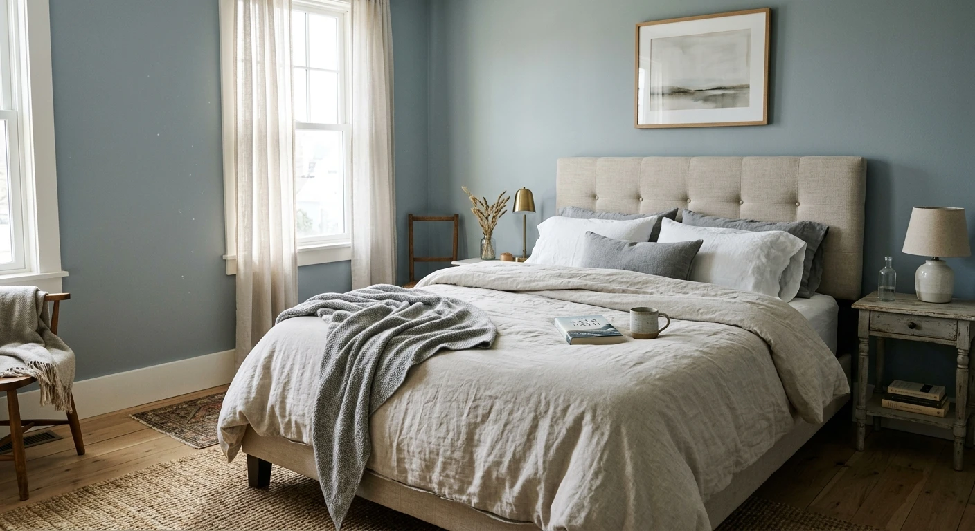
Bedrooms aiming for calm and coastal
In a bedroom the soft blue reads serene and restful, the same psychology that makes blue such a popular bedroom hue, but kept neutral enough to live with for years. It pairs beautifully with white bedding, natural linen, and pale wood. If a restful bedroom is your project, our guide to calming master bedroom paint colors shows how it sits next to other quiet picks.
Bright living rooms, hallways, and trim accents
In a south- or west-facing living room with good light, Stonington Gray loses its chill and reads as a sophisticated silvery backdrop for art and furniture. It also makes an excellent crisp trim or built-in color against a warmer wall. For where it lands among the year's other light grays, our interior gray paint shades guide is a useful map.
Where to think twice
A small, dim, north-facing room with only cool LED light is where Stonington Gray can tip from fresh to frosty. There the blue dominates and a cozy space can feel clinical. If you want that room to feel warm, this is the wrong gray; reach for a warmer greige instead, or at minimum switch to 2700K bulbs. Stonington rewards light, so do not bury it in a cave.
Trim, ceiling, and decor pairings
A cool gray lives or dies on what sits next to it. Get the trim right and Stonington Gray looks intentional and fresh; get it wrong and it can read either cold or oddly dingy.
- Soft warm trim (most balanced): BM White Dove (OC-17, LRV 85) is the designer default. Its gentle cream bias warms the room just enough to keep Stonington's blue from going cold, while still reading clean. This is the safe, cohesive pick for most homes.
- Crisp trim (cleaner, cooler): BM Chantilly Lace (OC-65) gives a bright, modern, slightly cooler edge and leans into Stonington's coastal side. Best for bathrooms, modern spaces, and black-window homes.
- Avoid: a heavy yellow-cream trim like a builder's antique white next to Stonington Gray. The warm-cool clash can make the walls look gray-blue and slightly dirty by comparison.
- Ceilings: a clean white (often the trim color) keeps the room bright and airy. A flat builder white can go slightly dingy over a cool gray, so favor a crisp white above.
- Floors and decor: pale oak, white oak, marble, polished nickel, and natural linen flatter the cool gray and reinforce the coastal read. Very warm orange-toned wood can fight the blue; temper it with cooler textiles.
For contrast and drama, a deep navy or charcoal on a door, vanity, or built-in reads crisp and tailored against the soft gray walls. If you want a deeper look at how cool grays relate as a family, its closest sibling is covered in our Benjamin Moore Gray Owl OC-52 review.
See walls, trim, and floor together in one preview, free.
Stonington Gray vs the colors people confuse it with
Almost every Stonington Gray search ends in a side-by-side. The three that matter most indoors:
- vs BM Gray Owl (OC-52): the classic dilemma. Gray Owl (LRV 61) is a touch lighter and leans green-blue, reading softer and slightly warmer. Stonington (LRV 59) is marginally deeper and leans more purely blue, reading crisper and cooler. Choose Gray Owl for a forgiving whole-home gray, choose Stonington when you want a cleaner, more coastal blue-gray.
- vs SW Repose Gray (SW 7015): Repose is a warmer greige with a violet-brown undertone and stays closer to neutral. Stonington is cooler and clearly bluer. Pick Repose to keep things warm and safe, pick Stonington when you want the wall to read fresh and a little cool.
- vs BM Coventry Gray (HC-169): Coventry, its HC neighbor, runs darker with a stronger blue-gray presence. Stonington is the lighter, airier of the two and far easier to live with on every wall of a small room.
Spelling note: stonington grey, BM Stonington Gray, and Stonington Gray Benjamin Moore all point to this same HC-170.
How to test Stonington Gray before you commit
A 2-inch fan-deck chip is the number-one reason people pick a cool gray that disappoints: it exaggerates the blue and cannot show how the undertone calms down across a real day on a real wall. Two better methods:
- Paint a large swatch: roll a 12-by-12-inch sample (or a peel-and-stick sample) on two different walls and check it mid-morning, mid-afternoon, and at night under your normal bulbs. Watch specifically for how blue it goes in your coolest corner; that corner tells you the truth.
- Preview it digitally first: upload a real photo of your room and apply Stonington Gray (plus a warmer and a lighter alternative such as Gray Owl) before you buy any samples, narrowing three contenders to the one worth painting. Pricing context for the full repaint is in our interior house painting cost guide for 2026.
Preview Stonington Gray against a warmer and a lighter gray, side by side, free.
Frequently asked questions
Is Stonington Gray warm or cool?
Stonington Gray (HC-170) is a cool color with a soft blue undertone and a faint green ghost that shows in shade. In bright or south light it calms into a soft silvery gray, but in cool, indirect, or north light the blue steps forward and it reads distinctly cooler. It never turns purple or muddy, which is why pros trust it, but it is firmly a cool gray, not a warm neutral.
What is the LRV of Stonington Gray?
Stonington Gray has a Light Reflectance Value of about 59 on the Benjamin Moore color data, with a hex approximation of #C5C7C2 (RGB 197, 199, 194). That makes it a light mid-range gray: bright enough to keep a small room open and airy, but with enough depth to read as a true gray rather than washing out like a high-LRV off-white.
What are the best rooms for Stonington Gray?
Bathrooms, powder rooms, calm coastal bedrooms, and bright living rooms or hallways are where Stonington Gray shines, because its cool blue undertone reads fresh and spa-clean against white tile, marble, and chrome. It is least reliable in small, windowless, or north-facing rooms with only cool LED light, where the blue can tip from fresh to frosty; a warmer gray or 2700K bulbs help there.
What trim color goes with Stonington Gray?
BM White Dove (OC-17) is the most balanced trim because its gentle cream bias warms the room just enough to keep Stonington's blue from reading cold while still looking clean. BM Chantilly Lace (OC-65) is the crisper, cooler option for bathrooms and modern spaces. Avoid a heavy yellow-cream antique white, which can make the walls look gray-blue and slightly dingy by contrast.
What is the difference between Stonington Gray and Gray Owl?
Gray Owl (OC-52, LRV 61) is slightly lighter and leans green-blue, so it reads a touch softer and warmer. Stonington Gray (HC-170, LRV 59) is marginally deeper and leans more purely blue, so it reads crisper and cooler. Choose Gray Owl for a forgiving whole-home gray, and Stonington when you want a cleaner, more coastal blue-gray for a bathroom or bright bedroom.
Preview BM Stonington Gray on your actual walls under your own light before buying a single sample.
Disclaimer: Benjamin Moore, Stonington Gray (HC-170), Gray Owl (OC-52), White Dove (OC-17), Chantilly Lace (OC-65), and Coventry Gray (HC-169) are trademarks of Benjamin Moore & Co. Sherwin-Williams and Repose Gray (SW 7015) are trademarks of The Sherwin-Williams Company. FacadeColorizer is an independent paint visualization service and is not affiliated with, endorsed by, or sponsored by Benjamin Moore or Sherwin-Williams. Color reproduction on screens approximates the manufacturer's chip; always confirm with a manufacturer sample under your own light before purchase. Sources: Benjamin Moore HC-170 Stonington Gray color data 2026, Benjamin Moore OC-52 Gray Owl and OC-17 White Dove color data 2026, The Spruce gray-paint undertone coverage, designer field reports compiled by FacadeColorizer.
Trademarks mentioned (Sherwin-Williams, Benjamin Moore, Behr, Caparol, Brillux, Sto, Alpina, Valspar, PPG, Glidden, Dulux, Crown Trade, Sandtex, Farrow & Ball, Johnstone's, Leyland) are property of their respective owners. FacadeColorizer is independent and not affiliated with any of them. Nominative fair use under Lanham Act §1125.


