
There is a reason Benjamin Moore Hawthorne Yellow (HC-4) has hung on in design books for decades while a hundred trendier yellows came and went. It is the yellow that looks like late-afternoon sun caught on a plaster wall: warm, golden, and grown-up rather than crayon-bright. I have brushed it onto entry halls, kitchens, and the kind of formal dining room that only gets used at the holidays, and the homeowner reaction is almost always the same pause, then a smile. The fear that brings people to this color, though, is the opposite of that smile: they worry it will turn out loud, mustardy, or like a fast-food sign. The truth sits in the undertone and the light. Here is exactly how Hawthorne Yellow behaves on a real interior wall.
Quick orientation before the deep dive. Hawthorne Yellow HC-4 has a published LRV of about 63 and a hex approximation of #F1DA9C (RGB 241, 218, 156). That puts it squarely in the soft, light-to-mid golden range: bright and cheerful, but reflective enough to keep a room feeling open rather than saturated. The undertone is a warm gold with a faint green-gray softening underneath, which is what keeps it from screaming and gives it that aged, historic quality. This profile is one stop in our wider Benjamin Moore interior paint colors guide, and if you are weighing several happy hues at once, our roundup of cheerful interior yellow paint colors shows where HC-4 lands among the field.
Upload a photo of your actual room and preview BM Hawthorne Yellow under your own light in about 30 seconds. Free: 1 HD render and 3 variations.
Hawthorne Yellow at a glance: the numbers that matter
Before opinions, here are the verifiable specs straight from the Benjamin Moore color library. These are the values you can take to a paint counter:
| Spec | Hawthorne Yellow HC-4 |
|---|---|
| Color number | HC-4 (Historical Color collection) |
| LRV (Light Reflectance Value) | Approximately 63: light-to-mid golden, keeps a room bright |
| Hex / RGB (approx.) | #F1DA9C / 241, 218, 156 |
| Color family | Warm golden yellow |
| Primary undertone | Warm gold, with a faint green-gray that softens it in shade |
| Best base / finish | Medium tint base; eggshell on walls, satin or semi-gloss on trim |
The takeaway from those numbers: Hawthorne Yellow is a true golden yellow, not a pale buttercream and not a saturated school-bus yellow. At LRV 63 it bounces a lot of light, so a room glows rather than darkens, but the color is unmistakably present, not a barely-there cream. The green-gray softening pigment is the secret ingredient. It is what tames the gold into something that reads warm and historic instead of acidic, and it is why HC-4 has survived in formal homes for so long. Lean into that warmth in the right rooms and the color feels timeless; force it into cold, blue light and the green undertone can surface and turn it slightly mustardy. That is the entire decision in one sentence.
Is Hawthorne Yellow too bold? The undertone, decoded
Hawthorne Yellow is a committed color, not a whisper. Anyone selling it as a soft neutral cream is misreading the chip. But committed is not the same as garish, and understanding the difference is what separates a sunny, gracious room from one that feels like a highlighter. Here is what is happening underneath.
The gold undertone is dominant, and it is warmest and most flattering in generous, natural light. Riding underneath it is a quiet green-gray that does the heavy lifting: it keeps the color from going pure egg-yolk and gives it the slightly dusty, aged-plaster quality that designers love. In warm south and west light, the gold glows and the green ghost stays politely hidden, so the wall reads rich and welcoming. In cool, indirect north light or under cool LED bulbs, the warm wavelengths drain out of the room and that green undertone steps forward: that is the moment Hawthorne Yellow can tip from golden to faintly mustard or olive. It does not turn dirty the way a cheaper yellow can, which is why pros trust it, but it will absolutely show its green side when the light is cold.
Watch out for one quirk that catches people off guard. Yellow is the most light-amplifying color on the wheel, so Hawthorne Yellow reads noticeably more intense as a finished, four-wall room than it does on a 2-inch chip. A swatch that looks like a gentle gold in your hand can wrap a small sunny kitchen in a glow that feels a full step bolder. Plan for the color to gain saturation once it is everywhere, not lose it.
| Indoor light | How Hawthorne Yellow reads |
|---|---|
| South-facing (bright, warm) | Rich, glowing golden yellow at its most generous and flattering |
| West-facing (warm afternoon) | Deepens to a warm honey-gold in late-day sun, the green ghost stays hidden |
| East-facing (cool after noon) | Bright and cheerful in morning, settles into a calmer softer gold by afternoon |
| North-facing (cool, indirect) | Its trickiest light: the green undertone can surface and read slightly mustard or olive |
| Artificial light at night | Warm 2700K bulbs deepen it into a cozy amber glow; cool 4000K bulbs flatten it and can push it greener |
Sources: Benjamin Moore HC-4 color data 2026; The Spruce yellow-paint undertone coverage; designer field reports compiled by FacadeColorizer.
Free AI visualizer. Test Hawthorne Yellow on your real walls before buying a single sample pot.
Best rooms for Hawthorne Yellow
Warm, golden, and full of light, Hawthorne Yellow is happiest in rooms where you want energy and a sense of welcome rather than calm restraint. It is not a quiet whole-home neutral; it is the color you reach for when you want a space to feel sunny and gracious. Here is where it consistently earns its keep:
Entry halls, foyers, and stairwells
This is Hawthorne Yellow's home turf. A foyer is the handshake of a house, and few colors say welcome as warmly as a glowing gold. Because entries and stair halls often borrow light from several directions, the color stays lively all day and the high LRV keeps a tall narrow space from feeling like a tunnel. Paired with crisp white trim and a dark wood floor, it reads classic and gracious from the first step inside.
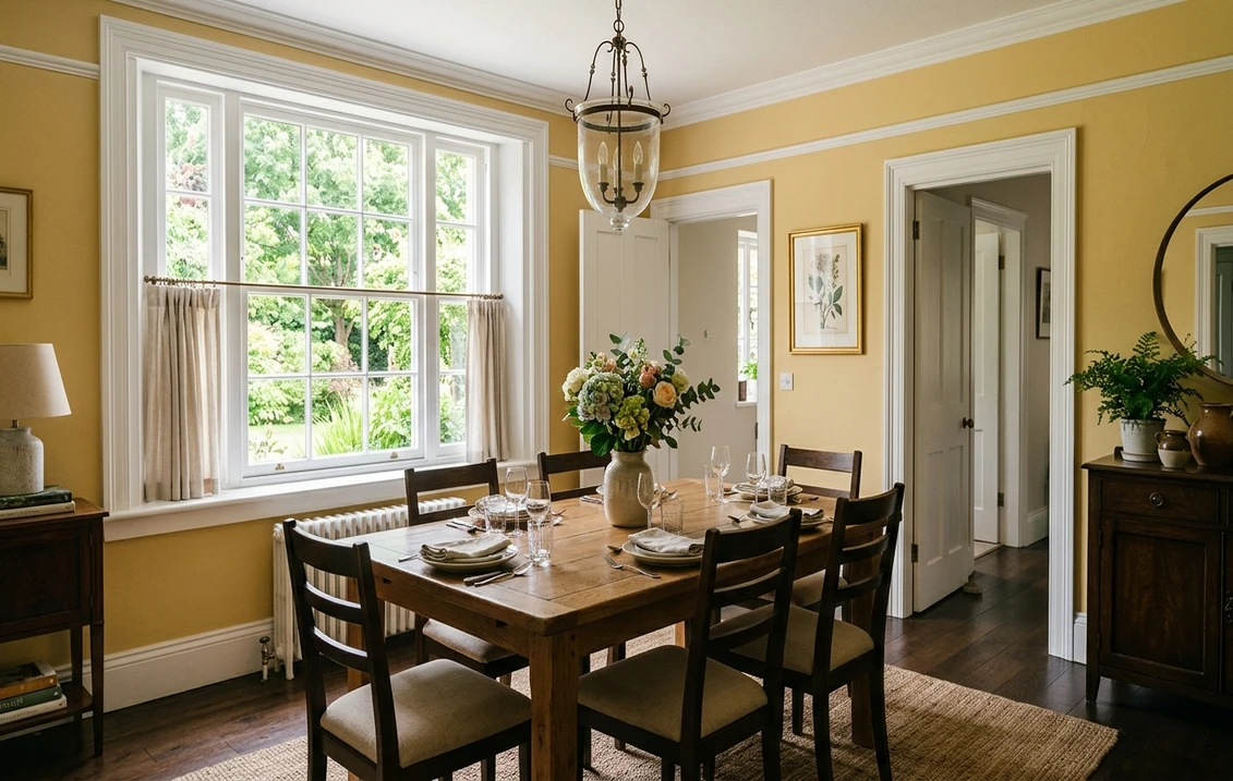
Formal and traditional dining rooms
Hawthorne Yellow is a longtime favorite for traditional dining rooms because candlelight and warm bulbs deepen it into a flattering amber that makes both food and faces look good. It has the period-correct warmth to suit colonial and Federal interiors without feeling stuffy. If a formal dining space is your project, see how a golden wall sits beside other rich picks in our guide to elegant dining room paint colors.
Sunny kitchens and breakfast nooks
In a south- or east-facing kitchen, Hawthorne Yellow turns the room into a permanent morning. It is gorgeous behind white or cream cabinets and over butcher-block counters, and it complements the natural warmth of brass and unlacquered hardware. Keep an eye on the morning-to-night swing here, since a kitchen that glows at breakfast can deepen substantially under warm evening bulbs.
Where to think twice
A small, dim, north-facing room with only cool LED light is where Hawthorne Yellow can tip from golden to mustard. There the green undertone dominates and a cheerful color can read slightly sour. If that room must stay yellow, switch to 2700K bulbs and add plenty of warm white in the trim and ceiling; otherwise consider a softer, paler buttercream that holds its warmth better in poor light. Hawthorne Yellow rewards sunshine, so do not bury it in a cave.
Trim, ceiling, and decor pairings
A saturated gold lives or dies on what frames it. Get the trim right and Hawthorne Yellow looks intentional and warm; get it wrong and it can read either harsh or, surprisingly, washed out next to the wrong white.
- Soft warm white trim (most balanced): BM White Dove (OC-17, LRV 85) is the designer default. Its gentle cream bias sits in the same warm family as the wall, so the trim frames the gold without the jarring cold-meets-warm clash you get from a bright blue-white. This is the safe, cohesive pick for most homes, and you can see exactly how it behaves in our Benjamin Moore White Dove OC-17 review.
- Crisp white trim (cleaner, more formal): a bright clean white sharpens the contrast and gives a tailored, period look that suits a formal dining room. Use it deliberately, because the extra contrast also makes the yellow read bolder.
- Avoid: a stark, blue-leaning white right next to Hawthorne Yellow. The cool-warm fight can make the gold look slightly dirty and the trim look icy, the opposite of the cozy effect you are after.
- Ceilings: a soft warm white keeps the glow unified. A flat builder white can look starkly blue over a golden wall, so favor a warm white above.
- Floors and decor: medium-to-dark wood, antique brass, navy, hunter green, and rich reds all flatter the gold and reinforce its traditional warmth. Cool gray textiles and chrome can fight the warmth, so use them sparingly.
For contrast and drama, a deep navy or forest green on a dining-room ceiling, a door, or a built-in reads handsome against the warm walls. Because HC-4 is a card-carrying Historical Color, it also sits naturally beside other period golds and creams. If you are working on a heritage or colonial home, our Williamsburg colonial paint palette shows how golds like this anchor an authentic historic scheme.
See walls, trim, and floor together in one preview. Free.
Hawthorne Yellow vs the colors people compare it with
Hawthorne Yellow is genuinely one of a kind in the Benjamin Moore deck, which is exactly why it has lasted: there is no true near-twin that does the same warm, dusty, historic gold. But shoppers almost always line it up against a few warm yellows to decide how bold to go. Here are the three comparisons that come up most:
- vs BM Concord Ivory (HC-12): the closest sibling in feel. Concord Ivory is a paler, creamier, lower-saturation version of the same warm-gold idea, with a higher LRV and a much gentler presence. Choose Concord Ivory when you want the warmth of Hawthorne Yellow dialed way down to a soft cream; choose Hawthorne Yellow when you actually want the room to read clearly golden, not just warm-white.
- vs BM Montgomery White (HC-33): Montgomery White is a soft, buttery off-white with just a hint of yellow. It is the safe pick for someone who likes the direction of Hawthorne Yellow but is nervous about commitment. Hawthorne Yellow is far more saturated and confident; Montgomery White is a yellow-tinged neutral by comparison.
- vs BM Philadelphia Cream (HC-30): Philadelphia Cream is a warmer, slightly more orange-gold cream that reads cozier and a touch deeper in dim light. Hawthorne Yellow is brighter and cleaner, with that green-gray ghost that keeps it from going orange. Pick Philadelphia Cream for a snug traditional glow, pick Hawthorne Yellow when you want sunshine.
Spelling note: hawthorne yellow, BM Hawthorne Yellow, Hawthorn Yellow, and Hawthorne Yellow Benjamin Moore all point to this same HC-4.
How to test Hawthorne Yellow before you commit
A 2-inch fan-deck chip is the number-one reason people pick a yellow that surprises them: it cannot show how a saturated color amplifies once it covers four walls, and it hides the green undertone that only appears in your real light. Two better methods:
- Paint a large swatch: roll a 12-by-12-inch sample (or a peel-and-stick sample) on two different walls and check it mid-morning, mid-afternoon, and at night under your normal bulbs. Watch specifically for how golden or mustard it goes in your coolest corner; that corner tells you the truth about the undertone.
- Preview it digitally first: upload a real photo of your room and apply Hawthorne Yellow (plus a paler and a creamier alternative such as Concord Ivory or Montgomery White) before you buy any samples, narrowing three contenders to the one worth painting. Budget context for the full repaint is in our interior house painting cost guide for 2026.
Preview Hawthorne Yellow against a paler and a creamier yellow, side by side. Free.
Frequently asked questions
Is Hawthorne Yellow warm or cool?
Hawthorne Yellow (HC-4) is a warm color with a dominant golden undertone and a faint green-gray softening pigment underneath. In bright south or west light the gold glows and the color reads rich and welcoming, but in cool, indirect, or north light the green undertone can surface and push it toward mustard or olive. It is firmly a warm golden yellow, never a cool or neutral shade.
What is the LRV of Hawthorne Yellow?
Hawthorne Yellow has a Light Reflectance Value of about 63 on the Benjamin Moore color data, with a hex approximation of #F1DA9C (RGB 241, 218, 156). That makes it a light-to-mid golden yellow: reflective enough to keep a room feeling bright and open, but saturated enough to read as a true, present gold rather than a barely-there cream.
What are the best rooms for Hawthorne Yellow?
Entry halls and stairwells, formal traditional dining rooms, and sunny south- or east-facing kitchens and breakfast nooks are where Hawthorne Yellow shines, because its golden warmth reads gracious and welcoming and deepens beautifully under warm bulbs and candlelight. It is least reliable in small, dim, north-facing rooms with cool LED light, where the green undertone can make it look slightly mustard.
What trim color goes with Hawthorne Yellow?
BM White Dove (OC-17) is the most balanced trim because its gentle cream bias sits in the same warm family as the wall, framing the gold without a cold-meets-warm clash. A crisp clean white works for a more formal, higher-contrast look. Avoid a stark blue-leaning white, which can make Hawthorne Yellow look dirty and the trim look icy.
Is Hawthorne Yellow a dated color?
No. Hawthorne Yellow is part of Benjamin Moore's Historical Color collection and has stayed in steady use for decades precisely because its dusty, green-softened gold reads timeless rather than trendy. It can look dated only when it is paired with heavy yellow-cream trim or used in poor cool light where the green undertone surfaces; with crisp white trim and good light it reads classic and current.
Preview BM Hawthorne Yellow on your actual walls under your own light before buying a single sample.
Disclaimer: Benjamin Moore, Hawthorne Yellow (HC-4), White Dove (OC-17), Concord Ivory (HC-12), Montgomery White (HC-33), and Philadelphia Cream (HC-30) are trademarks of Benjamin Moore & Co. FacadeColorizer is an independent paint visualization service and is not affiliated with, endorsed by, or sponsored by Benjamin Moore. Color reproduction on screens approximates the manufacturer's chip; always confirm with a manufacturer sample under your own light before purchase. Sources: Benjamin Moore HC-4 Hawthorne Yellow color data 2026, Benjamin Moore OC-17 White Dove color data 2026, The Spruce yellow-paint undertone coverage, designer field reports compiled by FacadeColorizer.
Trademarks mentioned (Sherwin-Williams, Benjamin Moore, Behr, Caparol, Brillux, Sto, Alpina, Valspar, PPG, Glidden, Dulux, Crown Trade, Sandtex, Farrow & Ball, Johnstone's, Leyland) are property of their respective owners. FacadeColorizer is independent and not affiliated with any of them. Nominative fair use under Lanham Act §1125.


