
I have brushed Benjamin Moore Dark Olive (2140-10) onto dining rooms, libraries, cabinet runs, and one very memorable powder room, and the reaction is always the same two-step. First glance: that looks black. Second glance, once a sample dries and the light moves: oh, it is green, and it is warmer than I expected. Dark Olive is one of those deep, drenched colors that hides its true character until it is on a real wall under real light. It is not a forest green and it is not a true brown. It sits in the narrow, sophisticated band where olive, khaki, and near-black overlap. The question every search asks is whether it reads too brown, too dark, or too military. The honest answer depends entirely on your light and what you put next to it. Here is exactly how it behaves indoors.
Quick orientation before the deep dive. Dark Olive 2140-10 has a published LRV of about 6 and a hex approximation of #4A4A38 (RGB 74, 74, 56). That is a very low LRV, firmly in the deep, dramatic, light-absorbing range alongside the darkest charcoals and near-blacks. The undertone is a muted yellow-green sitting over a brown-gray base, which is what gives it that earthy, organic, almost-camouflage character rather than a clean botanical green. This profile is one stop in our wider Benjamin Moore interior paint colors guide, and it pairs naturally with our roundup of colors that go with dark green for the moody pairings most people reach for once they commit to a deep wall.
Upload a photo of your actual room and preview BM Dark Olive 2140-10 under your own light in about 30 seconds, free.
Dark Olive at a glance: the numbers that matter
Before opinions, here are the verifiable specs straight from the Benjamin Moore color library. These are the values you can take to a paint counter:
| Spec | Dark Olive 2140-10 |
|---|---|
| Color number | 2140-10 (Color Preview collection) |
| LRV (Light Reflectance Value) | Approximately 6: a deep, light-absorbing dark color |
| Hex / RGB (approx.) | #4A4A38 / 74, 74, 56 |
| Color family | Deep earthy olive green |
| Primary undertone | Muted yellow-green over a brown-gray base |
| Best base / finish | Deep tint base; eggshell or matte on walls, satin or semi-gloss on cabinets and trim |
The takeaway from those numbers: at LRV 6 Dark Olive is a true deep color, not a mid-tone sage pretending to be dramatic. It absorbs light, swallows shadow, and visually pulls walls inward, which is precisely why it works so well in cocooning, drenched-room treatments and so poorly as a way to brighten a dim space. The yellow-green-over-brown undertone is the whole identity: it is what makes Dark Olive read organic and grounded rather than crisp and cold. Lean into that earthiness and it feels rich and tailored; ignore it and you may be surprised by how brown it goes in low light.
Is Dark Olive too brown? The undertone, decoded
Dark Olive is a warm green, not a cool one, and that is the single most important thing to understand before you buy a gallon. Anyone expecting a clean, leafy, botanical green will be thrown by how much brown and khaki sit underneath. That is not a defect, it is the entire point of the color. Here is what is happening below the surface.
The dominant note is a muted yellow-green, the dusty olive of an actual olive fruit or a field uniform. Riding under it is a brown-gray base that mutes the green and keeps it from ever reading bright or acidic. In warm, generous light the yellow-green steps forward and Dark Olive reads as a recognizable, handsome olive: earthy, a little military, clearly green. As the light drops, the green recedes and the brown-gray base takes over, so in shade, at night, or in a north room the same wall can read closer to a deep khaki-brown or even a soft near-black with just a whisper of green. It almost never goes blue or purple the way some deep greens do, which is part of its appeal: it stays warm and grounded across the day.
Watch out for one quirk specific to very dark colors like this. On a tiny fan-deck chip Dark Olive looks far more green and far less dark than it will on a finished wall, because a small chip is surrounded by white paper that tricks your eye into reading it lighter and more saturated. Once it covers a whole wall and starts absorbing the room's light, it deepens dramatically and the brown comes up. If you choose this color from a chip alone, assume the real wall will land noticeably darker and a half-step browner than the sample promised.
| Indoor light | How Dark Olive reads |
|---|---|
| South-facing (bright, warm) | Its richest, greenest read: a clear, handsome warm olive with depth |
| West-facing (warm afternoon) | Glows warm and golden-green in late sun, the brown softens |
| East-facing (cool after noon) | Green in the morning, then drifts toward khaki-brown by afternoon |
| North-facing (cool, indirect) | Darkest and brownest; reads as a deep khaki near-black, embrace the cocoon |
| Artificial light at night | Warm 2700K bulbs revive the green and warmth; cool 4000K bulbs flatten it toward gray-brown |
Sources: Benjamin Moore 2140-10 color data 2026; dark-paint undertone field reports compiled by FacadeColorizer.
Free AI visualizer. Test Dark Olive on your real walls before buying a single sample pot.
Best rooms for Dark Olive
Deep, warm, and enveloping, Dark Olive is at its best where you want a room to feel intimate, grounded, and a little bit of a retreat. This is not a color you spread across an open-plan great room to feel airy. It is a color you commit to for atmosphere. Here is where it consistently earns its keep:
Dining rooms and the drenched look
A dining room is the classic home for Dark Olive. Because dining rooms are often used at night under warm lamplight and candles, the low LRV becomes an asset: the walls recede into shadow, brass and wood glow, and the room feels like a tailored supper club. Painting walls, trim, and ceiling all in Dark Olive (the drenched or color-drench treatment) reads especially rich here. It sits comfortably among our picks for elegant dining room paint colors, where deep drenched walls are a recurring winner.
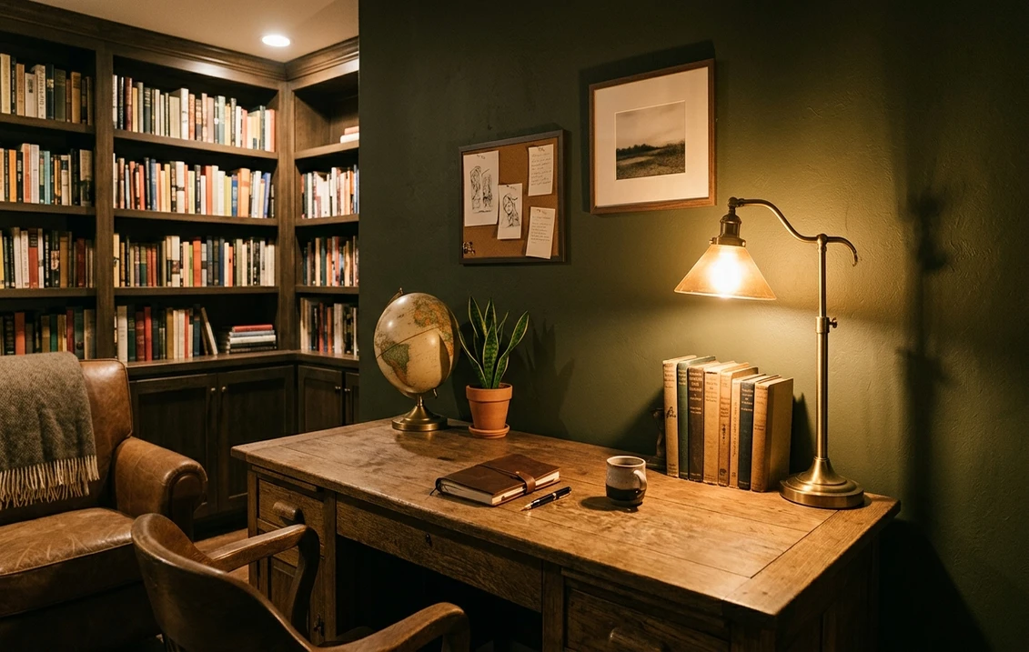
Libraries, studies, and home offices
The earthy, slightly masculine quality of Dark Olive makes a study or library feel established and serious without going corporate gray. Against leather, brass hardware, and built-in bookshelves it reads like an old club room. Because these spaces reward focus over brightness, the light-swallowing LRV works in your favor: the walls disappear and the books and lamps take center stage.
Kitchen cabinetry and islands
Olive cabinets are one of the strongest interior trends right now, and Dark Olive is a more grounded, less expected choice than the usual sage or forest. On lower cabinets or an island paired with warm wood uppers and brass, it reads custom and timeless rather than trendy. For the full landscape of green cabinet options and how a deep olive sits among them, see our guide to the best green kitchen cabinet paint colors.
Powder rooms and accent walls
A windowless powder room is the perfect low-stakes place to go bold. Dark Olive there feels like a jewel box, and because no one lingers, the lack of natural light stops being a problem and becomes the mood. As a single accent wall behind a bed or fireplace it adds depth without committing a whole room. For where it lands among other deep interior greens, our interior green paint shades guide is a useful map.
Where to think twice
A small, already-dim room that you want to feel bright and open is the wrong place for Dark Olive. At LRV 6 it will make a dark room darker, full stop. It can also feel heavy across every wall of a large, low-ceilinged space without enough light or contrast trim to relieve it. If your goal is brightness, this is the wrong color; if your goal is mood and enclosure, it is exactly right. Do not fight the color, choose the room that wants what it does.
Trim, ceiling, and decor pairings
A deep, warm color like Dark Olive lives or dies on contrast and on the warmth of what sits beside it. Get the trim and metals right and it looks intentional and rich; get them wrong and it can read flat or muddy.
- Soft warm trim (most balanced): BM White Dove (OC-17, LRV 85) is the designer default against deep greens. Its gentle cream bias picks up the olive's warmth and gives crisp, high-contrast relief without the cold snap of a stark white. This is the safe, cohesive pick for most rooms.
- Creamy trim (warmest, most organic): BM Swiss Coffee or a soft antique white leans into the khaki-brown base and makes the whole scheme feel earthy and timeless. Best for traditional and farmhouse spaces.
- Drenched (no contrast): for a dining room or powder room, painting trim and ceiling in Dark Olive itself removes contrast and maximizes the enveloping, modern effect. Use a satin trim and a matte wall so the sheen, not the color, defines the moldings.
- Avoid: a stark, cool, blue-white trim like a bright builder white. The warm-cool clash can make Dark Olive look dull and slightly dirty by comparison.
- Metals and decor: brass, aged bronze, and warm wood (walnut, oak) are the natural partners and amplify the warmth. Cream, terracotta, rust, and blush make warm, organic accents. Cool chrome and icy grays fight the undertone, so keep them minimal.
For a layered scheme, terracotta, ochre, cream, and warm rust are the standout companions; a deeper read on combining them lives in our roundup of colors that go with olive green. The principle is simple: keep the supporting cast warm, and Dark Olive rewards you.
See walls, trim, and floor together in one preview, free.
Dark Olive vs the deep greens people confuse it with
Almost every Dark Olive search ends in a side-by-side with another deep green. The two that matter most, plus one more, are below. The distinction is almost entirely about warmth and how much brown sits in the base.
- vs BM Hunter Green (2041-10): the most common mix-up. Hunter Green is a truer, cleaner forest green: cooler, more saturated, and noticeably less brown, with that classic crayon-green identity. Dark Olive is warmer, dustier, and far more khaki, with the brown-gray base that Hunter Green lacks. Choose Hunter Green when you want a recognizable, traditional dark green; choose Dark Olive when you want something earthier, more muted, and more organic that does not shout green.
- vs BM Essex Green: Essex Green is a near-black, blue-leaning green famous on historic shutters and doors. It is deeper, colder, and reads almost black with a cool cast. Dark Olive is warmer and a touch lighter, holding visible olive and brown rather than vanishing into black. Pick Essex Green for a crisp, cool, almost-black classic; pick Dark Olive for a warm, visibly olive depth.
- vs a mid-tone olive like BM Tate Olive (HC-112): Tate Olive is far lighter and softer, a livable everyday olive for full rooms. Dark Olive is the dramatic, low-LRV cousin meant for moody, drenched, or accent treatments. They are not interchangeable: one brightens, one envelops.
Spelling and search note: dark olive benjamin moore, BM Dark Olive 2140-10, and Benjamin Moore Dark Olive green all point to this same 2140-10.
How to test Dark Olive before you commit
A small fan-deck chip is the number-one reason people pick a deep color that disappoints: it makes Dark Olive look lighter and greener than it ever will on a full wall, and it cannot show how much the brown comes up once the color starts absorbing your room's light. Two better methods:
- Paint a large swatch: roll a generous 2-by-2-foot sample (or a peel-and-stick sample) on two different walls and check it mid-morning, mid-afternoon, and at night under your normal bulbs. Watch specifically for how brown and how dark it goes in your dimmest corner: with a low-LRV color, that corner is the real test, not the bright wall.
- Preview it digitally first: upload a real photo of your room and apply Dark Olive (plus a cooler alternative such as Hunter Green and a lighter olive) before you buy any samples, narrowing three contenders down to the one worth painting. Budget context for the full repaint, including the extra coats deep colors usually need, is in our interior house painting cost guide for 2026.
Preview Dark Olive against a cooler and a lighter green, side by side, free.
Frequently asked questions
Is Dark Olive 2140-10 warm or cool?
Dark Olive (2140-10) is a warm green. Its undertone is a muted yellow-green sitting over a brown-gray base, which gives it an earthy, khaki, almost-military character rather than a clean cool forest green. In bright warm light the green steps forward; in shade, at night, or in north light the brown-gray base takes over and it can read closer to a deep khaki-brown. It rarely goes blue or purple, so it stays warm and grounded across the day.
What is the LRV of Dark Olive 2140-10?
Dark Olive has a Light Reflectance Value of about 6 on the Benjamin Moore color data, with a hex approximation of #4A4A38 (RGB 74, 74, 56). That is a very low LRV, placing it firmly in the deep, light-absorbing range alongside the darkest charcoals and near-blacks. It will make a room feel enveloping and intimate, not bright, so it suits moody, drenched, and accent treatments rather than spaces you want to open up.
What are the best rooms for Dark Olive?
Dining rooms, libraries, studies and home offices, kitchen cabinetry and islands, powder rooms, and single accent walls are where Dark Olive shines, because its low LRV and warm earthy undertone create an intimate, tailored, retreat-like mood. It is least suited to small dim rooms you want to feel bright and open, where its light-absorbing depth will only make the space feel darker. Choose the room that wants enclosure, not brightness.
What trim color goes with Dark Olive?
BM White Dove (OC-17) is the most balanced trim because its gentle cream bias gives crisp, high-contrast relief while picking up the olive's warmth, avoiding the cold snap of a stark white. A creamy antique white leans further into the khaki base for a traditional look, while painting the trim and ceiling in Dark Olive itself creates a modern drenched effect. Avoid a stark blue-white builder trim, which can make Dark Olive look dull and slightly dirty.
What is the difference between Dark Olive and Hunter Green?
Hunter Green (2041-10) is a truer, cleaner forest green: cooler, more saturated, and noticeably less brown, with a classic crayon-green identity. Dark Olive (2140-10) is warmer, dustier, and far more khaki, thanks to a brown-gray base that Hunter Green lacks. Choose Hunter Green when you want a recognizable traditional dark green, and Dark Olive when you want something earthier, more muted, and more organic that does not read as obviously green.
Preview BM Dark Olive 2140-10 on your actual walls under your own light before buying a single sample.
Disclaimer: Benjamin Moore, Dark Olive (2140-10), Hunter Green (2041-10), Essex Green, Tate Olive (HC-112), White Dove (OC-17), and Swiss Coffee are trademarks of Benjamin Moore & Co. FacadeColorizer is an independent paint visualization service and is not affiliated with, endorsed by, or sponsored by Benjamin Moore. Color reproduction on screens approximates the manufacturer's chip; always confirm with a manufacturer sample under your own light before purchase. Sources: Benjamin Moore 2140-10 Dark Olive color data 2026, Benjamin Moore 2041-10 Hunter Green and Essex Green color data 2026, dark-paint undertone field reports compiled by FacadeColorizer.
Trademarks mentioned (Sherwin-Williams, Benjamin Moore, Behr, Caparol, Brillux, Sto, Alpina, Valspar, PPG, Glidden, Dulux, Crown Trade, Sandtex, Farrow & Ball, Johnstone's, Leyland) are property of their respective owners. FacadeColorizer is independent and not affiliated with any of them. Nominative fair use under Lanham Act §1125.


