
Benjamin Moore Sea Pearl (OC-19) is one of those off-whites that quietly does a lot of work without ever announcing itself. It is not a stark white, not a true greige, and not a cream. It sits in that hard-to-name space between, a soft, warm, pale off-white with the faintest cool whisper underneath that keeps it from ever turning buttery. Homeowners search for it because a designer specified it, or because they swatched a wall of bright whites and Sea Pearl was the one that finally felt calm instead of clinical. The question that drives every search is the same: is it warm enough, or too warm, and what undertone is hiding in it. The honest answer depends on your light and your trim. Here is exactly how Sea Pearl behaves on real interior walls.
Quick orientation first. Sea Pearl OC-19 carries a published LRV of about 75 and a hex approximation of #E6E0D5 (RGB 230, 224, 213). That places it firmly in soft off-white territory: high enough to keep a room bright and open, but well short of a bright white, so it always reads as a finished, warm wall color rather than a primer. The undertone is the interesting part: a gentle warm body with a soft green-gray ghost that surfaces in shade. That green-gray is what stops Sea Pearl from going yellow or peachy the way many warm whites do. This profile is one stop in our wider Benjamin Moore interior paint colors guide, and it sits comfortably alongside the softer picks in our off-white paint colors guide.
Upload a photo of your actual room and preview BM Sea Pearl under your own light in about 30 seconds, free.
Sea Pearl at a glance: the numbers that matter
Before opinions, here are the verifiable specs straight from the Benjamin Moore color library. These are the values you can take to a paint counter:
| Spec | Sea Pearl OC-19 |
|---|---|
| Color number | OC-19 (Off-White collection) |
| LRV (Light Reflectance Value) | Approximately 75: soft off-white, stays bright but never stark |
| Hex / RGB (approx.) | #E6E0D5 / 230, 224, 213 |
| Color family | Warm pale off-white |
| Primary undertone | Soft warm body with a green-gray ghost in shade |
| Best base / finish | White / light tint base; eggshell or matte on walls, satin on trim |
The takeaway from those numbers: Sea Pearl is a true off-white, not a white-white and not a greige in disguise. At LRV 75 it bounces a lot of light, so a small or low-light room still feels open, yet it stops just short of the glare you get from a high-LRV bright white. The undertone is the whole identity: a soft warmth that reads cozy, balanced by a quiet green-gray that keeps it sophisticated rather than yellow. Understand that balance and Sea Pearl is one of the most livable off-whites Benjamin Moore makes.
Is Sea Pearl warm or cool? The undertone, decoded
Sea Pearl is a warm off-white, but it is a restrained warmth, and that restraint is the entire reason designers reach for it. Anyone calling it a true neutral or a cool white is misreading it; equally, anyone bracing for a buttery cream will be surprised by how clean it stays. Here is what is actually happening underneath the surface.
The body of the color is warm, a pale putty warmth rather than a yellow or peach one. Riding underneath is a soft green-gray ghost, the pigment that pulls Sea Pearl back from cream toward something more grounded and adult. In bright, warm light the warmth dominates and the wall reads soft, creamy, and inviting, the off-white equivalent of a held breath. In cool or indirect light the green-gray ghost steps forward, the warmth recedes, and Sea Pearl reads grayer and quieter, almost like a very pale griege. This is why the same gallon can look creamy in a sunny kitchen and soft taupe-gray in a north bedroom: both are correct, the light is just pulling different threads.
Watch out for one quirk that trips up a lot of shoppers. Sea Pearl can look almost flat-white on a tiny fan-deck chip, which leads people to assume it is a plain bright white. On a full wall, especially next to a crisp white trim, the warmth and the green-gray depth show up clearly and the contrast surprises them. Always judge Sea Pearl as a rolled wall, never as a two-inch chip held in your hand.
| Indoor light | How Sea Pearl reads |
|---|---|
| South-facing (bright, warm) | Soft, creamy, and inviting; its warmest and most flattering read |
| West-facing (warm afternoon) | Glows gently warm in late sun; can edge toward soft cream at golden hour |
| East-facing (cool after noon) | Fresh and balanced in morning, then settles grayer as the green-gray ghost shows in afternoon |
| North-facing (cool, indirect) | At its quietest and grayest; reads like a pale warm griege, not a white |
| Artificial light at night | Warm 2700K bulbs deepen the cream; cool 4000K bulbs pull out the green-gray and flatten the warmth |
Sources: Benjamin Moore OC-19 color data 2026; off-white undertone field reports compiled by FacadeColorizer.
Free AI visualizer. Test Sea Pearl on your real walls before buying a single sample pot.
Best rooms for Sea Pearl
Soft, warm, and forgiving, Sea Pearl is the off-white you reach for when you want a room to feel calm and finished rather than bright and busy. It is genuinely a whole-home candidate because the warmth keeps it cozy while the green-gray keeps it from feeling dated. Here is where it consistently earns its keep:
Living rooms and open-plan main floors
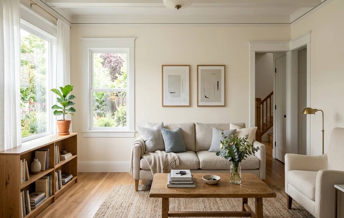
This is Sea Pearl's sweet spot. In a living room with decent light it reads as a soft, warm backdrop that flatters wood tones, brass, and natural fabrics without competing with them. Because it shifts gently with the light, an open-plan space painted entirely in Sea Pearl feels cohesive but never monotonous. If you want to see how it sits among other soft picks, our white living room paint ideas for 2026 is a useful map.
Bedrooms aiming for warm and restful
In a bedroom the gentle warmth reads soothing and enveloping, the kind of color that makes a room feel like a soft place to land. It pairs beautifully with linen, oatmeal, and pale wood, and it never gets the cold-hotel feeling that a bright white can bring at night. If a restful bedroom is your project, our guide to calming master bedroom paint colors shows how warm off-whites sit next to other quiet picks.
Kitchens and cabinetry
Sea Pearl is a favorite for cabinets that want to read soft and warm rather than stark. On uppers and islands it gives that lived-in, not-quite-white look that pairs naturally with warm metals and butcher block, while staying lighter and cleaner than a true cream. For more on coordinating it with backsplash and counters, see our white kitchen paint ideas for 2026.
Where to think twice
A small, dim, north-facing room with only cool LED light is where Sea Pearl can lose its charm. There the green-gray ghost dominates, the warmth drains away, and a color you picked for coziness can read flat and slightly dull. If that room needs warmth, lean into 2700K bulbs or pick a frankly creamier white instead. Sea Pearl gives its best in rooms with at least some natural light.
Trim, ceiling, and decor pairings
A soft off-white like Sea Pearl lives or dies on what sits next to it. Choose the trim well and Sea Pearl looks intentional and layered; choose it badly and the wall can look like it needs a second coat.
- Crisp white trim (cleanest contrast): BM White Dove (OC-17, LRV 85) is the classic pairing. It is bright and soft enough to read as clean white but warm enough to harmonize with Sea Pearl, giving a gentle, sophisticated step-up without a jarring line. This is the safe, cohesive pick for most homes, and its details live in our White Dove OC-17 review.
- Same color, different sheen (seamless look): running Sea Pearl on both walls and trim, eggshell on walls and satin on trim, gives a soft monochrome envelope that feels expensive and calm. Best for serene bedrooms and reading rooms.
- Avoid: a starkly cool, blue-white trim like a true bright white next to Sea Pearl. The cool-warm clash can make the Sea Pearl walls look dingy or yellow by comparison.
- Ceilings: a soft white (often the trim color) keeps the room bright. Sea Pearl itself can go on the ceiling in a small space for that cocooning, no-line effect.
- Floors and decor: warm oak, rattan, brass, linen, and unlacquered hardware all flatter Sea Pearl and reinforce its soft, organic warmth. Very cool gray flooring can fight the warm body; balance it with warm textiles.
For contrast and a bit of grounding, a soft black or deep olive on a door, an island, or built-ins reads tailored and modern against the warm off-white walls. If you want to step up to a slightly deeper warm neutral as a sibling color, its closest greige relative is covered in our Benjamin Moore Pale Oak OC-20 review.
See walls, trim, and floor together in one preview, free.
Sea Pearl vs the off-whites people confuse it with
Almost every Sea Pearl search ends in a side-by-side with another Benjamin Moore off-white. These three are the ones that matter most indoors, and getting the difference straight saves you a wasted sample pot:
- vs BM Bone White (OC-15): the closest call and the one people mix up most. Bone White is noticeably warmer and reads more clearly cream, with a soft yellow-beige body and very little of Sea Pearl's green-gray. Sea Pearl is the cooler, more balanced of the two: it stays warm but never tips toward yellow. Choose Bone White when you want unmistakable cozy cream; choose Sea Pearl when you want warmth that stays clean and a touch more modern.
- vs BM Maritime White (OC-5): Maritime White is brighter and crisper, sitting closer to a true soft white with a cleaner, slightly cooler feel. Sea Pearl is softer, warmer, and a step lower in LRV, so it reads more like a finished color and less like a white. Pick Maritime White when you want walls to read white; pick Sea Pearl when you want them to read as a soft, warm off-white that has a little color of its own.
- vs BM Pale Oak (OC-20): Pale Oak is the next step down, an ultra-light warm greige rather than an off-white. It carries more gray and more visible color, so it reads as a pale neutral wall, while Sea Pearl reads as a warm white. Use Pale Oak when you want a subtle wall color; use Sea Pearl when you want something that still passes as a white at a glance.
Spelling note: sea pearl benjamin moore, BM Sea Pearl, and Benjamin Moore Sea Pearl OC-19 all point to this same off-white.
How to test Sea Pearl before you commit
A tiny fan-deck chip is the number-one reason people misjudge a soft off-white: it flattens Sea Pearl into a generic white and hides both the warmth and the green-gray that show up at full scale. Two better methods:
- Paint a large swatch: roll a 12-by-12-inch sample (or a peel-and-stick sample) on two different walls and check it mid-morning, mid-afternoon, and at night under your normal bulbs. Watch specifically for how gray it goes in your coolest corner and how creamy it goes in your sunniest spot; those two extremes tell you the whole story.
- Preview it digitally first: upload a real photo of your room and apply Sea Pearl, plus a creamier and a crisper alternative such as Bone White and Maritime White, before you buy any samples, narrowing three contenders to the one worth painting. Pricing context for the full repaint is in our interior house painting cost guide for 2026.
Preview Sea Pearl against a creamier and a crisper off-white, side by side, free.
Frequently asked questions
Is Sea Pearl warm or cool?
Sea Pearl (OC-19) is a warm off-white, but a restrained one. Its body is a soft, pale putty warmth rather than a yellow or peach cream, and it carries a faint green-gray ghost that surfaces in shade. In bright or south light the warmth dominates and it reads creamy and inviting; in cool or north light the green-gray steps forward and it reads grayer and quieter. It is firmly a warm color, just not a buttery one.
What is the LRV of Sea Pearl?
Sea Pearl has a Light Reflectance Value of about 75 on the Benjamin Moore color data, with a hex approximation of #E6E0D5 (RGB 230, 224, 213). That makes it a soft off-white: bright enough to keep a small or low-light room feeling open and airy, but short of a true bright white, so it always reads as a finished warm wall color rather than a stark primer white.
What are the best rooms for Sea Pearl?
Living rooms, open-plan main floors, warm restful bedrooms, and kitchen cabinetry are where Sea Pearl shines, because its soft warmth reads cozy and finished while flattering wood, brass, and natural fabrics. It is least reliable in small, windowless, or north-facing rooms with only cool LED light, where the green-gray ghost dominates and the warmth drains out; 2700K bulbs or a frankly creamier white help there.
What trim color goes with Sea Pearl?
BM White Dove (OC-17) is the most balanced trim because it reads as a clean soft white but stays warm enough to harmonize with Sea Pearl, giving a gentle step-up without a jarring line. Running Sea Pearl on both walls and trim in different sheens gives a seamless monochrome envelope. Avoid a starkly cool blue-white trim, which can make Sea Pearl walls look dingy or yellow by comparison.
What is the difference between Sea Pearl, Bone White and Maritime White?
Bone White (OC-15) is warmer and more clearly cream, with a yellow-beige body. Maritime White (OC-5) is brighter and crisper, closer to a true soft white. Sea Pearl (OC-19) sits between them: warm like Bone White but cleaner and less yellow thanks to its green-gray ghost, and softer and lower in LRV than Maritime White, so it reads as a warm off-white rather than a white.
Preview BM Sea Pearl on your actual walls under your own light before buying a single sample.
Disclaimer: Benjamin Moore, Sea Pearl (OC-19), Bone White (OC-15), Maritime White (OC-5), Pale Oak (OC-20), and White Dove (OC-17) are trademarks of Benjamin Moore & Co. FacadeColorizer is an independent paint visualization service and is not affiliated with, endorsed by, or sponsored by Benjamin Moore. Color reproduction on screens approximates the manufacturer's chip; always confirm with a manufacturer sample under your own light before purchase. Sources: Benjamin Moore OC-19 Sea Pearl color data 2026, Benjamin Moore OC-15 Bone White, OC-5 Maritime White, OC-20 Pale Oak and OC-17 White Dove color data 2026, off-white undertone field reports compiled by FacadeColorizer.
Trademarks mentioned (Sherwin-Williams, Benjamin Moore, Behr, Caparol, Brillux, Sto, Alpina, Valspar, PPG, Glidden, Dulux, Crown Trade, Sandtex, Farrow & Ball, Johnstone's, Leyland) are property of their respective owners. FacadeColorizer is independent and not affiliated with any of them. Nominative fair use under Lanham Act §1125.


