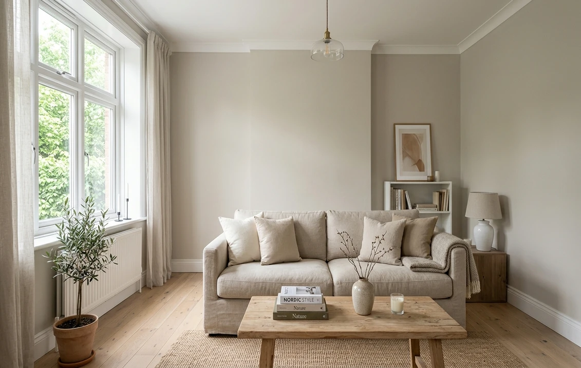
Two chips, side by side on the wall. White Dove looks a touch too white for the room you are picturing, and Edgecomb Gray looks a half-step too dark. Live in the gap between those two and you land on Benjamin Moore Pale Oak OC-20, an ultra-light warm greige from the Off-White (OC) Collection that has quietly become one of the most-painted neutrals in American homes. Indoors, its appeal is simple. It gives a room the softness of a beige and the calm of a gray without committing fully to either, and it does it at an LRV high enough to keep small rooms feeling open.
This is a walls-and-rooms profile: how it reads under real interior light, the undertones that surface in shade, the rooms where it earns its keep, the trim and wood tones that flatter it, and how it compares to its nearest Benjamin Moore neighbors. Weighing OC-20 for the outside of the house instead? That is a different decision with different rules, covered in our dedicated Pale Oak OC-20 exterior guide for siding and facade. This page owns the indoor side.
Upload a photo of your room and preview Pale Oak OC-20 under your actual light in about 30 seconds. No signup.
Pale Oak OC-20 at a glance
The name carries the brief: "Pale" signals the high reflectance for a greige, and "Oak" the soft warm tan-gray cast that keeps it from feeling like a flat builder white. Here is the technical reading that predicts how the wall behaves.
| Official name | Pale Oak |
| Benjamin Moore code | OC-20 (Off-White Collection) |
| Color family | Warm greige (beige base, gray balance) |
| LRV (Light Reflectance Value) | 68.64 |
| Approximate HEX | #DDD9CE |
| Undertones | Soft taupe-gray, faint warmth, no pink pull |
| Reads as | Soft white in bright light, gentle greige in shade |
Try it on your house
No photo? Try a sample
Source: Benjamin Moore OC-20 Pale Oak technical color data. HEX is a screen approximation, not a substitute for a sample.
Watch one figure above the others: the LRV of 68.64. That places Pale Oak about thirteen points brighter than Revere Pewter HC-172 (LRV 55.51) and roughly fifteen to seventeen points below White Dove OC-17 (LRV 85.38). Indoors, that high-60s reflectance is the sweet spot for people who want a light, airy neutral that still reads as a deliberate color on the wall rather than disappearing into the trim.
The undertones, and when they show up
Pale Oak is built on a beige base with enough gray mixed in to neutralize it, which gives it two faces. In strong, warm light the beige leads and the wall looks like a creamy soft white; in weak or cool light the gray steps forward and it settles into a quiet greige. It does this without the off-undertones that plague many greiges: essentially no pink or violet pull, with only the faintest green in the coolest light.
That stability lets it sit next to a wide range of finishes: it will not fight a cool gray sofa by going purple, nor clash with warm oak by going yellow. The one honest caution: because the warmth is so subtle, it can drift toward "almost white" on a sunny south wall, so check your shadier rooms before committing the whole house.
How interior light direction changes the read
- North-facing rooms: the coolest, most even light. It leans into its gray side and reads as a soft, slightly cool greige, staying clean where many warmer greiges turn muddy. One of the safer ultra-light picks for a north room.
- South-facing rooms: bright, warm, sun-flooded. The beige base dominates and it can read close to a warm white through midday, with less obvious greige than the chip suggests.
- East-facing rooms: warm at sunrise, neutral by afternoon. It shifts from creamy early to balanced greige later, a flattering arc for bedrooms and breakfast nooks.
- West-facing rooms: cool early, golden at sunset. The wall reads greige in the morning and warms in late-day sun, glowing softly without going orange.
Artificial light matters just as much after dark: a warm 2700K bulb pushes it toward cream while a neutral 3500K to 4000K bulb holds the greige, so factor in your evening lamps. For how neutrals sort into warm, cool, and balanced families, our interior paint color families guide is the companion explainer.
Free AI visualizer. Upload your real room photo to see OC-20 with your windows and lamps before buying a sample.
Best rooms for Pale Oak
This is not a statement color for one hero room. It is light, low-drama, and undertone-stable, the kind of whole-house neutral that quietly adapts from space to space. A few rooms where it really earns its keep:
- Living rooms and open-plan main floors: the high LRV keeps a great room bright, the soft warmth keeps a large space calm rather than cold, and it flows cleanly between rooms where a sterile white can feel harsh.
- Bedrooms: soft enough to feel cocooning yet light enough that the room never closes in, and a quiet backdrop for both white and wood-tone bedding.
- Kitchens and cabinetry: it doubles as cabinet and wall color, a warm, lived-in alternative to bright white that still lets white or wood cabinets read crisp.
- Hallways and entries: transitional spaces with mixed or borrowed light benefit from its stability; it will not swing between a sunny entry and a dim hall.
- Bathrooms: in a window-lit bath the warm greige softens tile and chrome; under warm bulbs in a windowless bath, expect it closer to cream.
Where it is a weaker choice: a dramatic, moody room that wants depth. For that, a saturated navy like Hale Navy HC-154 does the job, with Pale Oak as the breathing-room neutral on adjacent walls or trim. To plan which wall carries the color, see our best interior paint colors of 2026 roundup.
Trim, ceilings, and decor that flatter it
Pale Oak forgives almost any companion. A handful of pairings, though, take it from fine to genuinely good:
- Trim: Chantilly Lace OC-65 (LRV ~90) gives a crisp white edge that lets the walls read as a true greige by contrast. For a softer, blended look, White Dove OC-17 on the trim keeps everything in the warm family and avoids any cool snap.
- Ceiling: a flat ceiling white, or the color cut to 50 percent overhead for a seamless, enveloping bedroom. Avoid a bright, very cool ceiling white in a north room, which can make the walls look grayer than you want.
- Cabinets and built-ins: it pairs with both white millwork and natural wood; for a tonal kitchen, walls with slightly deeper greige cabinetry read rich and current.
- Wood floors: light to medium oak is the ideal match and bounces warm light back onto the walls. Walnut and dark woods make a high-contrast pairing; gray-washed floors tip the room cooler.
- Metals and textiles: brass, bronze, and warm woods amplify the cozy side; black hardware gives a clean, modern edge. Linen, jute, and cream upholstery sit comfortably against it.
Sheen pulls its weight here too. Go matte or flat and the undertone shift softens, and imperfect drywall gets a pass. Step up to eggshell and that faint extra sheen can amplify whichever cast the room is already throwing. Most designers land on eggshell for living areas and a scrubbable satin for kitchens and baths.
Pale Oak vs its closest Benjamin Moore neighbors
Rarely does Pale Oak get picked in a vacuum. For most people the real choice comes down to it versus one or two neighboring BM neutrals, and reflectance is the fastest way to tell them apart.
| Color | LRV | How it differs from Pale Oak indoors |
|---|---|---|
| Pale Oak OC-20 | 68.64 | The reference: ultra-light warm greige, soft white in sun, gentle greige in shade |
| White Dove OC-17 | 85.38 | Brighter, reads as a warm white; pick it when Pale Oak feels too gray |
| Edgecomb Gray HC-173 | 63.09 | A half-step deeper and a hair warmer; more obviously greige |
| Classic Gray OC-23 | 73.50 | Lighter and cooler, faint purple-gray base; airier but less warm |
| Revere Pewter HC-172 | 55.51 | A deeper greige with green-gray depth; a real color, not an off-white |
The everyday confusion is Pale Oak versus Edgecomb Gray HC-173: about five LRV points apart, with Edgecomb the safer call when you want the greige unmistakable and Pale Oak the pick for maximum brightness with a whisper of warmth; for the room-by-room breakdown, see our Pale Oak vs Edgecomb Gray side-by-side verdict. If you are torn on the cooler side instead, our Classic Gray vs Pale Oak comparison settles which of the two off-whites suits your light. Cross-shopping the other major brand? Our Sherwin-Williams vs Benjamin Moore interior comparison maps the closest matches, and the cluster hub, our Benjamin Moore interior paint colors guide, lists the full lineup of BM neutrals.
How to test Pale Oak before you commit
A fan-deck chip is the wrong tool for a greige this subtle: a 3-inch chip reads lighter and warmer than a rolled wall and cannot show the gray-to-cream swing that defines it. The reliable method is a large peel-and-stick sample or a coat on poster board, taped to the wall and watched at three moments: mid-morning, mid-afternoon, and after dark under your normal bulbs. Read it on the wall away from the window, where the undertone is most honest.
The faster, no-mess option is to preview it digitally first. Upload a photo of the real room and apply it (with Edgecomb Gray and White Dove) to compare them in your own light; for budgeting the rest of the job, see our interior house painting cost guide. A digital preview will not replace a physical swatch for final sign-off, but it eliminates the colors that were never going to work.
Preview OC-20, Edgecomb Gray, and White Dove side by side on your actual room, free.
Frequently asked questions
Is Benjamin Moore Pale Oak warm or cool?
It is a warm greige, but only mildly so: a beige base balanced by enough gray to keep it neutral, with no pink pull. In bright or warm light the beige leads and the wall reads as a soft warm white; in cool or dim light the gray surfaces and it settles into a gentle greige. It sits just on the warm side of neutral, which is why it pairs with both warm woods and cool grays without clashing.
What is the LRV of Pale Oak OC-20?
Pale Oak has a Light Reflectance Value of 68.64, high for a greige, which is why it reads almost like an off-white in sunny rooms. For context, that is about thirteen points brighter than Revere Pewter HC-172 (LRV 55.51) and roughly sixteen points below White Dove OC-17 (LRV 85.38). The high-60s reflectance keeps small or north-facing rooms feeling open while still reading as a real color.
What is the difference between Pale Oak and Edgecomb Gray?
They are close neighbors about five LRV points apart. Edgecomb Gray HC-173 is a half-step deeper and a touch warmer, so it reads as a clear greige across most light, while Pale Oak is a notch lighter and can slip toward soft white in bright rooms. Choose Edgecomb when you want the greige obvious, Pale Oak when you want maximum brightness with just a hint of warmth.
What trim color goes with Pale Oak?
For a crisp look, pair Pale Oak walls with a bright white trim like Benjamin Moore Chantilly Lace OC-65 (LRV around 90), which makes the walls read as a true greige by contrast. For a softer, blended look that stays in the warm family, use White Dove OC-17 on the trim. Avoid a heavy, very cool white in a north-facing room, since the sharp contrast can push the walls grayer than intended.
See OC-20 and its closest Benjamin Moore neighbors on your actual walls before buying a sample.
Disclaimer: Benjamin Moore, Pale Oak, and OC-20 are trademarks of Benjamin Moore & Co. Sherwin-Williams and Behr are trademarks of their respective owners. FacadeColorizer is an independent paint visualization service and is not affiliated with, endorsed by, or sponsored by Benjamin Moore, Sherwin-Williams, or Behr. Color reproduction on screens approximates the manufacturer's chip; always confirm with a physical sample before purchase. Sources: Benjamin Moore OC-20 Pale Oak, OC-17 White Dove, OC-23 Classic Gray, HC-173 Edgecomb Gray, and HC-172 Revere Pewter color data; The Spruce and designer undertone references.
Trademarks mentioned (Sherwin-Williams, Benjamin Moore, Behr, Caparol, Brillux, Sto, Alpina, Valspar, PPG, Glidden, Dulux, Crown Trade, Sandtex, Farrow & Ball, Johnstone's, Leyland) are property of their respective owners. FacadeColorizer is independent and not affiliated with any of them. Nominative fair use under Lanham Act §1125.