Most people assume a pure bright white can never also be a designer favorite, that the brightest whites all read too cold and clinical to win any beauty contest. Benjamin Moore Simply White (OC-117) is the exception that proves them wrong: it is the only pure white the brand has ever crowned Color of the Year, back in 2016, and a decade on it still lands on most painters' short list in the United States. The reason is practical. With a Light Reflectance Value of 91.7, it is one of the brightest whites Benjamin Moore sells, yet it never tips into that cold, hospital-bright feeling that scares homeowners off the brightest whites. What the chip never warns you about is the soft yellow undertone. It can read crisp and clean in one room and faintly buttery in the next.
This profile breaks down exactly what gives Simply White its character: the undertone, the LRV, the rooms where it shines, how it behaves under different light, and the trim, cabinet, and decor pairings that keep it looking intentional rather than builder-grade. If you are still deciding between the popular Benjamin Moore whites, start with the Benjamin Moore interior paint colors guide for the full lineup, then come back here for the deep dive on OC-117.
Upload a photo of your room and preview Benjamin Moore Simply White under your actual light in about 30 seconds, free.
Simply White OC-117 at a glance
Simply White sits in Benjamin Moore's Off-White Collection (that is what the OC prefix stands for), even though most people would call it a true white on sight. Here are the published numbers and where they place it:
- Color code: OC-117.
- LRV (Light Reflectance Value): 91.7 on Benjamin Moore's color data. That is high enough to bounce light like a bright white and brighten a dim room, but not the near-maximum reflectance of a stark blue-white.
- Undertone: warm, with a subtle yellow base. There is no gray, no pink, and no blue in the mix, which is what keeps it feeling clean rather than muddy.
- Family: warm white. Brighter than a creamy white like Benjamin Moore White Dove, warmer than a neutral-cool white like Chantilly Lace.
- Common uses: walls, trim, ceilings, kitchen cabinets, and whole-house schemes where the goal is bright and airy without going sterile.
The single most useful thing to know about Simply White is that its brightness and its warmth pull in opposite directions depending on the light. In a sun-filled room the high LRV dominates and it reads crisp and clean. In a low-light room or under warm bulbs, the yellow base steps forward and it can look soft, almost cream. That is why the same paint earns both "perfect bright white" and "too yellow" reviews from different homeowners.
How light changes Simply White
No color on a wall is more light-sensitive than white. It has no strong pigment of its own to anchor it, so whatever the light in the room is doing, the white amplifies. Orientation drives most of that, and here is how Simply White tends to shift from one exposure to the next in the Northern Hemisphere:
- South-facing rooms: warm, steady daylight all day. Simply White reads bright and clean, with just a hint of warmth. This is its best-case orientation and the most flattering.
- West-facing rooms: cool in the morning, very warm at sunset. The yellow undertone can glow gold in late-afternoon light, which is lovely in a living room but worth previewing if you want a crisp white.
- East-facing rooms: bright and slightly warm in the morning, flatter by afternoon. Simply White holds its clean character well here.
- North-facing rooms: cool, indirect blue light, no direct sun. The cool cast tones down the warmth, so Simply White reads cleaner and a touch crisper. Unlike a gray-based white, it does not go dingy in north light, which makes it a safer bright-white choice for cool rooms than many off-whites.
Artificial light matters just as much. Warm 2700K bulbs push the yellow undertone forward and make Simply White feel cozy. Cooler 3500K to 4000K bulbs keep it crisp, so for the cleanest white in a dim room, pair it with slightly cooler bulbs. For how the white family splits into warm, cool, and neutral, see the interior paint color families guide.
Free AI paint visualizer. Upload your room photo to see how warm or crisp Simply White looks before buying a sample.
Best rooms for Simply White
Bright without being cold is a rare combination, and it makes Simply White one of the most flexible whites Benjamin Moore offers. These are the rooms where it earns that reputation again and again:
Kitchens and cabinets
Ask a designer for a cabinet white and Simply White comes up constantly. The brightness keeps a kitchen feeling fresh and open. Meanwhile the warm base does the quiet work of stopping painted cabinets from looking cold next to wood floors or warm countertops. It pairs especially well with brass or unlacquered-brass hardware, warm quartz, and white oak. Paired with a slightly warmer wall, it reads as the crisp accent; paired with a cooler wall, it reads warm.
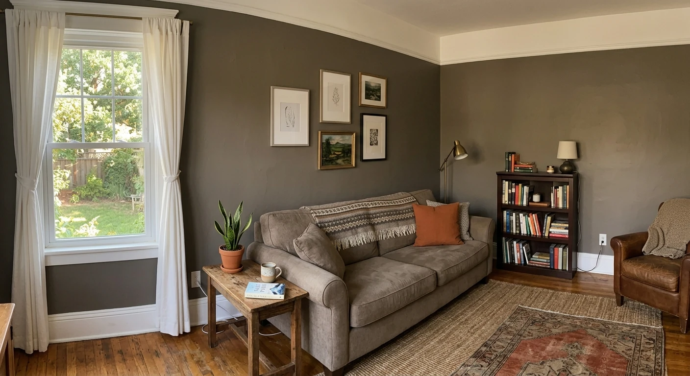
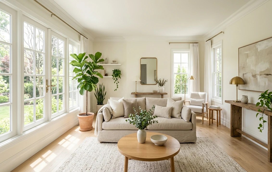
Living rooms and open-concept spaces
In a bright living room, Simply White on the walls gives you a gallery-clean backdrop that still feels lived-in. It is a strong choice for open-concept layouts because it flows room to room without the undertone clashes that trip up grayer whites. For a softer, cozier alternative, compare it with Benjamin Moore White Dove OC-17, which carries more gray and reads gentler in low light. If you are torn between the two, the White Dove vs Simply White side-by-side verdict settles it room by room.
Trim and ceilings
At LRV 91.7, Simply White works beautifully as a high-reflectance trim and ceiling color, particularly when the walls are a warm neutral or a soft greige. Against a color like Benjamin Moore Revere Pewter HC-172, Simply White trim provides bright, warm contrast without the harsh edge a cooler bright white would create.
Where to be careful
The one setting where Simply White can disappoint is a very dim, north-light bathroom or a windowless room lit only by warm bulbs. With no daylight to carry the brightness, the yellow undertone can dominate and the white can look slightly creamy. In those spaces, a cooler bright white reads cleaner.
Simply White vs the other Benjamin Moore whites
Nobody shops Simply White in isolation. It almost always comes down to a short face-off against one or two of Benjamin Moore's other bestsellers, so the table below lines them up on the two numbers that actually decide it, brightness (LRV) and undertone:
| White | LRV | Undertone | Reads as |
|---|---|---|---|
| Simply White (OC-117) | 91.7 | Warm, soft yellow | Bright but warm, clean without being cold |
| Chantilly Lace (OC-65) | ~90 | Neutral to cool | Crisp, modern, the cleanest of the three |
| White Dove (OC-17) | ~85 | Warm, soft gray base | Soft, creamy, gentle in low light |
Try it on your house
No photo? Try a sample
Sources: Benjamin Moore OC-117, OC-65, and OC-17 color data; The Spruce and designer references on warm-white behavior by orientation.
The short version: choose Simply White when you want a bright white that still feels warm. Choose Chantilly Lace OC-65 for the cleanest, most modern white with no warmth: our Simply White vs Chantilly Lace comparison shows exactly where each one wins. Choose White Dove for a soft, creamy white that flatters older homes and warm-toned rooms. Simply White lands right between the crisp Chantilly Lace and the creamy White Dove, which is exactly why it works for so many people.
Wondering whether the Sherwin-Williams equivalents are a better fit, or whether one brand simply paints better? The Sherwin-Williams vs Benjamin Moore interior comparison weighs coverage, durability, and price head to head.
Trim, cabinet, and decor pairings
Pairing Simply White is hard to get wrong. Its warmth bridges warm and cool palettes alike, which gives you room to play. Here are a handful of combinations that reliably look deliberate rather than accidental:
- Monochrome white scheme: Simply White on walls, trim, and ceiling for a soft, bright envelope. Vary the sheen (matte walls, satin or semi-gloss trim) so the architecture still reads.
- Crisper trim contrast: Simply White walls with Chantilly Lace trim gives a barely-there, modern step-up in crispness. Reverse it (warmer walls, Simply White trim) for a brighter, classic look.
- Warm woods and brass: white oak, walnut, and brass hardware lean into the yellow undertone and make the whole room feel warm and curated.
- Warm greige and earth tones: against Revere Pewter, taupe, or a warm beige, Simply White is the bright relief that keeps a neutral palette from feeling flat.
- Black accents: matte black window frames, hardware, or light fixtures read sharp and graphic against Simply White without the clinical edge a cool white would give.
For inspiration on building a full palette around a bright white, the best interior paint colors for 2026 roundup shows the trending neutrals and accents people are pairing with whites this year. And if you are budgeting a whole-house repaint, the interior house painting cost guide covers real per-room and whole-home pricing.
How to test Simply White before you commit
A white reads so differently from room to room that a fan-deck chip is close to useless for a final decision. Two reliable ways to test:
- Peel-and-stick or sample pot: paint a large swatch (at least 12 by 12 inches) on two different walls, ideally one that catches direct sun and one that stays in shade. Look at it in the morning, at midday, and at night under your normal bulbs. The yellow undertone shows up most in low light and warm bulbs.
- Digital preview first: before buying any samples, upload a real photo of your room into the FacadeColorizer visualizer and apply Simply White (plus alternatives like White Dove and Chantilly Lace) to see how each reads in your space. It is the fastest way to narrow three candidates to one before spending on sample pots.
Whatever you do, do not judge a white off the chip alone or off a photo from someone else's house. Their light is not your light, and with a white that is the whole story.
Compare Simply White, White Dove, and Chantilly Lace side by side before you buy a sample pot.
Frequently asked questions
Is Benjamin Moore Simply White warm or cool?
Simply White is a warm white. It carries a soft yellow undertone with no gray, pink, or blue. In bright daylight the high LRV keeps it reading clean and crisp, but in low light or under warm bulbs the yellow base steps forward and it can look soft or faintly creamy. That balance of brightness and warmth is what made it Benjamin Moore's 2016 Color of the Year.
What is the LRV of Simply White OC-117?
Simply White has a Light Reflectance Value of 91.7 on Benjamin Moore's color data. That makes it one of the brightest whites in the Off-White Collection, bright enough to bounce light and open up a dim room, but slightly softer than a maximum-reflectance stark white.
Simply White vs White Dove: which should I choose?
Choose Simply White (LRV 91.7) when you want a bright, airy white with a touch of warmth. Choose White Dove (LRV about 85) when you want a softer, creamier white with a gray base that feels gentle and timeless, especially in low-light rooms or older homes. Simply White is the brighter and slightly more yellow of the two; White Dove is the softer and more neutral-warm.
Does Simply White look yellow?
It can, but only in certain light. In a sunny room or under cooler bulbs, the high LRV dominates and Simply White reads as a clean bright white. In a dim, north-facing, or windowless room lit only by warm 2700K bulbs, the yellow undertone becomes more visible and it can look soft or creamy. Pairing it with slightly cooler bulbs keeps it crisp in low-light spaces.
Preview Simply White on your actual walls and compare it to White Dove and Chantilly Lace before buying a sample.
Disclaimer: Benjamin Moore and Simply White OC-117 are trademarks of Benjamin Moore & Co. Sherwin-Williams and Behr are trademarks of their respective owners. FacadeColorizer is an independent paint visualization service and is not affiliated with, endorsed by, or sponsored by Benjamin Moore, Sherwin-Williams, or Behr. Color reproduction on screens approximates the manufacturer's chip; always confirm with a manufacturer sample before purchase. Sources: Benjamin Moore OC-117 Simply White, OC-65 Chantilly Lace, and OC-17 White Dove color data 2026, Benjamin Moore 2016 Color of the Year announcement, and The Spruce designer references on warm-white behavior by orientation.
Trademarks mentioned (Sherwin-Williams, Benjamin Moore, Behr, Caparol, Brillux, Sto, Alpina, Valspar, PPG, Glidden, Dulux, Crown Trade, Sandtex, Farrow & Ball, Johnstone's, Leyland) are property of their respective owners. FacadeColorizer is independent and not affiliated with any of them. Nominative fair use under Lanham Act §1125.