
Sherwin-Williams Softened Green (SW 6177) is the sage that does not try too hard. It is not the bright herb-garden green of a paint chip you flinch at, nor a moody forest tone. It is a quiet gray-sage: green enough to feel like a color, gray enough to behave like a neutral, soft enough that it never grabs the room by the collar. That restraint is exactly the point, and exactly what makes people second-guess it on a tiny fan-deck chip where it can read as plain green-beige.
This profile is for the homeowner already circling Softened Green: how its gray-green undertone behaves, the published LRV and hex, the rooms it flatters, how the light in your house moves it, and the trim and decor that keep it crisp instead of drab. It is one of the muted greens in our wider Sherwin-Williams interior paint colors guide, and you can see where soft greens rank in our best interior paint colors for 2026 roundup.
Upload one photo and preview SW Softened Green under your room's actual light in about 30 seconds, free.
The numbers behind Softened Green SW 6177
Start with the published data; these figures predict the wall far better than any small fan-deck chip. They come from the Sherwin-Williams color tools:
| Spec | Value |
|---|---|
| SW code | SW 6177 Softened Green |
| HEX (screen approximation) | #BAC1AC |
| RGB approximation | 186, 193, 172 |
| LRV (Light Reflectance Value) | 53 |
| Hue family | Soft gray-sage, muted green with a clear gray base |
| Color collection | Part of the SW green family, near Comfort Gray and Halcyon Green |
| Closest SW cousins | Comfort Gray (SW 6205), Halcyon Green (SW 6213), Contented (SW 6191) |
Sources: Sherwin-Williams SW 6177 Softened Green color data, retrieved 2026; The Spruce paint undertone references.
The LRV of 53 is the figure to anchor on. That is a true mid-tone: not a pale tint-of-white you barely register, and not a deep color that swallows light. At 53, Softened Green has enough body to read clearly as sage on every wall, yet still bounces back about half the light that hits it, so it keeps a room feeling open rather than closed in. That puts it in a useful middle ground: lighter and airier than a deep sage like SW Evergreen Fog (LRV 30), but with noticeably more depth than an airy spa green like SW Sea Salt (LRV 63). If you want the cozier, enveloping direction instead, our SW Evergreen Fog profile shows how a low-LRV green reshapes the same rooms.
The undertones: gray first, green second
Where a color like Sea Salt juggles three undertones at once, Softened Green is more straightforward. It has one dominant undertone (a soft gray) and one supporting hue (a muted green). The "softened" in the name is literal: this is a green that has been grayed down on purpose so it sits quietly. There is a faint warmth in the gray base that keeps it from going cold, but no blue side and no yellow-chartreuse lean. What changes is the balance between the gray and the green, and that balance is set by your light.
- The sage read. Under warm light (direct sun or a 2700K bulb), the green steps forward and Softened Green reads as a clear, restful sage. This is the version most people picture and the reason they pick it.
- The gray read. Under cool or low light (a north window, overcast sky, a dim hallway), the green recedes and the gray base dominates, so the color reads closer to a green-gray than a green. Still soft, just more neutral.
- The drab risk. In a windowless room under weak warm builder bulbs, the muted green can flatten toward an olive-tinged gray-beige. Not ugly, but not the fresh sage you sampled. Light quality, not just direction, matters here.
None of these is the "wrong" Softened Green; they are the same paint behaving as designed. Because the green is intentionally muted, it shifts less dramatically than a finely balanced chameleon neutral, which makes it more predictable to live with. The room's orientation still nudges it, as the interior color families guide explains. Typical behavior across the four Northern Hemisphere orientations:
| Room orientation | Daylight character | How Softened Green reads |
|---|---|---|
| South-facing | Warm, abundant midday light | Greenest, freshest sage version, lively and clear |
| West-facing | Cooler by day, very warm at sunset | Grayer and quieter midday, glowing warm sage late afternoon |
| East-facing | Warm early sun, neutral later | Sage in the morning, settling to gray-green by afternoon |
| North-facing | Cool, indirect, no direct sun | Grayest and most muted, reads as a calm green-gray |
Sources: American Institute of Architects daylight reference; Sherwin-Williams SW 6177 color data; designer field notes on muted green neutrals.
Want the sage you fell for? Put Softened Green in a south or east room and lean warm with your bulbs. In a north room it will read more gray-green, which is lovely if that is what you want but a surprise if you expected a vivid sage. For a neutral that holds even steadier across orientations when you are not sure, our profile of SW Repose Gray is the predictable counterpoint.
The rooms Softened Green was made for
Softened Green earns its keep in rooms where you want color that calms rather than energizes, with enough depth to feel intentional. Its mid LRV and quiet sage make it a flexible whole-room color rather than a tricky accent. The spaces it suits best:
- Living rooms and dens: the sweet spot. At LRV 53 it has the depth to feel cozy and grounded across a big wall, yet it is restful enough to live with day to day. It reads sophisticated next to white oak, jute, and warm-toned wood.
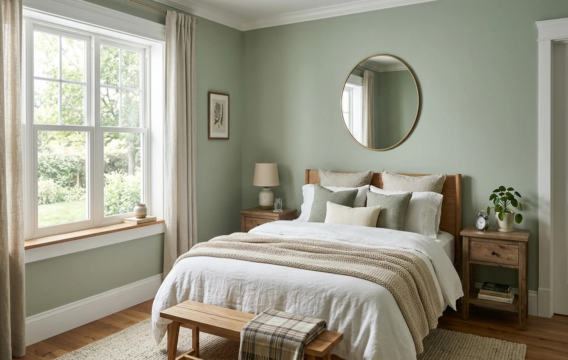
- Bedrooms: the grayed-down sage is genuinely soothing, an easy backdrop for white, cream, or natural-linen bedding. In a north bedroom it leans serene green-gray; in a south one it warms to a fresh sage.
- Home offices and studies: green is the classic focus-and-calm color, and Softened Green delivers it without the saturation that would feel busy on a video call backdrop.
- Kitchens, on cabinets: increasingly popular on lower cabinets or an island, where the muted sage reads custom and earthy against white uppers and warm counters. For a brighter kitchen sage, our sage green interior paint shades and pairings guide compares the field.
- Dining rooms: on all four walls it makes an enveloping, slightly formal space that flatters wood furniture and warm metals.
Where to be careful: a windowless powder room or interior hallway under weak warm bulbs can drain the green and leave a flat olive-gray, so add good lighting or pick a brighter sage there. And in a very small, dim room the mid LRV can feel a touch heavy wall to wall; a lighter sage may serve better. Our interior house painting cost guide covers what the repaint should run.
Free AI visualizer: test Softened Green in a living room, bedroom, or on cabinets before you buy a sample.
Trim, ceiling, and decor that keep it crisp
Because Softened Green is a grayed sage rather than a clean white-adjacent neutral, the white beside it decides whether it reads fresh or muddy. Soft, slightly warm whites tend to flatter it more than icy bright whites, which can make the sage look dull by contrast:
- Best all-around trim: Sherwin-Williams Alabaster (SW 7008, LRV 82). A soft, creamy white whose gentle warmth flatters the sage and keeps the scheme cohesive without going cold. The default designer pairing for muted greens.
- For a crisper, cleaner look: SW Pure White (SW 7005, LRV 84). Bright and only faintly warm, it gives a sharper trim line. Good in a south room with plenty of light; in a dim north room it can make the sage look slightly drab.
- Ceiling: a flat white keeps a Softened Green room feeling open. In a low room, avoid carrying the color overhead.
- Deeper coordinating tones: for an accent wall, built-in, or island, a navy like SW Naval (SW 6244) or a deeper green like SW Pewter Green (SW 6208) reads as a natural in-family step down. A warm bronze or aged-brass metal also grounds it.
- Decor and finishes: white oak and light woods, natural linen, jute, rattan, terracotta accents, and warm brass all flatter it. Heavy cool grays and stark blue-whites drag it toward murky.
To ground a Softened Green scheme with a warm neutral in adjoining rooms, the greiges are the obvious partners; our profiles of SW Agreeable Gray and SW Accessible Beige both flow naturally beside a muted sage.
Softened Green vs the colors people cross-shop
Softened Green has a handful of near-twins in the Sherwin-Williams green family, and knowing the difference saves a wrong sample and a repaint:
- vs SW Comfort Gray (SW 6205): the most common mix-up. Comfort Gray is cooler and carries a blue-green lean, so it can read spa-blue in north light, where Softened Green stays on the warmer gray-sage side with no blue. Comfort Gray is also a touch lighter and more watery; Softened Green is earthier and reads more clearly as a quiet green. Choose Comfort Gray for a cool, coastal feel, Softened Green for a warmer, more grounded sage.
- vs SW Halcyon Green (SW 6213): Halcyon Green is the deeper, more saturated member of the family, a richer gray-green that makes a statement on a wall. Softened Green is lighter and more restrained: the everyday backdrop where Halcyon Green is the moodier feature. If Softened Green feels too pale for a den, Halcyon Green is the step down in LRV.
- vs SW Contented (SW 6191): Contented is greener and a hair grayer-cool, sitting between a sage and a celadon. Softened Green carries slightly more warmth in its gray base, so the two can look close on a chip but Contented reads a touch cooler and crisper on the wall. Sample both side by side if you are torn; the difference shows up most under north light.
For a deeper, earthier sage entirely, our SW Dried Thyme profile covers a green with more drama, and the airy spa direction lives in our SW Sea Salt guide. We also untangle how the brands differ in formula, coverage, and finish in the full Sherwin-Williams vs Benjamin Moore interior comparison.
How to test Softened Green before you commit
Softened Green is one of those colors where the 3-inch fan-deck chip undersells it. Surrounded by other chips and viewed under store light near 4000K, it can flatten into a forgettable green-beige that bears little resemblance to how a full wall reads at home, where the sage has room to breathe. The reliable physical method is a large peel-and-stick sample (Sherwin-Williams sells one) taped to at least two walls and checked mid-morning, mid-afternoon, and after dark under your normal bulbs; the dim-light gray-green is the version you live with at night. The faster, no-paint first pass is a digital visualizer: upload a photo of the room and apply Softened Green beside a cooler alternative (Comfort Gray) and a deeper one (Halcyon Green) to see which way your light pulls it, and rule out the colors that were never going to work.
Preview Softened Green beside a cooler and a deeper alternative under your real light, free.
Frequently asked questions
What undertones does SW Softened Green have?
Softened Green (SW 6177) is a gray-sage with a dominant soft gray base and a supporting muted green. There is a faint warmth in the gray that keeps it from feeling cold, but no blue side and no yellow-chartreuse lean. Warm light brings the green forward as a clear sage; cool or low light lets the gray dominate so it reads as a calm green-gray. It is more predictable than a three-undertone chameleon color.
What is the LRV of SW Softened Green?
Softened Green has a Light Reflectance Value of 53, a true mid-tone. It has enough depth to read clearly as a sage on every wall, yet still reflects about half the light that hits it, so a room stays open rather than closed in. That makes it lighter and airier than a deep sage like Evergreen Fog (LRV 30) but with more body than an airy spa green like Sea Salt (LRV 63).
What trim color goes with Softened Green?
Sherwin-Williams Alabaster (SW 7008, LRV 82) is the most flattering trim for Softened Green: its soft, creamy warmth keeps the sage looking fresh rather than drab. For a crisper, brighter line in a well-lit room, SW Pure White (SW 7005) works, though in a dim north room a stark bright white can make the sage look dull. A flat white ceiling keeps the room feeling open.
What is the difference between Softened Green and Comfort Gray?
Comfort Gray (SW 6205) is cooler and carries a blue-green lean, so it can read spa-blue in north light. Softened Green (SW 6177) stays on the warmer gray-sage side with no blue and reads more clearly as a grounded, earthy green. Comfort Gray is a touch lighter and more watery; Softened Green is warmer and more restful. Choose Comfort Gray for a coastal cool feel, Softened Green for a warmer, quieter sage.
See SW Softened Green under your real light, beside a cooler and a deeper alternative, before you buy.
Disclaimer: Sherwin-Williams and SW 6177 Softened Green are trademarks of The Sherwin-Williams Company. Benjamin Moore and Behr are trademarks of their respective owners. FacadeColorizer is an independent paint visualization service and is not affiliated with, endorsed by, or sponsored by Sherwin-Williams, Benjamin Moore, or Behr. Screen color approximates the manufacturer's sample; always confirm with a physical sample before purchase. Sources: Sherwin-Williams SW 6177 Softened Green color data 2026, Sherwin-Williams Alabaster SW 7008 and Pure White SW 7005 color data, Sherwin-Williams Comfort Gray SW 6205, Halcyon Green SW 6213, and Contented SW 6191 color data, The Spruce paint undertone references, and designer field notes on muted green neutrals.
Trademarks mentioned (Sherwin-Williams, Benjamin Moore, Behr, Caparol, Brillux, Sto, Alpina, Valspar, PPG, Glidden, Dulux, Crown Trade, Sandtex, Farrow & Ball, Johnstone's, Leyland) are property of their respective owners. FacadeColorizer is independent and not affiliated with any of them. Nominative fair use under Lanham Act §1125.


