
Walk into any Home Depot, ask for a gallon "in white," and there is a good chance the can that lands on the counter is tinted Behr Ultra Pure White (PR-W15). It is the default white in Behr's system, the base most people reach for without thinking, and the brightest, most neutral white the brand makes. That ubiquity is exactly why it gets misjudged: people assume a "default" white is a safe nothing, then put it on a north wall, see it turn cold and clinical, and blame the paint. Ultra Pure White is not a nothing. It is a very specific kind of white, and it behaves like one.
This profile is for the homeowner choosing Ultra Pure White on purpose: where its (very faint) undertone sits, the published reflectance, the rooms it flatters, how it shifts under your light, and the popular whites it gets cross-shopped against. It sits inside our wider Behr interior paint colors guide, and you can see where it ranks among the brightest options in our shades of white paint colors guide.
Upload one photo and preview Behr Ultra Pure White under your room's actual light in about 30 seconds, free.
The numbers behind Behr Ultra Pure White
Start with the published data; for a white this stark, the specs tell you more than a fan-deck chip ever will:
| Spec | Value |
|---|---|
| Behr code | PR-W15 Ultra Pure White |
| HEX (screen approximation) | #FFFFFF |
| RGB approximation | 255, 255, 255 |
| LRV (Light Reflectance Value) | 94 |
| Hue family | True neutral white, near-zero undertone, very faint cool/blue cast |
| Role in the Behr line | The brand's default tint base and brightest stock white |
Sources: Behr PR-W15 Ultra Pure White color data, retrieved 2026; Behr tint-base documentation; designer field notes on stark whites.
The headline figure is that LRV of 94. That is about as high as architectural paint goes; an LRV of 100 would be pure theoretical white, so 94 puts Ultra Pure White right at the bright, reflective ceiling. Practically, that means it bounces nearly all the light that hits it, which makes it superb for brightening a dim space and demanding for almost everything else. A white this reflective shows shadow lines, drywall texture, and any color cast in the room more honestly than a softer white would. It is the opposite of a forgiving paint. For context on how high a 94 really is, our interior color families guide charts where the white family sits on the reflectance scale.
The undertone that barely is one
Most whites are built around a deliberate undertone: a drop of yellow for warmth, a whisper of gray for softness, a touch of blue for crispness. Ultra Pure White is engineered to have as little of any of that as possible. It is the closest thing Behr sells to a hue-free white. But "almost none" is not "none," and the trace it does carry leans very slightly cool. Under most light you will not name it; under the wrong light you will feel it.
- The clean read. Under balanced, abundant daylight (a bright south room, a daylight-balanced bulb near 4000K), Ultra Pure White reads as exactly what it is: a crisp, bright, modern white with no story. The version it was designed to deliver.
- The cool read. Under cool or indirect light (a north window, an overcast day, a high-Kelvin LED), the faint cool trace surfaces and the white can tip toward stark or slightly clinical, the look people describe as "hospital white."
- The flat read. Under warm builder bulbs (2700K) in a windowless room, the brightness can flatten into a dull, slightly dingy white because there is no built-in warmth to catch the glow.
Because it has so little undertone to anchor it, Ultra Pure White takes on the room's light and reflected color more than a tinted white does. A bright lawn outside the window, a wood floor, a colorful rug, all of it bounces up onto a wall this reflective. That is worth planning around. Typical behavior across the four Northern Hemisphere orientations:
| Room orientation | Daylight character | How Ultra Pure White reads |
|---|---|---|
| South-facing | Warm, abundant midday light | Crisp and clean at its best, bright without going cold |
| West-facing | Cool by day, very warm at sunset | Slightly cool midday, warms to a soft glow late afternoon |
| East-facing | Warm early sun, neutral later | Bright and friendly in the morning, cleaner and cooler by afternoon |
| North-facing | Cool, indirect, no direct sun | Coolest and starkest version, can read clinical without warm decor or bulbs |
Sources: American Institute of Architects daylight reference; Behr PR-W15 color data; designer field notes on stark whites.
The takeaway: Ultra Pure White rewards light and punishes the lack of it. Give it a sunny, well-lit room and it sings. Put it in a north-facing space and you will likely want either warmer bulbs or a softer white instead. If your room is short on natural light, a white with built-in warmth, like the one we profile in Behr Dove, will hold up better than this stark a white.
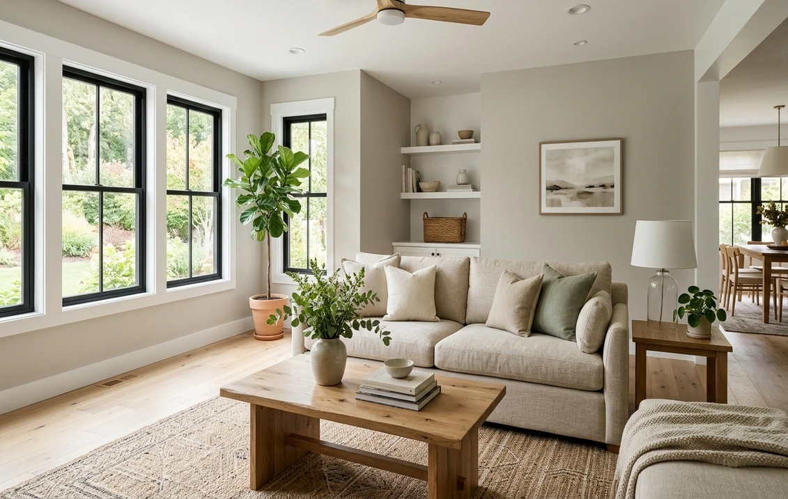
The rooms Ultra Pure White was made for
Ultra Pure White is at its best where you want maximum brightness, crisp contrast, and zero color story. That points it at a clear set of jobs:
- Ceilings, everywhere: the single most popular and most foolproof use. At LRV 94 it reflects light back down, lifts the whole room, and a flat finish overhead hides imperfections. As a ceiling white it is genuinely hard to beat.
- Trim, doors, and baseboards: its starkness becomes an asset here. A high-reflectance white in a semi-gloss frames a wall color cleanly and crisply, which is why it is a default trim choice in modern and transitional homes.
- Bright, sunny rooms: in a south- or east-facing kitchen or living room with good glass, it delivers the clean, gallery-bright modern look it was designed for.
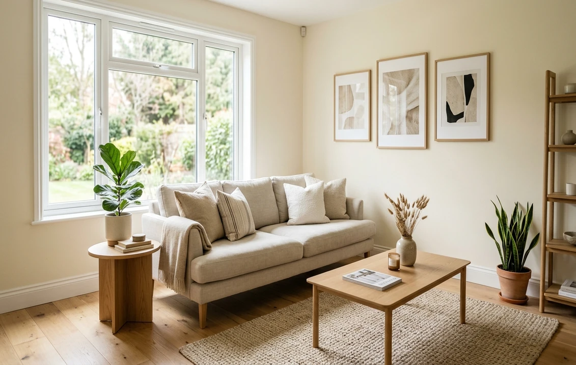
- Modern and minimalist spaces: where the goal is a deliberately cool, crisp, no-undertone white, this is the on-brief choice. It also reads well behind bold art and high-contrast black-and-white schemes.
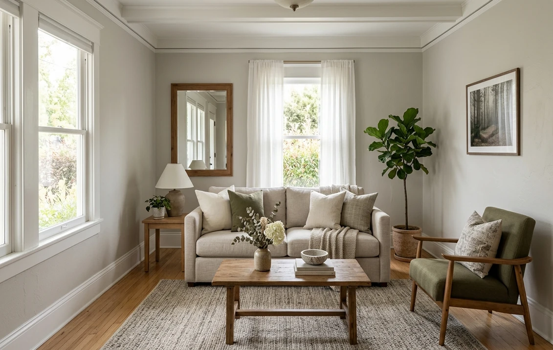
Where to be careful: a north-facing room with little natural light is where Ultra Pure White most often disappoints, drifting cold and clinical, and a cozy, traditional living room usually wants the softness of a warmer white instead. Whatever white you land on, the labor is the same; our interior house painting cost guide covers what the repaint should run.
Free AI visualizer: test it on a ceiling, on trim, or wall to wall before you commit a gallon.
Trim, ceiling, and coordinating colors
With a white this bright, the trick is what you put beside it. Pair it with warmth and texture and the starkness softens; surround it with more cool tones and it tips clinical.
- Walls under it: Ultra Pure White on the ceiling pairs cleanly with almost any wall color, which is a big part of why it is the default ceiling pick. The high contrast it creates against a deeper wall is intentional and modern.
- Trim with it: if Ultra Pure White is on the walls, keep trim in the same white in a different sheen (eggshell walls, semi-gloss trim) for a seamless modern look, rather than mixing in a warmer white that would suddenly look dingy next to it.
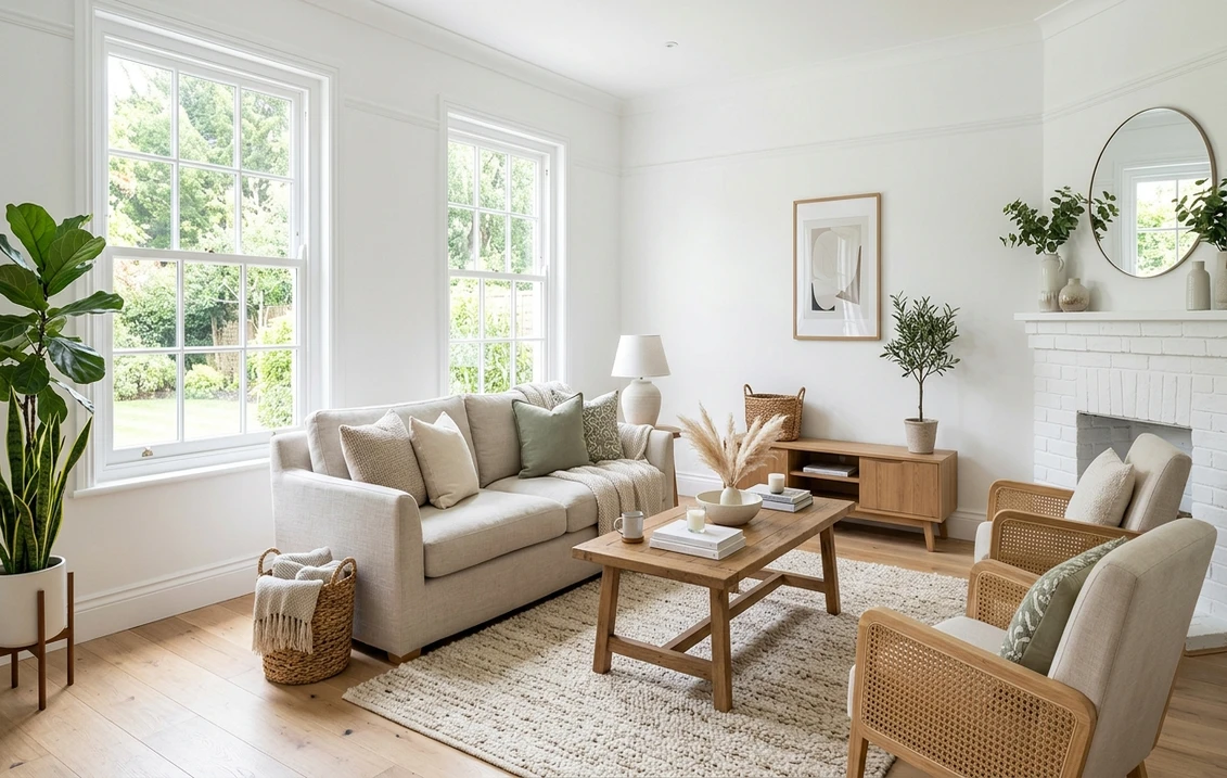
- Warm it up with materials: white oak, walnut, natural linen, rattan, and warm metals (brass, aged bronze) are what keep a stark white from feeling cold. Lean on materials, not paint, for warmth.
- Coordinating wall colors: it grounds beautifully against a charcoal, a deep navy, or a soft greige in adjoining rooms, where the crisp white reads as the architectural frame.
- Avoid beside it: creamy, yellow-based whites and warm off-whites next to Ultra Pure White will look dirty by comparison. Do not mix white families on the same plane.
If you find Ultra Pure White too stark once it is up but you still want a Behr white, the move is to step toward a softer one rather than fight the brightness. Our profiles of Swiss Coffee and Behr Dove both show what a warmer, more forgiving white does to the same room.
Ultra Pure White vs the whites people cross-shop
Two whites get lined up against Ultra Pure White more than any others, and the differences are small on a chip but obvious on a wall. Knowing them saves a wrong gallon:
- vs Benjamin Moore Chantilly Lace (OC-65): the most common cross-shop, and the closest in spirit. Both are bright, clean, low-undertone whites, but Chantilly Lace (LRV around 90) is a hair softer and very slightly warmer, which reads as "crisp" where Ultra Pure White can read as "stark." Ultra Pure White is the brighter, more clinical of the two; Chantilly Lace is the safer choice for a north room or a whole-house white. We break down the BM white in our Chantilly Lace OC-65 review.
- vs Sherwin-Williams Pure White (SW 7005): a name collision that confuses shoppers. Despite the matching "Pure White" label, SW 7005 (LRV 84) is meaningfully softer and warmer, with a gentle warm-gray undertone that makes it a forgiving, do-everything white. Ultra Pure White is brighter and far more neutral. Choose Ultra Pure White for a deliberately crisp modern look; choose SW Pure White when you want a white that frames color and flatters a cozier room, as our SW Pure White profile details.
- vs softer Behr whites: within Behr's own line, Ultra Pure White is the brightest and least tinted. Step down to a warm white like Swiss Coffee for traditional rooms, or to a soft gray-white for something quieter; Ultra Pure White is the high-contrast, gallery-bright end of the family.
One practical note: because Ultra Pure White is Behr's default tint base, the version sold off the shelf as a finished "Ultra Pure White" gallon and the un-tinted base used to mix other colors are essentially the same white. That is convenient, but it also means there is no warmth hiding in it; what you see is what you get. To see how it stacks up beside the other top whites in one place, our best interior paint colors for 2026 roundup lets you compare them on a real room.
How to test Ultra Pure White before you commit
A stark white is one of the riskiest colors to judge from a chip, because a 2-inch white sample against a white fan deck under store lighting tells you almost nothing about how a whole reflective wall will behave in your light. The reliable physical method is a large sample (Behr sells peel-and-stick swatches) taped to at least two walls and checked mid-morning, mid-afternoon, and after dark under your normal bulbs; the after-dark read under warm bulbs is the one that catches you out, since that is when a stark white can flatten or chill. The faster, no-paint first pass is a digital visualizer: upload a photo of the room and apply Ultra Pure White beside a softer white (Chantilly Lace) and a warmer one (SW Pure White) to see whether your light wants the crisp version or something more forgiving, ruling out the whites that were never going to work in your space.
Preview it beside a softer and a warmer white under your real light, free.
Frequently asked questions
Does Behr Ultra Pure White have an undertone?
Barely. Ultra Pure White (PR-W15) is engineered to be Behr's most neutral, hue-free white, the closest thing the brand sells to a true white. The trace it does carry leans very slightly cool, which you will not name under balanced daylight but can feel under cool or north light, where it tips toward stark or clinical. Because it has so little undertone of its own, it picks up reflected color and the room's light more than a tinted white does.
What is the LRV of Behr Ultra Pure White?
Ultra Pure White has a Light Reflectance Value of 94, near the top of the scale for architectural paint (100 would be a theoretical pure white). That very high reflectance makes it excellent for brightening dim rooms and for ceilings, but it also means it shows shadows, drywall texture, and any color cast in the room more honestly than a softer white would. It is bright and unforgiving rather than cozy.
Is Behr Ultra Pure White the same as Sherwin-Williams Pure White?
No, despite the similar names they are different whites. Behr Ultra Pure White (PR-W15, LRV 94) is a very bright, near-neutral white with almost no undertone. Sherwin-Williams Pure White (SW 7005, LRV 84) is noticeably softer and warmer, with a gentle warm-gray undertone that makes it more forgiving and better at framing other colors. Choose the Behr for a crisp modern look, the SW for a cozier, do-everything white.
Is Behr Ultra Pure White good for ceilings?
Yes, it is one of the best ceiling whites you can choose. At LRV 94 it reflects nearly all the light that hits it, bouncing it back down to brighten the whole room, and in a flat finish it hides minor imperfections overhead. The high contrast it creates against a deeper wall color is clean and modern. Its starkness is a drawback on a dim north wall, but on a ceiling it is an asset.
See Behr Ultra Pure White under your real light, beside a softer and a warmer white, before you buy.
Disclaimer: Behr and PR-W15 Ultra Pure White are trademarks of Behr Process Corporation. Benjamin Moore and Sherwin-Williams are trademarks of their respective owners. FacadeColorizer is an independent paint visualization service and is not affiliated with, endorsed by, or sponsored by Behr, Benjamin Moore, or Sherwin-Williams. Screen color approximates the manufacturer's sample; always confirm with a physical sample before purchase. Sources: Behr PR-W15 Ultra Pure White color data 2026, Benjamin Moore Chantilly Lace OC-65 color data, Sherwin-Williams Pure White SW 7005 color data, American Institute of Architects daylight reference, and designer field notes on stark whites.
Trademarks mentioned (Sherwin-Williams, Benjamin Moore, Behr, Caparol, Brillux, Sto, Alpina, Valspar, PPG, Glidden, Dulux, Crown Trade, Sandtex, Farrow & Ball, Johnstone's, Leyland) are property of their respective owners. FacadeColorizer is independent and not affiliated with any of them. Nominative fair use under Lanham Act §1125.