
You hold the Behr Muted Sage (S390-3) chip up in the paint aisle and it looks like a calm, gentle green. You brush a sample on the dining room wall and, by the next cloudy afternoon, it has gone soft and almost gray. That is the whole point of this color. Muted Sage is exactly what the name promises: a sage that has had its brightness turned down, a quiet gray-green that behaves more like a soft neutral than a saturated color. It is one of the easiest greens Behr makes to live with, and one of the most misjudged from a tiny chip.
This profile is for the homeowner already leaning toward Muted Sage: how its undertones read, the published light reflectance value, the rooms it flatters, how the direction your windows face changes it, and the trim and decor that keep it crisp instead of drab. It is one of the gentle hues in our wider Behr interior paint colors guide, and you can see where it sits among other 2026 picks in our best interior paint colors for 2026 roundup.
Upload one photo and preview Behr Muted Sage under your room's actual light in about 30 seconds, free.
The numbers behind Behr Muted Sage S390-3
Start with the published data; these figures predict the wall far better than a fan-deck chip ever will. They come from the Behr color tools:
| Spec | Value |
|---|---|
| Behr code | S390-3 Muted Sage |
| HEX (screen approximation) | #A9AC97 |
| RGB approximation | 169, 172, 151 |
| LRV (Light Reflectance Value) | 39 |
| Hue family | Soft gray-green, low-saturation muted sage with a touch of yellow warmth |
| Closest Behr cousins | Sea Fern (S390-4), Roman Plaster, Forest Edge |
Sources: Behr S390-3 Muted Sage color data, retrieved 2026; The Spruce paint undertone references.
The LRV of 39 is the number most people skip past, and it matters most. That is a true mid-tone: deep enough to read clearly as a color and to feel grounded and cozy, but not so dark that it swallows light in a small room. It sits well below an airy spa-sage like a high-LRV soft green and below the breezy blue-greens; Muted Sage is a green you notice. That mid-range body is exactly why it can feel enveloping and a little moody in a north room, and warm and earthy in a sunny one. For a deeper look at where greens like this fall on the spectrum, our interior green paint shades guide maps the lighter-to-darker range.
The undertones: gray first, green second
Plenty of sages lean obviously green or push toward olive. Muted Sage is built differently: it carries a strong gray base with a green sitting on top, plus a faint thread of warm yellow that keeps it from turning cold. The "muted" in the name is doing real work, because the gray is what tames the green into something you can put on every wall of a room without it feeling loud.
- The dominant gray-green read. In balanced or neutral light, the gray and green hold hands and the color lands as a soft, dusty sage. This is the version on the chip, and the version most people fall for.
- The warmer, earthier read. Under warm light (direct sun or a 2700K bulb), the faint yellow warms up and Muted Sage drifts toward a soft olive or eucalyptus, cozier and a little more saturated.
- The grayed-out read. Under cool or low light (a north window, an overcast sky, a dim hallway), the green recedes and the gray takes over, where some people see it slip toward a flat, almost colorless greige.
None of these is a defect; they are the same paint responding to the room. The skill is choosing which read you want to live with, then steering the light toward it. Because the green sits over a gray base, the direction a room faces nudges Muted Sage more than it nudges a committed warm beige, as our interior color families guide explains. Typical behavior across the four Northern Hemisphere orientations:
| Room orientation | Daylight character | How Muted Sage reads |
|---|---|---|
| South-facing | Warm, abundant midday light | Warmest and greenest, a soft earthy eucalyptus, very inviting |
| West-facing | Cool by day, very warm at sunset | Grayer by morning, glowing warm sage in late-afternoon sun |
| East-facing | Warm early sun, neutral later | Green and warm in the morning, settling to dusty gray-green after noon |
| North-facing | Cool, indirect, no direct sun | Grayest and most muted, can read as a cool greige; pair with warm bulbs |
Sources: American Institute of Architects daylight reference; Behr S390-3 color data; designer field notes on gray-green paints.
Want the warm eucalyptus you saw on the chip? Put Muted Sage in a south or east room and lean warm with your bulbs. Want a quieter, more neutral backdrop? A north room grays it down and dials the green back, which is flattering for a study or bedroom but can feel cold without warm-toned lighting and wood accents to balance it.
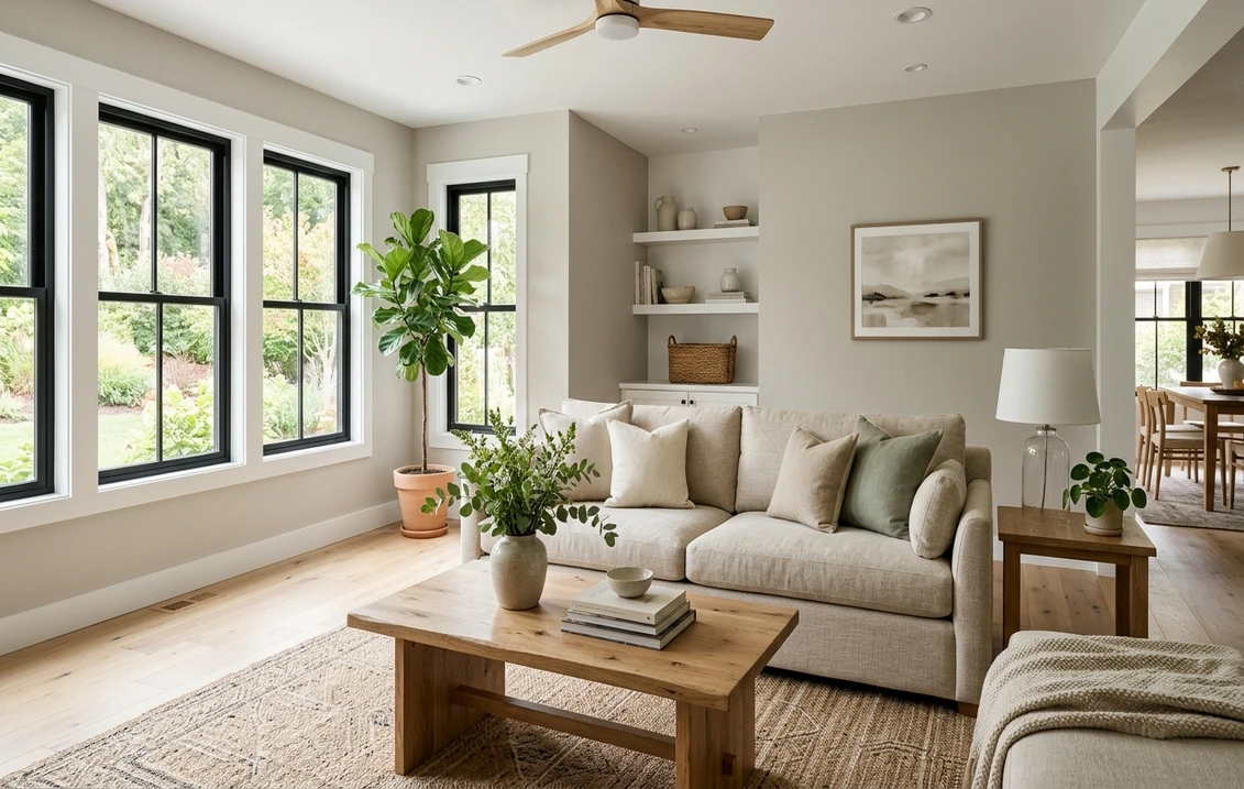
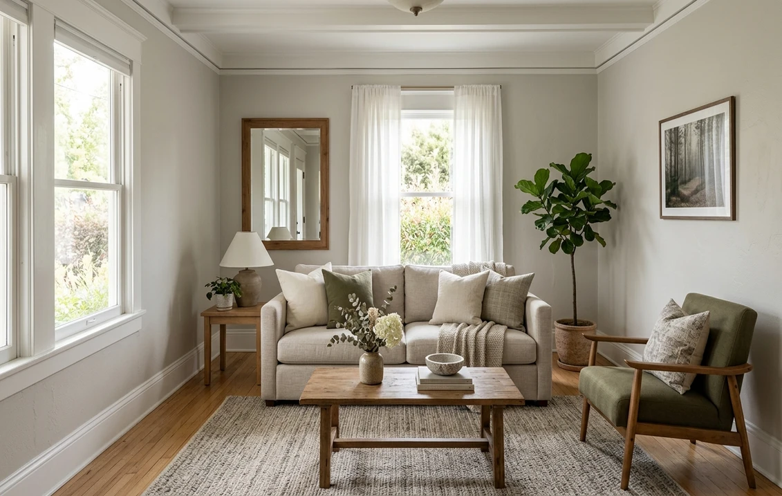
The rooms Muted Sage was made for
At LRV 39 with a gray-tempered green, Muted Sage is a grounding color rather than an energizing one. It steers toward rooms where you want depth and calm at the same time:
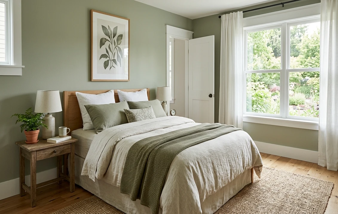
- Bedrooms: the standout use. The muted, dusty green is genuinely restful and reads sophisticated rather than sleepy. It layers beautifully under white, cream, oatmeal, and warm linen bedding and loves natural oak.
- Home offices and studies: deep enough to feel focused and enveloping without going dark, which suits a room you sit in for hours. Pairs well with bookshelves and warm wood desks.
- Dining rooms: the earthy side gives a dining room a relaxed, slightly old-world feel that works for both casual and formal tables, especially under warm pendant light.
- Kitchen cabinets: increasingly popular on lower cabinets or an island, where the gray-green reads custom and timeless against white uppers and butcher block or warm stone counters. For more on the cabinet route, see our sage green interior shades and pairings guide.
- Powder rooms and accent walls: in a small space its depth becomes a feature, wrapping the room in moody color rather than overwhelming it.
Where to be careful: a small, windowless north room under cool builder bulbs can drain Muted Sage to a flat, lifeless gray, so warm lighting matters there. And because it is a mid-tone, painting a very dark room wall to wall in it can feel heavy, where an accent wall plus a lighter coordinating color often reads better. For what the repaint should run, our interior house painting cost guide has the per-square-foot math.
Free AI visualizer: test Muted Sage in a bedroom, office, or on cabinets before you buy a sample.
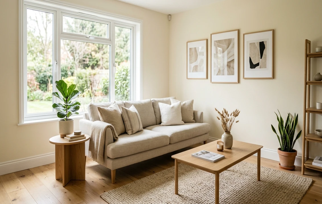
Trim, ceiling, and decor that keep it crisp
Because Muted Sage has that gray base, the white beside it decides whether the green reads fresh and intentional or drab and tired. With a gray-green this muted, a slightly warm white usually beats a stark icy one:
- Best all-around trim: Behr Swiss Coffee (very high LRV, soft warm white). Its faint warmth flatters the green and avoids the harsh contrast a bright cool white can throw against a muted sage. The reliable default.
- For a cleaner, crisper scheme: Behr Polar Bear (a brighter near-white) lifts the green and adds a little snap if your room runs warm and you want more contrast.
- Ceiling: a flat white keeps a mid-tone room feeling open. Skip painting the ceiling in Muted Sage unless you specifically want a cocooning, color-drenched effect.
- Deeper coordinating tones: for a built-in, an island, or a door, a soft black or a warm charcoal grounds Muted Sage beautifully, and a warm terracotta or rust makes a lively accent.
- Decor and finishes: warm woods (oak, walnut), brass and aged bronze hardware, natural linen, rattan, and cream textiles all flatter it. Cold chrome and heavy cool grays can drag it toward murky.
To build a whole palette around it, our guide to colors that go with green interiors covers the warm neutrals, blushes, and woods that pair naturally with a gray-green like this.
Muted Sage vs the sages people cross-shop
Shoppers almost never look at Muted Sage alone; they line it up against the two most famous gray-green sages from the other big brands. Knowing the difference saves a wrong sample, because all three photograph nearly identically and behave differently on a wall:
- vs Sherwin-Williams Soft Sage (SW 9647): the closest cross-brand twin. SW Soft Sage is a touch lighter and a little softer, with the green and gray more evenly balanced, so it reads slightly more airy and "neutral sage." Behr Muted Sage sits a step deeper at LRV 39 and carries a hair more gray, giving it more body and a moodier, more grounded feel. Choose Muted Sage when you want depth; Soft Sage when you want a lighter, more forgiving backdrop.
- vs Benjamin Moore Soft Fern (2144-40): Soft Fern leans noticeably warmer and greener, with more of a yellow-green, fern-leaf character and less gray. It is a livelier, leafier sage. Muted Sage is the calmer, grayer, more muted of the two; if Soft Fern feels too "garden" for you, Muted Sage is the dusty, restrained version of the same idea.
- vs Behr Sea Fern (S390-4): its own next-darker family member, a clear step deeper and greener. Reach for Sea Fern when Muted Sage tests too light or too gray for the mood you want, especially in a powder room or accent wall.
A note worth flagging before you sample: because Muted Sage, SW Soft Sage, and BM Soft Fern look almost interchangeable on a screen, the only honest way to choose between them is to see all three on your own wall under your own light. The brand on the can matters less than how your north or south exposure pulls each one. For a head-to-head on the two brands' formulas, coverage, and finish, our Behr vs Sherwin-Williams interior comparison breaks it down.
How to test Muted Sage before you commit
Muted Sage is a textbook case where a small chip will mislead you. Under store light near 4000K the chip lands on a balanced gray-green that may be none of the reads you get at home: warmer and greener in your sunny dining room, grayer and flatter in your north bedroom. The reliable method is a large peel-and-stick sample taped to at least two walls and checked mid-morning, mid-afternoon, and after dark under your normal bulbs; the dim-light gray-green is the version you actually live with at night. The faster, no-paint first pass is a digital visualizer: upload a photo of the room and apply Muted Sage beside a lighter alternative (like a soft sage) and a deeper one (like Sea Fern) to see which way your light pulls it, ruling out the colors that were never going to work and narrowing your real-sample order to one or two.
Preview Muted Sage beside a lighter and a deeper sage under your real light, free.
Frequently asked questions
Is Behr Muted Sage gray or green?
Both, with gray leading. Muted Sage (S390-3) is a soft gray-green: a green sitting on a strong gray base, plus a faint thread of warm yellow. In balanced light it reads as a dusty sage. Warm light brings out a cozier, slightly olive green, while cool or north light lets the gray take over so it can read close to a greige. It is the same paint each time; the light decides how much green you see.
What is the LRV of Behr Muted Sage?
Behr Muted Sage has a Light Reflectance Value of about 39, a true mid-tone. That is deep enough to read clearly as a color and feel grounded and cozy, but not so dark that it closes in a normal room. The mid-range body is why it feels enveloping and a little moody in a north room and warm and earthy in a sunny one.
What trim color goes with Muted Sage?
A soft warm white like Behr Swiss Coffee is the most reliable trim pairing, because its faint warmth flatters the gray-green and avoids the harsh look a stark cool white can throw against a muted color. If you want more contrast and your room runs warm, a brighter near-white such as Behr Polar Bear lifts the green. Keep the ceiling a flat white to keep a mid-tone room feeling open.
How is Muted Sage different from SW Soft Sage and BM Soft Fern?
They are near-twins that behave differently. SW Soft Sage is a touch lighter and more evenly balanced, so it reads airier and more neutral. BM Soft Fern leans warmer and greener with more of a yellow-green, leafy character. Behr Muted Sage sits a step deeper (LRV 39) with a bit more gray, giving it more body and a moodier feel. They look nearly identical on screen, so test all three on your own wall.
See Behr Muted Sage under your real light, beside a lighter and a deeper sage, before you buy. 1 HD preview plus 3 variations free.
Disclaimer: Behr and S390-3 Muted Sage are trademarks of Behr Process Corporation. Sherwin-Williams, Benjamin Moore, and their color names are trademarks of their respective owners. FacadeColorizer is an independent paint visualization service and is not affiliated with, endorsed by, or sponsored by Behr, Sherwin-Williams, or Benjamin Moore. Screen color approximates the manufacturer's sample; always confirm with a physical sample before purchase. Sources: Behr S390-3 Muted Sage color data 2026, Behr Swiss Coffee and Polar Bear color data, Sherwin-Williams Soft Sage SW 9647 and Benjamin Moore Soft Fern 2144-40 color data, The Spruce paint undertone references, and designer field notes on gray-green paints.
Trademarks mentioned (Sherwin-Williams, Benjamin Moore, Behr, Caparol, Brillux, Sto, Alpina, Valspar, PPG, Glidden, Dulux, Crown Trade, Sandtex, Farrow & Ball, Johnstone's, Leyland) are property of their respective owners. FacadeColorizer is independent and not affiliated with any of them. Nominative fair use under Lanham Act §1125.