
Sherwin-Williams Silvermist (SW 7621) is the color people reach for when Sea Salt feels a touch too green and a plain gray feels too flat. It is a cool blue-green-gray that lands a step deeper and a step bluer than the famous spa neutrals, with the kind of misty, watercolor quality that gives it the name. Tape a sample to a bathroom wall and it can read as a soft seafoam in the morning, a pale gray-blue at midday, and a quiet green-gray after dark. That movement is the whole appeal, and it is also why a small fan-deck chip almost always sells it short.
This profile is for the homeowner deciding whether Silvermist is the one: how its undertones trade places, the published LRV, the rooms it flatters, the trim and decor that keep it crisp instead of cloudy, and exactly how it differs from the SW colors it gets confused with. It is one of the cool, watery hues in our wider Sherwin-Williams interior paint colors guide, and you can see where the soft spa tones rank in our best interior paint colors for 2026 roundup.
Upload one photo and preview SW Silvermist under your room's actual light in about 30 seconds, free.
The numbers behind Silvermist SW 7621
Start with the published data; these figures predict the wall better than any fan-deck chip. They come from the Sherwin-Williams color tools:
| Spec | Value |
|---|---|
| SW code | SW 7621 Silvermist |
| HEX (screen approximation) | #C4CCC5 |
| RGB approximation | 196, 204, 197 |
| LRV (Light Reflectance Value) | 53 |
| Hue family | Cool blue-green-gray, misty spa tone with a clear blue cast |
| Closest SW cousins | Sea Salt (SW 6204), Comfort Gray (SW 6205), Rainwashed (SW 6211) |
Sources: Sherwin-Williams SW 7621 Silvermist color data, retrieved 2026; The Spruce paint undertone references.
The LRV of 53 is the figure that sets Silvermist apart from the lighter spa neutrals. At 53 it sits in the middle of the scale: bright enough to keep a bathroom or bedroom feeling open, but with real depth, so it reads as a clear color rather than a tinted white. That is meaningfully lower than Sea Salt's 63, which is why Silvermist feels a little more grounded and a little moodier in the same room. It is also far brighter than a true enveloping sage like SW Evergreen Fog (LRV 30); for that cozier direction, our SW Evergreen Fog profile shows how a low-LRV green reshapes the same space.
Three undertones, with blue in the lead
Silvermist is a blue-green-gray, like Sea Salt, but the balance is tipped. Where Sea Salt holds green and blue at near-equal weight, Silvermist leans cooler and bluer, with the green sitting just behind and a soft gray base under both. Which one you notice is decided by the room's light at that moment.
- The blue read. Its default direction. Under cool or indirect light (an overcast sky, a north window, a 4000K to 5000K daylight LED), the blue surfaces clearly and Silvermist reads as a soft, watery seafoam or gray-blue.
- The green read. Under warm light (direct afternoon sun or a 2700K bulb), the warmth tempers the blue and the green-gray steps forward, closer to a muted spa sage. Even then it stays cooler than Sea Salt.
- The gray read. In dim or balanced light (dawn, dusk, a windowless powder room under builder bulbs), blue and green cancel and the silvery gray base takes over, the read that earns the name.
None of these is the "wrong" Silvermist; they are all the same paint behaving as designed. Because the undertones are finely tuned and the blue is dominant, the direction a room faces moves Silvermist more than it moves a committed beige or gray, as the interior color families guide explains. Typical behavior across the four Northern Hemisphere orientations, and the bulb color you should pair with each:
| Room orientation | Daylight character | How Silvermist reads |
|---|---|---|
| North-facing | Cool, indirect, no direct sun | Bluest and coolest version, a clear gray-blue or seafoam; can drift chilly, so warm it with 2700K bulbs |
| South-facing | Warm, abundant midday light | Warmest and greenest version, a balanced spa green-blue; the most flattering room for it |
| East-facing | Warm early sun, neutral later | Soft green-blue in the morning, settling to a silvery gray-blue by afternoon |
| West-facing | Cool by day, very warm at sunset | Gray-blue most of the day, glowing softly greener in late-afternoon sun |
Sources: American Institute of Architects daylight reference; Sherwin-Williams SW 7621 color data; designer field notes on color-shifting spa neutrals.
Want the spa-blue you fell for? A north or east room with daylight bulbs delivers it. Want the warmer green-blue side? Put Silvermist in a south room and lean to 2700K. The one combination to plan around is a north room with cool LEDs, where Silvermist can tip genuinely chilly; warm bulbs are the fix. For a neutral that holds far steadier across orientations, our profile of SW Repose Gray is the predictable counterpoint.
The rooms Silvermist was made for
Silvermist earns its keep in rooms where calm and a touch of cool sophistication are the point. The slightly lower LRV and blue lean steer it toward spaces where you want a real color presence without heaviness:
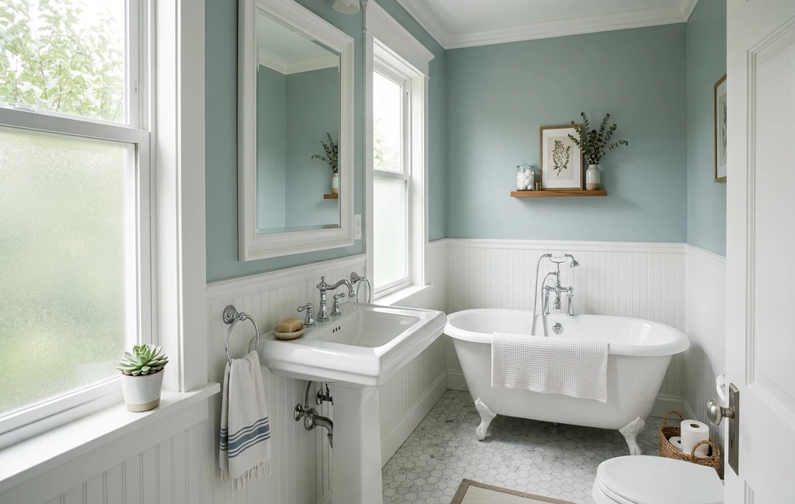
- Bathrooms and powder rooms: the signature use. The watery blue-green reads clean and spa-like against white tile, marble, and polished chrome or brushed nickel. Its depth gives a small bath more character than a pale tint, while LRV 53 keeps it from closing in.
- Bedrooms: the cool, low-saturation hue is genuinely restful, a quiet, serene envelope that layers under white, cream, or natural-linen bedding and pairs beautifully with light oak.
- Home offices and reading nooks: blue-greens are the calming, focus-friendly hues, and Silvermist gives a workspace a composed, uncluttered feel.
- Laundry, mudrooms, and built-ins: it brings quiet life to utility spaces and looks custom on a bookcase or vanity, where its depth reads richer than a flat color. For the cabinetry call, our Sherwin-Williams vs Benjamin Moore interior comparison covers how the two brands' finishes wear.
Where to be careful: a windowless bathroom under warm builder bulbs can flatten Silvermist's freshness to a murky gray-green, and in a large, very bright north-facing great room it can read as a lot of cool color across the day, so many designers use it on a feature wall or in a smaller room rather than wall to wall in an open plan. Our interior house painting cost guide covers what the repaint should run.
Free AI visualizer: test Silvermist in a bathroom, bedroom, or on a vanity before you buy a sample.
Trim, ceiling, and decor that keep it crisp
Because Silvermist is a soft cool color rather than a true neutral, the white beside it decides whether it reads spa-fresh or cloudy. Clean, only-faintly-warm whites win; a heavily warm cream can fight the blue and make it look dingy:
- Best all-around trim: Sherwin-Williams Pure White (SW 7005, LRV 84). Bright and barely warm, it frames Silvermist cleanly and keeps the blue-green crisp without going icy. The default designer pairing.
- For a softer scheme: SW Extra White (SW 7006, LRV 86) leans slightly cool and reinforces Silvermist's clean, watery side, good in a bright bath. Use Alabaster (SW 7008) only if you specifically want to warm and mute the color.
- Ceiling: a flat white keeps the room open. Avoid running Silvermist overhead in a low room; the cool color can feel heavy above you.
- Deeper coordinating tones: for an accent, a built-in, or a vanity, SW Comfort Gray (SW 6205) steps the family down a shade, and a navy like SW Naval (SW 6244) or a deep teal makes a confident in-family contrast.
- Decor and finishes: white oak and light woods, natural linen, rattan, polished nickel, chrome, and soft brass all flatter it. Heavy warm-beige flooring and orange-toned woods fight the blue; cool gray-washed or pale floors are a safer match.
To ground a Silvermist scheme with a warm neutral in adjoining rooms, the greiges are the natural partners; our profiles of SW Accessible Beige and SW Agreeable Gray both flow comfortably beside a soft cool blue-green and keep the home from reading all-cool.
Silvermist vs the colors people cross-shop
Silvermist has a small cluster of near-twins, and most wrong-sample regrets come from confusing it with one of them. Here is how to tell them apart before you spend on the wrong quart:
- vs SW Sea Salt (SW 6204): the most common mix-up. Sea Salt is lighter (LRV 63) and greener, an airy spa-sage that holds its green side longer. Silvermist is deeper (LRV 53) and bluer, reading cooler and a touch moodier in the same room. Choose Sea Salt for an airy, greener calm; choose Silvermist when you want more color presence and a clearer blue.
- vs SW Comfort Gray (SW 6205): Comfort Gray is the grayer, more muted member of this family, leaning green-gray with the color dialed back. Silvermist keeps a livelier, more obvious blue-green. Pick Comfort Gray when you want the spa feel to whisper; pick Silvermist when you want it to speak.
- vs SW Rainwashed (SW 6211): Rainwashed is closer to Sea Salt, a light, clearly blue spa tone (LRV around 60) that stays bright and consistent. Silvermist is deeper and a little grayer, so it reads more sophisticated and less sweet, where Rainwashed reads fresh and beachy.
One name trap worth flagging: Benjamin Moore sells a color called Silver Mist (BM 1619), two words, a different, more straightforwardly gray paint. SW Silvermist is one word, SW 7621, with a clear blue-green character. If a designer or a Pinterest pin says "silver mist," confirm the brand and code before sampling. We untangle how the two brands differ in formula, coverage, and finish in the full Sherwin-Williams vs Benjamin Moore interior comparison, and if a softer green-sage is what you are really after, compare it against our SW Sea Salt profile.
How to test Silvermist before you commit
Silvermist is a textbook color where a 3-inch fan-deck chip will mislead you. Viewed under store light near 4000K, the chip lands on a balanced gray-blue that may be none of the reads you get at home, and because the blue is dominant it can look chillier on the wall than the chip suggests. The reliable method is a large peel-and-stick sample (Sherwin-Williams sells one) taped to at least two walls and checked mid-morning, mid-afternoon, and after dark under your normal bulbs; the dim-light silvery gray is the version you live with at night, and the cool-bulb test tells you whether a north room will feel too chilly. The faster, no-paint first pass is a digital visualizer: upload a photo of the room and apply Silvermist beside a lighter, greener option (Sea Salt) and a grayer one (Comfort Gray) to see which way your light pulls each, ruling out the colors that were never going to work before you spend on samples.
Preview Silvermist beside a greener and a grayer alternative under your real light, free.
Frequently asked questions
Is Silvermist green, blue, or gray?
All three, with blue in the lead. Silvermist (SW 7621) is a cool blue-green-gray, and unlike Sea Salt, which holds green and blue evenly, Silvermist tips bluer. Cool or north light brings out a soft seafoam or gray-blue, warm light tempers it toward a muted spa green, and dim or balanced light lets the silvery gray base take over. It is the same paint in every case; the light decides which side you see.
What is the LRV of SW Silvermist?
Silvermist has a Light Reflectance Value of 53, a true mid-tone. It is bright enough to keep a bathroom or bedroom feeling open but has enough depth to read as a clear color rather than a tinted white. That is lower than Sea Salt (LRV 63), which is why Silvermist feels a little more grounded and moodier, and much brighter than an enveloping sage like Evergreen Fog (LRV 30).
What is the difference between Silvermist and Sea Salt?
Both are blue-green-gray spa tones, but Sea Salt (SW 6204) is lighter (LRV 63) and greener, an airy spa-sage, while Silvermist (SW 7621) is deeper (LRV 53) and bluer, reading cooler and a touch moodier. Choose Sea Salt for an airy, greener calm; choose Silvermist when you want more color presence and a clearer blue cast.
What trim color goes with Silvermist?
Sherwin-Williams Pure White (SW 7005, LRV 84) is the most reliable trim pairing. It is bright and only faintly warm, so it frames Silvermist crisply and keeps the blue-green reading fresh rather than cloudy. For an even cleaner, cooler scheme use Extra White (SW 7006). Avoid heavily warm creams, which can fight the blue and make the color look dingy. A flat white ceiling keeps the room open.
Is SW Silvermist the same as Benjamin Moore Silver Mist?
No. They share a near-identical name but are different colors from different brands. SW Silvermist (SW 7621, one word) is a cool blue-green-gray spa tone. Benjamin Moore Silver Mist (BM 1619, two words) is a more straightforwardly gray paint without the same blue-green character. Confirm the brand, spelling, and code before you sample.
See SW Silvermist under your real light, beside a greener and a grayer alternative, before you buy. One HD preview plus three variations, free.
Disclaimer: Sherwin-Williams and SW 7621 Silvermist are trademarks of The Sherwin-Williams Company. Benjamin Moore and Behr are trademarks of their respective owners. FacadeColorizer is an independent paint visualization service and is not affiliated with, endorsed by, or sponsored by Sherwin-Williams, Benjamin Moore, or Behr. Screen color approximates the manufacturer's sample; always confirm with a physical sample before purchase. Sources: Sherwin-Williams SW 7621 Silvermist color data 2026, Sherwin-Williams Pure White SW 7005, Extra White SW 7006, and Alabaster SW 7008 color data, Sherwin-Williams Sea Salt SW 6204 and Comfort Gray SW 6205 color data, Benjamin Moore Silver Mist 1619 color data, The Spruce paint undertone references, and designer field notes on color-shifting spa neutrals.
Trademarks mentioned (Sherwin-Williams, Benjamin Moore, Behr, Caparol, Brillux, Sto, Alpina, Valspar, PPG, Glidden, Dulux, Crown Trade, Sandtex, Farrow & Ball, Johnstone's, Leyland) are property of their respective owners. FacadeColorizer is independent and not affiliated with any of them. Nominative fair use under Lanham Act §1125.


