
Sherwin-Williams Halcyon Green (SW 6213) is the color people reach for when a sage feels too pale and a forest green feels too heavy. It sits right in the middle: a soft, dusty gray-green with just enough depth to anchor a room and just enough gray to keep it from going leafy. The name fits, because the color reads calm rather than bold. But that quiet quality is also where it trips people up. Sampled on the wrong wall, Halcyon Green can drift from a restful muted green to a flat gray, or surprise you with a cool blue cast you did not order.
This profile is for the homeowner who already likes Halcyon Green and wants to use it well: how its undertones behave, the published LRV, the rooms it flatters, the trim and decor that keep it crisp, and how it differs from the three near-twins shoppers always cross-shop against. It is one of the muted greens in our wider Sherwin-Williams interior paint colors guide, and you can see where the green family ranks in our best interior paint colors for 2026 roundup.
Upload one photo and preview SW Halcyon Green under your room's actual light in about 30 seconds, free.
The numbers behind Halcyon Green SW 6213
Start with the published data; these figures predict the wall better than any fan-deck chip. They come from the Sherwin-Williams color tools:
| Spec | Value |
|---|---|
| SW code | SW 6213 Halcyon Green |
| HEX (screen approximation) | #AFBAA3 |
| RGB approximation | 175, 186, 163 |
| LRV (Light Reflectance Value) | 41 |
| Hue family | Muted gray-green with a faint cool (blue) side |
| Color collection | Part of the SW green family, near Softened Green and Comfort Gray |
| Closest SW cousins | Softened Green (SW 6177), Contented (SW 6191), Comfort Gray (SW 6205) |
Sources: Sherwin-Williams SW 6213 Halcyon Green color data, retrieved 2026; The Spruce paint undertone references.
The LRV of 41 is the figure that defines the experience. That is a true mid-tone: dark enough to register clearly as a color rather than a tinted neutral, but light enough to keep a room from feeling closed. It puts Halcyon Green in the "cozy but not cave-like" band. For comparison, a soft spa neutral like Sea Salt sits much higher at LRV 63, which is why Sea Salt feels airy where Halcyon Green feels grounded. If you want that lighter, more open read, our SW Sea Salt profile shows how a high-LRV blue-green reshapes the same rooms. And if you want to go deeper still, a true low-LRV sage like Evergreen Fog (LRV 30) crosses into enveloping territory, which our SW Evergreen Fog profile covers.
Halcyon Green's undertones
Halcyon Green is built on a gray-green base, but it is not a single flat hue. It carries a clear green as its lead, a substantial gray that keeps the green dusty and muted, and a faint blue that surfaces only in cool light. Understanding the order of those three explains every surprise the color throws at you.
- The green lead. In neutral-to-warm light, the green takes charge and Halcyon Green reads as a soft, sophisticated sage, the version most people picture and want. It is muted, never grassy or minty.
- The gray body. The gray is always present underneath. It is what keeps Halcyon Green calm and easy to live with, but in dim or shadowed light it can step forward and pull the color toward a quiet green-gray, draining some of the sage.
- The blue whisper. Under cool, indirect light, the faint blue side wakes up and the green can read a touch cooler, drifting toward a gray-blue-green. It is subtle, far less dramatic than the blue swing in a color like Sea Salt, but it is enough to make a north room feel cooler than you expected.
The takeaway: Halcyon Green is more stable than the famous color-shifting neutrals, but it is not immune to its light. The gray and the blue are the two things to watch, because they are what turn a warm sage into a cool gray-green. Because it is a muted color, the direction a room faces matters, as the interior color families guide explains. Typical behavior across the four Northern Hemisphere orientations:
| Room orientation | Daylight character | How Halcyon Green reads |
|---|---|---|
| South-facing | Warm, abundant midday light | Warmest, greenest version: a rich, restful sage at its best |
| West-facing | Cool by day, very warm at sunset | Cooler gray-green by day, glowing golden sage late afternoon |
| East-facing | Warm early sun, neutral later | Bright sage in the morning, settling to muted gray-green by afternoon |
| North-facing | Cool, indirect, no direct sun | Coolest and grayest, the blue side shows, can read as gray-blue-green |
Sources: American Institute of Architects daylight reference; Sherwin-Williams SW 6213 color data; designer field notes on muted green neutrals.
Want the warm sage you fell for? Put Halcyon Green in a south or east room and lean warm with your bulbs. A 2700K bulb keeps the green warm and inviting at night; a cool 4000K-plus daylight bulb pushes it toward gray and wakes the blue, which is exactly what you do not want in a north room. For a neutral that holds far steadier across orientations as a companion in adjoining spaces, our profile of SW Repose Gray is the predictable counterpoint.
The rooms Halcyon Green was made for
At LRV 41, Halcyon Green is comfortable carrying a whole room rather than serving as a quiet backdrop. Its mid depth and muted character steer it toward spaces where you want warmth and a little drama without going dark:
- Living rooms and dens: the sweet spot. The mid-tone green wraps a gathering space in calm color, especially flattering on a fireplace wall or with built-ins, and pairs beautifully with natural wood and leather.
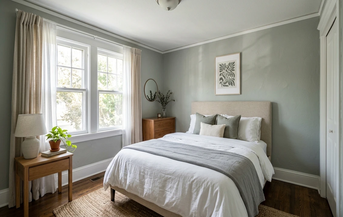
- Bedrooms: the muted sage is genuinely restful and reads as cocooning rather than heavy at this LRV. It layers easily under white, cream, and natural-linen bedding.
- Home offices and studies: the gray-green has a grounded, focused quality that suits a workspace, and it photographs well on video calls.
- Kitchens, on cabinets: a top use. Halcyon Green on lower cabinets or an island reads custom and earthy against white uppers, warm wood counters, and brass hardware. For the cabinetry call, our Sherwin-Williams vs Benjamin Moore interior comparison covers how the two brands' finishes wear.
- Dining rooms: the muted depth flatters candlelight and warm bulbs, making it a strong choice for a room used mostly at night.
Where to be careful: a small north-facing room with no warm light can pull Halcyon Green toward a flat, cool gray-green that loses its charm, and a dim hallway can mute it further. In those spots, either commit to warm bulbs or choose a lighter, more forgiving green. Our interior house painting cost guide covers what the repaint should run before you commit a whole room.
Free AI visualizer: test Halcyon Green in a living room, bedroom, or on cabinets before you buy a sample.
Trim, ceiling, and decor that keep it crisp
Because Halcyon Green is a muted mid-tone, the white beside it does a lot of work: the right trim makes the green look intentional and fresh, the wrong one makes it look drab. Clean, slightly warm whites win here:
- Best all-around trim: Sherwin-Williams Pure White (SW 7005, LRV 84). Bright and only faintly warm, it frames Halcyon Green crisply and gives the mid-tone green a clean edge without going icy. The reliable default.
- For a softer, warmer scheme: SW Alabaster (SW 7008, LRV 82). A creamy white that nudges Halcyon Green toward its warm, sage side, good in a bedroom or warm-light living room where you want cozy over crisp.
- Ceiling: a flat white keeps a mid-tone room feeling open. Halcyon Green overhead can feel low in an average-height room, so reserve it for a moodier den with good light.
- Deeper coordinating tones: for an accent, a built-in, or a door, a soft black like SW Tricorn Black (SW 6258) or a deep navy like SW Naval (SW 6244) reads as a confident step down. A warm wood tone is the easiest partner of all.
- Decor and finishes: white oak and walnut, natural linen and rattan, terracotta and cognac leather, and brass or aged-bronze hardware all flatter it. Cold chrome and heavy cool grays drag it toward drab.
To carry a warm neutral into adjoining rooms beside Halcyon Green, the greiges are the natural partners; our profile of SW Agreeable Gray flows comfortably next to a muted green, giving the open floor plan a warm, cohesive backbone while the green does the feature work.
Halcyon Green vs the colors people cross-shop
Halcyon Green sits in a crowded part of the SW deck, and shoppers routinely line it up against three near-twins. Knowing the difference saves a wrong sample:
- vs SW Softened Green (SW 6177): the most common mix-up. Softened Green is lighter (LRV 53) and more restrained, the everyday backdrop version of the same muted-green idea. Halcyon Green is the deeper, more saturated member (LRV 41) that makes a statement on a wall. Choose Halcyon Green when Softened Green feels too pale to register; choose Softened Green when Halcyon Green feels too much color for the room.
- vs SW Contented (SW 6191): Contented is a warmer, slightly more yellow-leaning gray-green that reads cozier and a touch more earthy. Halcyon Green is cooler and grayer, with that faint blue side Contented lacks. Reach for Contented when you want warmth above all; reach for Halcyon Green when you want a cleaner, cooler sage that still has depth.
- vs SW Comfort Gray (SW 6205): Comfort Gray is the lighter, airier cousin (LRV 36 reads brighter than its number because of its blue side) that swings more clearly toward blue-green and spa territory. Halcyon Green is greener, more grounded, and more consistently a sage. Pick Comfort Gray for a soft, cool, watery feel; pick Halcyon Green for a richer, warmer green with body.
The short version: Halcyon Green is the deeper, greener anchor of this little family. Softened Green is the pale backdrop, Contented is the warm one, and Comfort Gray is the cool, watery one. We untangle the brand differences in formula, coverage, and finish across green families in the full Sherwin-Williams vs Benjamin Moore interior comparison.
How to test Halcyon Green before you commit
Halcyon Green is one of those mid-tone greens where the 3-inch fan-deck chip undersells it. Surrounded by other chips and viewed under store light near 4000K, it can flatten into a forgettable gray-green that bears little resemblance to how a full wall reads at home, where the sage has room to breathe and warm up. The reliable physical method is a large peel-and-stick sample (Sherwin-Williams sells one) taped to at least two walls and checked mid-morning, mid-afternoon, and after dark under your normal bulbs; the dim-light gray-green is the version you live with at night, so judge it then too. The faster, no-paint first pass is a digital visualizer: upload a photo of the room and apply Halcyon Green beside a lighter alternative (Softened Green) and a cooler one (Comfort Gray) to see which way your light pulls it, and rule out the colors that were never going to work.
Preview Halcyon Green beside a lighter and a cooler alternative under your real light, free.
Frequently asked questions
What undertones does Halcyon Green have?
Halcyon Green (SW 6213) is a muted gray-green. Green is the lead, a substantial gray keeps it dusty and calm, and a faint blue shows up only in cool, indirect light. In warm or neutral light it reads as a soft, sophisticated sage; in dim or north light the gray and the faint blue come forward and it cools toward a gray-blue-green. It is more stable than famous color-shifting neutrals, but warm bulbs keep it at its best.
What is the LRV of SW Halcyon Green?
Halcyon Green has a Light Reflectance Value of 41, a true mid-tone. That is deep enough to register clearly as a color and carry a whole room, yet light enough to avoid feeling cave-like. It sits well below an airy spa neutral like Sea Salt (LRV 63) and a step above a true low-light sage like Evergreen Fog (LRV 30), which makes it the "cozy but not dark" option in the green family.
What trim color goes with Halcyon Green?
Sherwin-Williams Pure White (SW 7005, LRV 84) is the most reliable trim pairing. It is bright and only faintly warm, so it frames the mid-tone green crisply and keeps it looking intentional rather than drab. For a softer, warmer scheme that leans into Halcyon Green's sage side, use SW Alabaster (SW 7008). A flat white ceiling keeps a mid-tone room feeling open, and warm wood and brass are the easiest decor partners.
What is the difference between Halcyon Green and Softened Green?
They are close cousins in the same muted-green family, but Halcyon Green (SW 6213, LRV 41) is the deeper, more saturated one and Softened Green (SW 6177, LRV 53) is lighter and more restrained. Halcyon Green makes a statement on a wall and works as a feature color; Softened Green is the airier everyday backdrop. Choose Halcyon Green when Softened Green feels too pale to register, and Softened Green when Halcyon Green feels like too much color for the space.
See SW Halcyon Green under your real light, beside a lighter and a cooler alternative, before you buy.
Disclaimer: Sherwin-Williams and SW 6213 Halcyon Green are trademarks of The Sherwin-Williams Company. Benjamin Moore and Behr are trademarks of their respective owners. FacadeColorizer is an independent paint visualization service and is not affiliated with, endorsed by, or sponsored by Sherwin-Williams, Benjamin Moore, or Behr. Screen color approximates the manufacturer's sample; always confirm with a physical sample before purchase. Sources: Sherwin-Williams SW 6213 Halcyon Green color data 2026, Sherwin-Williams Softened Green SW 6177, Contented SW 6191, Comfort Gray SW 6205, Sea Salt SW 6204, Pure White SW 7005 and Alabaster SW 7008 color data, The Spruce paint undertone references, and designer field notes on muted green neutrals.
Trademarks mentioned (Sherwin-Williams, Benjamin Moore, Behr, Caparol, Brillux, Sto, Alpina, Valspar, PPG, Glidden, Dulux, Crown Trade, Sandtex, Farrow & Ball, Johnstone's, Leyland) are property of their respective owners. FacadeColorizer is independent and not affiliated with any of them. Nominative fair use under Lanham Act §1125.


