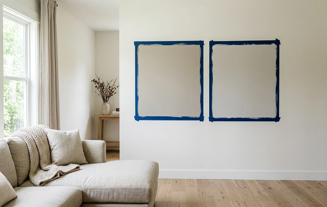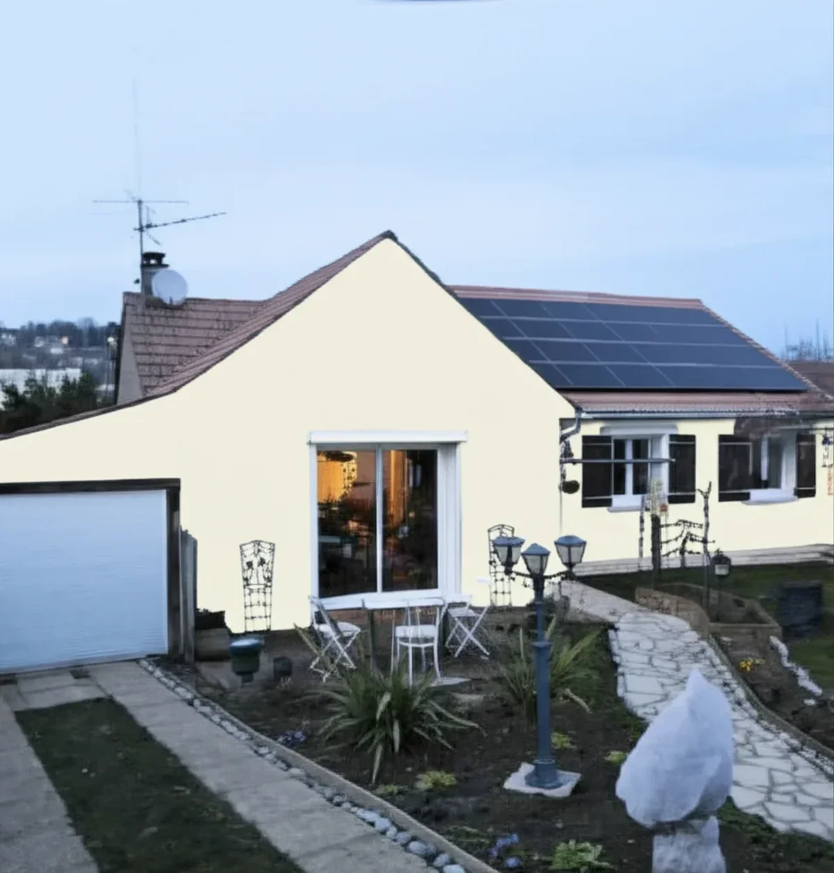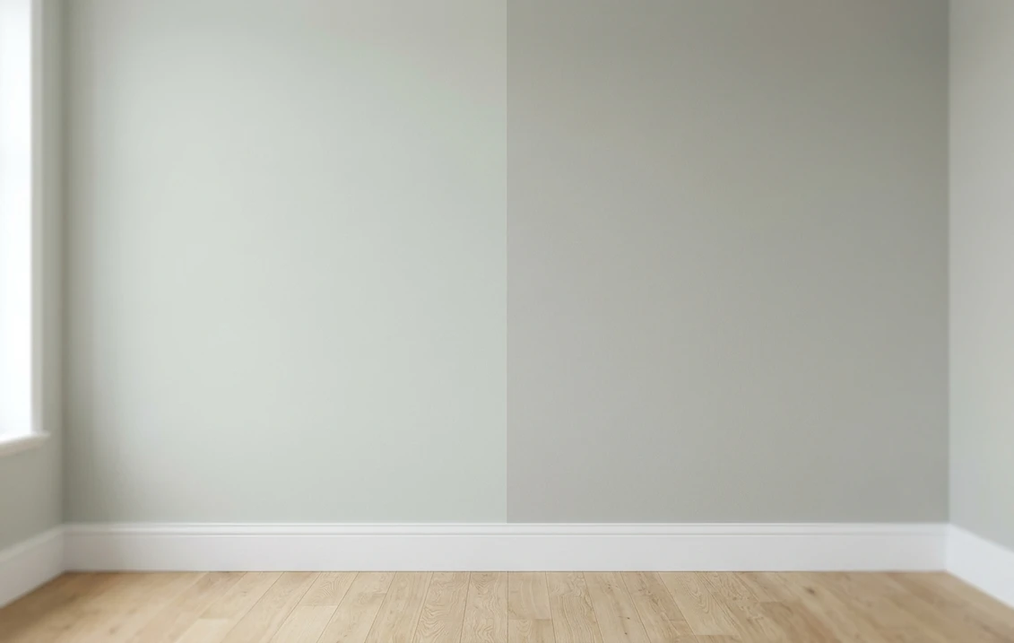
Try it on your house

The verdict in three lines. Sea Salt SW 6204 (LRV 63) is the lighter, airier pick: a pale green-blue-gray that keeps small and dim rooms bright but can wash toward off-white in strong sun.
Comfort Gray SW 6205 (LRV 54) is the same color one step deeper: it holds visible green-blue color in bright rooms and reads like a true spa shade, not a tinted white.
They sit next to each other on the same Sherwin-Williams strip, so undertone is a tie. Depth decides this duel, and the fastest way to judge depth is on a photo of your own room.
Sherwin-Williams Sea Salt (SW 6204) and Comfort Gray (SW 6205) are strip neighbors: two consecutive numbers on the same color card, cut from the same green-blue-gray formula at different strengths. In most head-to-heads, warm versus cool undertones settle the argument; here they match almost perfectly, so the decision comes down to one question: how much color do you want on the wall? This comparison puts the numbers side by side, runs the duel room by room, and tells you exactly when each shade wins. For the general method behind any two-color decision, start with our side-by-side method for comparing paint colors.
The numbers side by side
| Attribute | Sea Salt SW 6204 | Comfort Gray SW 6205 |
|---|---|---|
| Family | Pale green-blue-gray | Soft green-blue-gray, one step deeper |
| LRV | 63 | 54 |
| Approximate hex | #CDD2CA | #BEC3BB |
| Approximate RGB | 205, 210, 202 | 190, 195, 187 |
| Undertone | Green-blue that shifts with the light | The same green-blue, more saturated and steadier |
| Loves | Small baths, dim bedrooms, airy coastal palettes | Bright rooms, white tile and trim, spa-style baths |
| Watch out for | Can fade toward off-white in strong direct sun | Can read moody blue-gray in dim north light |
| Overall vibe | Light, breezy, barely-there color | Calm, present, unmistakably a color |
Try it on your house
No photo? Try a sample
LRV values are the published Sherwin-Williams figures. Hex and RGB are approximate digital renderings; the authoritative reference is a physical Sherwin-Williams chip or peel-and-stick sample.
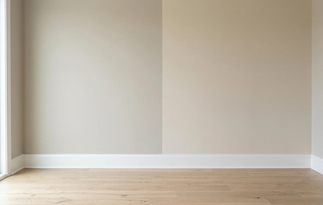
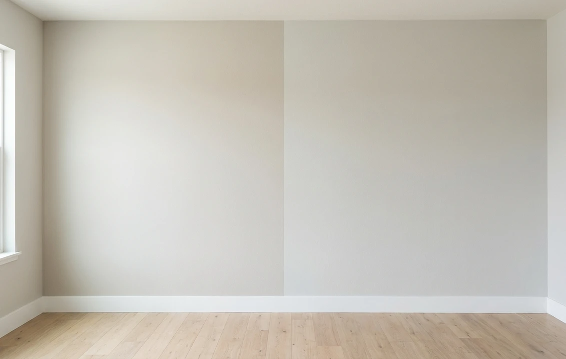
Read that table once and the shape of the duel is clear. The undertone row is nearly identical, and the LRV row shows a real 9-point gap you will see on a wall. Sea Salt at 63 sits in tinted-white territory: in a sunny room it can quiet down until guests wonder whether the walls are painted at all. Comfort Gray at 54 keeps enough pigment to stay visibly green-blue at noon. Hold both chips on white printer paper and you will not argue about warm versus cool; you will simply see the same color at two volumes. That white-paper trick, plus the two-coat sample rule, comes straight from the pillar guide linked above.
Upload one photo, get a photorealistic render, then swap to Comfort Gray in one click. Free, no signup.
Room by room, exposure by exposure
Because the undertones match, the same room crowns its winner almost entirely on light and size. Here is how the duel typically plays out across the most common situations.
| Situation | Usual winner | Why |
|---|---|---|
| Small or windowless bathroom | Sea Salt | The higher LRV keeps a tight space airy; Comfort Gray can close it in |
| Bright south-facing bedroom | Comfort Gray | Holds its green-blue in full sun, where Sea Salt can bleach toward off-white |
| North-facing bedroom | Either, pick by mood | Both cool down; Sea Salt stays pale and soft, Comfort Gray turns deeper blue-gray |
| Open-plan main floor | Sea Salt | Light enough to run wall to wall like an off-white with personality |
| Spa-style bath with white tile | Comfort Gray | Enough depth to read as a deliberate color against bright white surfaces |
| Exterior body color | Either, sample outside | Daylight lightens both dramatically; deeper chips survive the jump better |
Outdoors the same logic applies with harsher light: exterior sun makes any chip read lighter, which flatters Comfort Gray and can erase Sea Salt on a bright elevation. If your shortlist is for siding rather than walls, the Sea Salt exterior guide covers orientation, trim pairings, and siding materials in full.
When to choose Sea Salt
- The room is small, dim, or both. At LRV 63, Sea Salt bounces meaningfully more light than Comfort Gray, which is why it owns the small-bathroom category.
- You want color that whispers. Sea Salt reads as atmosphere rather than statement: a coastal cast on the light itself, not a painted wall demanding attention.
- You are painting a large connected area. Whole-floor applications punish saturated choices; Sea Salt behaves like a near-neutral across kitchens, halls, and living rooms.
- You enjoy a shape-shifter. Sea Salt famously reads green in the morning, blue-gray at dusk, and nearly white at noon. If that liveliness delights you, it is the pick.
For its full undertone breakdown, best rooms, and trim pairings, see the dedicated Sea Salt undertones and best rooms profile.
When to choose Comfort Gray
- The room is bright. Strong daylight is exactly what washes Sea Salt out; Comfort Gray keeps its green-blue presence at the sunniest hour of the day.
- You picked this family for the color, not the lightness. If the mood board says spa, coastal, or watery green-blue, Comfort Gray delivers it on the wall instead of hinting at it.
- Your finishes are crisp white. Against white tile, quartz, and bright trim, Sea Salt can look like a slightly dingy white; Comfort Gray reads as an intentional contrast.
- You want steadier behavior. The extra saturation damps the dramatic light shifts, so the wall looks like roughly the same color morning to evening.
The full room-by-room treatment, including its lighting behavior and companion shades, lives in the Comfort Gray SW 6205 room-by-room profile. Whichever of the two takes the walls, a soft green-gray this light usually needs something with weight beside it on the island, the built-ins, or the door. The Benjamin Moore Historic deck holds two neighbors for that job, and the choice between them is a depth question rather than an undertone one: Chelsea Gray HC-168 against Kendall Charcoal HC-166, LRV about 22 and about 12.
Same wall, both depths, your actual light. Free render in about 30 seconds.
Frequently asked questions
What is the difference between Sea Salt and Comfort Gray?
Depth, not undertone. Sea Salt SW 6204 (LRV 63) and Comfort Gray SW 6205 (LRV 54) sit next to each other on the same Sherwin-Williams strip and share the same green-blue-gray character. Comfort Gray is simply the deeper, more saturated step: Sea Salt behaves like a tinted white, Comfort Gray reads as a visible color.
Is Comfort Gray darker than Sea Salt?
Yes, noticeably. At LRV 54 versus 63, Comfort Gray reflects meaningfully less light than Sea Salt, and the 9-point gap is easy to see on a full wall. In bright rooms Comfort Gray keeps its green-blue color at midday, while Sea Salt can fade toward off-white in the same light.
Which is better for a bathroom, Sea Salt or Comfort Gray?
It depends on the light. In a small or windowless bathroom, Sea Salt wins: its higher LRV keeps the space feeling airy. In a bright bathroom with white tile, Comfort Gray usually wins, because it holds a true spa green-blue where Sea Salt can wash out. Sample both on that specific wall before committing.
Can I use Sea Salt and Comfort Gray together in the same house?
Yes, and better than most pairs. Because they come from the same strip, they layer as a planned tone-on-tone scheme rather than a mismatch: Sea Salt on the main walls, Comfort Gray in a bath, bedroom, or on cabinetry where you want the color to deepen. Keep trim consistent so the step-down reads deliberate.
Settle it on your photo
Chips lie, screens lie, and a 9-point LRV gap is impossible to judge from a 2-inch square. The fastest honest answer to Sea Salt vs Comfort Gray is to test both depths on a photo of your actual room and let your own windows decide. If you are still weighing Sea Salt against its other rival, the Sea Salt vs Rainwashed duel settles the coastal side of the bracket, and the 2026 Sherwin-Williams interior color guide maps the rest of the deck.
1 HD render plus 3 free color variations. Start with Sea Salt, swap to Comfort Gray in one click.
Trademark notice. Sherwin-Williams®, Sea Salt®, Comfort Gray®, Rainwashed® and Silver Strand® are trademarks of The Sherwin-Williams Company. FacadeColorizer is not affiliated with, endorsed by, or sponsored by The Sherwin-Williams Company. Brand and color names are used for descriptive and editorial purposes only, consistent with nominative fair use. Hex and RGB values are approximate digital renderings; the only authoritative reference is a physical Sherwin-Williams color sample.
Trademarks mentioned (Sherwin-Williams, Benjamin Moore, Behr, Caparol, Brillux, Sto, Alpina, Valspar, PPG, Glidden, Dulux, Crown Trade, Sandtex, Farrow & Ball, Johnstone's, Leyland) are property of their respective owners. FacadeColorizer is independent and not affiliated with any of them. Nominative fair use under Lanham Act §1125.