Try it on your house

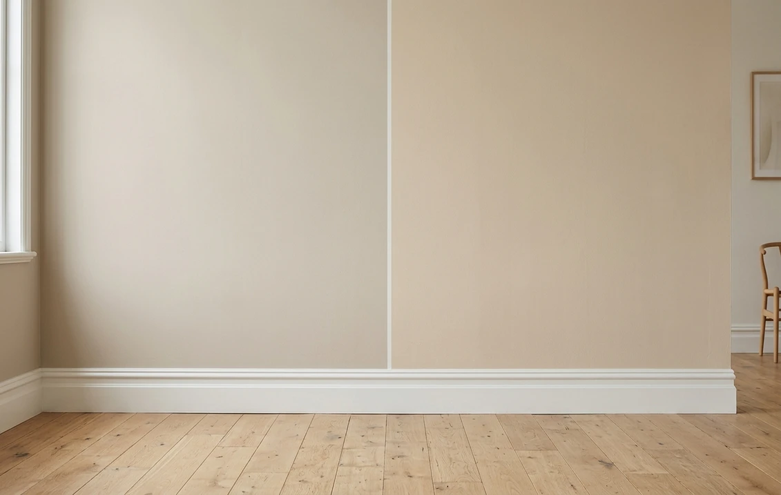
The verdict in three lines. Accessible Beige SW 7036 (LRV 58) is the greige of the pair: beige tempered with gray, it stays quiet next to white trim and bridges gray and beige finishes.
Kilim Beige SW 6106 (LRV 57) is the frank warm beige: a gold-leaning tan with a soft pink cast that flatters wood, travertine, and cream trim.
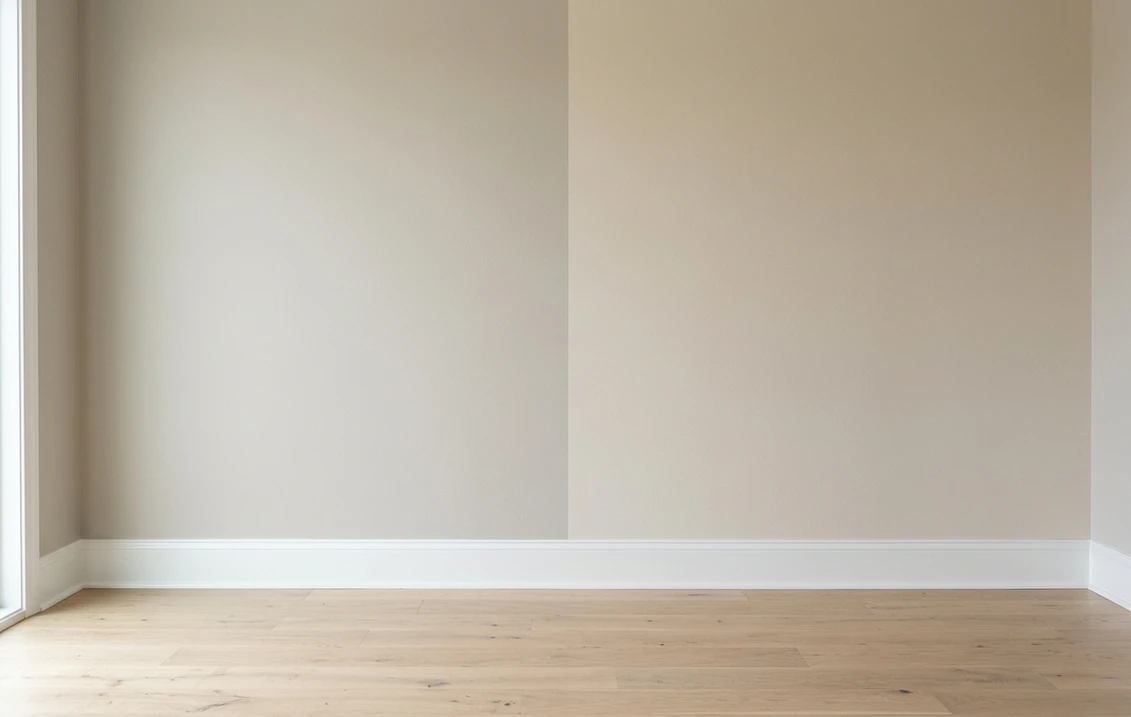
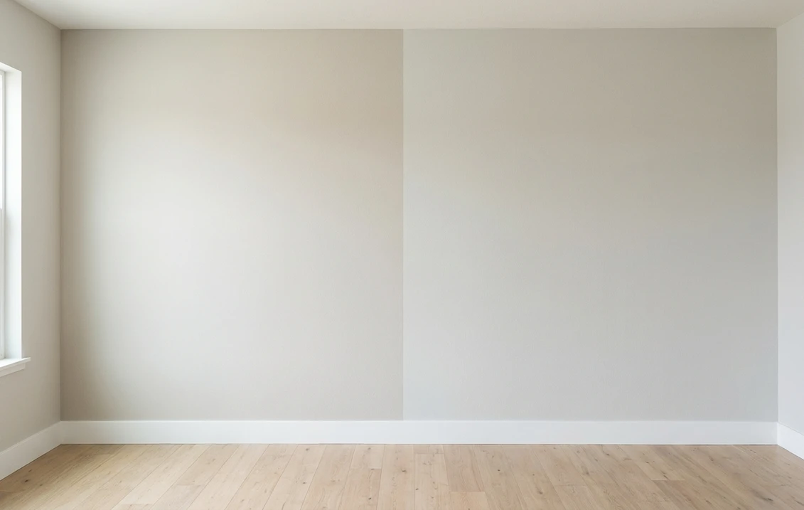
The 1-point LRV gap is invisible on a wall. Undertone decides this duel, so the only real tiebreaker is seeing both on a photo of your own room.
Sherwin-Williams Accessible Beige (SW 7036) and Kilim Beige (SW 6106) are the two beiges American homeowners shortlist most often, and on small chips they look like siblings. On a full wall they part ways fast: one keeps a gray backbone, the other commits to warmth. This head-to-head puts the numbers side by side, walks the duel room by room and exposure by exposure, and tells you exactly when each color wins. For the general method behind any two-color decision, start with our side-by-side method for comparing paint colors.
The numbers side by side
| Attribute | Accessible Beige SW 7036 | Kilim Beige SW 6106 |
|---|---|---|
| Family | Greige-leaning beige | Warm true beige |
| LRV | 58 | 57 |
| Approximate hex | #D1C7B8 | #D7C5AE |
| Approximate RGB | 209, 199, 184 | 215, 197, 174 |
| Undertone | Beige steadied by gray, stays neutral | Gold warmth with a soft pink-peach cast |
| Loves | Crisp white trim, gray-veined stone, mixed gray and beige finishes | Oak and walnut floors, travertine, cream trim, warm textiles |
| Watch out for | Can drift flat and grayish in dim north light | Can flash peachy-pink in strong warm or western light |
| Overall vibe | Calm, current, transitional | Cozy, classic, unapologetically warm |
Try it on your house
No photo? Try a sample
LRV values are the published Sherwin-Williams figures. Hex and RGB are approximate digital renderings; the authoritative reference is a physical Sherwin-Williams chip or peel-and-stick sample.
Read the table once and the shape of the duel is clear. Depth is a tie: at LRV 58 versus 57, both colors reflect almost exactly the same share of visible light, and nobody standing in your living room will call one of them "the dark one." Everything that matters happens in the undertone row. Accessible Beige carries enough gray to stay neutral, which is why it survived the gray decade as the beige gray-lovers could accept. Kilim Beige never hedged: it is a committed warm beige whose gold base can lean pink-peach when the light pushes it. Hold each chip against a plain sheet of white printer paper and the split jumps out in seconds: Accessible shows its gray backbone, Kilim shows its warmth. That white-paper trick, plus the two-coat sample rule, comes straight from the comparison method in the pillar guide linked above.
Upload one photo, get a photorealistic render, then swap to Kilim Beige in one click. Free, no signup.
Room by room, exposure by exposure
Because the LRV gap is negligible, the same room can crown either color depending on its light and its fixed finishes. Here is how the duel typically plays out across the most common situations.
| Situation | Usual winner | Why |
|---|---|---|
| North-facing living room | Kilim Beige | Its stronger warmth survives flat, cool light; Accessible can turn grayish and flat |
| Bright south or west room | Accessible Beige | Strong warm sun amplifies Kilim's gold and can pull it peachy; Accessible stays composed |
| Open-plan whole-main-floor color | Either, pick by finishes | Both are proven whole-house neutrals; match the undertone to floors and trim |
| Kitchen with bright white cabinets | Accessible Beige | The gray backbone sits cleanly next to crisp white; Kilim can read yellowed beside it |
| Bedroom with wood furniture and linen | Kilim Beige | Gold warmth flatters wood tones, rattan, and warm textiles |
| Exterior body color | Either, sample outside | Daylight shifts both; test on the sunniest and shadiest sides before committing |
Outdoors the same logic applies with harsher light. If the shortlist is for siding rather than walls, the Accessible Beige exterior guide covers orientation, trim pairings, and siding materials in full. Kilim Beige runs warmer still under direct sun, so sample it on the brightest facade before ordering gallons.
When to choose Accessible Beige
- Your finishes mix gray and beige. Gray quartz next to oak floors, beige carpet next to a charcoal sofa: Accessible Beige is the diplomat that makes both camps look intentional.
- Your trim is crisp bright white. The gray backbone keeps the wall looking clean and current against stark white; a warmer beige can look yellowed in the same spot.
- The room gets strong afternoon sun. South and west light push every beige warmer; Accessible has less warmth to exaggerate and holds its neutral read.
- You want beige without the yellow. If "warm but not golden" is the brief, Accessible Beige is that exact chip.
For its full undertone breakdown, best rooms, and trim pairings, see the dedicated Accessible Beige undertones and best rooms profile.
When to choose Kilim Beige
- Your finishes are warm through and through. Honey oak, walnut, travertine, terracotta, brass, cream trim: Kilim Beige joins that family instead of cooling it down.
- The room faces north or gets little direct sun. Cool light strips warmth from every paint color; Kilim has warmth in reserve and stays welcoming where Accessible can go flat.
- You are layering warm accents. Rust, camel, olive, and chocolate sit more comfortably on Kilim's gold base than on a gray-steadied wall.
- The house leans traditional. In colonial, Tuscan-inspired, or classic-trim interiors, Kilim Beige reads established rather than trendy.
The full room-by-room treatment, including its lighting behavior and companion shades, lives in the Kilim Beige room-by-room profile.
Both lists end on the same unnamed decision: the trim white. Accessible Beige asks for a crisp one, Kilim Beige asks for a warmer one, and the Benjamin Moore pair that splits along exactly that line is Chantilly Lace OC-65, at LRV 90.04 with almost no visible yellow, against Simply White OC-117, at LRV 91.7 with a soft yellow base. Note the shape of it: those two whites sit under two LRV points apart, so brightness settles nothing on your millwork any more than the 1-point gap settles the walls here. Our Simply White vs Chantilly Lace duel decides the trim on undertone, the same way this page decides the walls.
Same wall, both beiges, your actual light. Free render in about 30 seconds.
Frequently asked questions
What is the real difference between Accessible Beige and Kilim Beige?
Undertone, not depth. Accessible Beige SW 7036 (LRV 58) is a greige-leaning beige steadied by gray, while Kilim Beige SW 6106 (LRV 57) is a frankly warm beige with a gold base and a soft pink-peach cast. The 1-point LRV difference is invisible on a wall; the neutral-versus-warm character is what changes how a room feels.
Is Kilim Beige warmer than Accessible Beige?
Yes, clearly. Hold both chips against white paper and Kilim Beige shows a gold, slightly pink-peach warmth while Accessible Beige reads grayer and more neutral. That warmth makes Kilim the friendlier partner for honey oak, travertine, and cream trim, and the safer pick in rooms with little natural light.
Which is better for a north-facing room, Accessible Beige or Kilim Beige?
Kilim Beige, in most homes. North light is cool and flat, and it can push Accessible Beige toward a grayish, washed-out reading. Kilim Beige keeps its warmth in the same light. If the room's finishes are strongly cool (bright white trim, gray stone), Accessible Beige can still work, but sample it on that specific wall first.
Can I use Accessible Beige and Kilim Beige together in the same house?
You can, but keep them in separate zones. At nearly identical depth, side by side on connected walls they look like a mismatched batch rather than a deliberate contrast. A cleaner plan is one beige for the main areas and the other, or a deeper shade from the same strip, in a closed-off room.
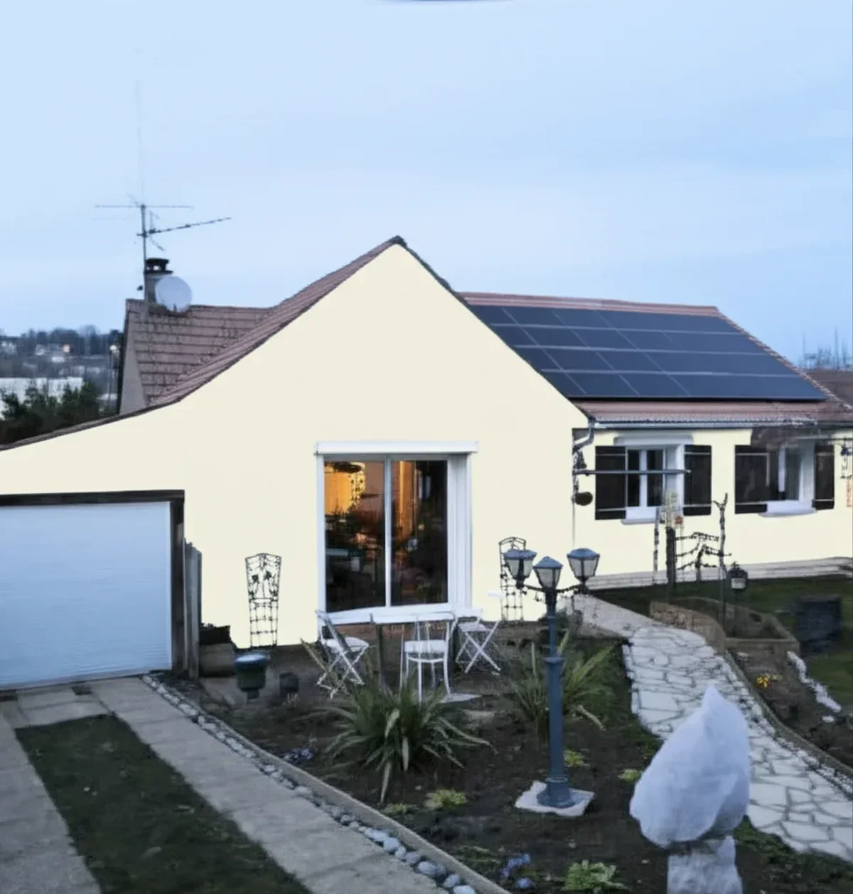
The difference between the two shows most clearly in the shutters a house can carry: Accessible Beige takes black or navy as readily as brown, Kilim Beige's red-yellow base wants brown (Sequoia SW 6313) or a dark green. Our guide to shutter colors for a beige house goes through both cases.
Settle it on your photo
Chips lie, screens lie, and even honest sample patches sit on someone else's wall in someone else's light. The fastest honest answer to Accessible Beige vs Kilim Beige is to test both colors on a photo of your actual room and let your own trim, floor, and windows pick the winner. And if Accessible Beige takes the crown but the room wants one step more depth, the Accessible Beige vs Balanced Beige duel walks the next shade down the same strip.
1 HD render plus 3 free color variations. Start with Accessible Beige, swap to Kilim Beige in one click.
Trademark notice. Sherwin-Williams®, Accessible Beige®, Kilim Beige®, Balanced Beige® and Natural Linen® are trademarks of The Sherwin-Williams Company. FacadeColorizer is not affiliated with, endorsed by, or sponsored by The Sherwin-Williams Company. Brand and color names are used for descriptive and editorial purposes only, consistent with nominative fair use. Hex and RGB values are approximate digital renderings; the only authoritative reference is a physical Sherwin-Williams color sample.
Trademarks mentioned (Sherwin-Williams, Benjamin Moore, Behr, Caparol, Brillux, Sto, Alpina, Valspar, PPG, Glidden, Dulux, Crown Trade, Sandtex, Farrow & Ball, Johnstone's, Leyland) are property of their respective owners. FacadeColorizer is independent and not affiliated with any of them. Nominative fair use under Lanham Act §1125.