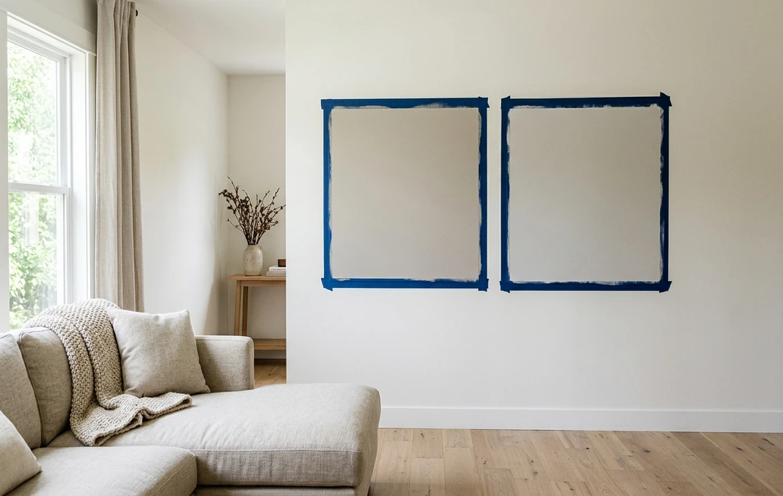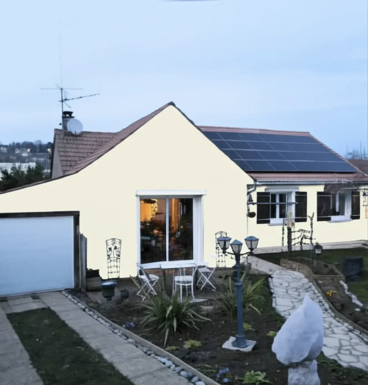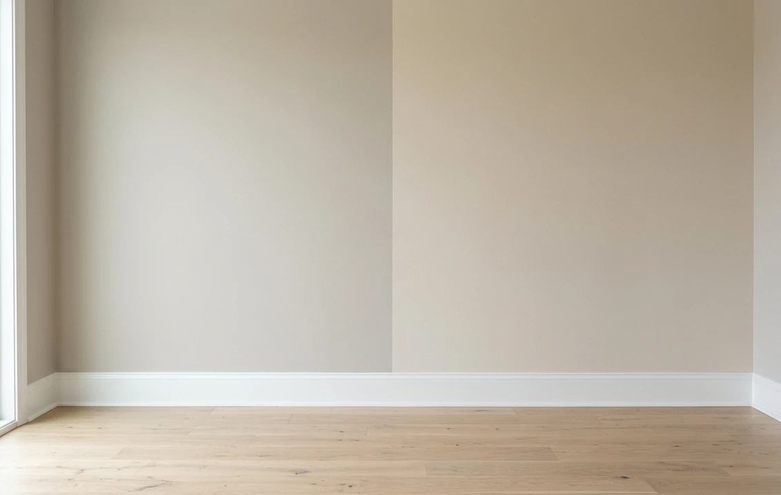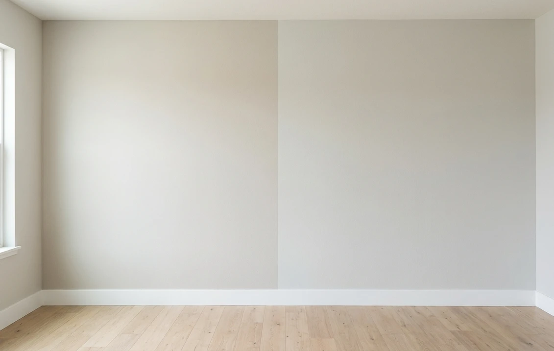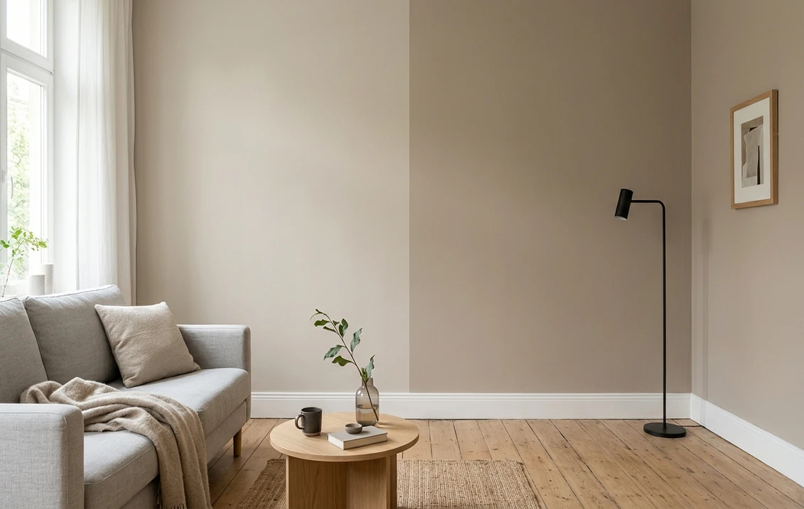
Try it on your house

The verdict in three lines. Accessible Beige SW 7036 (LRV 58) is the lighter contender: a beige softened with gray that can run through a whole house without tiring the eye.
Balanced Beige SW 7037 (LRV 46) is the next chip down on the same Sherwin-Williams strip: one full step deeper and warmer, with a taupe lean that holds its color in bright light.
Unlike most beige duels, depth decides this one, not undertone. The 12-point LRV gap is visible from the doorway, so the only honest tiebreaker is seeing both on a photo of your own room.
Sherwin-Williams Accessible Beige (SW 7036) and Balanced Beige (SW 7037) sit side by side on the same color strip, share the same warm greige-beige DNA, and end up taped to the same wall in thousands of American living rooms every month. On chips they look like near twins. On a full wall they behave like a light neutral and a mid-tone, which is a very different decision. This head-to-head puts the numbers side by side, walks the duel room by room and exposure by exposure, and tells you exactly when each color wins. For the general method behind any two-color decision, start with our side-by-side method for comparing any two paint colors.
The numbers side by side
| Attribute | Accessible Beige SW 7036 | Balanced Beige SW 7037 |
|---|---|---|
| Family | Warm greige-beige | Warm taupe-beige |
| LRV | 58 (light neutral) | 46 (mid-tone) |
| Approximate hex | #D1C7B8 | #C0B2A2 |
| Approximate RGB | 209, 199, 184 | 192, 178, 162 |
| Undertone | Beige tempered by gray, no loud yellow or pink | Same warmth one step deeper, leans taupe |
| Loves | White trim, oak floors, linen, whole-house schemes | Creamy trim, wood tones, cozy rooms, strong daylight |
| Watch out for | Can wash toward off-white in strong direct sun | Can feel heavy in small, dim rooms |
| Overall vibe | Airy, versatile, safe | Grounded, cozy, more saturated |
Try it on your house
No photo? Try a sample
LRV values are the published Sherwin-Williams figures. Hex and RGB are approximate digital renderings; the authoritative reference is a physical Sherwin-Williams chip or peel-and-stick sample.
Read that table once and the shape of the duel is clear. In most greige face-offs the LRV gap is background noise and undertone does all the deciding. Here it is the reverse: the two undertones are close siblings from the same strip, and depth does the deciding. Twelve LRV points is roughly the difference between a color that brightens a room and a color that wraps it. The real question is not which undertone you prefer but how much color these walls need to carry.
Upload one photo, get a photorealistic render, then swap to Balanced Beige in one click. Free, no signup.
Room by room, exposure by exposure
Because depth is the deciding factor, the winner in each room follows the light and the job the wall has to do. Here is how the duel typically plays out across the most common situations.
| Situation | Usual winner | Why |
|---|---|---|
| Open-plan main floor | Accessible Beige | Light enough to run through connected spaces without going dark in corners |
| Bright south-facing room | Balanced Beige | Strong sun washes lighter neutrals toward off-white; SW 7037 keeps its color |
| North-facing or dim room | Accessible Beige | The higher LRV keeps a low-light room from feeling heavy |
| Dining room or bedroom that should feel cocooned | Balanced Beige | Mid-tone depth does the cozy work without going brown |
| Kitchen with white cabinets | Accessible Beige | A soft, warm backdrop that lets the cabinetry stay the star |
| Accent wall in an Accessible Beige scheme | Balanced Beige | Same-strip tone-on-tone reads deliberate, never like a mismatched batch |
Outdoors the same logic applies with harsher light. Full sun visually lightens every paint color by a step or more, which is why mid-tones like Balanced Beige often photograph better on siding than the light neutrals that looked perfect indoors. If the shortlist is for the outside of the house rather than the walls inside it, the Accessible Beige exterior guide covers orientation, trim pairings, and siding materials in full.
When to choose Accessible Beige
- You want one color for the whole main floor. At LRV 58 it is light enough to repeat through hallways, stairwells, and open-plan rooms without any of them reading dark.
- The room gets modest or northern light. The gray in its base keeps it composed in cool light, and the higher LRV keeps the room feeling open.
- Your fixed finishes are already busy. Patterned tile, veined stone, or bold textiles want a quiet wall, and SW 7036 is the quieter of the two.
- You are stepping away from gray without committing to a saturated beige. It is the classic bridge color between a gray era and a warm one.
For its full undertone breakdown, best rooms, and trim pairings, see the dedicated Accessible Beige undertones and best rooms profile.
When to choose Balanced Beige
- The room is bright and sun-flooded. Where lighter neutrals bleach out by mid-morning, SW 7037 still looks like a chosen color at noon.
- You want warmth you can actually see. Dining rooms, bedrooms, and dens that should feel wrapped rather than airy are its home turf.
- You are layering, not repainting everything. As an accent wall, a below-the-rail color, or a hallway moment inside a lighter scheme, it pairs seamlessly with its strip-mate.
- The furniture leans wood and leather. The taupe lean flatters walnut, oak, caramel leather, and woven textures better than a paler wall does.
The full room-by-room treatment, including its lighting behavior and companion shades, lives in the Balanced Beige room-by-room profile.
Same wall, both beiges, your actual light. Free render in about 30 seconds.
Frequently asked questions
What is the difference between Accessible Beige and Balanced Beige?
Mainly depth. Both are warm greige-beiges from the same Sherwin-Williams strip, so their undertones are close siblings. Accessible Beige SW 7036 sits at LRV 58, a light neutral; Balanced Beige SW 7037 sits at LRV 46, a true mid-tone that reads one full step deeper and slightly more taupe on the wall.
Is Balanced Beige darker than Accessible Beige?
Yes, clearly. The 12-point LRV gap (46 versus 58) is visible on a full wall from across the room in any light. On small chips the two can look deceptively similar, which is exactly why this pair gets sampled together so often and why a full-wall preview settles it faster than chips do.
Can I use Accessible Beige and Balanced Beige together?
Yes, and it is one of the safest tone-on-tone pairings in the deck because they share a strip. A classic recipe is Accessible Beige on the main walls, Balanced Beige on an accent wall, below wainscoting, or in a connected dining room, with the same warm white on all the trim to tie the two together.
Which is better for a dark or north-facing room, Accessible Beige or Balanced Beige?
Accessible Beige, in most homes. Its higher LRV keeps a low-light room from feeling closed in, while Balanced Beige can turn heavy where daylight is scarce. The exception is a deliberately moody den or dining room with good lamp light, where the deeper SW 7037 makes the dimness feel intentional.
Settle it on your photo
Chips lie, screens lie, and a sample patch on someone else's wall tells you about their light, not yours. The fastest honest answer to Accessible Beige vs Balanced Beige is to test both colors on a photo of your actual room and let your own trim, floor, and windows pick the winner. If the shortlist drifts warmer while you compare, the Kilim Beige profile covers the sunniest of the popular SW beiges, and the wider 2026 Sherwin-Williams interior color guide maps the rest of the deck.
1 HD render plus 3 free color variations. Start with Accessible Beige, swap to Balanced Beige in one click.
Trademark notice. Sherwin-Williams®, Accessible Beige®, Balanced Beige®, Kilim Beige® and Natural Linen® are trademarks of The Sherwin-Williams Company. FacadeColorizer is not affiliated with, endorsed by, or sponsored by The Sherwin-Williams Company. Brand and color names are used for descriptive and editorial purposes only, consistent with nominative fair use. Hex and RGB values are approximate digital renderings; the only authoritative reference is a physical Sherwin-Williams color sample.
Trademarks mentioned (Sherwin-Williams, Benjamin Moore, Behr, Caparol, Brillux, Sto, Alpina, Valspar, PPG, Glidden, Dulux, Crown Trade, Sandtex, Farrow & Ball, Johnstone's, Leyland) are property of their respective owners. FacadeColorizer is independent and not affiliated with any of them. Nominative fair use under Lanham Act §1125.