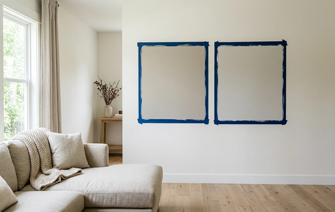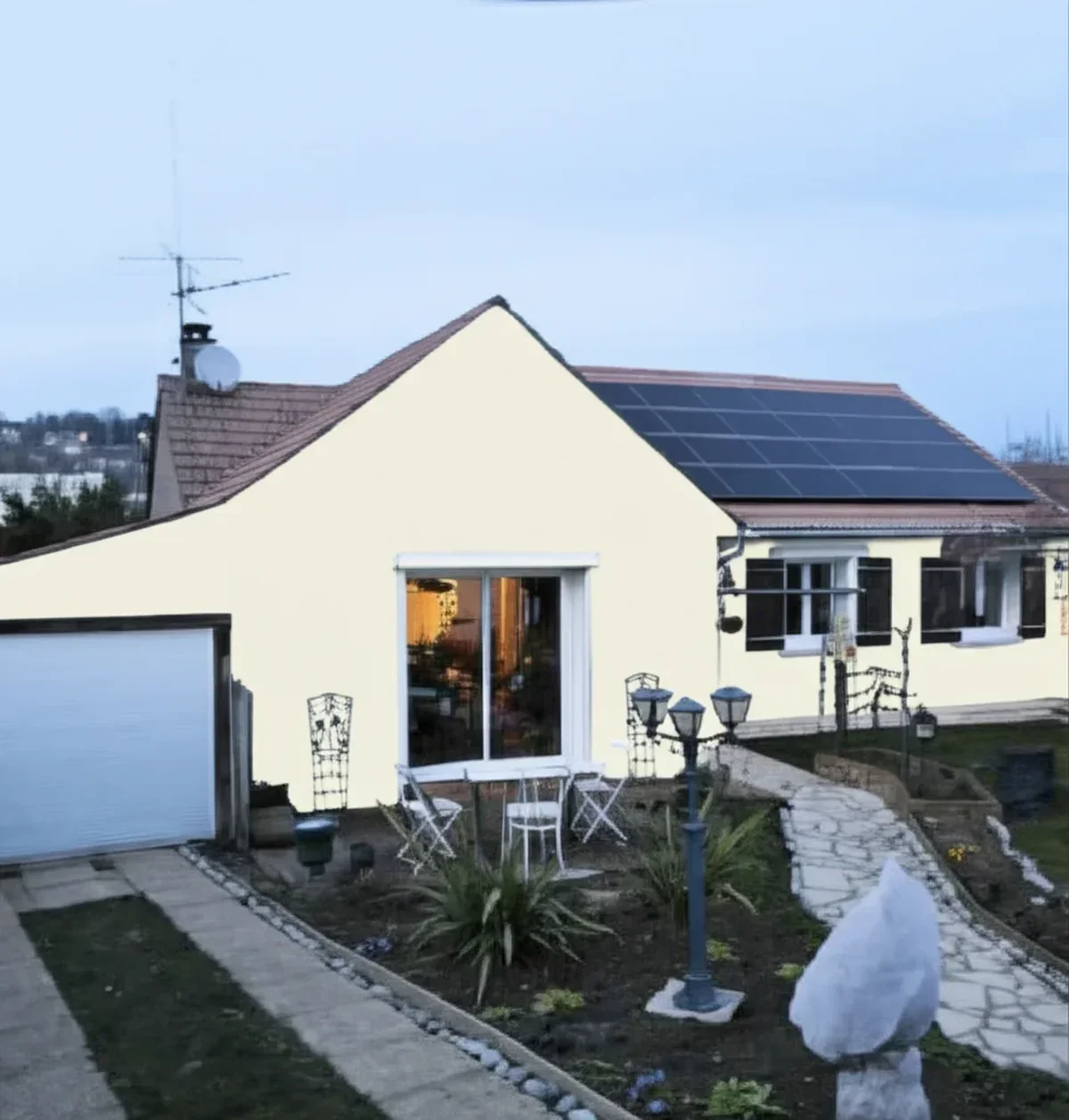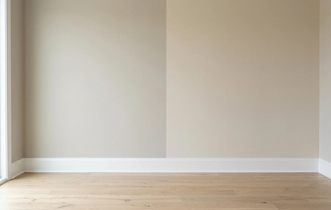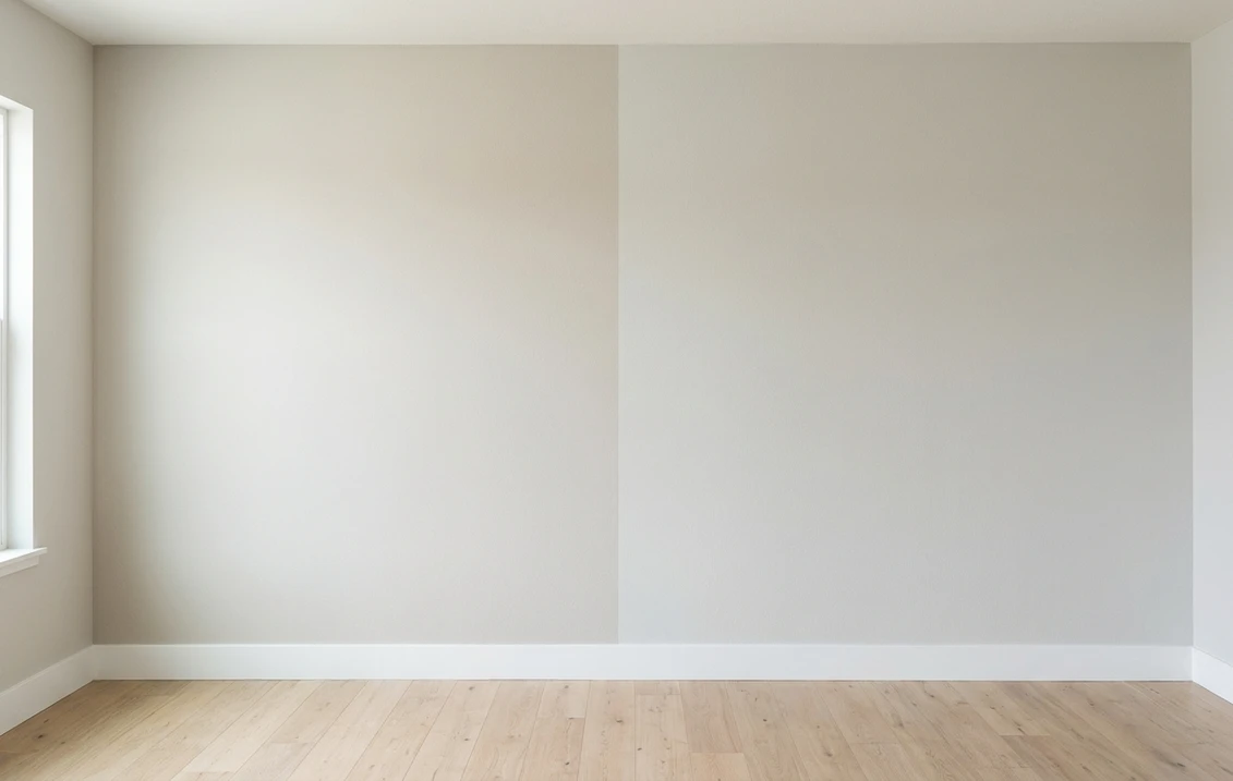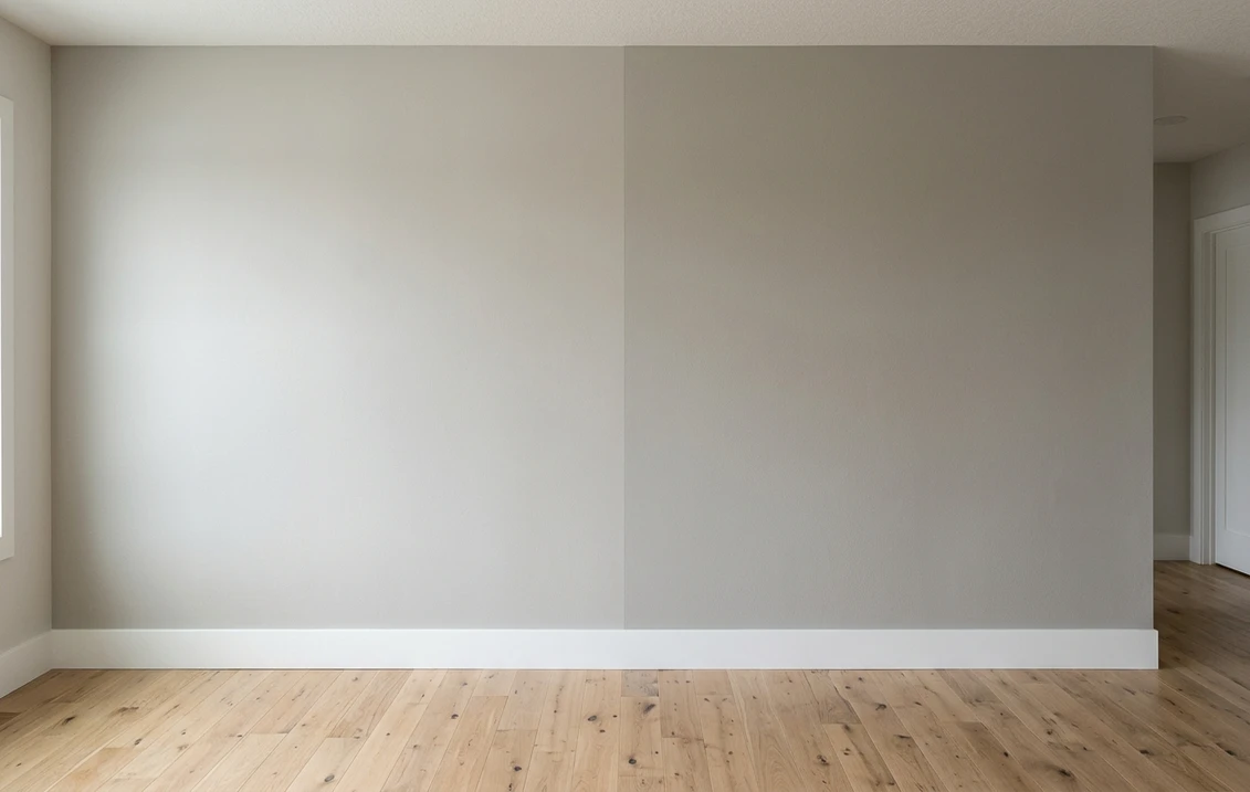
Try it on your house

The verdict in three lines. Mindful Gray SW 7016 (LRV 48) is the lighter pick: a mid-light warm gray that keeps average rooms open and bright.
Dorian Gray SW 7017 (LRV 39) is the deeper pick: one full step down the same strip, with real weight against white trim.
The undertones are essentially the same, so this duel is decided by depth and daylight. The only real tiebreaker is seeing both on a photo of your own room.
Sherwin-Williams Mindful Gray (SW 7016) and Dorian Gray (SW 7017) are next-door neighbors on the same warm gray strip, sitting directly below Repose Gray. That makes this duel the mirror image of most gray showdowns: instead of two look-alike chips separated by undertone, you get two colors from one family separated by a clearly visible 9-point LRV gap. Pick wrong and the room feels either washed out or heavier than you planned. This head-to-head puts the numbers side by side, runs the duel room by room and exposure by exposure, and tells you exactly when each shade wins. For the general playbook behind any two-color decision, start with our method for comparing two paint colors side by side.
The numbers side by side
| Attribute | Mindful Gray SW 7016 | Dorian Gray SW 7017 |
|---|---|---|
| Family | Warm gray, mid-light | Warm gray, mid-depth |
| LRV | 48 | 39 |
| Approximate hex | #BCB7AD | #ACA79E |
| Approximate RGB | 188, 183, 173 | 172, 167, 158 |
| Undertone | Warm taupe base, can flash softly green in bright light | Same warm taupe family, reads slightly earthier as it darkens |
| Loves | White trim, light oak floors, rooms with average light | Bright rooms, crisp white trim, brass or black hardware |
| Watch out for | Can wash out in strong southern sun | Can feel heavy in small or dim rooms |
| Overall vibe | Calm, open, whole-house safe | Grounded, tailored, more dramatic |
Try it on your house
No photo? Try a sample
LRV values are the published Sherwin-Williams figures. Hex and RGB are approximate digital renderings; the authoritative reference is a physical Sherwin-Williams chip or peel-and-stick sample.
Read that table once and the shape of this duel is clear. Undertone is a tie: both colors come from the same strip and share the same warm taupe base, so neither will surprise you with a hidden blue or purple cast. Everything that matters happens in the LRV row. Nine points is not chip-swatch noise; it is the difference between a wall that recedes and a wall that asserts itself. Hold the two chips side by side on white printer paper and Dorian Gray immediately reads as "the dark one." That is why the usual undertone tests matter less here, and the light audit from the pillar guide linked above matters more: count your windows, note your exposure, and be honest about how much daylight the room actually gets.
Upload one photo, get a photorealistic render, then swap to Dorian Gray in one click. Free, no signup.
Room by room, exposure by exposure
Because depth is the deciding factor, the winner tracks the light almost mechanically: the brighter the room, the more Dorian Gray earns its keep. Here is how the duel typically plays out.
| Situation | Usual winner | Why |
|---|---|---|
| North-facing living room | Mindful Gray | Flat, cool light already darkens paint; Dorian can slide toward gloomy |
| Bright south-facing room | Dorian Gray | Strong sun bleaches lighter grays; Dorian keeps its presence all day |
| Small bedroom or hallway | Mindful Gray | Higher LRV keeps tight spaces from closing in |
| Open-plan whole-main-floor color | Mindful Gray | Mid-light depth stays livable across mixed exposures; Dorian is better zoned |
| Den, office, or dining room | Dorian Gray | The extra depth delivers the tailored, enveloping look those rooms want |
| Exterior body color | Either, sample outside | Full daylight lifts both roughly a step lighter; mid-tones often gain from it |
Outdoors the depth logic actually flips in Dorian's favor less often than you would think, because open daylight makes both colors read lighter than their interior selves and Mindful Gray holds up better outside than its LRV suggests. If your shortlist is for siding rather than walls, the complete Mindful Gray 7016 exterior guide covers orientation, trim pairings, and siding materials in full.
When to choose Mindful Gray
- The room gets average or limited light. At LRV 48, Mindful Gray still reflects enough light to keep a normal room open where Dorian Gray would start to brood.
- You want one color for connected spaces. Its mid-light depth survives the exposure changes of an open floor plan without turning cave-like in the dim corners.
- You are nervous about "too dark." Mindful Gray delivers more presence than pale greiges like Repose Gray while staying safely inside mainstream, resale-friendly territory.
- Your finishes are light. White trim, light oak, and pale counters keep their airy contrast against a mid-light wall.
When to choose Dorian Gray
- The room is genuinely bright. Big windows and southern sun wash lighter grays toward off-white; Dorian Gray keeps its color from morning to evening.
- You want visible contrast with white trim. The 39 LRV gives baseboards, casings, and cabinetry a crisp outline that Mindful Gray only hints at.
- The brief is cozy, tailored, or moody-but-warm. Dens, offices, dining rooms, and feature walls are where Dorian Gray does its best work.
- You are layering a tone-on-tone palette. Dorian reads as the natural "one step deeper" partner to its strip mates rather than a new color entirely. A ladder like that usually still wants one true anchor at the bottom, under LRV 10, and warm greige schemes take it in navy rather than black: our Hale Navy vs Newburyport Blue duel picks between the two that pair with warm woods and brass.
If you would rather take that bottom anchor in black than in navy, the warm-versus-cool question simply repeats one octave down. Peppercorn vs Iron Ore separates the near-black that keeps a faintly warm edge, Iron Ore at LRV 6, from the cooler charcoal that never lets go of its gray identity, Peppercorn at LRV 10. Iron Ore is the one that sits comfortably under a Mindful or Dorian ladder without turning the scheme cold.
For its full undertone breakdown, lighting behavior, and companion shades, see the dedicated Dorian Gray undertones and best rooms profile.
Same wall, both depths, your actual light. Free render in about 30 seconds.
Frequently asked questions
What is the real difference between Mindful Gray and Dorian Gray?
Depth, not undertone. Both are warm grays from the same Sherwin-Williams strip, so they share the same taupe-leaning base. Mindful Gray SW 7016 has an LRV of 48 and Dorian Gray SW 7017 an LRV of 39, a 9-point gap that is clearly visible on a full wall: Mindful keeps rooms open while Dorian adds noticeable weight.
Is Dorian Gray darker than Mindful Gray?
Yes. Dorian Gray sits one full step below Mindful Gray on the same color strip. On chips the difference looks modest, but across an entire room the 9 LRV points read as a distinctly deeper, more tailored wall, especially next to white trim.
Which is better for a dark or north-facing room, Mindful Gray or Dorian Gray?
Mindful Gray, in most homes. Cool, flat light makes every paint color read darker than its chip, and Dorian Gray can tip from cozy into gloomy without direct sun. Mindful Gray keeps enough reflectance to stay warm and open. Save Dorian Gray for the bright rooms, or for a deliberately moody den.
Can I use Mindful Gray and Dorian Gray together in the same house?
Yes, and unlike most look-alike pairs they combine beautifully. Because they share the same undertone, the pairing reads as a deliberate tone-on-tone scheme: Mindful Gray on main walls with Dorian Gray on a feature wall, built-ins, or an adjacent room delivers depth without introducing a second color family.
Settle it on your photo
Chips lie, screens lie, and a 9-point LRV gap behaves differently in every room it meets. The fastest honest answer to Mindful Gray vs Dorian Gray is to test both on a photo of your actual space and let your own windows decide. If the shortlist is drifting lighter instead of deeper, the Repose Gray vs Mindful Gray duel covers the step up the strip, and the Agreeable Gray vs Repose Gray head-to-head settles the classic light-greige matchup.
1 HD render plus 3 free color variations. Start with Mindful Gray, swap to Dorian Gray in one click.
Trademark notice. Sherwin-Williams®, Mindful Gray®, Dorian Gray®, Repose Gray® and Gauntlet Gray® are trademarks of The Sherwin-Williams Company. FacadeColorizer is not affiliated with, endorsed by, or sponsored by The Sherwin-Williams Company. Brand and color names are used for descriptive and editorial purposes only, consistent with nominative fair use. Hex and RGB values are approximate digital renderings; the only authoritative reference is a physical Sherwin-Williams color sample.
Trademarks mentioned (Sherwin-Williams, Benjamin Moore, Behr, Caparol, Brillux, Sto, Alpina, Valspar, PPG, Glidden, Dulux, Crown Trade, Sandtex, Farrow & Ball, Johnstone's, Leyland) are property of their respective owners. FacadeColorizer is independent and not affiliated with any of them. Nominative fair use under Lanham Act §1125.