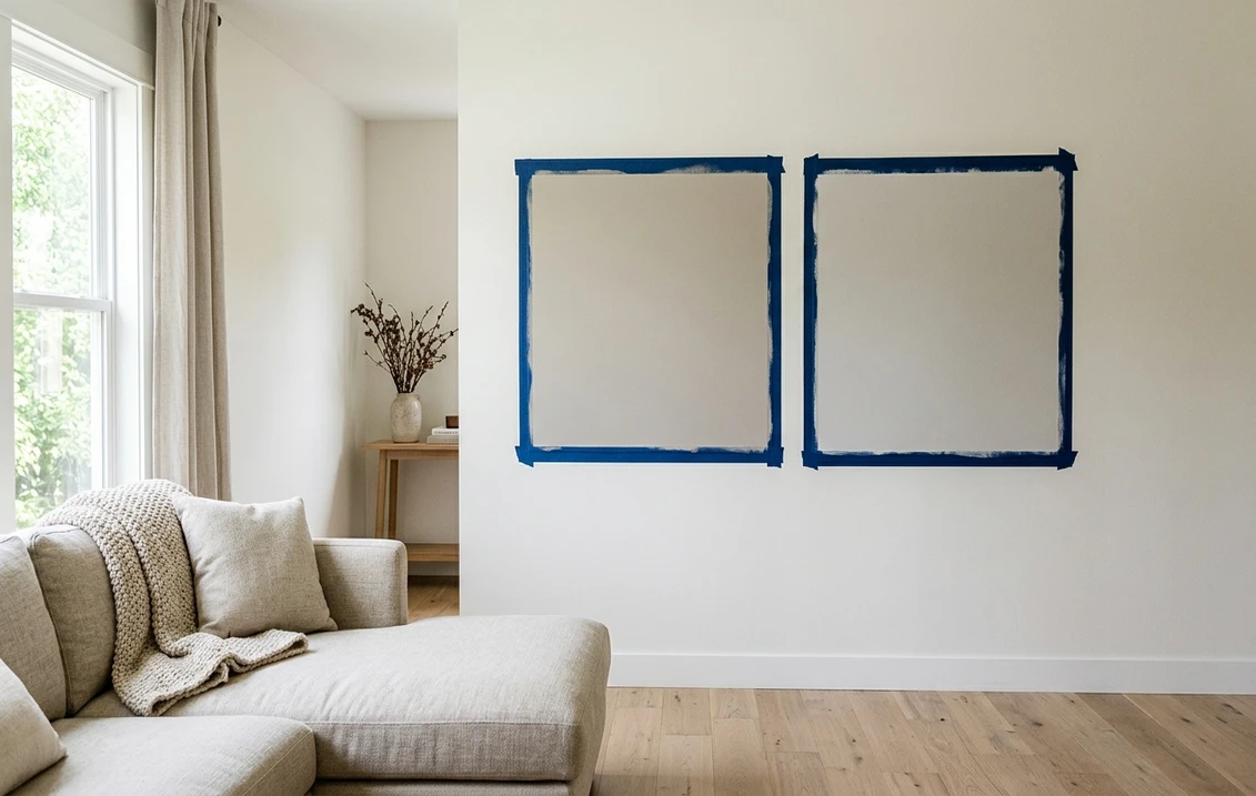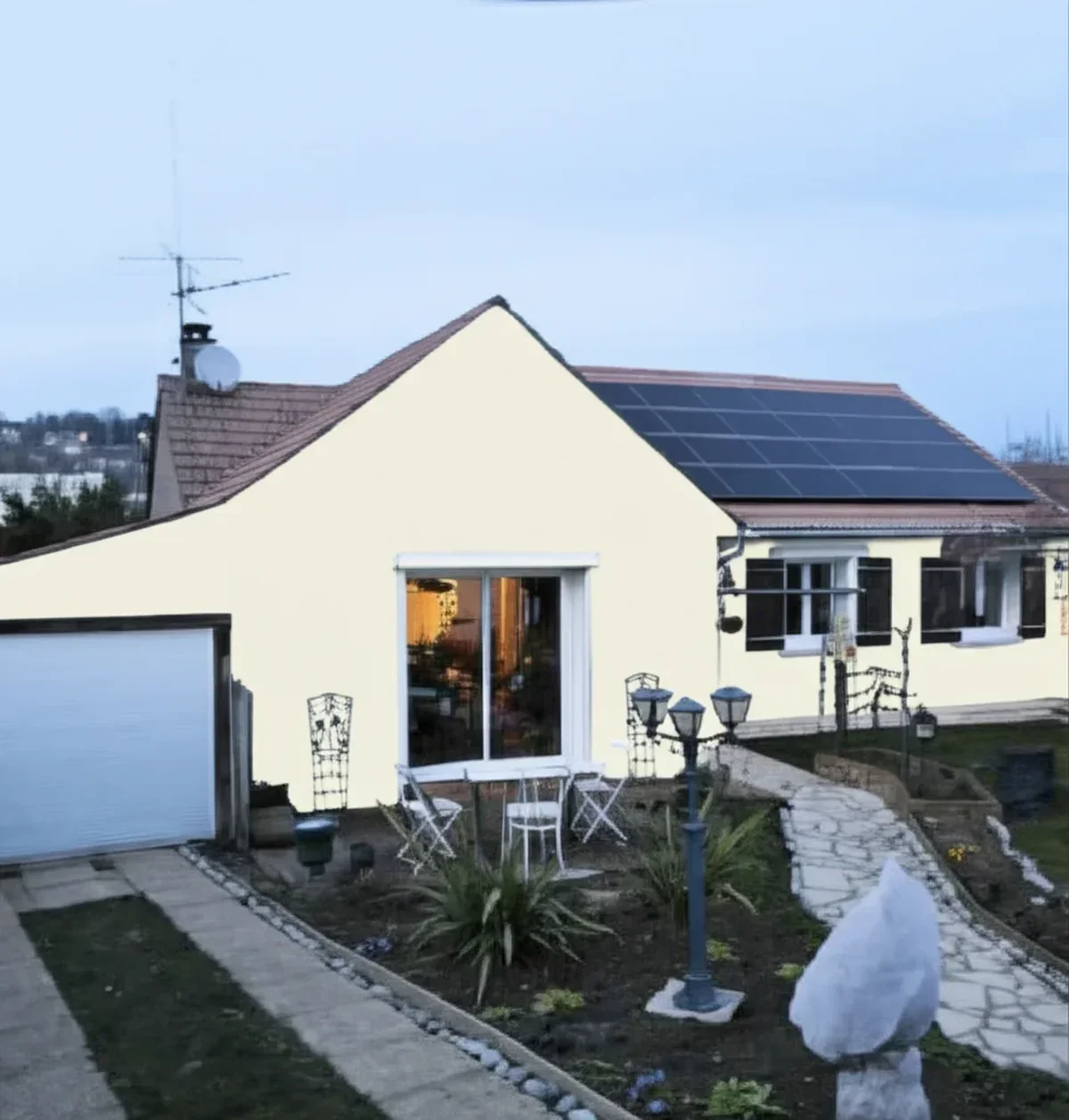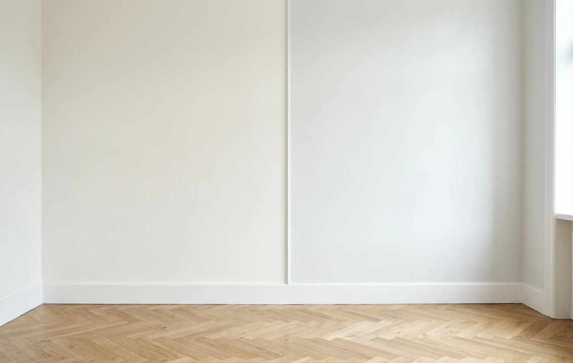
Try it on your house

The verdict in three lines. Pure White SW 7005 (LRV 84) is the soft, forgiving white: a whisper of warmth that flatters wood, cream, and brass and never reads stark.
Extra White SW 7006 (LRV 86) is the crisp, cool white: a faint blue-gray edge that makes trim pop bright and suits gray walls, marble, and black metal.
The 2-point LRV gap is background noise. Warm-versus-cool undertone decides this duel, so the only real tiebreaker is seeing both on a photo of your own room.
Sherwin-Williams Pure White (SW 7005) and Extra White (SW 7006) are the two most-sold whites in the Sherwin-Williams deck, and between them they anchor more trim, cabinet, and ceiling jobs than any other pair. On a chip they look like the same white. On a full wall, in real light, they are not: one is soft and barely warm, the other crisp and faintly cool. This head-to-head puts the numbers side by side, walks the duel surface by surface and room by room, and says when each white wins. For the method behind any two-color decision, start with our side-by-side method for comparing paint colors.
The numbers side by side
| Attribute | Pure White SW 7005 | Extra White SW 7006 |
|---|---|---|
| Family | Soft warm-neutral white | Cool crisp white |
| LRV | 84 | 86 |
| Approximate hex | #EDECE6 | #EEEFEA |
| Approximate RGB | 237, 236, 230 | 238, 239, 234 |
| Undertone | Barely-there warmth, a whisper of soft gray-cream | Cool and clean, with a faint blue-gray edge |
| Loves | Warm woods, cream cabinets, brass, transitional rooms | Gray or greige walls, black metal, marble, modern rooms |
| Watch out for | Can look slightly warm next to a stark bright white | Can read cold or sterile in low or north light |
| Overall vibe | Soft, versatile, forgiving | Bright, crisp, modern |
Try it on your house
No photo? Try a sample
LRV values are the published Sherwin-Williams figures. Hex and RGB are approximate digital renderings; the authoritative reference is a physical Sherwin-Williams chip or peel-and-stick sample.
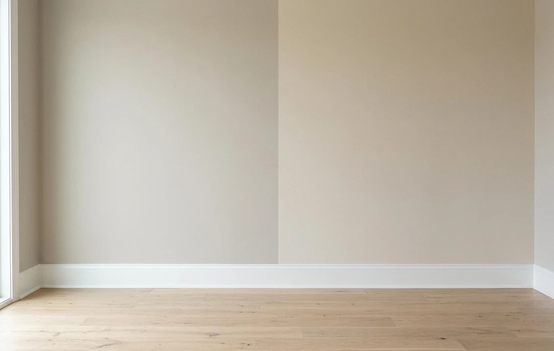
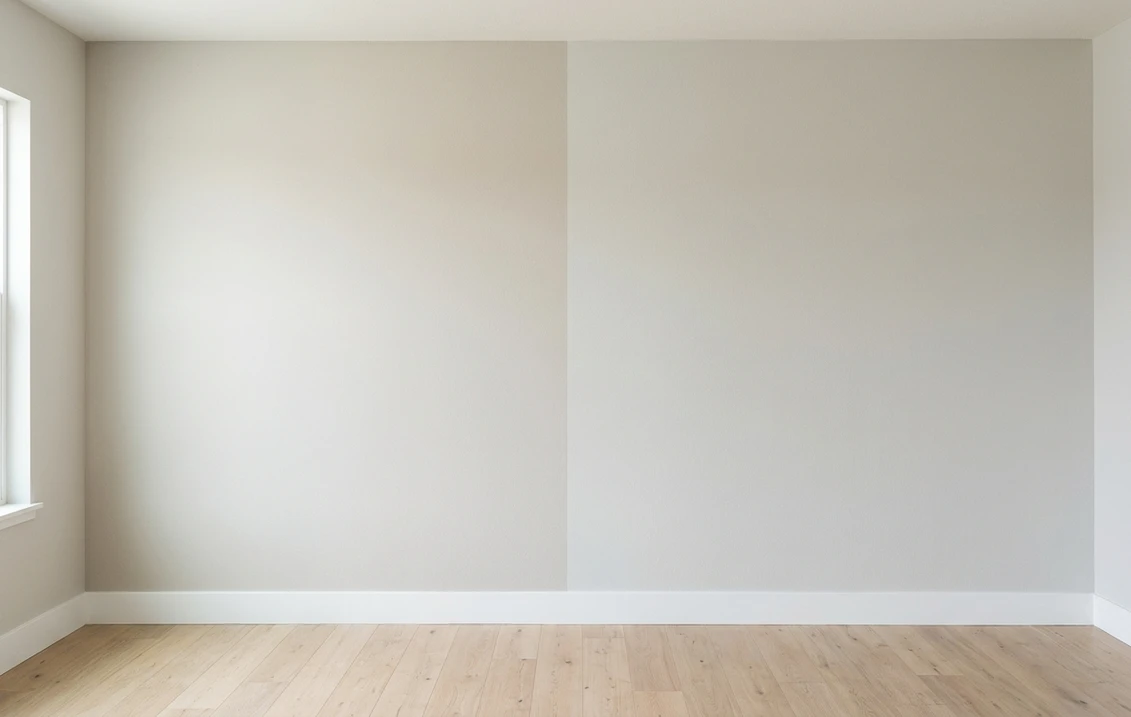
Read that table once and the duel's shape is clear. Depth is a tie: at LRV 84 versus 86, both whites bounce back nearly the same light, and nobody will call one the dark one. Everything that matters sits in the undertone row. Pure White carries a barely-there warmth that keeps it soft; Extra White holds a cooler, cleaner base with a faint blue-gray edge. Hold each chip against bright white printer paper and it shows in seconds: Pure White warms slightly, Extra White reads crisp and a touch cool. That white-paper trick, plus the two-coat sample rule, comes straight from the pillar guide linked above.
Upload one photo, get a photorealistic render, then swap to Extra White in one click. Free, no signup.
Surface by surface, room by room
Because the LRV gap is negligible, the winner flips with the surface, the light, and the fixed finishes around it. Here is how the duel usually plays out.
| Situation | Usual winner | Why |
|---|---|---|
| Wall color for the whole home | Pure White | Its soft warmth reads easy and lived-in in almost any light |
| Trim against gray or greige walls | Extra White | The cool crispness makes the trim line pop clean and bright |
| North-facing or low-light room | Pure White | Its warmth keeps the room from going cold; Extra White can turn sterile |
| Bright, sun-filled modern room | Extra White | Full daylight keeps it fresh and crisp instead of stark |
| Ceilings | Either, match the room | Both recede overhead; pick the one that matches your wall and trim white |
| Kitchen with warm wood and brass | Pure White | The slight warmth joins the wood-and-brass family instead of fighting it |
One nuance is specific to these two: because Pure White is soft-warm and Extra White is cool-crisp, pairing them directly (Pure White walls, Extra White trim) can read as a slight mismatch rather than a clean contrast, so keep one white per surface family where you can. Whites rarely get shortlisted only two at a time, either. If your list runs warmer, the Alabaster vs Pure White duel weighs Pure White against a creamier option; if it runs cooler and grayer, Snowbound vs Pure White covers the soft-gray-white side.
When to choose Pure White
- Your fixed finishes are warm. Oak or walnut floors, cream cabinets, brass or bronze hardware, beige stone. Pure White's whisper of warmth joins that family instead of fighting it.
- The room faces north or gets little natural light. Cool, flat light drains warmth from every white; Pure White has just enough to stay soft where Extra White can turn sterile.
- You want one white for walls, trim, and ceilings. Pure White is famously easy to run across every surface at once, the reason it anchors so many whole-house schemes.
- You want a white that never reads stark or clinical. If "clean but soft" is the brief, Pure White is that exact chip.
For its full undertone breakdown, best rooms, and trim pairings, see the dedicated Pure White undertones and best rooms profile.
When to choose Extra White
- Your fixed finishes are cool. Gray or greige walls, marble with gray veining, black window frames, chrome or matte-black hardware. Extra White reads intentional next to them.
- You want trim and cabinets that pop crisp. Against a colored wall, Extra White's cool brightness gives you the cleanest, sharpest trim line.
- The room is bright and sun-filled. Strong daylight keeps Extra White fresh and clean rather than stark.
- You want the most modern, contemporary white. If "crisp, bright, and current" is the goal, Extra White is that exact white.
The full room-by-room treatment, including its lighting behavior and companion colors, lives in the Extra White room-by-room profile.
If your painter carries Benjamin Moore, the same decision exists there under different names, with one difference worth knowing: the gap is wider. Pure White and Extra White sit two LRV points apart (84 and 86), which is why they can look almost identical on a chip. The Benjamin Moore equivalent duel, White Dove versus Chantilly Lace, spans five points (85 and 90) and separates warm from crisp far more visibly on a wall.
Same wall, both whites, your actual light. Free render in about 30 seconds.
Frequently asked questions
What is the real difference between Pure White and Extra White?
Undertone, not depth. Pure White SW 7005 (LRV 84) is a soft white with a barely-there warmth, while Extra White SW 7006 (LRV 86) is a crisp white with a cooler, faintly blue-gray base. The 2-point LRV difference is invisible on a wall; the warm-versus-cool character is what changes how the white feels.
Is Extra White brighter or whiter than Pure White?
Only slightly on paper. Extra White's LRV of 86 is two points above Pure White's 84, so it reflects a hair more light, but the reason it looks "whiter" in a room is its cool base: cool whites read cleaner and crisper to the eye, while Pure White's touch of warmth reads softer. In bright light the gap is subtle; in low light Extra White can look stark while Pure White stays soft.
Which is better for trim, Pure White or Extra White?
It depends on the wall. Extra White's cool crispness makes trim pop bright and sharp against gray, greige, or saturated wall colors, which is why it is a go-to trim white. Pure White is the better trim choice when the walls and finishes are warm, or when you want trim, walls, and ceiling to share one soft, cohesive white. Sample the trim color right next to your actual wall color before committing.
Can I use Pure White walls with Extra White trim?
You can, but it is not the cleanest pairing. Because Pure White is soft-warm and Extra White is cool-crisp, side by side they can read as a slightly-off match rather than a deliberate contrast. For tonal trim, use the same white on walls and trim. For contrast trim, pair Extra White with a distinctly grayer or colored wall, and pair Pure White trim with warmer walls.
Settle it on your photo
Chips lie, screens lie, and even an honest sample patch sits on someone else's wall in someone else's light. The fastest honest answer to Pure White vs Extra White is to test both on a photo of your actual room and let your own trim, floor, and windows pick the winner. If the duel widens into a full shortlist, the 2026 Sherwin-Williams interior color guide maps the rest of the deck.
1 HD render plus 3 free color variations. Start with Pure White, swap to Extra White in one click.
Trademark notice. Sherwin-Williams®, Pure White®, Extra White®, Snowbound® and Alabaster® are trademarks of The Sherwin-Williams Company. FacadeColorizer is not affiliated with, endorsed by, or sponsored by The Sherwin-Williams Company. Brand and color names are used for descriptive and editorial purposes only, consistent with nominative fair use. Hex and RGB values are approximate digital renderings; the only authoritative reference is a physical Sherwin-Williams color sample.
Trademarks mentioned (Sherwin-Williams, Benjamin Moore, Behr, Caparol, Brillux, Sto, Alpina, Valspar, PPG, Glidden, Dulux, Crown Trade, Sandtex, Farrow & Ball, Johnstone's, Leyland) are property of their respective owners. FacadeColorizer is independent and not affiliated with any of them. Nominative fair use under Lanham Act §1125.