
The first kitchen that sold me on this color belonged to a client in Portland with a north-facing window over the sink and a lot of weather to match. She wanted "blue, but not beach-house blue." We sampled a soft blue-gray on the lower cabinets, left the uppers white, and cut in around the range hood on a gray Saturday. By the time the second coat flashed off, the boxes had quietly shifted from gray to a muted denim, and the whole room felt calmer than the swatch ever promised. That is the trick with blue-gray kitchen cabinets: the color does most of its work in the room, not on the chip. This guide gives you 12 picks that hold up, the undertone and LRV behind each, and the honest spots where the color falls flat.
Quick framing before the picks. Blue-gray is a desaturated blue with enough gray pulled in to keep it from going nautical. On cabinets it behaves like a chameleon, leaning gray under cool light and warming toward soft denim near a window, which is exactly why so many people search blue grey kitchen cabinets and then second-guess the chip. This page is the cabinet-specific sibling to our broader complete kitchen cabinet colors guide, and it sits next to our wall-focused blue-gray paint colors and undertones guide. That one covers walls and full rooms; this one stays on boxes, doors, and drawer fronts. Complementary, not duplicates.
Upload a photo of your real kitchen and preview a blue-gray cabinet color under your own light in about 30 seconds, free.
12 blue-gray cabinet colors, ranked by how they read
Here are the picks I keep coming back to, grouped from palest to deepest. LRV (Light Reflectance Value) tells you how much light the color bounces: high LRV stays airy, low LRV reads moody and shows brush marks more. On cabinets I treat LRV as a depth dial, not a brightness one.
| Color and code | LRV | Undertone and read on cabinets |
|---|---|---|
| SW Misty (SW 6232) | 53 | Pale dusty blue-gray; nearly gray in shade, softly blue at a window |
| BM Quiet Moments (1563) | 54 | Blue-green-gray; the green keeps it from going cold |
| SW Sea Salt (SW 6204) | 63 | More green than blue, but a frequent fallback; airy and coastal |
| SW Mineral Deposit (SW 7652) | 53 | Mid blue-gray with a green whisper; the safe transitional pick |
| BM Smoke (2122-40) | 53 | Clean spa blue-gray; leans cool, loves brass |
| SW Sleepy Blue (SW 6225) | 47 | Soft muted blue-gray; the blue holds even under cool LEDs |
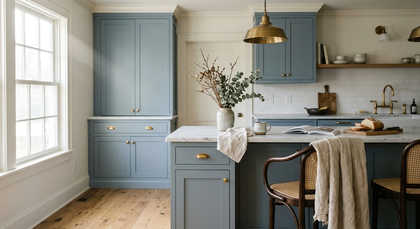
| BM Wedgewood Gray (HC-146) | 47 | Classic blue-gray with a faint green; reads historic, not trendy |
| SW Krypton (SW 6247) | 52 | Barely-there blue-gray; the cautious "is this even blue" choice |
| SW Storm Cloud (SW 6249) | 25 | Deep slate blue-gray; dramatic on lowers, needs good light |
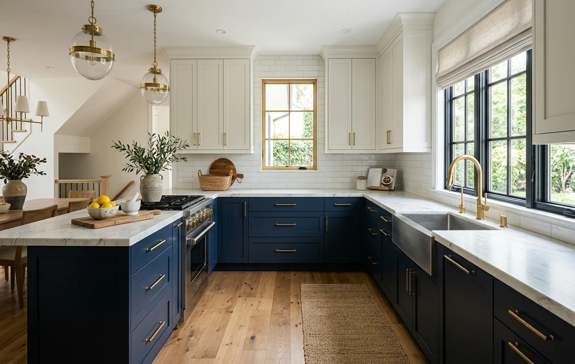
| BM Van Deusen Blue (HC-156) | 16 | Rich navy-leaning blue-gray; moody and high-contrast |
| SW Cyberspace (SW 7076) | 10 | Near-black blue-gray; the darkest pick, shows every flaw |
| BM Knoxville Gray (HC-160) | 20 | Deep teal-leaning blue-gray; sophisticated, polarizing |
Sources: Sherwin-Williams and Benjamin Moore published color data 2026; LRV values per manufacturer libraries; designer field reports compiled by FacadeColorizer.
My honest shortlist out of those twelve: if you want forgiving and timeless, Mineral Deposit or Wedgewood Gray. If you want airy and bright, Misty. If you want drama and you have the light to carry it, Van Deusen Blue. The one I steer people away from on a whole kitchen is Cyberspace: it is gorgeous on a single island in a sunny room, but run it across every lower cabinet in a dim galley and it turns the space into a cave.
Free AI visualizer. Compare a pale and a deep blue-gray on your real cabinets before buying a sample pot.
Why blue-gray cabinets read differently than the chip
This is the part that trips people up, so it earns its own section. A blue-gray that looks perfect on a 3-inch fan deck can land cooler, grayer, or greener once it is rolled and second-coated across a full run of doors. Three forces are at work.
First, light direction. North light is cool and subtracts the warm wavelengths, so a blue-gray leans grayer and can go faintly steely. South and west light warm the color and pull the blue forward, which is flattering. East light gives you both across the day. Second, your bulbs. Cool 4000K LEDs over the sink will sharpen the blue and crisp it up, while warm 2700K bulbs soften it toward gray-green and cozy it down. Test under the bulbs you actually own, not the showroom's.
Third, and this is the cabinet-specific one: surface area and sheen. A wall is one flat plane. Cabinets are dozens of vertical doors and drawer fronts catching light at different angles, usually in a satin or semi-gloss finish that reflects more than a wall's eggshell. That extra reflection deepens the color and reads it back to you more saturated than the swatch. Blue-gray almost always lands a half-step deeper and a touch more blue on cabinet boxes than it does on the chip. Plan for that, not against it.
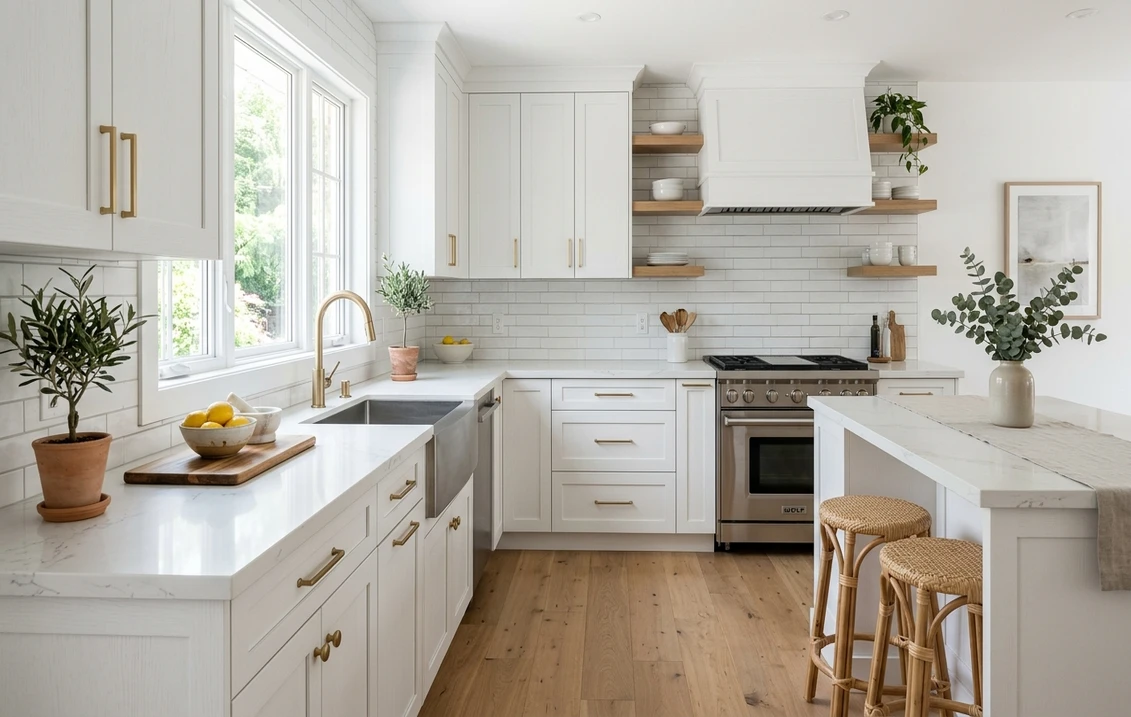
The white that goes with blue-gray cabinets
Most blue-gray kitchens are two-tone: blue-gray on the lowers, white on the uppers or the perimeter. That is the heart of the blue and white kitchen cabinets look, and it lives or dies on which white you pick. Get it wrong and the white reads dingy or, paired with the wrong cool white, makes the blue-gray look dirty by comparison.
- Soft warm white (most harmonious): BM White Dove (OC-17, LRV 85) is the designer default. Its gentle cream bias warms the pairing and keeps the blue-gray from going cold. Safe in almost any light.
- Crisp clean white (cooler, more modern): SW Pure White (SW 7005) gives a brighter, current edge and lets the blue-gray read more clearly blue. Best in sunny kitchens and black-window homes.
- Avoid: a stark blue-white like SW Extra White next to a cool blue-gray. Two cool tones competing makes both look flat, and the cabinets can read slightly gray-dirty.
- Countertops: warm white quartz with soft veining bridges the two; a cold stark-white counter fights a warm white upper. Honed marble looks (Carrara) flatter blue-gray beautifully.
For a wider view of how white cabinets behave on their own, our white kitchen cabinet paint colors guide covers the best whites in detail. And if you are still weighing a truer blue or a straight gray for the boxes instead, compare against our blue kitchen cabinet colors and gray kitchen cabinet colors roundups before you commit.
See the two-tone combination on your real kitchen in one preview, free.
Hardware, backsplash, and the warm-metal rule
Blue-gray is a cool color, so the fastest way to keep a kitchen from feeling chilly is to bring in a warm metal. This is the single styling move that makes or breaks the look.
- Hardware: unlacquered brass, aged brass, or warm gold pulls are the strongest pairing; they add the warmth the blue is missing. Matte black is the modern alternative and reads graphic against pale blue-gray. Polished chrome is the safe-but-flat choice; it disappears.
- Backsplash: a warm white subway tile or a creamy zellige flatters blue-gray without competing. A cool gray marble can tip the whole room cold, so warm it up elsewhere.
- Wood: white oak or walnut open shelving and butcher block bring the organic warmth that blue-gray cabinets crave. Cool gray-washed wood does the opposite and leaves the kitchen feeling flat.
- Walls and ceiling: a warm white or soft greige wall lets the cabinets be the star. A cool-gray wall over cool blue-gray cabinets is too much of one temperature.
If you want to take the blue-gray onto an adjacent wall or a butler's pantry too, the room-by-room behavior is mapped in our blue-gray paint and undertones guide so the cabinet and wall tones stay in the same family instead of clashing by a half-step.
Where blue-gray cabinets fall flat
A conversion guide that only sells you the color is doing you a disservice, so here is the honest other side. Blue-gray is not a universal yes. Skip it, or choose carefully, in these cases.
- Tiny, windowless galley kitchens: a deep blue-gray (Van Deusen, Cyberspace, Storm Cloud) closes the space in. Stay above LRV 50 (Misty, Krypton) or it reads like a cave.
- Heavy warm-wood floors everywhere: an orange-toned oak or honey floor fights a cool blue-gray. It can work, but you need warm metals and a warm white to bridge it, or the room looks split in two.
- If you want timeless above all: blue-gray is more of a moment than a forever-neutral. It is not the resale-proof choice that white or a soft greige cabinet is. Lovely now, slightly dated in a decade is a fair bet.
- On cheap thermofoil or oak-grain doors: a flat blue-gray exaggerates a plastic or heavily grained surface. The color rewards a smooth, well-primed door and a sprayed finish.
None of that should scare you off. It just means you sample, you check it morning and night, and you do not commit a whole kitchen off a chip and a Pinterest board. For the budget side of a full cabinet repaint, our interior painting cost guide sets realistic numbers.
How to test blue-gray before you commit
A fan-deck chip is the number-one reason people pick a blue-gray that disappoints on cabinets: it reads lighter and grayer than a sprayed door and cannot show the blue stepping forward across a day. Two better methods.
- Paint a large sample on a real door: roll or brush two coats on a spare cabinet door or a 12-by-12 board, prop it against your lowers, and check it mid-morning, mid-afternoon, and at night under your normal bulbs. Watch how much bluer it gets near the window.
- Preview it digitally first: upload a real photo of your kitchen and apply a blue-gray (plus a pale and a deep option) before you buy any samples, narrowing three contenders to the one worth painting. It is the fastest way to see the two-tone with your white uppers and your real light.
Preview a blue-gray cabinet color against a pale and a deep alternative, side by side, free.
Frequently asked questions
What is the most popular blue-gray cabinet color?
SW Mineral Deposit (SW 7652) and BM Wedgewood Gray (HC-146) are the two most requested soft blue-grays for cabinets, because both sit mid-tone with a faint green that keeps them from reading cold. For a pale, airy look, SW Misty (SW 6232) is the go-to; for drama, BM Van Deusen Blue (HC-156). The right pick depends mostly on your kitchen's light and how deep you want to go.
What white goes with blue-gray kitchen cabinets?
A soft warm white like BM White Dove (OC-17) is the most harmonious, because its gentle cream bias warms the cool blue-gray and keeps the pairing from feeling chilly. SW Pure White (SW 7005) is the crisper, more modern choice for sunny kitchens. Avoid a stark blue-white like Extra White next to a cool blue-gray, since two cool tones make both look flat.
Do blue-gray cabinets make a kitchen look smaller?
A deep blue-gray (LRV under 30, like Storm Cloud or Cyberspace) can close in a small, windowless kitchen. A pale blue-gray above LRV 50 (Misty, Krypton, Sea Salt) keeps a small space open and airy. In tight galleys, keep the boxes light or limit the dark blue-gray to an island so it does not surround you.
What hardware looks best on blue-gray cabinets?
Warm metals win. Unlacquered brass, aged brass, or warm gold add the warmth that cool blue-gray is missing and make the kitchen feel inviting. Matte black is the strong modern alternative and reads graphic against pale blue-gray. Polished chrome works but tends to disappear and adds no warmth, so it is the least interesting choice.
Are blue grey kitchen cabinets timeless?
Blue grey is more of a current favorite than a forever-neutral. It looks fresh now and pairs beautifully with white and brass, but it is not as resale-proof as white or a soft greige cabinet. If you plan to sell soon, that is worth weighing. If this is your long-term kitchen, a muted, mid-tone blue-gray like Wedgewood Gray ages more gracefully than a trendy bright blue.
Preview a blue-gray cabinet color on your actual kitchen under your own light before buying a single sample.
Disclaimer: Sherwin-Williams, Misty (SW 6232), Mineral Deposit (SW 7652), Sea Salt (SW 6204), Sleepy Blue (SW 6225), Krypton (SW 6247), Storm Cloud (SW 6249), Cyberspace (SW 7076), Pure White (SW 7005), and Extra White are trademarks of The Sherwin-Williams Company. Benjamin Moore, White Dove (OC-17), Quiet Moments (1563), Smoke (2122-40), Wedgewood Gray (HC-146), Van Deusen Blue (HC-156), and Knoxville Gray (HC-160) are trademarks of Benjamin Moore & Co. FacadeColorizer is an independent paint visualization service and is not affiliated with, endorsed by, or sponsored by Sherwin-Williams or Benjamin Moore. Color reproduction on screens approximates the manufacturer's chip; always confirm with a manufacturer sample on a real cabinet door under your own light before purchase. Sources: Sherwin-Williams and Benjamin Moore published color data 2026, manufacturer LRV libraries, designer field reports compiled by FacadeColorizer.
Trademarks mentioned (Sherwin-Williams, Benjamin Moore, Behr, Caparol, Brillux, Sto, Alpina, Valspar, PPG, Glidden, Dulux, Crown Trade, Sandtex, Farrow & Ball, Johnstone's, Leyland) are property of their respective owners. FacadeColorizer is independent and not affiliated with any of them. Nominative fair use under Lanham Act §1125.