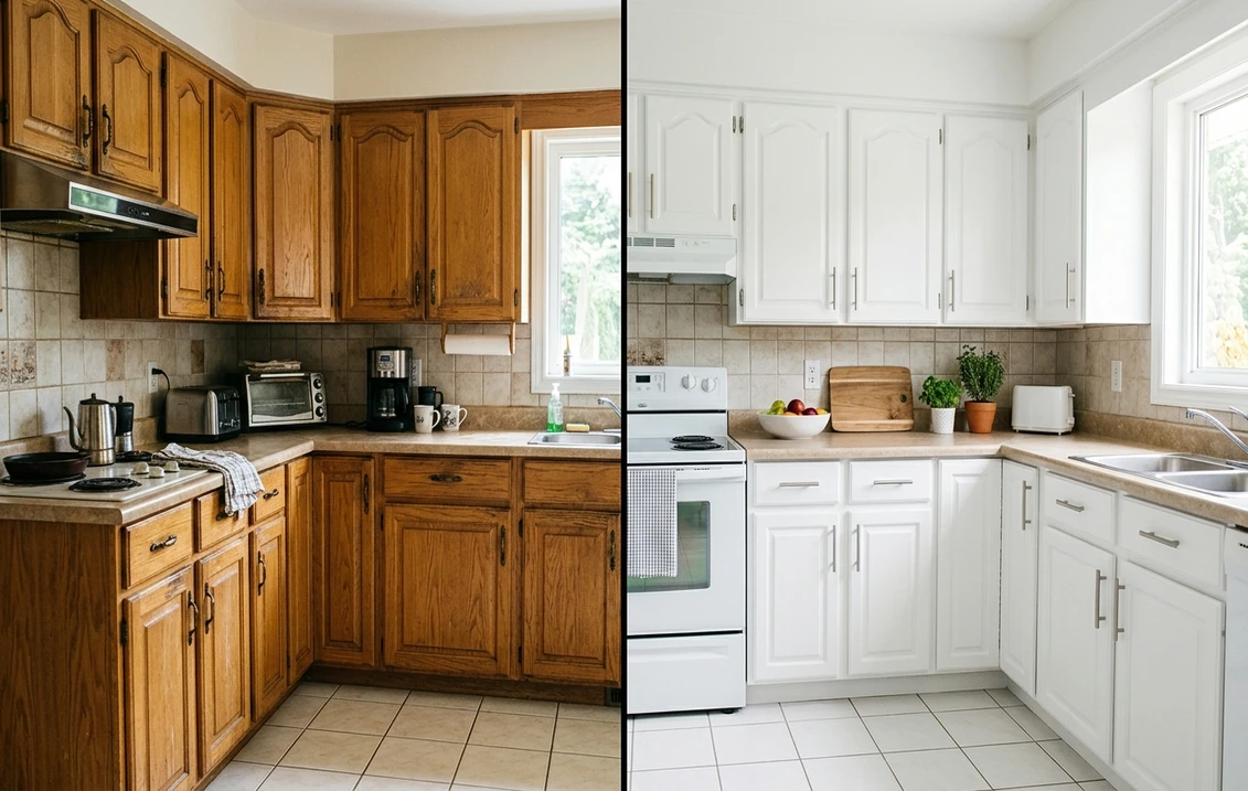

Nothing changes a kitchen faster, or cheaper, than paint on the cabinets. A full replacement runs $12,000 to $30,000 and tears the room apart for weeks. A repaint costs a few hundred dollars in materials and a couple of weekends, and the painted kitchen cabinets before and after gap is the most dramatic single change most homeowners ever make to a room. This is the gallery page: real transformation patterns, organized by the color people actually choose, with a clear-eyed note on what each one fixes and where it can go wrong.
This is the inspiration and decision page, not the how-to. If you have already picked your color and you want the prep, primer, and topcoat sequence, jump straight to our step-by-step guide to painting kitchen cabinets. Here, the job is to help you see the after before you commit to the before.
Upload a photo of your kitchen and preview a repaint in about 30 seconds. Free AI preview: 1 HD render plus 3 variations.
Why the before-and-after is so dramatic
The reason a repaint reads as a whole new kitchen is that cabinets are the largest continuous color surface in the room. They wrap the perimeter, climb the walls, and frame everything else. When that surface is dated orange oak or builder-grade golden maple, it sets the era of the room and pulls every other finish down with it. Swap the cabinet color and the same countertops, the same floor, and the same backsplash suddenly look intentional instead of stuck in 2004.
That is also why people get nervous. The surface that makes the after so good is the same surface that makes a wrong choice so loud. The most common regrets are picking a white that goes yellow against warm counters, a gray that turns out cold and clinical, or a trendy color that fights the floor. The whole point of previewing first is to move those mistakes from your real kitchen to a screen.
The transformation gallery, by color
Below are the repaint directions that show up most often in real before-and-after photos, what the "before" usually is, and what the color actually does for the room. Use it to narrow your shortlist, then preview your top two on your own kitchen.
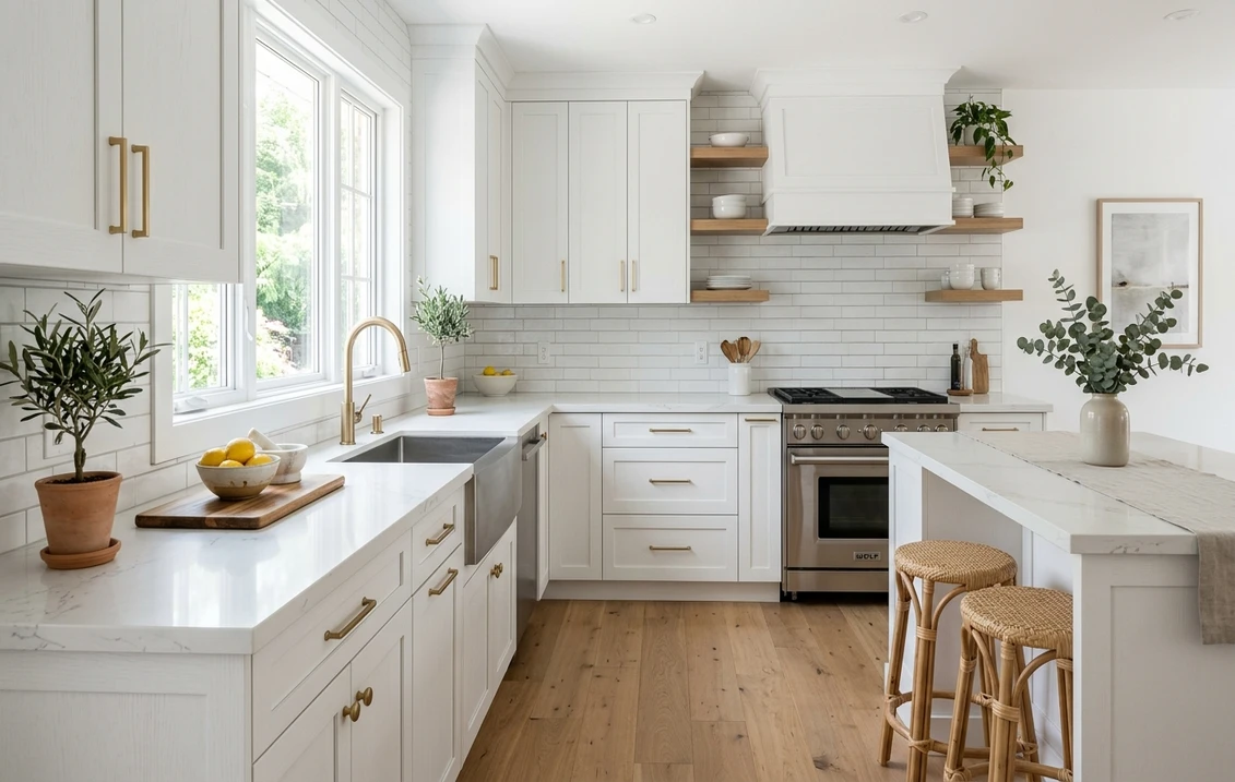
1. Honey oak to crisp white
This is the single most-searched transformation, and for good reason: it is the biggest visual jump. The before is almost always 1990s to mid-2000s golden or honey oak, with the grain reading orange under kitchen lighting. The after is a warm or soft white that bounces light, makes a small kitchen feel larger, and quietly modernizes everything around it.
- What it fixes: the orange cast, the dated era stamp, and a dark or cramped feeling.
- Watch out for: a stark bright white can look cold next to warm beige tile; oak grain telegraphs through thin coats unless you fill and prime it. A creamy white (think Alabaster or White Dove) hides grain and stays warm.
- Best paired with: brushed nickel or matte black hardware, butcher block or quartz counters.
This direction has so many variations that it earns its own deep dive. Our 12 best white paint colors for kitchen cabinets walks through the warm-versus-cool whites and which one survives your lighting.
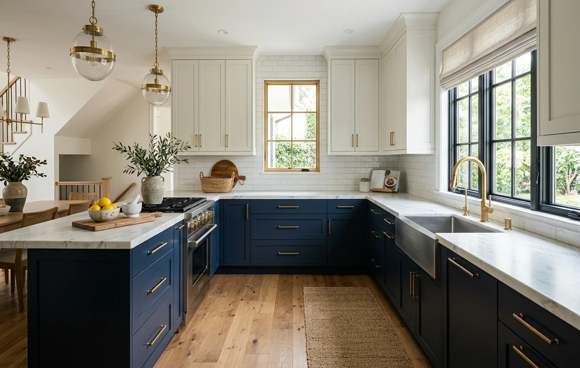
2. Tired wood to deep navy
Navy is the confident answer when white feels too safe. The before is often a flat builder maple or a worn dark stain that read as brown sludge. The after is a saturated, almost-black blue (Hale Navy and Naval are the usual suspects) that looks custom and expensive, especially on a lower run or an island with white uppers.
- What it fixes: a kitchen that felt cheap or flat; navy adds depth and a designer edge for the price of a quart.
- Watch out for: navy eats light, so reserve it for the lowers or an island in a darker room, and keep the uppers light. On a north-facing kitchen with little daylight, all-navy can feel like a cave.
- Best paired with: brass or gold hardware, white or marble-look counters, warm wood floors.
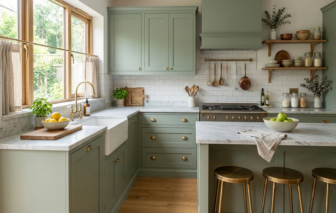
3. Builder beige to sage or olive green
Green is the color that made the jump from "bold" to "new neutral" over the last few years. The before is usually a forgettable beige or a yellowed thermofoil. The after, in a muted sage or a deeper olive, feels grounded, organic, and current without the risk of a primary color.
- What it fixes: blandness. Green reads as a considered choice, not a default.
- Watch out for: greens swing hard on undertone. A sage with too much gray goes drab; one with too much yellow goes pea-soup. Lighting decides it, which is exactly why you preview before buying.
- Best paired with: aged brass, white oak open shelving, cream or white walls.
4. Orange oak to warm greige or gray
Gray was the default of the 2010s and has matured into warmer greige tones. The before is typically the same honey oak from direction one, and the after is a soft, low-contrast neutral that calms a busy kitchen without the brightness of white.
- What it fixes: the orange, while keeping the room cozy rather than crisp.
- Watch out for: a cool gray with blue undertones can read clinical and instantly date itself. Greige (gray plus a warm base) ages far better.
- Best paired with: warm metals, wood accents, and a contrasting island in white or navy.
5. Two-tone: light up, dark down
The two-tone before-and-after is the one that reads most "designed." Instead of one color, the uppers go light (white or cream) and the lowers or island go dark (navy, green, charcoal, or a warm wood tone). The before is a single dated finish; the after has the layered, custom-kitchen look that costs nothing extra beyond a second quart of paint.
- What it fixes: flatness and the "all one slab" look; two-tone adds visual weight at the floor and openness up high.
- Watch out for: in a small kitchen, dark uppers shrink the room, so keep the dark color low. Make sure the two colors share an undertone so they look paired, not random.
- Best paired with: one metal finish carried across both, a counter that bridges both tones.
Before-and-after at a glance
| Typical "before" | Repaint "after" | Effect | Best for |
|---|---|---|---|
| Honey / golden oak | Warm white | Bigger, brighter, modern | Small or dark kitchens |
| Worn dark stain | Deep navy (lowers) | Custom, high-end look | Rooms with good daylight |
| Builder beige | Sage / olive green | Organic, current neutral | Anyone bored of beige |
| Orange oak | Warm greige | Calm, cozy, low-contrast | Open-plan kitchens |
| Single dated finish | Two-tone | Layered, designed | Islands and tall runs |
Color directions reflect 2026 US kitchen-repaint trends reported by major paint brands and design publications; results vary with lighting, counters, and cabinet material.
What the camera does not show in a before-and-after
Online galleries make every transformation look effortless. Two things they rarely show are the prep that earned that finish and how the color behaves outside one perfect photo.
- Prep is most of the result. A flawless painted finish on oak almost always involved degreasing, sanding, grain filler, and a bonding primer. Skip it and the after looks great for a month, then chips at every handle. The full sequence is in our how to paint kitchen cabinets guide.
- The right product matters as much as the right color. Cabinets get touched, wiped, and grease-splattered, so they need a durable cabinet-grade enamel, not wall paint. See the picks in best paint for kitchen cabinets.
- One photo is one lighting condition. The white that glows in a bright midday shot can go gray at night or yellow under warm bulbs. This is the single biggest source of repaint regret.
For the full color-theory background (undertones, LRV, how to coordinate cabinets with walls and counters), the complete kitchen cabinet color guide is the hub that ties all of this together.
Make your own before-and-after, before you paint
The smartest version of a before-and-after is the one you generate before any prep happens, on your own kitchen, under your own light. Upload a photo of your current cabinets into our interior paint visualizer and the AI preview shows your kitchen repainted in white, navy, green, or greige, so you compare your real "after" options side by side instead of guessing from a stranger's photo.
It will not replace a brushed-out sample door for the final go or no-go, but it rules out the directions you would have hated in seconds, and it answers the question galleries never can: what does this look like on my cabinets, with my counters, in my room?
See your own before-and-after, free: 1 HD render plus 3 color variations.
Frequently asked questions
Is painting kitchen cabinets really worth it before and after?
For most kitchens, yes. A repaint costs a few hundred dollars in materials versus $12,000 to $30,000 for new cabinets, and the before-and-after change is the most dramatic single update you can make to the room. The caveat is that cabinets must be structurally sound. If the boxes are falling apart, paint only buys time. If they are solid but dated, paint transforms them.
What is the most popular cabinet color for a repaint?
A warm white remains the most-chosen and most-searched repaint, because it gives the biggest visual jump on dated oak and makes small kitchens feel larger. Deep navy on lowers or an island is the strongest runner-up, followed by muted sage green and warm greige. Two-tone (light uppers, dark lowers) is the fastest-growing direction for a custom look.
Can you paint over old stained or oak cabinets?
Yes, and oak is one of the most common before states in repaint galleries. The key is prep: degrease, sand, fill the open grain if you want a smooth finish, and use a bonding primer so the paint adheres. Skipping prep is why some repaints chip within months. The full sequence for wood and laminate is in our step-by-step guide.
How can I see what my kitchen will look like before painting?
Upload a photo of your current cabinets into a paint visualizer and generate the after on your own kitchen, under your own lighting. Our free AI preview gives you 1 HD render plus 3 color variations, so you can compare white, navy, green, and greige side by side before committing to prep and paint.
Skip the guesswork: preview your before-and-after before you lift a brush.
Disclaimer: Color names referenced (Alabaster, White Dove, Hale Navy, Naval) are trademarks of their respective paint manufacturers. FacadeColorizer is an independent paint visualization service, not affiliated with or endorsed by any paint brand. Screen color approximates the manufacturer's chip, and repaint results vary with lighting, cabinet material, counters, and surface prep; always confirm with a physical sample before painting.