
The first time I sprayed a client's island a deep teal, she went quiet in the doorway for a good ten seconds. Then she laughed and said she'd stared at white shaker boxes for eleven years and forgot a kitchen could feel like a room you actually want to be in. That is the whole case for colorful kitchen cabinets. White will never be wrong, but it is never the thing people remember. Color is. The trick is doing it so the kitchen reads custom, not like a phase you'll repaint in two years. This guide walks through sixteen bold colors that hold up, with the undertone and hardware notes that separate a great painted kitchen from a regrettable one.
A quick word on where this sits. The full method (deglossing, primer, sheen, spray vs brush) lives in our complete kitchen cabinet colors guide, and the product question (which enamel survives a busy kitchen) is answered in best paint for kitchen cabinets. This page is the gallery: the colors themselves, ranked by how bold they go and how forgiving they are to live with.
Upload a photo of your actual cabinets and preview any color below under your own light in about 30 seconds, free.
How to go bold without it looking like a mistake
Before the colors, three rules I give every client who wants painted cabinets with real saturation. Break these and even a beautiful color can land wrong.
- Pick where the color lives. Full-room saturated color works in a big, well-lit kitchen. In a small or dim one, put the bold color on the lowers or the island and keep uppers light. That two-tone move carries most of the drama with half the risk. Our two-tone cabinet combinations breaks down which pairings read balanced.
- Mind the undertone, not the name. A "blue" can lean gray, green, or violet; a "green" can lean olive, sage, or emerald. The undertone decides whether cabinets fight your counter and floor or settle in. I call it out for every color below.
- Hardware finishes the sentence. Unlacquered brass warms a cool jewel tone, matte black sharpens a soft sage, polished nickel keeps things crisp. Cheap builder-chrome on a $4,000 paint job is the fastest way to make custom color look flat.
The safest bold colors: navy, green, and charcoal
Start here if you want color but also want resale-proof. These three families read as new neutrals: bold enough to feel like a choice, calm enough that nobody walks in and recoils.
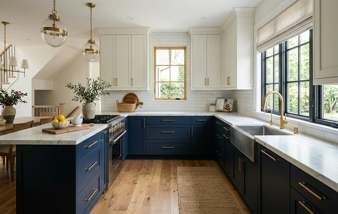
1 to 4: The navy and blue lane
Navy is the gateway drug of bold cabinets, and for good reason: it looks expensive in almost any light. SW Naval (SW 6244) is the saturated, slightly purple-leaning navy everyone pictures. BM Hale Navy (HC-154) runs softer and grayer, the easier one to live with in a north-facing kitchen. SW Salty Dog (SW 9177) goes deeper and inkier, and BM Newburyport Blue (HC-155) sits in the cleaner mid-navy zone. Pair any with white quartz, warm brass, and white oak floors. For the full range and trim pairings, see our blue kitchen cabinets paint colors guide.
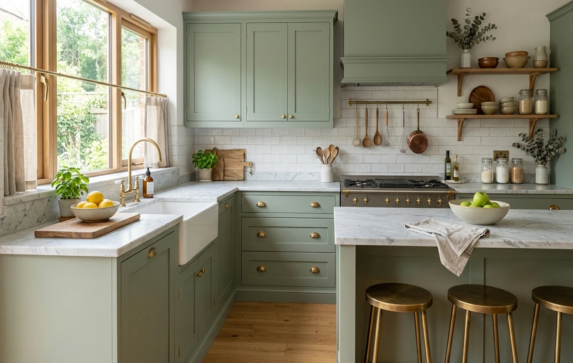
5 to 8: The green lane
Green has quietly overtaken gray as the cabinet color of the moment, and the muted ones age beautifully. SW Pewter Green (SW 6208) is a green-gray that reads almost neutral, the lowest-risk way into green. SW Evergreen Fog (SW 9130) is the soft sage-meets-gray that blew up because it flatters warm wood and white together. Go bolder with SW Rosemary (SW 6187), a true forest green, or BM Essex Green for near-black depth. The undertone watch is olive versus blue-green: olive greens warm a room, blue-greens cool it. Our green kitchen cabinets guide maps the spectrum, and the soft end gets its own treatment in sage green kitchen cabinets.
9 to 10: Charcoal and true black
Black cabinets are not for the timid, but on a lower run or a single wall they are stunning. SW Tricorn Black (SW 6258) is a true, neutral black with no muddy undertone, exactly what you want; some "blacks" go brown or blue under LED and look dirty. SW Iron Ore (SW 7069) is the softer near-black (LRV around 6) with a hair more forgiveness. Both demand good lighting and a satin or semi-gloss sheen so the color does not read as a void. Full detail in our black kitchen cabinets paint colors guide.
Free AI visualizer. Test a bold cabinet color on your real kitchen before buying a single quart.
Jewel tone cabinets: teal, emerald, plum, and burgundy
Now the fun end. Jewel tone cabinets are where bold kitchen cabinets stop being safe and start being memorable: saturated, slightly moody colors with real chroma. They are not for every kitchen, but in the right room they are the thing guests photograph.
11 to 13: Teal and emerald
SW Rainstorm (SW 6230) is a deep blue-teal that behaves like navy's more interesting sibling. BM Galapagos Turquoise goes brighter and more tropical: gorgeous in a sun-drenched kitchen, overwhelming in a dark one. For emerald, SW Greens (SW 6748) reads jewel-box rich against brass and marble. The rule with teal and emerald: they need light to glow. In a windowless galley they go flat and sad, so put them where the sun visits.
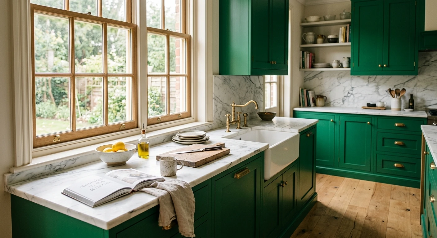
14 to 16: Plum, burgundy, and oxblood
The warm jewel tones are the most divisive picks on this list. SW Sommelier (SW 7595) is a rich, wine-inspired burgundy (LRV around 6) that reads sophisticated and cocooning. BM Caliente (AF-290) is a true red for the fearless. A deep aubergine or oxblood on a lower run, with warm brass and a creamy upper, can look straight out of a Paris bistro. My honest opinion: full-kitchen burgundy or red is a hard sell and dates fast. Keep these to an island, a pantry, or a butler's nook where the commitment is small and the payoff is high.
The 16 colors at a glance
Here is the whole list in one place, sorted from most forgiving to most daring, with the LRV (where published), the undertone to watch, and how hard each one is to live with day to day.
| Color | LRV (approx) | Undertone to watch | Risk level |
|---|---|---|---|
| SW Evergreen Fog (SW 9130) | 30 | Soft sage, slight gray | Low |
| SW Pewter Green (SW 6208) | 12 | Green-gray, near neutral | Low |
| BM Hale Navy (HC-154) | 6 | Soft gray-navy | Low |
| SW Naval (SW 6244) | 4 | Slight violet in low light | Low |
| SW Iron Ore (SW 7069) | 6 | Warm near-black | Medium |
| SW Tricorn Black (SW 6258) | 3 | True neutral black | Medium |
| SW Rosemary (SW 6187) | 8 | Deep forest green | Medium |
| SW Salty Dog (SW 9177) | 5 | Inky blue, can go black | Medium |
| SW Rainstorm (SW 6230) | 6 | Blue-teal, light-hungry | Medium |
| BM Essex Green | 5 | Near-black forest | Medium |
| SW Sommelier (SW 7595) | 6 | Wine burgundy | High |
| BM Galapagos Turquoise | 14 | Bright teal, needs sun | High |
| SW Greens (SW 6748) | 10 | Jewel emerald | High |
| BM Newburyport Blue (HC-155) | 7 | Clean mid-navy | Medium |
| Deep aubergine / oxblood | 5 to 7 | Plum to red-brown | High |
| BM Caliente (AF-290) | 9 | True warm red | High |
Sources: Sherwin-Williams and Benjamin Moore published color data 2026; LRV figures are manufacturer values where available and approximate otherwise; risk ratings are designer field reports compiled by FacadeColorizer.
See the bold color on your real cabinets before you commit a single coat, free.
Painted cabinet ideas that keep color looking custom
The color is half the job. These painted cabinet ideas are what make the difference between a kitchen that looks professionally designed and one that looks like a weekend project that got away from someone.
- Sheen matters more on bold color. A satin or semi-gloss enamel makes saturated color look deep and wipeable. Flat on a dark cabinet reads chalky and shows fingerprints. Cut in the rails and stiles by hand, spray or roll the panels, and plan on a second coat because bold pigment rarely covers evenly in one.
- Keep the counter and backsplash quiet. When cabinets are loud, the surfaces around them should whisper. White or honed-marble counters and a simple backsplash let the color sing. Busy granite under emerald cabinets is visual chaos.
- Warm it with wood. A walnut shelf, white oak floors, or a butcher-block island top keeps bold cabinets from feeling cold or theme-y. Color plus warm wood is the combination that reads timeless.
- Let one element be the star. Bold cabinets, backsplash, and counters at once is too much. Pick one, usually the painted cabinets.
On budget: painting existing cabinets is far cheaper than replacing them, which is the entire appeal. A pro spray job runs real money but a fraction of new boxes, and a careful DIY costs little more than materials and a long weekend. For where cabinet painting sits in a broader project, our interior house painting cost guide has the numbers.
How to test a bold color before you commit
This is the step most people skip, and it is why so many painted kitchens disappoint. A 2-inch fan-deck chip of Naval or Rainstorm tells you almost nothing about how that color fills a room or shifts from morning light to evening LEDs. Two better moves:
- Paint a real sample door. Buy a sample quart, paint an old cabinet door or large poster board, and prop it against your counter. Check it at breakfast, mid-afternoon, and at night under your actual bulbs. Bold colors swing hard between daylight and warm LED.
- Preview it digitally first. Upload a photo of your kitchen and apply the color (plus a safer and a bolder option) before buying anything. It narrows four contenders to the one worth sampling, which on a cabinet job saves real money and a lot of second-guessing.
Preview a bold cabinet color against a safer and a bolder option, side by side, free.
Frequently asked questions
What are the most popular colorful kitchen cabinet colors right now?
Navy (SW Naval, BM Hale Navy) and muted green (SW Evergreen Fog, SW Pewter Green) lead by a wide margin because they feel bold but read as new neutrals. Charcoal and true black (SW Iron Ore, SW Tricorn Black) follow. Jewel tones like deep teal and emerald are rising fast but stay more niche because they need good natural light to look their best.
Do colorful kitchen cabinets hurt resale value?
The safe-bold colors (navy, soft green, charcoal) read as upscale and rarely hurt resale; many buyers see them as a feature. The riskier the color, the more it splits opinion, so very saturated reds, plums, and bright teals are best kept to an island or a single run rather than the whole kitchen. Painted cabinets are also easy and cheap to repaint, which lowers the stakes either way.
What are jewel tone cabinets, and which kitchens suit them?
Jewel tone cabinets are saturated, high-chroma colors like deep teal, emerald, sapphire, plum, and oxblood. They suit bright, sunny kitchens with white counters and brass hardware, where the light lets the color glow. In a small, dim, or windowless kitchen they tend to go flat and heavy, so there it is smarter to use them on a lower run or island only.
Should I paint all my cabinets a bold color or just some?
In a large, well-lit kitchen, full-room color can be spectacular. In a small or dim kitchen, the smarter move is two-tone: bold lowers or a bold island with light uppers. That carries most of the drama while keeping the space feeling open and lowering the risk if your taste shifts. Hardware and a quiet countertop tie the two tones together.
What finish is best for bold painted cabinets?
A satin or semi-gloss cabinet enamel is best. It makes saturated color look deep, holds up to daily wiping, and resists fingerprints far better than flat, which reads chalky on dark colors. Plan on two coats with bold pigment, since one coat rarely covers evenly, and use a hard-curing enamel made for cabinets rather than standard wall paint.
Preview any color from this guide on your actual cabinets under your own light before buying a single quart.
Disclaimer: Sherwin-Williams, Naval (SW 6244), Pewter Green (SW 6208), Evergreen Fog (SW 9130), Rosemary (SW 6187), Tricorn Black (SW 6258), Iron Ore (SW 7069), Salty Dog (SW 9177), Rainstorm (SW 6230), Greens (SW 6748), and Sommelier (SW 7595) are trademarks of The Sherwin-Williams Company. Benjamin Moore, Hale Navy (HC-154), Newburyport Blue (HC-155), Essex Green, Galapagos Turquoise, and Caliente (AF-290) are trademarks of Benjamin Moore & Co. FacadeColorizer is an independent paint visualization service and is not affiliated with, endorsed by, or sponsored by Sherwin-Williams or Benjamin Moore. LRV figures are manufacturer values where published and approximate otherwise. Color reproduction on screens approximates the manufacturer's chip; always confirm with a manufacturer sample under your own light before purchase. Sources: Sherwin-Williams and Benjamin Moore published color data 2026, designer field reports compiled by FacadeColorizer.
Trademarks mentioned (Sherwin-Williams, Benjamin Moore, Behr, Caparol, Brillux, Sto, Alpina, Valspar, PPG, Glidden, Dulux, Crown Trade, Sandtex, Farrow & Ball, Johnstone's, Leyland) are property of their respective owners. FacadeColorizer is independent and not affiliated with any of them. Nominative fair use under Lanham Act §1125.