Nine blue chips, fanned out on the counter, all looked roughly the same navy under the paint store's fluorescent tubes. Then you taped them to the cabinet doors at home. Three turned purple. Two went almost black. One read like faded denim. That gap between the chip and the painted door is the whole problem with blue kitchen cabinets, and it is why this color sends back more sample pots than almost any other.
Blue is not one decision. It runs from near-black naval to soft chambray, and each shade carries a different undertone (green, gray, violet, or true blue) that the kitchen's light rescues or exposes. This guide breaks down the 12 blues US designers actually specify for cabinets in 2026: published codes and Light Reflectance Values, the undertone to watch, the rooms each suits, and the pairings that make or break the result.
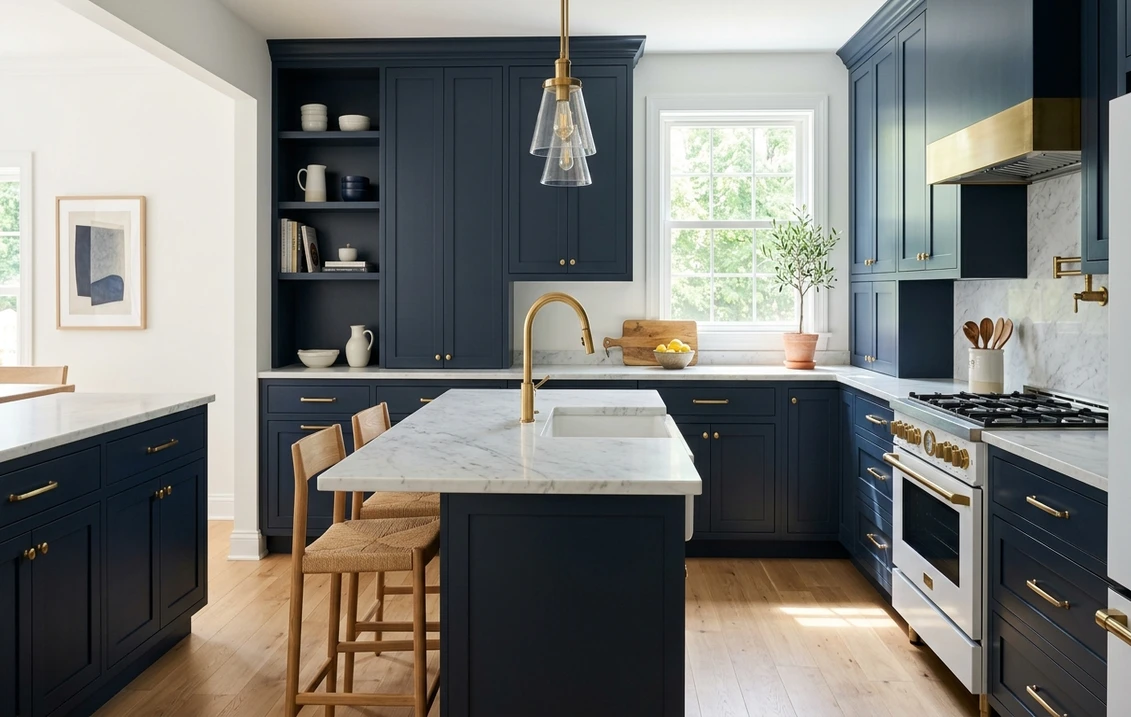
Upload one photo of your kitchen and preview Naval, Hale Navy, and 10 more blues on your actual cabinets in about 30 seconds, free.
Why blue is the trickiest cabinet color to pick
A cabinet door sees more shadow than a wall and sits next to the countertop, backsplash, and floor, all of which bounce color back onto the paint. Two things make blue especially unpredictable there: undertone and depth.
First, undertone. Navies lean either green (classic, nautical) or violet (richer, can turn purple under warm bulbs). Mid-tone blues often hide a gray base that reads "blue-gray" in daylight and flat gray under a cool LED. Pair a violet-based navy with 2700K bulbs and the cabinets can drift lavender after dark, the most common complaint homeowners report.
Second, depth. Deep blues have very low Light Reflectance Values, often LRV 4 to 9, so they absorb most of the light that hits them. In a small or north-facing kitchen, a near-black navy can swallow the room and read charcoal. The fix is not always a lighter color; sometimes it is better lighting or keeping the dark blue to the island. For how blue sits among all the cabinet families, see our complete kitchen cabinet color guide.
The 12 best blue cabinet paint colors for 2026
Here are the twelve that keep turning up on real US kitchen projects, ordered deepest to lightest. The codes and LRV come straight from each manufacturer's published data. The undertone notes are different: they describe how the color actually behaves once it is on a cabinet door, not how it looks on the chip.
| Color and code | Approx. LRV | Undertone | Best for |
|---|---|---|---|
| SW Naval (SW 6244) | 4 | True navy, slight green | Bright kitchens, full cabinetry statement |
| SW Rainstorm (SW 6230) | 5 | Deep blue, slate-gray base | Moody kitchens, alternative to navy |
| SW Salty Dog (SW 9177) | 6 | Deep blue, low gray | Coastal navy without the green cast |
| SW Cyberspace (SW 7076) | 6 | Blue-black with gray | Modern, near-black alternative |
| SW Sea Serpent (SW 7615) | 7 | Teal blue-green | Moody kitchens, brass hardware |
| BM Hale Navy (HC-154) | 8 | Navy with soft black depth | Classic, transitional, islands |
| SW Indigo Batik (SW 7602) | 8 | Denim blue, slight gray | Relaxed, casual kitchens |
| BM Newburyport Blue (HC-155) | 10 | Navy, faint violet | Traditional and Colonial kitchens |
| BM Van Deusen Blue (HC-156) | 12 | Slate navy, gray base | Softer navy, period homes |
| SW Distance (SW 6243) | 15 | Blue-gray, faint teal | Transitional, low-light kitchens |
| SW Slate Tile (SW 7624) | 15 | Soft blue-gray | Light, airy, north-facing rooms |
| SW Krypton (SW 6247) | 53 | Pale blue-gray | Two-tone uppers, cottage kitchens |
Try it on your house
No photo? Try a sample
Sources: Sherwin-Williams and Benjamin Moore published color data 2026. LRV is approximate and rounded; confirm against the manufacturer's current technical data sheet before purchase.
Deep navies: the safe statement
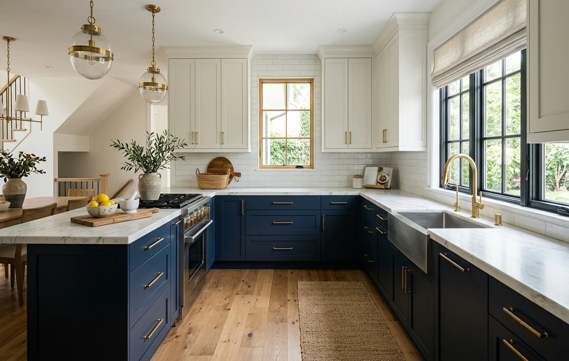
Navy is where most blue-cabinet projects land, because it behaves like a neutral: it pairs with white, wood, brass, and black without fuss and hides wear better than a light color. SW Naval (SW 6244) is the most-specified navy for US cabinets. At LRV 4 it is genuinely deep, almost ink, with a slight green base that keeps it reading as a true navy rather than a purple-navy. It shines with natural light or generous task lighting; in a dim galley it goes nearly black. BM Hale Navy (HC-154) reads a touch softer at LRV 8, with a quiet black depth that keeps it sophisticated rather than primary-blue. It is the safest "navy but not too saturated" choice, photographs beautifully, and works on full cabinetry or as an island anchor below white perimeter cabinets.
Two coastal navies round out the deep end. BM Newburyport Blue (HC-155) carries a faint violet base, luxurious in daylight but worth testing under evening bulbs to be sure it stays true. SW Salty Dog (SW 9177) is the opposite: a clean navy with a low gray base and almost no green or violet, so it stays crisp under daylight and LED, the more predictable beach-house pick.
Blue-grays and teals: the modern middle
If full navy feels heavy, the LRV 8 to 15 range gives you color without the darkness. These shades read blue in good light and lean gray or teal as the light cools, which is why they suit transitional kitchens. Two near-navy blue-blacks sit just below them for anyone who wants depth with a twist.
- SW Distance (SW 6243): a blue-gray with a faint teal whisper, LRV 15. Forgiving in low light and reads as a moody, grown-up blue rather than a bold one.
- BM Van Deusen Blue (HC-156): a slate navy, LRV 12, with a clear gray base. Softer than Hale Navy and excellent in period homes where a pure navy would look too sharp.
- SW Slate Tile (SW 7624): a soft blue-gray, LRV 15, that keeps a kitchen light and airy, a strong choice for a north-facing room where a dark navy would feel cave-like.
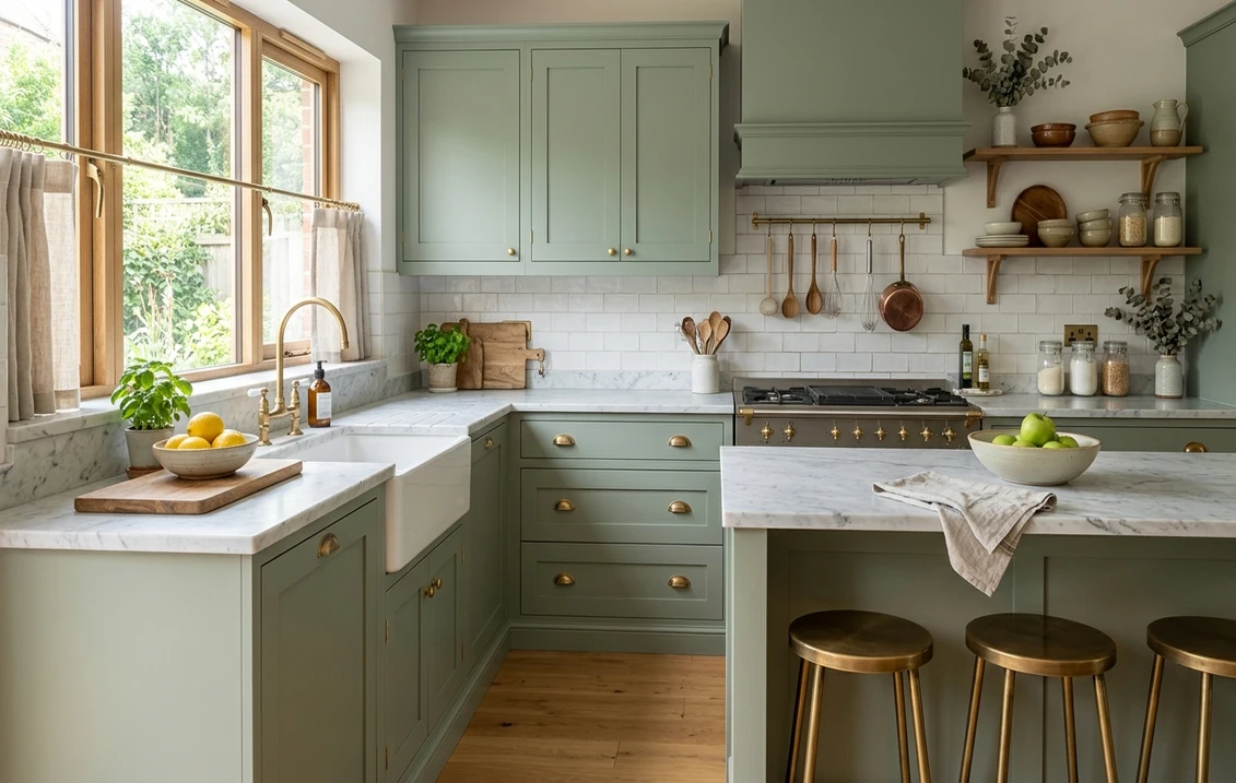
- SW Indigo Batik (SW 7602): a relaxed denim blue, LRV 8, with a gray base that keeps a casual family kitchen from looking too precious.
- SW Sea Serpent (SW 7615): a deep teal-blue at LRV 7 that leans green. Put it next to brass and warm wood and it wakes up. Under warm-lit kitchens it reads richer than a cool navy ever could.
- SW Rainstorm (SW 6230): a deep, dramatic blue at LRV 5 with a slate-gray base and a faint green lean. It sits at navy depth, not in the lighter middle, so treat it like a navy: a moody, warm-lit alternative that softens beside brass.
- SW Cyberspace (SW 7076): a blue-black at LRV 6 that reveals its blue only in daylight. Expect it darker than Hale Navy, not lighter. This is your pick if you love black cabinets but want a hint of color buried in them.
For the two-tone look that is everywhere in 2026, a pale blue such as SW Krypton (LRV 53) on the uppers over a deep navy base keeps the room bright. Prefer neutral uppers? Blue lowers pair effortlessly with the warm-white and greige tones in our white kitchen cabinet paint colors guide, and our interior paint color families guide explains how blue, green, and gray differ at the pigment level.
Light, lighting, and which blue your kitchen can handle
The same blue is a different color in two kitchens, so match its depth to the light you have. North-facing kitchens get cool, indirect light that pushes blue toward gray and can make a deep navy feel cold; lean toward the lighter blue-grays (Slate Tile, Distance) or a warmer green-based blue like Sea Serpent, and keep the very dark navies for islands. South and west-facing kitchens get warm, abundant light that carries a full navy like Naval beautifully, and the warmth keeps violet-based blues like Newburyport from reading cold.
Bulb temperature matters just as much. Warm 2700K bulbs flatter green-based and true navies but can tip violet-based blues toward purple; cooler 3500K to 4000K bulbs keep blue-grays crisp but can wash out a warm navy at night. Test your shortlisted blue under your own bulbs after dark. The north-light logic from our best interior paint colors of 2026 roundup applies in reverse for blue: light subtracts warmth and exaggerates whatever gray or violet hides in the base.
Countertops, backsplash, hardware, and trim
A blue cabinet is only as good as what sits around it. Get the counters, hardware, and trim right and a handful of pairings will carry almost every shade on this list.
- Countertops: white marble (Carrara or Calacatta) and warm-white quartz are the classic partners, brightening the room so the blue stays the star. Avoid cool gray quartz with a deep navy. Butcher block softens green-leaning blues like Rainstorm and Sea Serpent.
- Hardware: brass and unlacquered gold are the runaway favorite, adding warmth that balances the cool color. Matte black reads crisp and modern, especially with blue-grays. Avoid oil-rubbed bronze on a violet-based navy, where the undertones can clash.
- Backsplash: white subway tile, zellige in white or pale blue, and honed marble slab all work, with a warm-white grout to keep things from feeling stark.
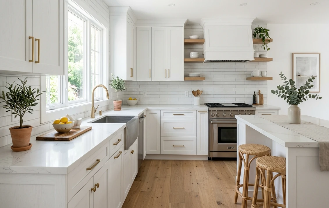
- Walls, trim, and floors: a warm white wall (a soft off-white in the LRV 80s) keeps a navy kitchen from going dark, while crisp white trim gives the contrast that makes blue pop. White oak and natural wood floors add warmth, but very dark floors plus a very dark navy can close the room in.
How to test a blue before you commit
A 2-inch fan-deck chip is the worst way to choose a deep blue: it reads lighter than a painted door, shows none of the undertone shift, and cabinets are the priciest color decision in the kitchen to undo. Two better methods, in order of speed:
- Digital preview first. Upload a photo of your kitchen into our paint visualizer and apply several blues virtually. Nothing rules out the wrong shades faster, and you get to see a full navy go head to head with a blue-gray on your own layout.
- Then a real sample on the door. Paint a large swatch of your final two on a cabinet door or a movable poster board, and check it mid-morning, late afternoon, and after dark under your own bulbs. Watch for a navy going purple or a blue-gray flattening to gray under cool LEDs.
To weigh the brands first, our Sherwin-Williams vs Benjamin Moore comparison covers durability, sheen, and deep colors, while our interior painting cost guide sets expectations for a blue-cabinet refresh.
Skip the wasted sample pots. Preview your top blues on your own kitchen photo first, free.
Frequently asked questions
What is the most popular blue for kitchen cabinets?
Sherwin-Williams Naval (SW 6244) and Benjamin Moore Hale Navy (HC-154) are the two most-specified blues for US cabinets. Naval is the deeper, more saturated navy (LRV 4); Hale Navy reads slightly softer (LRV 8). Both pair effortlessly with white, brass, and wood.
Will navy cabinets make my kitchen look dark?
They can, because deep navies have a very low LRV (often 4 to 9) and absorb most of the light. In a small or north-facing kitchen, a full navy can read charcoal. Keep the room bright with white counters, a warm-white wall, and task lighting, or limit the dark blue to the island and lower cabinets.
Why do my blue cabinets look purple at night?
Some navies, such as Benjamin Moore Newburyport Blue, carry a violet undertone, and warm 2700K bulbs push that base toward purple after dark. For a navy that stays true under warm light, choose a green-based or low-gray blue like SW Naval or SW Salty Dog, and test under your own evening bulbs before painting.
What hardware and countertop go best with blue cabinets?
Brass and unlacquered gold are the favorite because the warmth balances the cool color; matte black is the modern alternative, especially with blue-grays. For counters, white marble and warm-white quartz keep the blue the star. Avoid cool gray quartz with a deep navy, which can make the room feel heavy.
See Naval, Hale Navy, Distance, and more on your actual cabinets before you commit to a single can.
Disclaimer: Sherwin-Williams, SW 6244 Naval, and the SW color names cited are trademarks of The Sherwin-Williams Company. Benjamin Moore, HC-154 Hale Navy, and the BM color names cited are trademarks of Benjamin Moore and Co. FacadeColorizer is an independent paint visualization service and is not affiliated with, endorsed by, or sponsored by Sherwin-Williams, Benjamin Moore, or Behr. LRV values are approximate, rounded, and may differ slightly from the manufacturer's current figure; color reproduction on screens approximates the manufacturer's chip. Always confirm with a physical manufacturer sample before purchase. Sources: Sherwin-Williams and Benjamin Moore published color and LRV data 2026, manufacturer technical data sheets, and designer color references including The Spruce.
Trademarks mentioned (Sherwin-Williams, Benjamin Moore, Behr, Caparol, Brillux, Sto, Alpina, Valspar, PPG, Glidden, Dulux, Crown Trade, Sandtex, Farrow & Ball, Johnstone's, Leyland) are property of their respective owners. FacadeColorizer is independent and not affiliated with any of them. Nominative fair use under Lanham Act §1125.