
Benjamin Moore Tissue Pink (2087-70) is one of those colors that disarms people. They expect a sweet, candy nursery pink, and instead they get a wall that, in most daylight, looks like a soft warm white with a quiet rose glow hiding inside it. That is the whole appeal: it is the pink for people who think they do not like pink. The questions that flood every search bar are predictable: is it too cool, will it photograph like cotton candy, and where does it actually work? The honest answers depend entirely on your light and what you put next to it. Here is exactly how Tissue Pink behaves on real interior walls.
Quick orientation before the deep dive. Tissue Pink 2087-70 carries a published LRV of about 77 and a hex approximation of #F2DEDD (RGB 242, 222, 221). That places it firmly in the pale, light-reflecting end of the pink range: bright enough to keep a small bedroom or bath feeling open, soft enough that it never shouts color. The undertone is a clean, slightly cool blush with a barely perceptible lilac whisper rather than a peachy warmth. This profile is one stop in our wider Benjamin Moore interior paint colors guide, and it sits alongside other gentle blush options in our roundup of soft blush pink paint colors for interiors. This page goes deep on the single color; those pages give you the wider field.
Upload a photo of your actual room and preview BM Tissue Pink under your own light in about 30 seconds, free.
Tissue Pink at a glance: the numbers that matter
Before opinions, here are the verifiable specs from the Benjamin Moore color library. These are the values you can take to a paint counter:
| Spec | Tissue Pink 2087-70 |
|---|---|
| Color number | 2087-70 (Color Preview collection) |
| LRV (Light Reflectance Value) | Approximately 77: pale and light-reflecting, keeps a room bright |
| Hex / RGB (approx.) | #F2DEDD / 242, 222, 221 |
| Color family | Pale pink / soft blush |
| Primary undertone | Clean cool blush with a faint lilac whisper, not peachy |
| Best base / finish | Light tint base; matte or eggshell on walls, satin on trim |
The takeaway from those numbers: Tissue Pink is a true pale pink, not a pink-leaning white and not a saturated rose. At LRV 77 it sits high enough to behave like a near-neutral in bright rooms, dropping the pink intensity down to a glow rather than a statement. The clean, faintly cool undertone is the whole identity. In good light it whispers; in poor light it can either vanish into off-white or, with the wrong bulbs, tip slightly mauve. That tension is the entire decision in one sentence.
Is Tissue Pink too cool or too pink? The undertone, decoded
Tissue Pink is a cool-leaning blush, and that matters more than its lightness. Many popular nursery pinks (think peachy or coral blushes) carry a yellow-orange warmth that reads cozy. Tissue Pink does not. Its base is a clean pink that sits just on the cool side of neutral, with a barely-there lilac thread underneath. That is what keeps it looking modern and fresh rather than dated and sugary, but it is also what makes it sensitive to light.
In bright, clean daylight the pink is at its most flattering: a soft, sophisticated wash that almost reads as a warm white with a rosy cast. As the light cools (a north room, deep shade, an overcast afternoon) the warm wavelengths drain out and the faint lilac steps forward, so the wall can tip from blush to a quiet mauve-pink. It will not go gray or muddy, but it will lean cooler and slightly more violet than the chip suggested. In warm light, the opposite happens: the pink saturates a touch and reads sweeter and more obviously rosy.
Watch out for one quirk specific to very pale pinks. On a tiny fan-deck chip, Tissue Pink looks far pinker than it ever will on a finished wall. Pale colors read more intensely at small scale and against the white of the deck; rolled across a real wall under real light, it calms down dramatically and often surprises people by looking nearly neutral. So if it looks too pink on the chip, it almost certainly will not be too pink on the wall.
| Indoor light | How Tissue Pink reads |
|---|---|
| South-facing (bright, warm) | Its happiest read: a soft, glowing blush that looks fresh, not sweet |
| West-facing (warm afternoon) | Saturates and warms in late sun, reads more clearly rosy |
| East-facing (cool after noon) | Clean blush in morning, cools toward a quiet mauve by afternoon |
| North-facing (cool, indirect) | Coolest read; the faint lilac surfaces and the pink can go mauve |
| Artificial light at night | Warm 2700K bulbs keep it soft and rosy; cool 4000K bulbs push it toward mauve and can wash it out |
Sources: Benjamin Moore 2087-70 color data 2026; The Spruce pink-paint undertone coverage; designer field reports compiled by FacadeColorizer.
Free AI visualizer. Test Tissue Pink on your real walls before buying a single sample pot.
Best rooms for Tissue Pink
Pale, clean, and quietly rosy, Tissue Pink is happiest in rooms where you want warmth and softness without committing to obvious color. It is not a bold statement pink; it is the gentle wash you reach for when you want a space to feel calm and gently feminine without going saccharine. Here is where it consistently earns its keep:
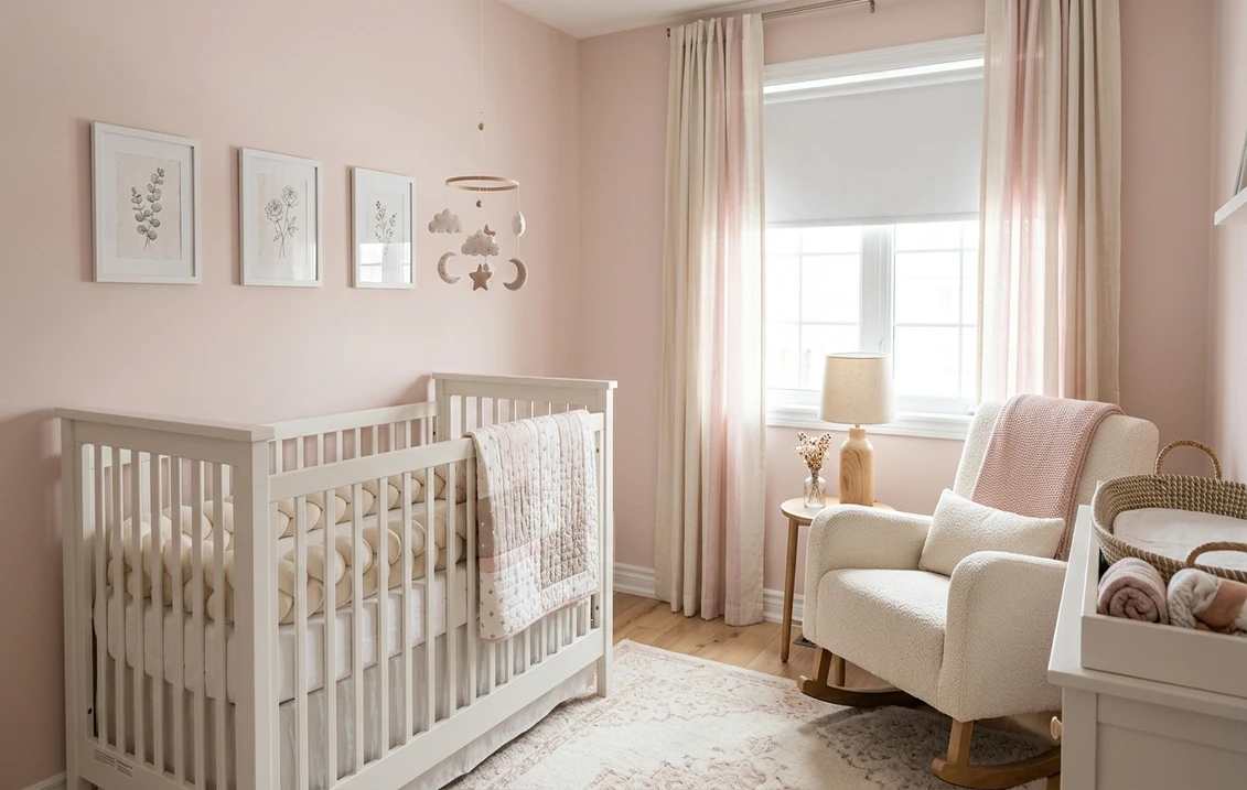
Nurseries and kids' rooms
This is Tissue Pink's natural home. At LRV 77 it stays light and soothing, and its grown-up, near-neutral character means the room will not look babyish in two years the way a candy pink would. It works beautifully for a girl's nursery, but it is restrained enough to read as a soft blush for any child's room. If you are weighing softer options, our guide to gender-neutral nursery paint colors shows how a gentle blush sits next to greige and pale green.
Bedrooms aiming for calm and softness
In a primary or guest bedroom, Tissue Pink reads restful and gently warm, a softer alternative to the usual greige. It flatters skin tones and morning light, and it pairs cleanly with white bedding, natural linen, and pale wood. If a calm bedroom is your goal, our roundup of calming master bedroom paint colors shows where a quiet blush fits among other serene picks.
Powder rooms and dressing areas
A small powder room is a perfect place to let Tissue Pink glow, because the flattering, slightly rosy light it throws makes mirrors kinder. Against white tile and polished nickel it reads soft and boutique rather than girly. For the wider field of pink bath ideas, our pink bathroom paint ideas guide is a useful map.
Where to think twice
A dim, north-facing room lit only by cool LED light is where Tissue Pink struggles: there the faint lilac dominates and the wall can read mauve and slightly cold instead of warm. It can also nearly disappear into off-white in a very bright, sun-flooded room, frustrating anyone who actually wanted to see pink. If you want a stronger, warmer pink that holds its color, this is the wrong one; reach for a deeper rose, or at minimum commit to 2700K bulbs.
Trim, ceiling, and decor pairings
A pale pink lives or dies on what sits next to it. The right white keeps Tissue Pink looking crisp and intentional; the wrong one makes it look either washed out or unexpectedly mauve.
- Soft warm trim (most balanced): BM White Dove (OC-17, LRV 85) is the designer default. Its gentle cream bias adds just enough warmth to keep Tissue Pink from cooling into mauve, while still reading clean. This is the safe, cohesive pick for most rooms, and you can read the full breakdown in our Benjamin Moore White Dove OC-17 review.
- Crisp trim (cleaner, cooler): BM Chantilly Lace (OC-65) gives a bright, modern, slightly cooler edge that makes the blush look more contemporary and boutique. Best for powder rooms and modern spaces; see our Chantilly Lace OC-65 review for how stark it reads.
- Avoid: a heavy yellow-cream antique white trim. Next to a cool blush it can make Tissue Pink look slightly dingy and clash warm against cool.
- Ceilings: a clean white (often the trim color) keeps the room bright. A flat builder white can pick up the pink and look faintly stained, so favor a true white above.
- Floors and decor: pale oak, white oak, brass, cane, and natural linen flatter the soft pink and warm it gently. Cool gray flooring can push the room toward mauve, so balance it with warm textiles and wood tones.
For a little contrast, a deep forest green or warm caramel on a piece of furniture or a built-in reads sophisticated and grounding against the blush walls. Black hardware and matte black fixtures also keep the look modern rather than sweet.
See walls, trim, and floor together in one preview, free.
Tissue Pink vs the pinks people confuse it with
Almost every Tissue Pink search ends in a side-by-side. The three that matter most indoors:
- vs BM Pink Damask (2078-60): the classic dilemma, and the most important one. Pink Damask is deeper, warmer, and noticeably more saturated, with a lower LRV (around 70) and a softer peachy-rose warmth. It reads clearly as pink in almost any light. Tissue Pink is paler (LRV 77), cooler, and far more restrained, often reading near-neutral. Choose Pink Damask when you actually want the wall to look pink and cozy; choose Tissue Pink when you want a whisper of blush that behaves like a warm neutral.
- vs BM First Light (2102-70): First Light is a more famous pale pink with a stronger peachy-warm undertone, which makes it feel cozier and a touch more obviously rosy. Tissue Pink is cleaner and cooler, with that faint lilac thread instead of peach. Pick First Light for warmth, Tissue Pink for a crisper, more modern blush.
- vs BM Proposal (2094-60): Proposal is a deeper, warmer mid-tone pink with real color presence. Tissue Pink is the much lighter, airier choice and the only one of the two that will keep a small room feeling bright and open.
Spelling note: BM Tissue Pink, Benjamin Moore Tissue Pink 2087-70, and Tissue Pink paint all point to this same 2087-70.
How to test Tissue Pink before you commit
A 2-inch fan-deck chip is the single biggest reason people misjudge a pale pink: it exaggerates the pink at small scale and cannot show how the undertone shifts from blush to mauve across a real day on a real wall. Two better methods:
- Paint a large swatch: roll a 12-by-12-inch sample (or a peel-and-stick sample) on two different walls and check it mid-morning, mid-afternoon, and at night under your normal bulbs. Watch specifically for how mauve it goes in your coolest corner and how much it disappears in your brightest one; those extremes tell you the truth.
- Preview it digitally first: upload a real photo of your room and apply Tissue Pink (plus a warmer pink like Pink Damask and a crisp white) before you buy any samples, narrowing three contenders to the one worth painting. Pricing context for the full repaint is in our interior house painting cost guide for 2026.
Preview Tissue Pink against a deeper pink and a clean white, side by side, free.
Frequently asked questions
Is Tissue Pink 2087-70 warm or cool?
Tissue Pink is a cool-leaning blush with a clean pink base and a faint lilac whisper, rather than the peachy warmth of many nursery pinks. In bright or warm light it reads soft and gently rosy, but in cool, indirect, or north light the lilac surfaces and it can tip toward a quiet mauve. It never goes gray or muddy, but it is firmly a cool-side blush, not a warm peachy pink.
What is the LRV of Tissue Pink?
Tissue Pink has a Light Reflectance Value of about 77 on the Benjamin Moore color data, with a hex approximation of #F2DEDD (RGB 242, 222, 221). That makes it a pale, light-reflecting blush: bright enough to keep a small bedroom, nursery, or powder room feeling open and airy, and soft enough that the pink reads as a quiet glow rather than a bold statement.
What are the best rooms for Tissue Pink?
Nurseries and kids' rooms, calm bedrooms, and powder rooms or dressing areas are where Tissue Pink shines, because its pale, near-neutral blush feels soft and flattering without looking babyish or sugary. It is least reliable in dim north-facing rooms with cool LED light, where it can read mauve, and in very sun-flooded rooms, where it can nearly disappear into off-white; 2700K bulbs help it stay rosy.
What trim color goes with Tissue Pink?
BM White Dove (OC-17) is the most balanced trim because its gentle cream bias adds just enough warmth to keep Tissue Pink from cooling into mauve while still looking clean. BM Chantilly Lace (OC-65) is the crisper, cooler option for modern powder rooms. Avoid a heavy yellow-cream antique white, which can clash warm against the cool blush and make the walls look slightly dingy.
What is the difference between Tissue Pink and Pink Damask?
Pink Damask (2078-60, LRV around 70) is deeper, warmer, and more saturated, with a soft peachy-rose warmth that reads clearly pink in almost any light. Tissue Pink (2087-70, LRV around 77) is paler, cooler, and far more restrained, often reading near-neutral. Choose Pink Damask when you want the wall to look genuinely pink and cozy, and Tissue Pink when you want a barely-there blush that behaves like a warm neutral.
Preview BM Tissue Pink on your actual walls under your own light before buying a single sample.
Disclaimer: Benjamin Moore, Tissue Pink (2087-70), Pink Damask (2078-60), First Light (2102-70), Proposal (2094-60), White Dove (OC-17), and Chantilly Lace (OC-65) are trademarks of Benjamin Moore & Co. FacadeColorizer is an independent paint visualization service and is not affiliated with, endorsed by, or sponsored by Benjamin Moore. Color reproduction on screens approximates the manufacturer's chip; always confirm with a manufacturer sample under your own light before purchase. Sources: Benjamin Moore 2087-70 Tissue Pink color data 2026, Benjamin Moore 2078-60 Pink Damask and OC-17 White Dove color data 2026, The Spruce pink-paint undertone coverage, designer field reports compiled by FacadeColorizer.
Trademarks mentioned (Sherwin-Williams, Benjamin Moore, Behr, Caparol, Brillux, Sto, Alpina, Valspar, PPG, Glidden, Dulux, Crown Trade, Sandtex, Farrow & Ball, Johnstone's, Leyland) are property of their respective owners. FacadeColorizer is independent and not affiliated with any of them. Nominative fair use under Lanham Act §1125.


