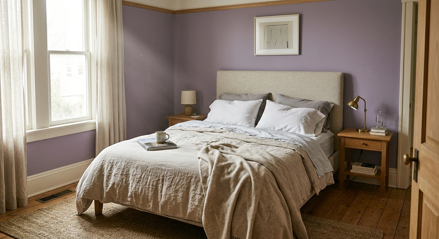

The first purple bedroom I ever painted belonged to a ten-year-old who wanted "the loudest grape in the store." So we split the difference: one smoky plum accent wall behind the headboard, three walls in a pale lavender that goes nearly gray at noon. Ten years on, that room still works, and that is the whole trick with a purple bedroom. Purple is the most misjudged color on the fan deck. Done right it is restful, a little romantic, never the cartoon lilac people fear. Done wrong it tips into nursery, or into a teenage cave. Below are 12 looks that land on the right side of that line, each with a real shade, its undertone, and how it reads under bedroom light.
Quick orientation first. Purple sits between blue and red on the wheel, so every purple bedroom paint leans one of two ways: a cooler blue-violet (calm, modern, can go chilly in north light) or a warmer red-violet (cozy, dusty, mauve and plum territory). Which way a shade leans matters more than the name on the can. This idea gallery is one stop in our wider room paint color ideas by room guide, and it sits next to the broader interior purple paint colors family page, which covers undertones and codes across the whole house. This article stays in the bedroom.
Upload a real photo of your bedroom and preview any purple under your own light in about 30 seconds, free.
Why purple is tricky in a bedroom (and how to win)
Bedrooms are lamp-lit at the hours you actually use them, and that changes everything about a purple wall. Warm 2700K bulbs push every violet toward its red side: lavender warms into mauve, plum deepens and glows. Cool 4000K bulbs and north-facing daylight do the opposite, pulling purples toward blue and gray, which can flatten a soft lilac into something almost stony. So before you fall for a chip, decide two things: which way the shade leans, and how dark you will go on how many walls.
One painter rule keeps purple bedroom walls from going wrong: the lighter and grayer the purple, the more walls it can cover. Pale grayed lavenders (high LRV, low saturation) are safe on all four walls. Saturated mid-violets and deep plums (low LRV) belong on one feature wall behind the bed, where the depth reads as cocooning instead of closing in. Break that rule and a small room in full eggplant feels like a velvet box: great for a moody guest room, rough for daily sleep.
12 purple bedroom ideas, by shade and feel
Here are twelve looks I keep coming back to, grouped from lightest to deepest. Treat the codes as starting points, then sample. Screens lie about violet more than any other hue.
1. Barely-there lavender, all four walls
A pale lilac like BM Spring Iris (1402) reads as a soft cool neutral by day and a gentle mauve under lamps. This is the easiest full-room purple: enough color to feel intentional, light enough that it never crowds the room. Pair with crisp white trim and warm wood for balance.
2. Gray-lavender for a calm, modern room
Greige with a violet whisper (think SW Mature Grape's far paler cousins, or a grayed lilac) gives you a restful, grown-up purple that behaves like a neutral. It is the move when you want a bedroom that hints at color without announcing it. Reads beautifully next to oak and brass.
3. Dusty mauve, warm and romantic
A muted rose-violet such as SW Plummy (SW 6558) is the red-leaning, cozy end of purple. It flatters skin tones, looks expensive against cream linen, and stays warm even in cool light. My pick for a primary bedroom that wants softness without going pink.
4. Mid violet on a single feature wall
BM Wood Violet (2071-30) is a true mid-tone violet with a quiet blue lean. Too much on every wall, just right behind the bed. The headboard wall in this color with the other three in soft white is a clean, current look that does not read juvenile.
5. Periwinkle, the blue-purple bridge
Periwinkle straddles blue and violet and brings the calm of a blue bedroom with a hint of warmth. Cheerful in south light, cool-serene in north light. Full-room in a bright space, accent-only in a dim one.
6. Wisteria, soft and a little vintage
A medium grayed lilac in the wisteria range gives a gentle, nostalgic bedroom that pairs well with rattan, linen, and antique brass. Keep trim warm-white so the violet does not go cold.
7. Heather, the cozy textile tone
Heather is a muted purple-gray with a brown thread running through it, the color of a good wool sweater. Forgiving in low light, sophisticated rather than sweet. Excellent on all four walls of a north-facing room that other purples would chill.
8. Smoky plum accent wall
SW Mature Grape (SW 6286, LRV about 7) is a grayed, grown-up plum. On one wall behind the bed it reads as a deep, enveloping backdrop that makes white bedding pop. This is the loud-grape compromise: drama where you want it, light everywhere else.
9. Eggplant for a moody guest room
Deep eggplant on all four walls turns a small guest room into an intentional jewel box. Not for a room you sleep in nightly unless you love dark and cocooned. Cut in carefully and plan on a second coat: deep purples cover unevenly.
10. Plum and blush, the two-tone bedroom
Pair a deep plum feature wall with soft blush-pink on the rest for a warm, layered scheme. The shared red undertone keeps both colors in the same family, so the room feels collected rather than saccharine.
11. Lavender and sage, the garden palette
Soft lavender walls with sage-green textiles is a quietly restful, nature-leaning combination. Violet and green sit near-opposite on the wheel, so they balance rather than compete. Add natural wood for a calm retreat.
12. Violet with charcoal trim, for edge
A mid violet on the walls with near-black charcoal on doors, frames, or built-ins reads modern and a little bold. The dark trim grounds the purple and stops it reading childish. Best in a room with enough light to carry the contrast.
Free AI visualizer. Test a feature wall against a full-room shade before buying a single sample pot.
Purple bedroom shades compared: shade, lean, LRV, best use
A quick reference for the shades above. LRV (Light Reflectance Value) tells you how light a color reads: high numbers are airy and full-room friendly, low numbers are deep and best kept to one wall. Values are approximate, rounded from manufacturer data:
| Shade | Undertone lean | Approx LRV | Best use in a bedroom |
|---|---|---|---|
| Soft lavender (Spring Iris 1402) | Cool blue-violet | High 60s | All four walls, bright rooms |
| Dusty mauve (Plummy SW 6558) | Warm red-violet | Low 40s | Full room, cozy and romantic |
| Heather purple-gray | Neutral, slight brown | Mid 30s | All walls, north-facing rooms |
| Wood violet (BM 2071-30) | Mid blue-violet | Low 20s | One feature wall behind the bed |
| Smoky plum (Mature Grape SW 6286) | Grayed red-violet | About 7 | Accent wall only |
| Deep eggplant | Dark cool-violet | Single digits | Moody guest room, all walls |
Sources: Sherwin-Williams and Benjamin Moore color data 2026; The Spruce and Better Homes & Gardens purple-paint coverage; designer field reports compiled by FacadeColorizer. Confirm exact LRV at the paint counter.
What goes with purple bedroom walls
Purple lives or dies on what sits beside it. Trim, bedding, and wood tone decide whether a violet wall reads luxe or juvenile. The pairings that work in a bedroom:
- Warm white trim (safest): a soft cream-white keeps lavender and mauve from going cold and lets plum feel rich. This is the default for almost any purple bedroom.
- Crisp white trim (cleaner, cooler): a brighter white sharpens blue-violets and modern schemes, but can chill a pale lilac. Use it when the room has good warm light.
- Greens and sages: sage, olive, and eucalyptus balance purple beautifully because they sit near its complement. A lavender and sage room is one of the most restful combinations there is.
- Gray and greige: a warm greige on adjacent walls or in bedding lets a plum or violet feature wall carry the room without fighting it.
- Wood and brass: warm oak, walnut, and brass hardware add the warmth cool purples need. Cool chrome and gray-washed wood can leave a violet room feeling flat.
- Avoid: heavy primary yellow next to a saturated purple in a bedroom. The high contrast reads playful, not restful, and fights the calm you want.
For full schemes built around a single hero wall color, our bedroom color schemes and palettes guide shows how purple sits next to neutrals, greens, and blues across a whole room. If your goal is a restful primary suite specifically, the soft mauve and gray-lavender picks here pair naturally with the tones in our calming master bedroom paint colors guide.
See walls, trim, and floor together in one preview, free.
How to test a purple before you commit
Violet is the single most deceptive hue on a small chip. A 3-inch swatch cannot show how a purple swings from mauve under lamps to gray-blue in cool daylight, and that swing is what surprises people on the second coat. Two better methods:
- Paint a large swatch: roll a 12-by-12-inch sample on the headboard wall and an adjacent wall, then check it mid-morning, mid-afternoon, and at night under your normal bulbs. Watch how far it drifts toward blue or red across the day.
- Preview it digitally first: upload a real photo of your bedroom and apply a lavender, a mauve, and a deep plum before you buy samples, narrowing three contenders to one worth painting. Budget context for a full repaint is in our interior house painting cost guide for 2026.
Preview a lavender, a mauve, and a plum side by side in your room, free.
Frequently asked questions
What is the best purple for a bedroom?
For most bedrooms the safest choice is a pale grayed lavender (high LRV, low saturation) such as a soft lilac on all four walls, because it reads calm and almost neutral in daylight and warms gently under lamps. If you want warmth and romance, a dusty mauve like SW Plummy is the move. Save deep plums and eggplant for a single feature wall behind the bed, where the depth feels cozy rather than closed-in.
Is purple a calming color for a bedroom?
Yes, when you choose the right value. Soft, muted, low-saturation purples (lavender, mauve, heather, gray-lavender) are restful and a little romantic, which suits a bedroom. Bright, highly saturated purples are more stimulating and can feel busy, so keep those to an accent wall or to decor. The calmer the purple, the better it works for sleep.
What colors go with purple bedroom walls?
Warm white or cream trim is the safest pairing and keeps lavender and plum from going cold. Greens and sages balance purple because they sit near its complement, so a lavender and sage room feels especially restful. Warm wood and brass add the warmth cool purples need, and a warm greige on adjacent walls lets a plum feature wall carry the room. Avoid heavy primary yellow next to a saturated purple in a bedroom.
Should I paint all four walls purple or just one?
It depends on the value. Light, grayed purples (high LRV) are fine on all four walls and keep a room airy. Saturated mid-violets and deep plums (low LRV) are best on one feature wall behind the bed, because full-room dark purple can make a small space feel like a velvet box. A reliable rule: the lighter and grayer the purple, the more walls it can cover.
Does purple make a bedroom look smaller?
A deep, saturated purple absorbs light and will make a room feel smaller and more enclosed, which can be a deliberate cozy effect on a feature wall. A pale lavender does the opposite: with a high LRV it reflects light and keeps a small bedroom feeling open. If your room is small and you still want purple everywhere, choose the lightest, grayest version and keep the trim a clean warm white.
Preview lavender, mauve, and plum on your actual bedroom walls under your own light before buying a single sample.
Disclaimer: Sherwin-Williams, Mature Grape (SW 6286), and Plummy (SW 6558) are trademarks of The Sherwin-Williams Company. Benjamin Moore, Spring Iris (1402), and Wood Violet (2071-30) are trademarks of Benjamin Moore & Co. FacadeColorizer is an independent paint visualization service and is not affiliated with, endorsed by, or sponsored by Sherwin-Williams or Benjamin Moore. LRV values are approximate and rounded from manufacturer data; color reproduction on screens approximates the manufacturer's chip, so always confirm with a manufacturer sample under your own light before purchase. Sources: Sherwin-Williams and Benjamin Moore color data 2026, The Spruce and Better Homes & Gardens purple-paint coverage, designer field reports compiled by FacadeColorizer.
Trademarks mentioned (Sherwin-Williams, Benjamin Moore, Behr, Caparol, Brillux, Sto, Alpina, Valspar, PPG, Glidden, Dulux, Crown Trade, Sandtex, Farrow & Ball, Johnstone's, Leyland) are property of their respective owners. FacadeColorizer is independent and not affiliated with any of them. Nominative fair use under Lanham Act §1125.