Try it on your room

Quick answer: For most living rooms, start with Sherwin-Williams Cavern Clay (SW 7701, LRV about 20), the reference burnt-terracotta. Want it lighter and redder, closer to raw clay? Baked Clay (SW 6340, LRV about 26). For a deep, evening-cozy accent wall, Benjamin Moore Rich Chestnut (2090-20, LRV about 11). Pair any of them with cream trim, natural wood, jute, and a few green plants.
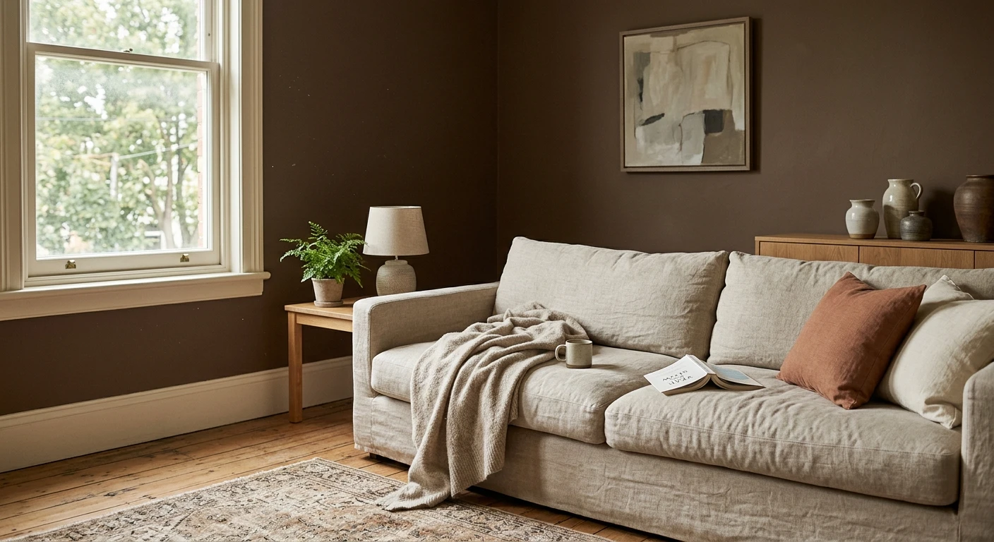
Terracotta has been having a long moment in living rooms, and for once the trend has legs, because it is not really a color so much as a memory: sun-warmed clay pots, adobe walls, a Tuscan courtyard at five in the afternoon. Rolled onto a living room wall it does something plain beige never manages. It makes the whole space feel warm, lived-in, and a little sun-baked, even in January. The first time I talked a hesitant client into it, we put a mid terracotta on a single fireplace wall, kept everything else cream, and by the end of the day it was the wall everyone stood in front of. This is the specific terracotta living room paint guide inside our wider room-by-room paint color ideas series.
If terracotta ends up feeling a touch bold for your space, the wider living room palette of warm browns and clays covers every earthy neutral in one place. This page stays tight on terracotta: which shades to use, where to put them, and how to keep a clay wall glowing instead of muddy.
Best terracotta shades for a living room
Terracotta is a family, not a single color, and the shades below run from raw-clay light down to deep, chocolate-clay dark. LRV (Light Reflectance Value) runs from 0 (black) to 100 (white): the lower the number, the darker and more enveloping the wall. Treat the figures as approximate and always confirm with a sample in your own room.
| Color | Brand and code | Approx LRV | Why it works in a living room |
|---|---|---|---|
| Cavern Clay | Sherwin-Williams SW 7701 | ~20 | The reference terracotta: a burnt, mid-depth orange-brown. Warm enough to wrap a whole room in good light, rich enough to feel intentional. The safe first sample. |
| Baked Clay | Sherwin-Williams SW 6340 | ~26 | Redder and a touch lighter, closer to raw, unglazed pottery. The most livable full-room terracotta, keeps a living room glowing instead of going cave-dark. |
| Audubon Russet | Benjamin Moore HC-51 | ~20 | A softer, dustier russet with a boho lean. Reads calmer than Cavern Clay and loves rattan, jute, and linen. Great over a big sofa wall. |
| Rich Chestnut | Benjamin Moore 2090-20 | ~11 | Deep, saturated, almost chocolate-terracotta. Save it for an accent or fireplace wall, or a small, low-light living room you want to feel like a den. |
Try it on your house
No photo? Try a sample
If your spec is Behr-only (an HOA rider or a contractor preference), Behr Terra Cotta Clay (M200-5) sits comfortably in the same family and can stand in for the mid Sherwin-Williams picks. Whichever brand you land on, buy a sample pot before a gallon: terracotta shifts more than almost any color between a fan deck, a screen, and your real afternoon light.
Upload one photo and preview these shades on your actual living room. Free, no signup.
How to use terracotta in a living room
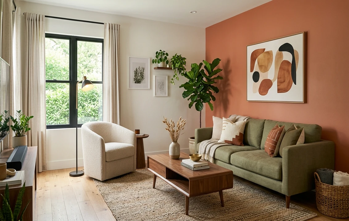
Whole room or a feature wall? The honest answer depends on your light. In a bright, south or west-facing living room with big windows, a mid terracotta like Cavern Clay or Baked Clay can go on all four walls and the room will feel like a warm, glowing cocoon. In a north-facing, small, or low-light room, keep terracotta to a single feature wall (the fireplace, the media wall, the wall behind the sofa) and let the other three stay cream. That gives you the color and the coziness without the after-dark heaviness a deep clay can bring.
Trim and ceiling. Terracotta wants a warm white next to it, never a stark blue-white. Something like Sherwin-Williams Alabaster or Benjamin Moore White Dove on the trim keeps the whole wall reading warm; a cool white fights the clay and makes it look muddy by contrast. Leave the ceiling white or a barely-there warm off-white. Going terracotta overhead in a standard-height room usually feels like the walls are closing in.
Light it warm. This is the rule that saves a terracotta room. Terracotta comes alive under warm 2700K bulbs and goes flat, brown, and dirty under cool 4000K daylight LEDs. If you have already tried an earthy wall and hated it, cool bulbs were probably the culprit. Swap them before you swap the paint.
Accents. Terracotta is a backdrop color, so let the room layer on top of it: natural oak or walnut, leather, brass or aged bronze hardware, and a green plant or three. That southwestern, boho warmth is exactly what the shade is built for, and it is why terracotta flatters a lived-in living room more than a formal, matched-set one.
What to pair with terracotta (and what to avoid)
Terracotta is generous. It pairs happily with almost anything warm and natural, and it only gets into trouble when you fight its heat with something cool and clinical. The short list:
- Cream and warm white for trim, a large rug, or the majority of the woodwork. This is the pairing that keeps terracotta from feeling relentless.
- Natural wood, oak to walnut. Terracotta and wood grain are the same warm family, so they read collected together, never busy.
- Green plants and soft olive or sage accents. Green sits opposite orange on the wheel, so a fiddle-leaf fig or a sage throw makes the terracotta look richer, not louder.
- Jute, rattan, boucle, and linen. Texture is what turns terracotta from a paint choice into a boho, southwestern room.
- Black or bronze metal in small doses (a lamp base, a frame, legs) for a bit of crisp contrast against all that warmth.
What to avoid: stark blue-white trim and cool gray accents, which drain the warmth right out of the wall; pink-beige neutrals nearby, which muddy each other; and painting a dark, north-facing living room terracotta on all four walls without testing, because it can slide to a heavy brown once the sun is gone.
Before you commit to a gallon, it is worth seeing your shortlist on your own four walls, because terracotta shifts so much with light. Our interior paint visualizer lets you drop these shades onto a photo of your real living room. If you love the mood but want it somewhere quieter, the same clay logic carries to a terracotta bedroom, and if you decide clay is a shade too bold for a main wall, a greige living room is the calmer neutral cousin that still pairs beautifully with terracotta accents. And if terracotta turns out to be one note in a wider scheme rather than the whole story, it is the headline of the 2026 earthy family rather than an outlier in it: our roundup of trending earthy paint colors sets clay beside the ochres, the warm browns, and the mushroom neutrals it is usually specified with, which is the easiest way to find the two supporting shades a terracotta wall needs.
Frequently asked questions
Is terracotta a good color for a living room?
Yes, terracotta suits living rooms especially well because it is a warm, grounding earth tone that flatters wood, leather, and lamplight. In a bright, warm-lit room you can use it on all four walls; in a darker or smaller room, keep it to a feature wall and pair it with cream trim so it stays cozy rather than heavy.
What is the best terracotta paint color for a living room?
Sherwin-Williams Cavern Clay (SW 7701, LRV about 20) is the reference pick: a burnt, mid-depth terracotta that works over a whole room in good light. For a lighter, redder clay look try Baked Clay (SW 6340), and for a deep accent wall Benjamin Moore Rich Chestnut (2090-20). Always test a sample in your own light before buying.
What colors go with terracotta in a living room?
Cream and warm white, natural wood, and green plants are the core pairings, with jute, rattan, and linen textures for a boho, southwestern feel. Brass or aged bronze metals and a soft mushroom-greige on adjacent walls round it out. Avoid stark blue-white trim and cool gray accents, which fight the warmth of terracotta.
Does terracotta make a room look smaller or darker?
A mid-depth terracotta like Cavern Clay reflects around 20 percent of light, so it reads warmer and slightly cozier than a pale neutral but does not close a room in the way a true dark shade does. To keep a small living room open, use terracotta on one wall, hold the trim and ceiling in a warm white, and light the room at 2700K.
1 HD render plus 3 free color variations.
Color names and codes are trademarks of their respective owners (Sherwin-Williams, Benjamin Moore, Behr). FacadeColorizer is an independent AI visualization tool and is not affiliated with them. LRV and hex values are approximate; the authoritative reference is a physical paint sample in your own light.
Trademarks mentioned (Sherwin-Williams, Benjamin Moore, Behr, Caparol, Brillux, Sto, Alpina, Valspar, PPG, Glidden, Dulux, Crown Trade, Sandtex, Farrow & Ball, Johnstone's, Leyland) are property of their respective owners. FacadeColorizer is independent and not affiliated with any of them. Nominative fair use under Lanham Act §1125.