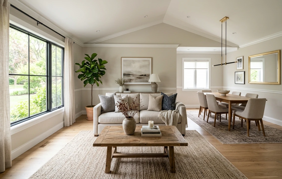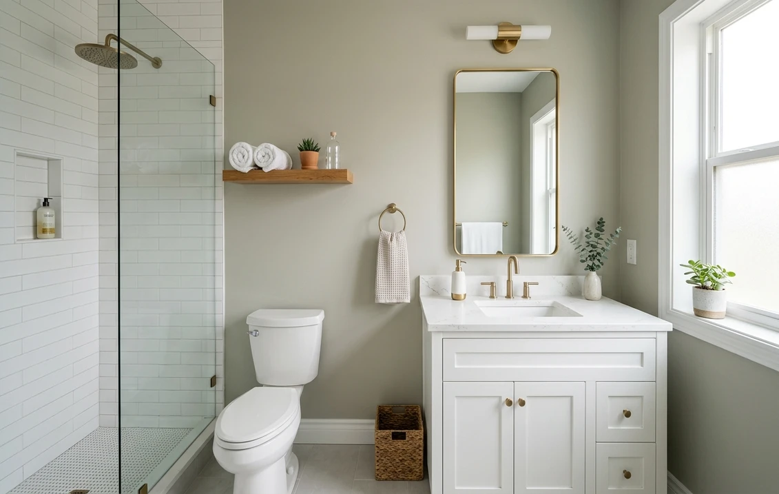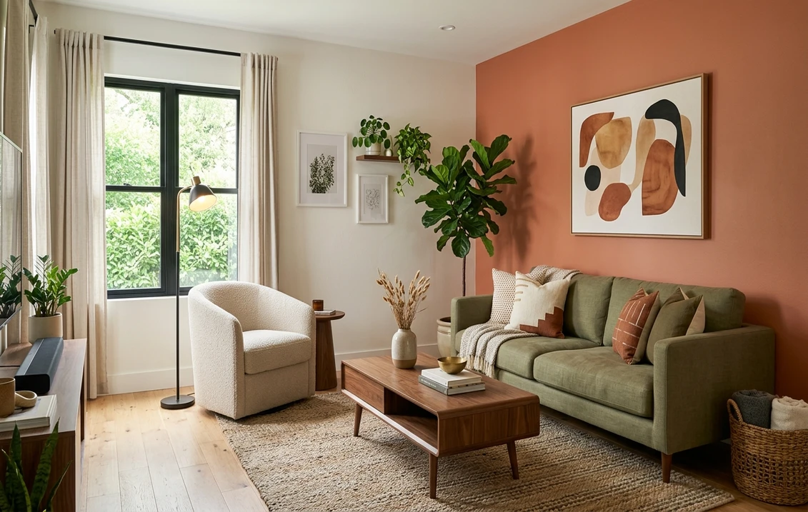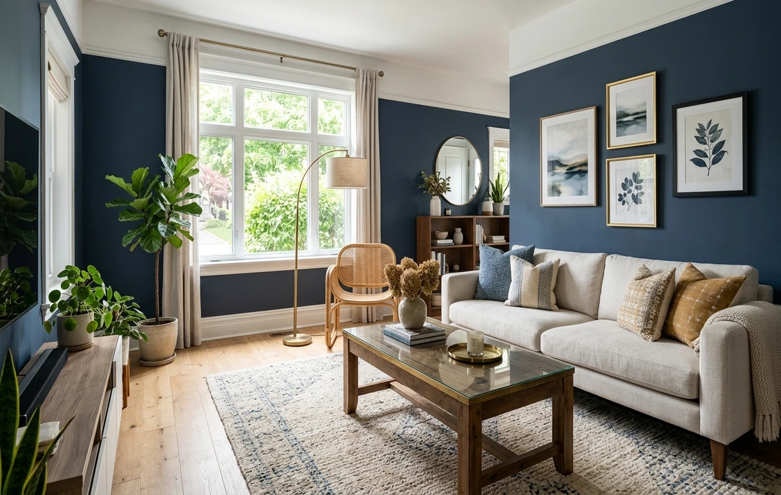
Try it on your room

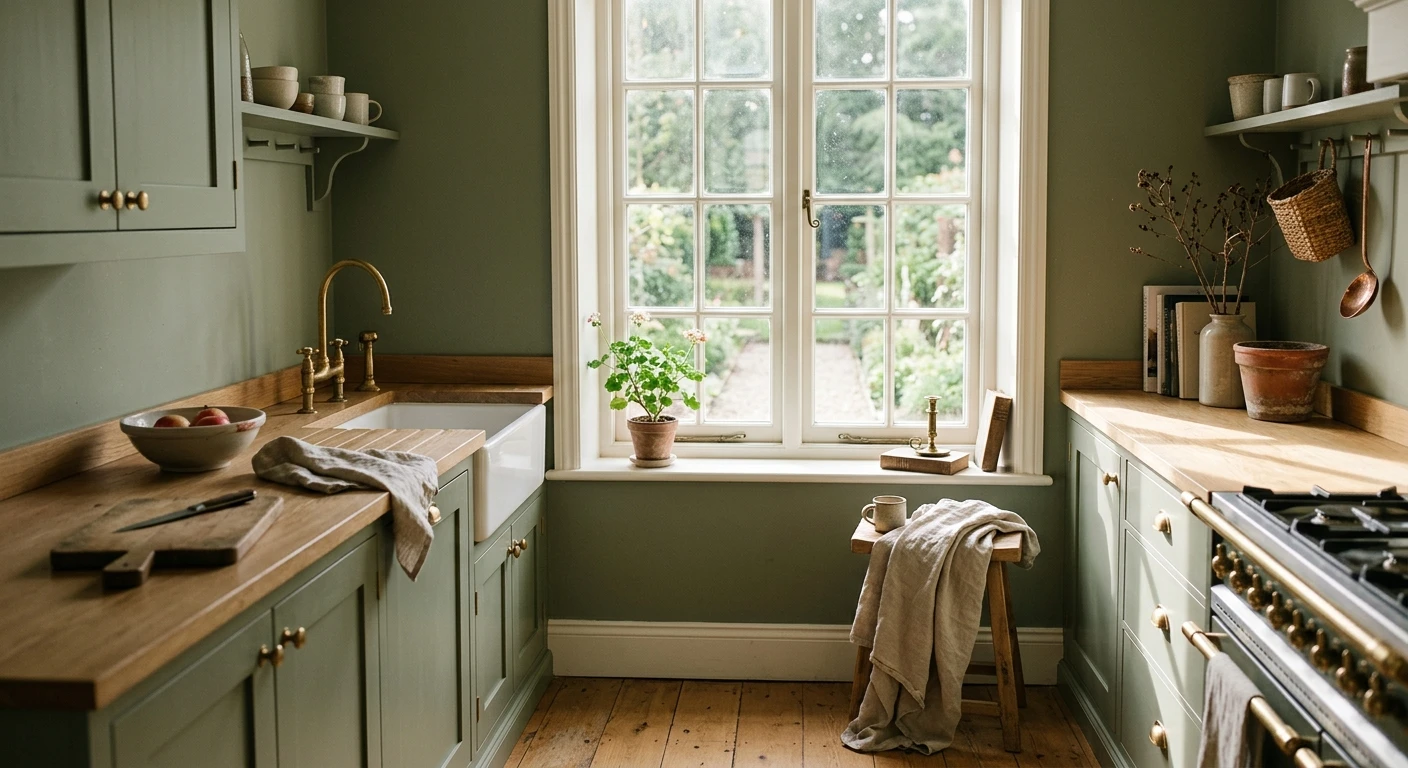
Quick answer: For a sage green kitchen in 2026, start with three shades: SW Evergreen Fog (SW 9130, LRV 30) for a smoky gray-green wall that stays calm next to grease and fingerprints, SW Clary Sage (SW 6178, LRV 41) for a true muted sage on open walls, and BM October Mist (1495, LRV 47) for a soft, bright sage that reads almost neutral. Pair any of them with cream cabinets, warm wood, brass hardware, and a white counter.
Sage green has quietly become the default "warm but not white" kitchen color, and for good reason: it sits between gray and green, so it flatters wood, brass, and cream without ever feeling loud. This guide is the specific playbook for sage green kitchen paint: which shades to buy, where to put them, and what to pair them with. It is part of our wider room-by-room paint color ideas hub, and if you are still deciding between sage and other greens, our green kitchen paint ideas guide covers the wider kitchen palette. Here we stay tight on sage.
One quick note before the shades: this page is about sage on the walls and the overall scheme. If your plan is to keep the walls neutral and paint the units instead, our sage green kitchen cabinet colors guide is the one you want. Everything below assumes sage is going on a wall, an island, or wrapping the whole room.
Best sage green shades for a kitchen
These five sages cover almost every kitchen. They run from a barely-there gray-sage to a deeper, dustier green you would save for an island or a single band of lower cabinets. LRV (light reflectance value, from 0 for black to 100 for pure white) tells you how bright each will keep the room.
| Color | Brand and code | Approx LRV | Why it works in a kitchen |
|---|---|---|---|
| Evergreen Fog | Sherwin-Williams SW 9130 | 30 | Smoky gray-green that never turns muddy next to grease or steam; the safest deeper sage for a wall you actually cook by. |
| Clary Sage | Sherwin-Williams SW 6178 | 41 | A true muted sage with a soft gray base; warms up beautifully under wood and brass on open walls. |
| October Mist | Benjamin Moore 1495 | 47 | Benjamin Moore's soft, grayed sage (its 2022 color of the year); bright enough to read almost neutral in a busy kitchen. |
| Sea Salt | Sherwin-Williams SW 6204 | 63 | The palest option here and the most gray-blue leaning; use it when you want barely-there sage in a small or north-facing kitchen. |
| Saybrook Sage | Benjamin Moore HC-114 | ~31 | A deeper, dustier heritage sage; save it for an island front, a lower band of cabinets, or one feature wall. |
Try it on your house
No photo? Try a sample
LRV figures are published Sherwin-Williams and Benjamin Moore values (Saybrook Sage LRV is approximate and varies by source). Always confirm a shade with a physical sample in your own kitchen light.
Upload one photo and preview these shades on your actual kitchen. Free, no signup.
How to use sage green in a kitchen
For most kitchens, sage belongs on the open walls: the plaster above the backsplash, the run beside a window, the breakfast nook. A mid sage like Clary Sage or October Mist there reads fresh and grown-up rather than trendy. If you want more punch without darkening the whole room, paint the island base a deeper sage (Evergreen Fog or Saybrook Sage) and leave the surrounding walls a warm off-white. That gives the kitchen a center of gravity while the work surfaces stay light. Taken onto the cabinets themselves, that is a two-tone scheme, and it lives or dies on the value gap: Evergreen Fog at LRV 30 under Greek Villa at 84 is the pairing designers reach for most, while two sages a few points apart just look unresolved. Our roundup of the best two-tone kitchen cabinet colors gives the published LRV of each combination and says which shade belongs on the uppers.
In a broken-up kitchen with lots of soffits and short wall runs, color-drenching (walls, trim, and ceiling in one quiet sage) erases the fussy lines and makes the space feel calm and intentional. Keep the LRV above 40, so October Mist or Clary Sage rather than a deep forest, and the counters stay lit even when the color wraps overhead.
Trim is where sage schemes are won or lost. A warm white is sage's best partner: a creamy off-white keeps the look cozy and traditional and lets the green stay soft. A stark, blue-based white can leave a warm sage looking slightly dull, so keep your whites in the same warm lane. The same rule applies to the counter: a soft warm-white or cream quartz flatters sage, while an icy blue-white can fight it.
For accents, sage's natural friends are cream cabinets, white oak or walnut, and brass or aged-bronze hardware. Unlacquered brass in particular makes sage look designed rather than decorated. A white or zellige backsplash keeps the wall calm; a terracotta or checkerboard floor gives the room a warm, slightly Mediterranean edge. You do not need all of these at once, one or two warm metals and one wood tone is plenty.
Lighting shifts sage more than most colors. Cool north light flattens it and pulls it gray, so lean on Evergreen Fog or Clary Sage there, which hold their character in indirect light. Warm 2700K bulbs over the prep zone push sage more golden at night, which is usually flattering. Judge any sample both by the window and under your task lights before you commit.
Sage green kitchen mistakes to avoid
- Matching the wall and cabinets too closely. A sage wall behind sage cabinets in the same depth flattens the room. Keep one clearly lighter or darker, or send the walls neutral and let the cabinets carry the color.
- Pairing warm sage with a cool blue-white counter. A stark, blue-based white quartz can make a warm sage look dirty under task light. Keep your whites in the same warm lane.
- Going too deep in a small or north-facing kitchen. A dark sage wrapped around a galley reads heavy. Use the deeper sages (Evergreen Fog, Saybrook Sage) as an accent on one wall or the island instead.
- Skipping the night test. Sage that looks perfect at noon can turn gray or olive under warm LEDs. Live with a sample for a couple of evenings before you buy the gallon.
- Trusting the chip. A fan-deck chip is too small to show how far sage shifts across a kitchen. Test a large swatch, or preview it on a photo of your own room first.
The fastest way to choose is to see two or three sages on your actual kitchen before you buy a single sample pot. Our interior paint visualizer lets you drop Evergreen Fog, Clary Sage, and October Mist onto a photo of your own walls and compare them side by side. Once the kitchen is sorted, the same sages carry beautifully into the next room: see our sage green living room ideas to continue the palette, or switch gears with navy blue kitchen paint ideas if you want a moodier alternative on the island.
Frequently asked questions
What is the best sage green for a kitchen?
For most kitchens, SW Clary Sage (SW 6178, LRV 41) and BM October Mist (1495, LRV 47) are the safest everyday sages, because they read as soft, warm neutrals next to white counters and wood. If you want a deeper sage that still works in a busy cook space, SW Evergreen Fog (SW 9130, LRV 30) is the most reliable because it never turns muddy. Pair any of them with cream cabinets, brass, and a warm-white counter.
Is sage green a good color for a kitchen?
Yes. Sage sits between gray and green, so it flatters warm wood, brass, and cream without feeling loud, and it hides everyday kitchen wear better than a flat white. The key is matching the depth to your light: use lighter sages like October Mist on the open walls, and save deeper sages like Evergreen Fog for an island front or a single feature wall.
What colors go with a sage green kitchen?
Cream and warm-white cabinets, white oak or walnut wood, brass or aged-bronze hardware, and a white or warm-white counter are sage's most natural partners. A white or zellige backsplash keeps the wall calm, while a terracotta or checkerboard floor adds a warm, slightly Mediterranean edge. Avoid pairing a warm sage with a stark blue-white counter, which can make the green look dull under task lighting.
Does a sage green kitchen make the room look smaller?
A light sage with an LRV above 40, like October Mist or Sea Salt, keeps a kitchen feeling open and often calmer and larger. Deeper sages such as Evergreen Fog (LRV 30) or Saybrook Sage do absorb more light, so they work best on one wall, an island, or a lower band of cabinets rather than wrapped around a small kitchen.
1 HD render plus 3 free color variations.
Color names and codes are trademarks of their respective owners (Sherwin-Williams, Benjamin Moore, Behr). FacadeColorizer is an independent AI visualization tool and is not affiliated with them. LRV and hex values are approximate; the authoritative reference is a physical paint sample in your own light.
Trademarks mentioned (Sherwin-Williams, Benjamin Moore, Behr, Caparol, Brillux, Sto, Alpina, Valspar, PPG, Glidden, Dulux, Crown Trade, Sandtex, Farrow & Ball, Johnstone's, Leyland) are property of their respective owners. FacadeColorizer is independent and not affiliated with any of them. Nominative fair use under Lanham Act §1125.