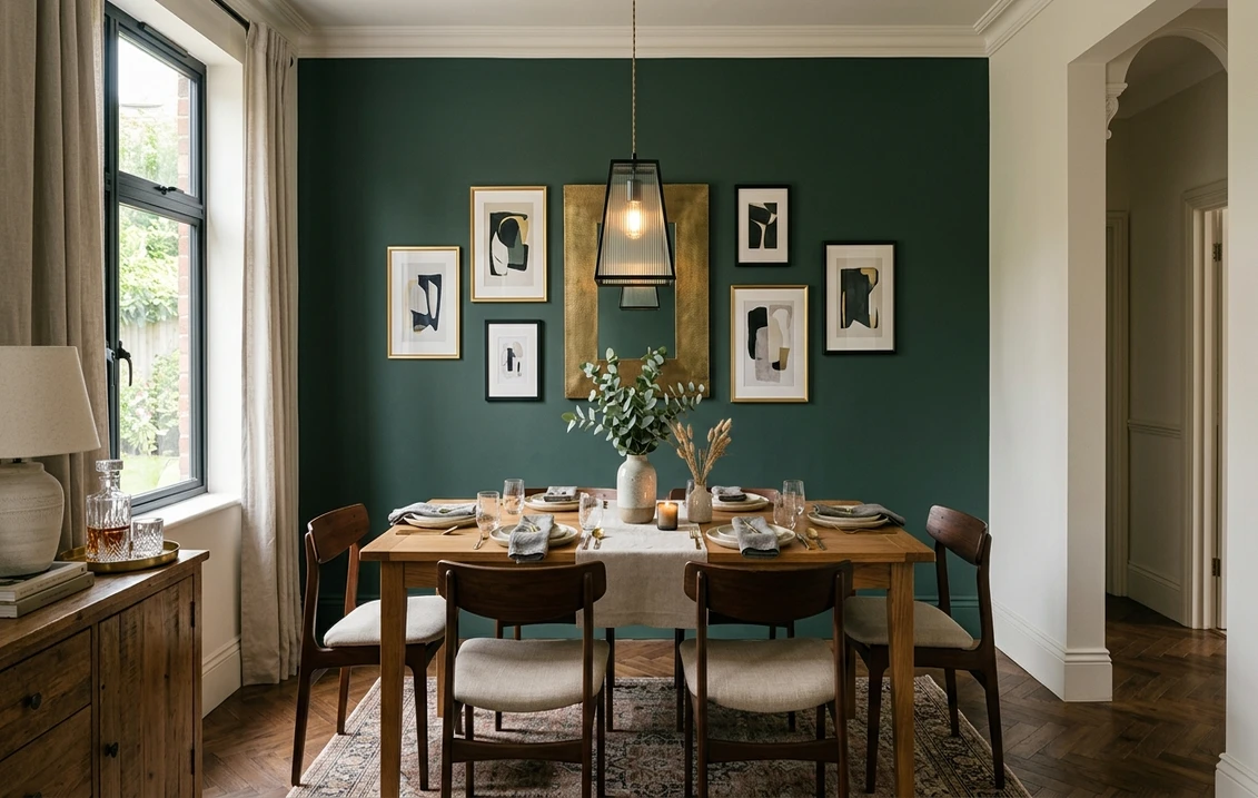
Try it on your room

Quick answer: The three navy blue shades that carry a dining room best in 2026 are Sherwin-Williams Naval (SW 6244), Benjamin Moore Hale Navy (HC-154), and Sherwin-Williams Salty Dog (SW 9177). Pair any of them with white wainscoting, a brass chandelier, a crisp white ceiling, and a natural wood table for a room that glows at dinner.
Navy blue is the one bold color almost everyone agrees on for a dining room. It reads formal without feeling stiff, it flatters warm lamplight, and it makes a natural wood table and a brass chandelier look expensive. This guide stays tightly on navy blue for the dining room: the exact shades, where to put them, and what to pair. For the full room-by-room context, start with our room-by-room paint color ideas, and if you are still weighing other colors for this space, browse the wider dining room palette before you commit to blue.
Best navy blue shades for a dining room
Navy is not one color, it is a family that runs from near-black to bright denim. In a dining room, the LRV (light reflectance value, roughly how much light a color bounces on a 0 to 100 scale) is the number that decides how dramatic or how open the room feels. Here are five real, widely available navies, ordered from deepest to lightest, with the codes and approximate LRVs you can take to the paint counter.
| Color | Brand + code | Approx LRV | Why it works in a dining room |
|---|---|---|---|
| Naval | Sherwin-Williams SW 6244 | 4 | The 2020 SW Color of the Year, a deep saturated navy that never turns purple. The classic full-envelope drama pick for a formal dining room. |
| Hale Navy | Benjamin Moore HC-154 | 6.3 | The most popular navy in the country, a hair softer than Naval. Reads crisp against white wainscoting and photographs beautifully under a chandelier. |
| Salty Dog | Sherwin-Williams SW 9177 | 8 | A brighter marine navy with a denim edge. The friendliest of the group in lower light, so a good pick for a room with one small window. |
| Newburyport Blue | Benjamin Moore HC-155 | 7 (approx) | A historic navy with a faint gray cast. Restrained and elegant, it suits a formal dining room where you want depth without full drama. |
| Van Deusen Blue | Benjamin Moore HC-156 | 9.5 (approx) | The lightest navy here, a rich denim-blue that keeps a small or north-facing dining room from feeling closed in. |
Try it on your house
No photo? Try a sample
If you only test two, make them Naval and Hale Navy. They are the safest, most repeatable navies for a US dining room, and everything else on the list is a lean toward more drama (deeper) or more light (brighter).
Upload one photo and preview these shades on your actual dining room. Free, no signup.
How to use navy blue in a dining room
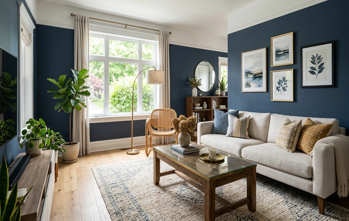
Where to put it. A dining room is the rare space where you can wrap all four walls in a deep navy without regret, because you use it at night, in short bursts, under warm light. The full-envelope treatment (all four walls in navy, white trim and ceiling) is the most striking. If that feels like a lot, the classic compromise is navy above white wainscoting to chair-rail height, roughly 36 to 42 inches, which lifts the eye and protects the lower wall from chair scuffs. The lowest-commitment version is a single navy accent wall behind a buffet, hutch, or fireplace, with the other three walls in a soft white.
Trim, wainscoting, and ceiling. Navy wants a bright, clean white next to it, not a creamy one that can read dingy against the depth of the blue. Chantilly Lace (OC-65), Pure White (SW 7005), or Alabaster (SW 7008) in a semi-gloss finish are the go-to trim whites. Keep the ceiling a crisp flat white to hold the room tall, which matters because navy visually lowers a ceiling. Only carry navy up onto the ceiling for a full jewel-box effect if you have 9-foot or taller walls and a strong chandelier.
Finish and lighting. Use eggshell on the walls: it has just enough sheen to catch chandelier light and it wipes clean after a splash of red wine, but it does not glare like satin. Then get the light right, because navy lives or dies by its bulbs. A brass or unlacquered gold chandelier on a dimmer, with 2700K warm white bulbs dimmed to around 60 percent, is what makes navy glow at dinner. Cool 3500K or higher bulbs will flatten it toward gray, and no paint choice can rescue that.
What to expect on the wall. Deep navies almost always need a tinted primer plus two solid coats (sometimes three for Naval) to look even and rich rather than patchy. Buy a little more than the calculator suggests, and always test a large swatch on the actual wall, since the same gallon can look like true navy in one dining room and near-black in another.
What to pair with navy blue
Navy is a team player, but it wants warmth around it or it can tip cold. The reliable partners:
- White or off-white trim and wainscoting (Chantilly Lace, Pure White, or Alabaster) for the crisp contrast that makes navy read intentional.
- Brass or unlacquered gold on the chandelier, sconces, and cabinet hardware. This is the single biggest upgrade for a navy dining room.
- Natural wood: an oak or walnut table and wood floors keep the room from feeling like a cold box.
- Warm textiles: cognac leather chairs, cream linen, or oatmeal upholstery soften the depth of the walls.
- One warm accent: a touch of terracotta, mustard, or rust in the art or rug stops navy from feeling severe.
- A crisp white ceiling to keep the eye moving up and the room feeling tall.
The one pairing to avoid is a cool, gray-heavy palette all around the navy (gray floors, gray chairs, chrome light). Without a warm anchor, the room reads flat and corporate rather than cozy and formal.
The surest way to choose is to see navy on your own walls before you buy a single sample. Load a photo of your space into our interior paint visualizer and compare Naval, Hale Navy, and Salty Dog side by side in your actual light. If navy ends up feeling like too much for the room, two close alternatives are a softer blue dining room palette or a warm gray dining room scheme.
Frequently asked questions
What is the best navy blue paint for a dining room?
For most dining rooms, Sherwin-Williams Naval (SW 6244) and Benjamin Moore Hale Navy (HC-154) are the two safest, most popular picks: both are deep, balanced navies that never turn purple and photograph beautifully under a chandelier. Choose Naval for the richer, more saturated look and Hale Navy for a slightly softer, more classic navy. If your dining room is small or short on daylight, Salty Dog (SW 9177) or Van Deusen Blue (HC-156) give you the same navy mood with a touch more light.
Is navy blue too dark for a small dining room?
No, and small dining rooms are actually where navy performs best. Because you mostly use the room at night under warm chandelier light, a dark navy envelope reads cozy and formal rather than cramped. Keep the ceiling crisp white, add white wainscoting to about 36 inches to break up the wall, use an eggshell finish so lamplight bounces, and put the chandelier on a dimmer with 2700K bulbs. If you want to hedge, pick a lighter navy like Van Deusen Blue (HC-156).
What color trim and ceiling go with a navy blue dining room?
A bright white trim and ceiling are the classic pairing: Chantilly Lace (OC-65), Pure White (SW 7005), or Alabaster (SW 7008) in semi-gloss on the trim and wainscoting, with a flat white ceiling to keep the room feeling tall. For a bolder, enveloping look in a room with 9-foot or higher ceilings, you can carry the navy up onto the ceiling too, but always test it first. Warm brass or gold lighting completes the scheme better than chrome or nickel.
Does a navy blue dining room need a lot of natural light?
Not necessarily. Navy is one of the few bold colors that looks better at night than at noon, so a dim or windowless dining room is a great candidate. The thing to watch is how navy reads in whatever daylight you do get: in weak north light a very deep navy like Naval (SW 6244) can flatten toward near-black, so if that matters to you, lean toward a lighter, brighter navy such as Salty Dog (SW 9177). The only real fix is to test the shade on your own wall.
1 HD render plus 3 free color variations.
Color names and codes are trademarks of their respective owners (Sherwin-Williams, Benjamin Moore, Behr). FacadeColorizer is an independent AI visualization tool and is not affiliated with them. LRV and hex values are approximate; the authoritative reference is a physical paint sample in your own light.
Trademarks mentioned (Sherwin-Williams, Benjamin Moore, Behr, Caparol, Brillux, Sto, Alpina, Valspar, PPG, Glidden, Dulux, Crown Trade, Sandtex, Farrow & Ball, Johnstone's, Leyland) are property of their respective owners. FacadeColorizer is independent and not affiliated with any of them. Nominative fair use under Lanham Act §1125.