Try it on your room

Quick answer: For a blue dining room, three shades cover almost every home. Benjamin Moore Van Deusen Blue (HC-156, LRV about 17) is the classic mid slate-blue, saturated but easy to live with. Sherwin-Williams Krypton (SW 6247, LRV about 52) is the soft, barely-there option for a small or dim room. Sherwin-Williams Distance (SW 6243, LRV about 10) is the deep, dramatic pick that reads near-navy by candlelight. Pair any of them with white wainscoting, a wood table, brass, and a white ceiling.
The dining room is the one space where blue really earns its keep. You mostly use it after dark, under lamps and candlelight, and blue does something no builder beige can: it turns quiet and rich at night, flatters a set table, and makes white trim and warm wood look expensive. This guide stays tight on one question, how to use blue paint in a dining room, from a soft blue-gray you barely notice to a deep slate that wraps the room like a jewel box. For planning the whole house by space, start with our room-by-room paint color ideas hub, and if you are still weighing blue against greens and warm neutrals, our wider dining room palette compares the full family. Everything below is specific to blue.
Best blue shades for a dining room
Blue for a dining room spans a wide range, and the right pick depends mostly on how dark you want to go and how much daylight the room gets. Here are five that I keep coming back to, from the palest soft blue to a deep smoky slate, with approximate LRV (the light reflectance value, where 0 is black and 100 is white) so you can gauge depth at a glance.
| Color | Brand + code | Approx LRV | Why it works in a dining room |
|---|---|---|---|
| Woodlawn Blue | BM HC-147 | about 59 | The palest, clearest soft blue; keeps a small or north-facing dining room bright and open |
| Krypton | SW 6247 | about 52 | Barely-there blue-gray; the cautious "is this even blue" choice, easy next to any wood |
| Smoky Blue | SW 7604 | about 26 | Dusty mid blue; the safe all-rounder, hides everyday scuffs behind a buffet |
| Van Deusen Blue | BM HC-156 | about 17 | Classic slate-blue; traditional, high-contrast with white wainscoting and brass |
| Distance | SW 6243 | about 10 | Deep, dramatic smoky blue; reads near-navy by candlelight, full jewel-box mood |
Try it on your house
No photo? Try a sample
LRV figures are approximate, drawn from Sherwin-Williams and Benjamin Moore published color data 2026. Confirm on a real sample under your own light.
Upload one photo and preview these shades on your actual dining room. Free, no signup.
How to use blue in a dining room
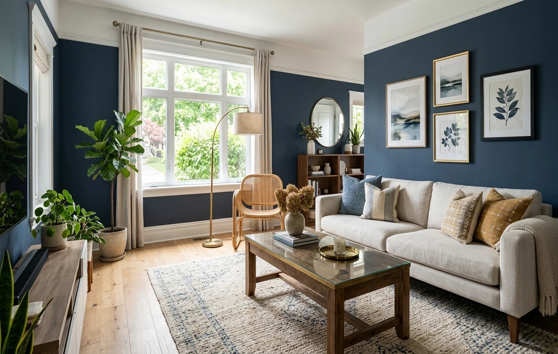
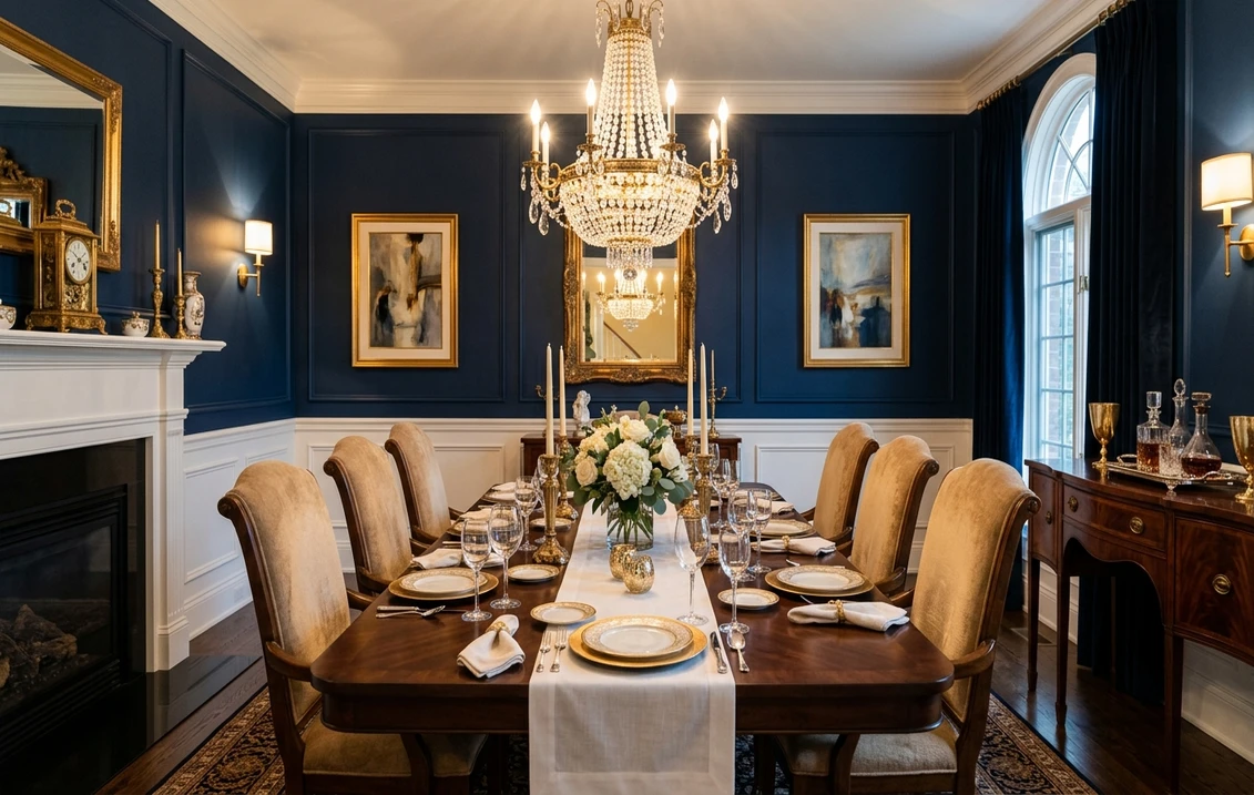
The signature blue dining room is not four flat blue walls. It is blue above white wainscoting: a chair-rail or plate-height run of white paneling on the lower third, with the blue carried up to the ceiling line. The white base keeps a mid or deep blue from feeling heavy, gives you a durable wipe-clean surface right where chairs scuff, and reads instantly traditional. If your room has no wainscoting, the two easy alternatives are all four walls in a soft-to-mid blue (Krypton or Smoky Blue are the most forgiving here), or a single feature wall in a deeper blue like Distance behind the buffet or the head of the table.
Keep the trim and ceiling a soft warm white. A white ceiling lifts the room and stops a deep blue from closing in, and warm-white trim, rather than a stark blue-white, keeps the blue from reading cold. The one exception is the drenched look: with Distance you can carry the same blue onto the trim and even the ceiling for a modern jewel-box effect, which works best in a room you use mostly at night.
Blue is a cool color, so your lighting decides whether it reads elegant or clinical. Warm 2700K bulbs and candlelight pull blue toward its richest, coziest self, which is exactly why blue suits a dining room: you see it lit, not daylit. In a north-facing or dim room, a pale blue like Krypton can drift gray, so lean warmer with the bulbs and let a wood table and brass add heat. In a bright south-facing room you can go as deep as Distance without the space feeling like a cave.
Warm materials are what make a blue dining room feel inviting instead of chilly. Brass or aged-gold lighting and hardware, a walnut or oak table, cane or rush chairs, and cream or oatmeal upholstery all add back the warmth that blue is missing. On sheen, eggshell or satin is the smart choice: both wipe clean around a table and hide wall flaws better than a flat finish, and a deep blue in flat can chalk-rub when you wash it.
What to pair with blue (and mistakes to avoid)
A blue dining room lives or dies on what sits next to it. A few rules keep a good blue from going cold or flat:
- Do pair blue with white wainscoting or trim, a warm-white ceiling, brass or gold metals, warm wood, and cream or caramel textiles. These are the classic partners that keep the room warm.
- Do sample at night. A blue that looks perfect at noon can go flat or gray under your dinner bulbs, so judge it lit, with a candle going, not just at midday.
- Avoid matching the wall blue to a stark blue-white trim. Two cool tones side by side make the wall read cold and the whites look dingy. Warm the trim white instead.
- Avoid a single deep-blue accent wall against three plain white walls in a formal dining room; it often looks unbalanced. Deep blues like Distance look better wrapping the whole room or paired with white wainscoting.
- Avoid going too gray if you actually want blue. The palest, grayest end (Krypton) can read as a neutral. For color that clearly reads blue, choose Smoky Blue or Van Deusen Blue, which hold their hue.
Blue is only one direction for the room. If you know you want something moodier and deeper, our navy dining room paint ideas guide goes all the way to true deep-navy territory, and if you would rather keep things neutral, our gray dining room paint ideas guide covers the greige-to-charcoal range. Whichever way you lean, the fastest way to choose is to see the shade on your own walls: our interior paint visualizer lets you preview any of these blues on a photo of your actual dining room, under your own light, before you buy a single sample.
Frequently asked questions
What is the best blue for a dining room?
For most rooms a classic mid slate-blue like Benjamin Moore Van Deusen Blue (HC-156, LRV about 17) is the safest, most livable pick: saturated enough to look intentional, light enough to stay easy with white trim and wood. Want it lighter and airier? Sherwin-Williams Krypton (SW 6247, LRV about 52) barely reads blue and keeps a small room open. Want drama? Sherwin-Williams Distance (SW 6243, LRV about 10) turns the walls near-navy by candlelight.
Does a blue dining room feel too cold?
Only if you leave every surface cool. Blue is a cool color, so warm it back with a wood table, brass or aged-gold lighting, cream or oatmeal textiles, and warm 2700K bulbs. A soft blue-gray like Krypton stays gentle in most light, and a deeper Distance or Van Deusen Blue actually feels cozy at night once the warm metals and wood are in the room.
What trim and ceiling color go with a blue dining room?
A soft warm white is the classic partner. White wainscoting or trim and a clean white ceiling let a mid or deep blue read crisp and traditional. For a lighter blue like Krypton, keep the same warm white so the walls do not look washed out. For a deep Distance, you can drench the trim in the same blue for a modern jewel-box look, or keep the wainscoting white for contrast.
Is a blue dining room a good resale choice?
A muted, classic blue is one of the safer bold colors for resale because it reads timeless rather than trendy, especially a mid slate like Van Deusen Blue paired with white wainscoting and wood. Very saturated or very dark blues are more personal, so if you plan to sell soon, keep the blue muted and let the neutrals, meaning trim, ceiling, and floor, carry the room.
1 HD render plus 3 free color variations.
Color names and codes are trademarks of their respective owners (Sherwin-Williams, Benjamin Moore, Behr). FacadeColorizer is an independent AI visualization tool and is not affiliated with them. LRV and hex values are approximate; the authoritative reference is a physical paint sample in your own light.
Trademarks mentioned (Sherwin-Williams, Benjamin Moore, Behr, Caparol, Brillux, Sto, Alpina, Valspar, PPG, Glidden, Dulux, Crown Trade, Sandtex, Farrow & Ball, Johnstone's, Leyland) are property of their respective owners. FacadeColorizer is independent and not affiliated with any of them. Nominative fair use under Lanham Act §1125.