
The dining room is the one space in most American homes that earns its color. You sit there at night, lamps low, candles lit, and a flat builder beige just gives up under that warm light. Green does the opposite. The first time I cut in a deep gray-green around a client's dining room, she was nervous right up until the chandelier came on, and then the whole room went still and warm in a way no neutral had managed. That is the case for green: it holds candlelight, flatters food and faces, and does not need daylight to look expensive. This guide walks through 12 looks for a green dining space, from barely-there sage to a blackened forest wrap, with the shades, LRV numbers, and pairings that make each one work.
Two quick framing notes before the looks. First, dining rooms are forgiving with depth: because you mostly use the room after dark and rarely live in it all day, you can go darker and richer here than you would dare in a living room or kitchen. Second, this page is a room-and-color idea gallery. For the broader shade-by-shade breakdown of the family, see our interior green shades guide, and for whole-room schemes by space, our room-by-room paint color ideas hub maps where each tone belongs.
Upload a photo of your actual dining room and preview these greens under your own light in about 30 seconds, free.
How green reads in a dining room (before you pick a look)
Green behaves differently in a dining room than anywhere else, and it is worth knowing why before you fall for a chip. Three things drive it:
- You see it lit, not daylit. Warm 2700K bulbs and candle flame push every green warmer and richer. A sage that looks chilly at noon turns soft and golden at dinner, so sample under the bulbs you actually use.
- Undertone is everything. Greens swing yellow (olive, old-world), gray (smoky, modern), or blue (cool, crisp). The gray and yellow undertones flatter skin and food by candlelight; a cold blue-green can leave faces looking drained.
- Dark walls disappear at night, in the best way. A blackened green at LRV 12 reads as a soft, bottomless backdrop after sundown rather than a heavy box. It is why dining rooms are the one place I happily go nearly black.
LRV, the light reflectance value, is your quick depth gauge: 0 is black, 100 is white. In a dining room you can run the whole range, but most looks below cluster in two zones: airy sages at LRV 40 to 55, and deep greens at LRV 6 to 18.
12 green dining room ideas, by depth and mood
1. Soft sage, full room
The gateway green. A light sage in the LRV 45 to 55 band (think Sherwin-Williams Clary Sage at LRV 41, or a hair lighter) wraps the whole room without ever feeling like a commitment. It reads almost neutral next to oak and rattan, and it is the safest first step if green still makes you nervous. Pair with warm-white trim and let a wood table do the rest.
2. Smoky gray-green feature wall
Evergreen Fog (SW 9130, LRV 30) on the wall behind the buffet is the look that defined the last few years: moody enough to feel designed, muted enough to keep the room calm. Keep the other three walls a warm off-white so the feature reads intentional, not closed-in.
3. Blackened forest wrap
This is my favorite use of green in any house. Take a deep green like Pewter Green (SW 6208, LRV 12) up all four walls and onto the trim, and the dining room turns into a jewel box after dark. Counterintuitive but true: dark walls make a small dining room feel larger at night because the corners melt away. Brass and warm wood pop hard against it.
4. Olive and warm wood
A warm, yellow-leaning olive (LRV roughly 18 to 28) is the old-world dining room: trattoria warmth, terracotta, and aged brass. It loves candlelight and reads cozy rather than cool, and it pairs with the rust, cream, and black tones that keep olive from going drab.
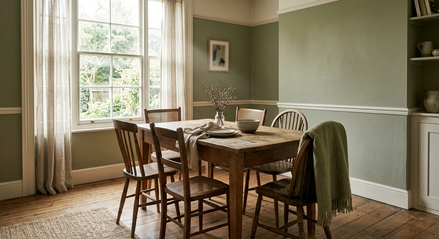
5. Green below, white above (two-thirds wall)
Paint a deep or mid green to plate-rail height (about two-thirds up) with a warm white above and a picture-rail molding on the seam. It is the most traditional dining-room move there is, and it lets you use a richer green without the room feeling heavy floor to ceiling.
6. Green on wainscoting and paneling
If your dining room already has board-and-batten or beadboard, color the paneling in a mid sage or gray-green and leave the wall above in white. The texture catches the green at the bevels and edges, so the color reads softer and more dimensional than a flat wall ever could.
7. Sage with a black accent
A light or mid sage on the walls plus a near-black on the doors, window sash, or a single built-in hutch is the modern-farmhouse dining look. The black grounds the green and keeps a soft sage from reading too sweet. A warm near-black like SW Iron Ore plays nicely with green undertones.
8. Color-drenched mid green (walls, trim, ceiling)
Color drenching, one green on every surface including the ceiling, is having a moment, and the dining room is the ideal test room because you use it at night. A mid gray-green at LRV 25 to 35 drenched top to bottom feels enveloping under a chandelier. Go eggshell on the walls, a flatter finish of the same color on the ceiling.
9. Cool blue-green, crisp and current
A blue-leaning green (closer to teal) gives a cleaner, more contemporary dining room than the warm sages. It pairs beautifully with crisp white trim and chrome or nickel. One honest caution: cool blue-greens can flatten faces under cool bulbs, so keep your dining lighting warm if you go this route.
10. Sage paneling plus a botanical mural wall
Pair a painted sage on three walls with a green-toned botanical or chinoiserie mural on the fourth. The paint picks up the green in the paper so the mural feels custom, not pasted on. This is the dressed-up dinner-party version of a green dining room.
11. Soft green with brass and cream
For a lighter take, run a clean mid green and lean the palette warm: cream upholstery, brass sconces, a natural-fiber rug. The green stays the quiet anchor while the metals carry the warmth, and the room photographs soft and lived-in rather than dark.
12. Green dining open to a neutral kitchen
When the dining area flows into a kitchen, treat the dining zone as the accent and keep the kitchen neutral so the green feels deliberate, not random. A gray-green that shares an undertone with your kitchen cabinets ties the two together. For where these greens land across the rest of the home, our top dining room colors for 2026 roundup compares them against warm neutrals and deep blues.
Free AI visualizer. Test these greens on your real walls before buying a single sample pot.
The shades at a glance: LRV, undertone, and best dining use
Here is the quick comparison I keep coming back to when a client cannot decide. These are verifiable LRV values from the Sherwin-Williams color library, with the dining context that matters most:
| Shade | LRV | Undertone | Best dining use |
|---|---|---|---|
| Clary Sage (SW 6178) | 41 | Soft gray-green | Calm full-room sage, almost neutral |
| Evergreen Fog (SW 9130) | 30 | Smoky gray-green | Feature wall or full color-drench |
| Olive (range) | 18 to 28 | Warm yellow-green | Cozy old-world room, loves candlelight |
| Pewter Green (SW 6208) | 12 | Blackened forest | Drama wrap for small or windowless rooms |
| Deep blue-green (range) | 8 to 16 | Cool blue-green | Crisp modern look, keep lighting warm |
Sources: Sherwin-Williams SW 6178, SW 9130, and SW 6208 color data 2026; designer field reports compiled by FacadeColorizer.
Trim, ceiling, and pairing rules for green dining walls
A green dining room lives or dies on what sits next to it. Get these right and the color looks collected; get them wrong and a good green goes muddy.
- Trim with sage and mid greens: a warm white such as SW Alabaster keeps the room cohesive. A stark blue-white can make a warm green read slightly dirty by contrast.
- Trim with deep greens: paint the trim the same green (the drench) for a seamless jewel-box feel, or a warm near-black like SW Iron Ore for a sharper edge.
- Ceiling: a warm white lifts a dark dining room; a same-color drenched ceiling makes a mid green feel enveloping. Avoid a cold bright-white ceiling over a warm green.
- Metals and wood: brass, aged bronze, walnut, and oak bring out the warmth in any green. Chrome and nickel suit only the cooler blue-greens.
- Textiles: cream, oatmeal, terracotta, and rust ground a green scheme. Our colors that go with green guide breaks down the safe and the risky companions.
See walls, trim, and floor together in one preview, free.
How to test a green dining color before you commit
A 3-inch fan-deck chip is the number-one reason people pick a green that disappoints here: it cannot show the undertone shift between daylight and candlelight, and a dining room is all about that nighttime read. Two better methods:
- Paint a large swatch and judge it at dinner. Roll a 12-by-12-inch sample (or a peel-and-stick sample) on two walls and check it under your actual dining bulbs with a candle lit, not just at midday. The second coat matters here; greens shift between coat one and coat two.
- Preview it digitally first. Upload a real photo of your dining room and apply a sage, a gray-green, and a deep forest before buying samples, so you narrow three contenders to the one worth painting. Pricing for the full repaint is in our interior house painting cost guide for 2026.
Preview a sage, a gray-green, and a deep forest side by side, free.
Frequently asked questions
What shade of green is best for a dining room?
It depends on the mood. For a calm, almost-neutral room, a soft sage around LRV 41 (like Clary Sage) is the safest pick. For a designed, current look, a smoky gray-green such as Evergreen Fog at LRV 30 is the go-to. If you want drama and use the room mostly at night, a blackened forest green at LRV 12 (like Pewter Green) turns a dining room into a jewel box. All three flatter candlelight and warm wood.
Does a dark green make a dining room feel small?
No, and often the opposite at night. Because you use a dining room mostly after dark, a deep green at low LRV lets the corners recede so the walls feel limitless rather than boxed in. Dark green is one of the few cases where going darker can make a small room feel bigger and more atmospheric, especially when you drench the trim and ceiling in the same color.
What trim color goes with green dining walls?
For sage and mid greens, a warm white like SW Alabaster keeps the room soft and cohesive and avoids the dingy look a stark blue-white can cause. For deep greens, paint the trim the same green for a seamless drenched effect, or use a warm near-black like SW Iron Ore for a sharper, tailored edge. Keep the ceiling a warm white to lift a darker room.
What undertone of green is most flattering at dinner?
Gray-green and warm yellow-green (olive) undertones are the most flattering for faces and food under warm dining light, because they read soft and rich by candle and 2700K bulbs. A cool blue-leaning green can drain skin tones under cool light, so if you choose a blue-green, keep your dining bulbs warm to balance it.
Should I paint all four dining walls green or just an accent wall?
Both work; it comes down to depth. A light or mid sage is comfortable on all four walls. A moody gray-green looks intentional as a single feature wall behind a buffet, or color-drenched on every surface if you want to commit. Deep blackened greens almost always look best wrapping the whole room, because a single dark accent wall in a dining room can read heavy and unbalanced.
Preview these greens on your actual dining walls under your own light before buying a single sample.
Disclaimer: Sherwin-Williams, Clary Sage (SW 6178), Evergreen Fog (SW 9130), Pewter Green (SW 6208), Alabaster (SW 7008), and Iron Ore are trademarks of The Sherwin-Williams Company. FacadeColorizer is an independent paint visualization service and is not affiliated with, endorsed by, or sponsored by Sherwin-Williams. Color reproduction on screens approximates the manufacturer's chip; always confirm with a manufacturer sample under your own light before purchase. LRV values are approximate and drawn from manufacturer color data. Sources: Sherwin-Williams SW 6178, SW 9130, and SW 6208 color data 2026, designer field reports compiled by FacadeColorizer.
Trademarks mentioned (Sherwin-Williams, Benjamin Moore, Behr, Caparol, Brillux, Sto, Alpina, Valspar, PPG, Glidden, Dulux, Crown Trade, Sandtex, Farrow & Ball, Johnstone's, Leyland) are property of their respective owners. FacadeColorizer is independent and not affiliated with any of them. Nominative fair use under Lanham Act §1125.