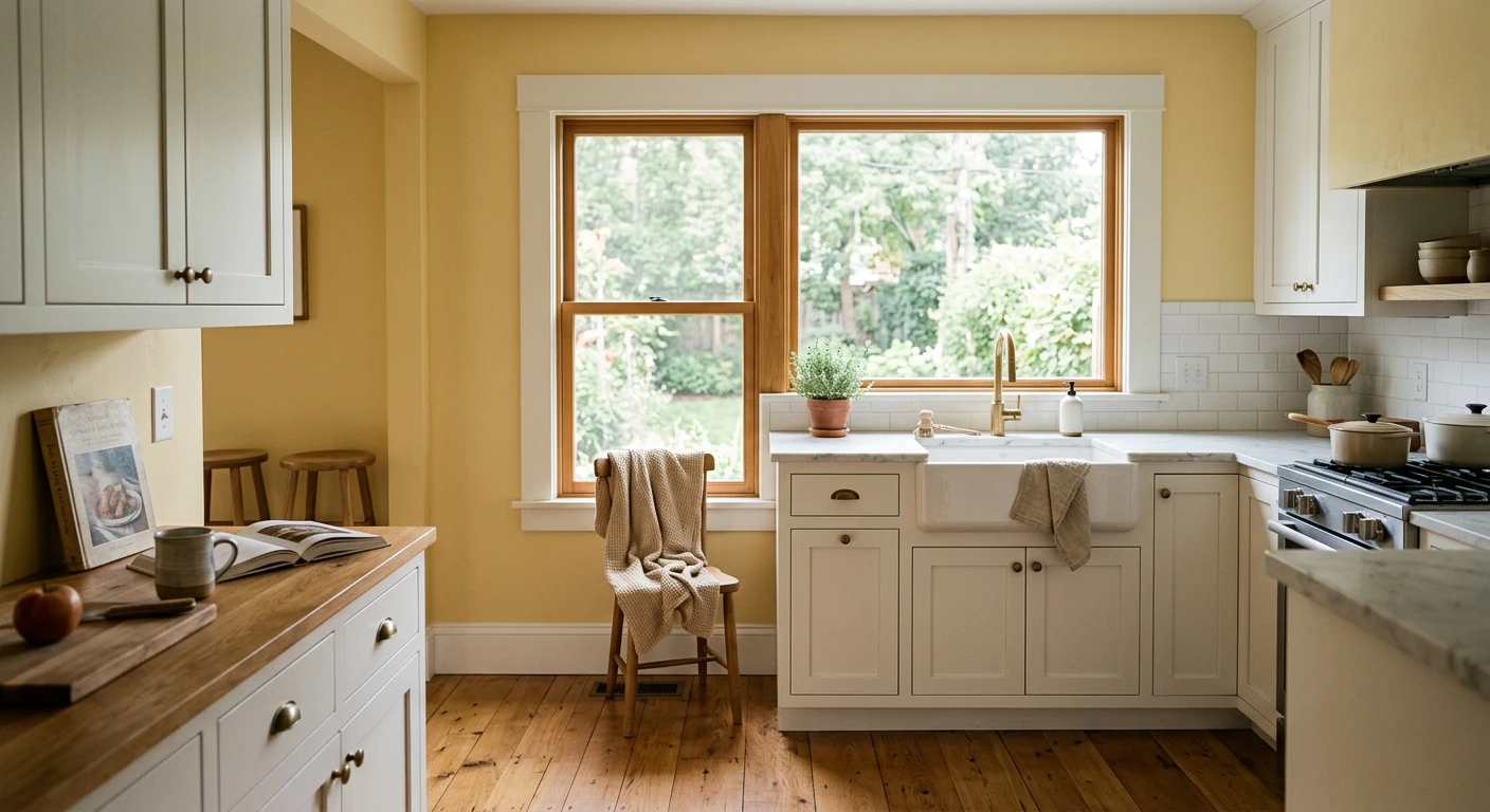

The first kitchen I ever painted yellow belonged to my aunt, a narrow galley with one north window and a permanent gray cast no overhead light could fix. We rolled a soft butter yellow on the upper walls and the whole room finally felt awake at breakfast. That is the case for yellow in a kitchen in one sentence: it is the one color family that adds the warmth a kitchen wants without going dark. The trap is that yellow is also the easiest color to overdo, where a chip that looked cheerful turns acid-bright on a full wall. This guide walks through 12 yellow kitchen ideas, from a whisper of cream to a full mustard island, with the LRV and pairing notes that keep each one looking intentional.
A quick frame before the looks. Yellow in a kitchen breaks into three jobs: a soft pale yellow that behaves like a warm neutral across every wall, a mid-tone golden yellow for a single accent plane, and a deep mustard reserved for an island or one short wall. Get the depth wrong for the job and the room either reads washed-out or shouts. For the underlying color theory, our guide to interior yellow paint colors and their undertones maps the warm-to-green spectrum; this page stays in the kitchen. It is one stop in our room-by-room paint color ideas series.
Upload a photo of your actual kitchen and preview a yellow wall under your own light in about 30 seconds, free.
How yellow reads in a kitchen (before you pick a shade)
Yellow is the most light-sensitive color you can put on a kitchen wall, and the reason is physical. Yellow pigment reflects warm wavelengths hard, so in a south-facing kitchen with strong afternoon sun a pale yellow can jump two shades brighter than the chip and start reading lemon. The same color in a north-facing kitchen calms down, deepens, and finally looks like the soft butter you wanted. North light is yellow's best friend; bright south light is where you size down to the palest tint you can find.
The second thing to watch is the undertone. A yellow with a green lean reads fresh and citrusy. A yellow with a touch of brown or gray reads vintage and grounded (think 1940s farmhouse). A yellow with a red lean tips toward gold and amber. None is wrong, but they pair with different counters, so name your undertone before your shade. And the kitchen rule of thumb: yellow looks best as the warm note in a room, not the whole story, so I almost always cut it with white trim and a neutral counter.
| Yellow depth | Rough LRV | Best kitchen job | Light it loves |
|---|---|---|---|
| Pale buttercream | 70 to 80 | All walls, behaves like a warm neutral | North or east; calms bright south rooms |
| Soft sunny yellow | 60 to 70 | Walls in a low-light kitchen, breakfast nook | North; cozy under warm bulbs |
| Golden wheat / honey | 45 to 55 | One accent wall, pantry, backsplash niche | Any; richest in warm afternoon light |
| Mustard / ochre | 25 to 40 | Island, banquette, lower cabinets only | Good natural light; muddy in dim corners |
Sources: Sherwin-Williams and Benjamin Moore color data 2026 (LRV ranges); The Spruce and Better Homes & Gardens kitchen-color coverage; designer field reports compiled by FacadeColorizer.
Free AI visualizer. See how yellow shifts on your real walls before buying a sample pot.
12 yellow kitchen ideas that actually work
Here are the twelve looks I keep coming back to, ordered roughly from softest to boldest. Each note tells you where the yellow goes and what to pair it with so it reads warm, not loud.
1. Buttercream walls with white cabinets
The lowest-risk yellow kitchen there is. A pale buttercream on the walls (LRV near 75) behind crisp white cabinets reads like sunshine even on a gray day, and because the yellow is so light it functions as a warm off-white. Keep the trim a clean warm white so the wall stays the only yellow note. This is the look for anyone nervous about color committing for the first time.
2. Soft yellow walls in a north-facing galley
A slightly deeper sunny yellow rescues the cold, narrow kitchen that no recessed lighting can warm. North light mutes yellow, so a shade that looks bold on the chip lands as a friendly soft yellow on the wall. Pair it with white or pale-wood cabinets and a light counter to keep the galley feeling open.
3. Yellow walls above a tile wainscot
A vintage-feeling move: paint the upper wall a soft yellow and run white subway or bead-board to chair-rail height below. The split keeps the yellow from overwhelming the room and gives a cottage kitchen real character. Cut in the rail line clean, because a wobbly transition is what makes this look amateur.
4. A single golden accent wall
When you want yellow but not everywhere, commit one wall, usually behind a breakfast table, to a golden wheat tone (LRV around 50) and keep the rest neutral. The deeper yellow has room to be rich without taking over, and it frames the table like a backdrop. For where a single bold plane lands best, see our accent wall color strategy.
5. Mustard lower cabinets, white uppers
A two-tone run with muted mustard below and white above is the trendiest yellow look of the year. It works because the mustard is grounded at the bottom, where it reads as furniture rather than wall. A muted ochre with a touch of brown keeps it sophisticated, and brass hardware seals the vintage-modern feel.
6. A yellow island in a neutral kitchen
Paint the island a deep golden or mustard and leave the perimeter cabinets white or greige. The island becomes the room's jewelry: high impact, fully contained, and easy to repaint later. This is my favorite way to use a bold yellow because the risk is low and the payoff is big.
7. Pale yellow with sage green
Yellow and green sit beside each other on the color wheel, so a soft yellow wall with sage-green lower cabinets feels effortlessly garden-fresh. Keep both colors muted and let a white counter referee between them. It is a calmer take on color than two saturated tones, ideal for a country kitchen.
8. Yellow and navy for contrast
For a kitchen with energy, pair a golden yellow accent with navy cabinetry. Navy and yellow are a classic high-contrast couple: the navy grounds the room and the yellow lifts it. Use the yellow as the smaller note, on a wall or open shelving, so the pair stays balanced rather than competitive.
9. Buttery yellow with natural wood
Soft yellow walls against white-oak or maple cabinets is a warm-on-warm scheme that feels Scandinavian and bright. Keep the yellow pale so it does not compete with the wood grain; the two warm tones should hum together, not clash. A white quartz counter and 2700K bulbs complete the cozy read.
10. A yellow ceiling over white walls
An unexpected idea for a kitchen with good height: keep the walls white and wash the ceiling in a pale buttercream. The yellow reflects a soft warm glow down into the room without ever sitting at eye level. It is the move for someone who wants warmth but keeps their walls neutral for resale.
11. Yellow accents only, neutral shell
The renter-friendly version. Leave walls and cabinets a warm white or greige and bring yellow in through a painted pantry door, the inside of open shelving, or a banquette cushion. You get the cheer of a yellow kitchen with a single afternoon of painting and almost zero risk.
12. Full sunny yellow, all in
For the maximalist: a saturated sunny yellow on every wall, white cabinets, and a vintage tile floor. This only works if the kitchen has enough natural light to carry the saturation and enough white to balance it. In a dim kitchen it turns oppressive fast, so know your light before you go all in. Want the cabinet pairings worked out in full? See our complete guide to kitchen cabinet colors.
See walls, cabinets, and counter together in one render, free.
Pairing yellow kitchen walls with trim, counters, and cabinets
A yellow wall lives or dies on what surrounds it. Get the white and the counter right and the yellow looks designed; get them wrong and even a lovely butter shade can read dated or dingy.
- Trim and ceiling: a clean warm white is the default. Avoid a cool blue-white next to a warm yellow, which can make the wall look slightly green by contrast.
- Cabinets: white is the foolproof partner; warm wood and pale sage both flatter yellow; navy gives high contrast. Steer clear of cool gray, which fights the warmth.
- Counters: white quartz, light marble, and butcher block all let the yellow stay the star. A busy speckled granite under a strong yellow is visual overload.
- Backsplash: white subway or a soft handmade zellige keeps things calm. For pattern, pull a muted yellow from the wall into the tile rather than adding a competing color.
- Metals: brass and aged bronze are yellow's natural allies. Polished chrome can read cold against a golden wall; matte black works for crisp contrast.
If you would rather build the whole room around a tested combination than assemble it piece by piece, our kitchen color schemes guide lays out full cabinet, wall, and counter palettes you can lift wholesale, several of which carry a yellow note.
Mistakes that make a yellow kitchen look cheap
Yellow earns its reputation as a risky kitchen color only when a few avoidable errors stack up. Sidestep these and it behaves:
- Going too saturated on every wall: a bright yellow that delighted you on a 2-inch chip becomes relentless across four walls. Size down, or confine the strong yellow to one plane.
- Ignoring the light: the same yellow is a different color in a south kitchen at 3 p.m. and a north kitchen at 8 a.m. Test in your own room and bulbs, not the store.
- A green-yellow with cool gray: a citrusy yellow against cool gray cabinets or a gray-veined counter makes both look off. Match warm with warm.
- Skipping the second coat: yellow has notoriously poor hide. A single coat looks patchy over white primer; plan on two full coats, and a tinted primer for the deep golds.
- Forgetting the floor: an orange-toned wood floor under a gold wall pushes the room toward 1990s honey. A cooler or grayer floor keeps a deep yellow current.
How to test a yellow kitchen before you commit
Yellow is the worst color to judge from a fan-deck chip, because its light sensitivity means the chip and the wall can look like two different colors. Two better ways:
- Paint a big swatch: roll a 12-by-12-inch sample (two coats) on more than one wall and check it at breakfast, mid-afternoon, and at night under your real bulbs. Watch how far the south wall jumps in bright sun versus the north wall.
- Preview it digitally first: upload a real photo of your kitchen and apply a pale, a mid, and a deep yellow before you buy any samples, so you narrow three contenders to the one worth painting. For what a full kitchen repaint runs, our interior house painting cost guide has the numbers.
Preview a pale, a golden, and a mustard yellow side by side on your real kitchen, free.
Frequently asked questions
Is yellow a good color for a kitchen?
Yes, yellow is one of the best warm colors for a kitchen because it adds energy and sunlight without darkening the room. It works especially well in north-facing or low-light kitchens, where north light mutes the yellow into a friendly soft tone. The key is matching the depth to the job: a pale buttercream for all walls, a golden tone for one accent, and a deep mustard only for an island or lower cabinets.
What color cabinets go with yellow kitchen walls?
White cabinets are the foolproof partner for yellow kitchen walls because they keep the room bright and let the yellow be the only warm note. Natural wood and soft sage green both flatter yellow, and navy gives a striking high-contrast look. Avoid cool gray cabinets with a warm yellow wall, since the clashing temperatures make the room feel uneasy.
What shade of yellow is best for a kitchen?
For walls, a pale buttercream with an LRV around 70 to 80 is safest because it behaves like a warm neutral and resists going acid-bright in strong light. For a single accent wall or pantry, a golden wheat tone near LRV 50 adds richness. Save deep mustard or ochre for an island, banquette, or lower cabinets, where it grounds the room instead of overwhelming it.
Does a yellow kitchen make a small space feel bigger?
A pale, high-LRV yellow can make a small kitchen feel brighter and more open because it reflects a lot of light, much like a warm off-white. A deep or saturated yellow does the opposite and can close a small kitchen in, so in tight spaces stick to the palest tint and pair it with white cabinets and trim to keep the room feeling airy.
How many coats of paint does a yellow kitchen need?
Plan on two full coats for any yellow, because yellow pigment has poor hide and a single coat looks patchy and streaky over white primer. For deep golds and mustards, a gray-tinted primer under the color helps it reach full depth in two coats instead of three and keeps the finish even.
Preview yellow on your actual kitchen walls under your own light before buying a single sample.
Disclaimer: Paint color names, LRV values, and undertone notes in this guide reference publicly available Sherwin-Williams and Benjamin Moore color data for 2026 and are provided for general guidance only. FacadeColorizer is an independent paint visualization service and is not affiliated with, endorsed by, or sponsored by any paint manufacturer. Color reproduction on screens approximates a manufacturer's chip; always confirm with a manufacturer sample under your own kitchen light before purchase. Sources: Sherwin-Williams and Benjamin Moore color data 2026, The Spruce and Better Homes & Gardens kitchen-color coverage, designer field reports compiled by FacadeColorizer.
Trademarks mentioned (Sherwin-Williams, Benjamin Moore, Behr, Caparol, Brillux, Sto, Alpina, Valspar, PPG, Glidden, Dulux, Crown Trade, Sandtex, Farrow & Ball, Johnstone's, Leyland) are property of their respective owners. FacadeColorizer is independent and not affiliated with any of them. Nominative fair use under Lanham Act §1125.