
The thrift-store oil painting had been leaning against my client's baseboard for three weeks. Big gold frame, moody green landscape, exactly the piece her living room needed. The problem was the wall behind it: a cool builder gray that turned the painting's greens slightly gray and dead. We did not buy new art. We changed the wall. That is the whole job here, and it is the part most people skip. Wall art for living room walls only works when the paint underneath is chosen to serve it, not the other way around. This guide is about matching art to paint, not selling you prints.
Quick framing before the method. A wall color does three jobs for a piece of art: it sets the background value (how light or dark), it sets the undertone (warm or cool), and it decides how much the frame disappears or pops. Get those three right and a $40 print can look like it belongs in a gallery. Get them wrong and an expensive canvas reads flat. This piece sits inside our wider room-by-room paint color ideas hub, and it pairs with our interior color schemes guide for building the rest of the palette around the piece.
Upload a photo of the room, test a backdrop color around your actual piece in about 30 seconds, free.
The order of operations: art first, paint second
If you already own the art, the art wins. It is the fixed point. You can repaint a wall in a weekend for the cost of a gallon, but you are not going to repaint a canvas because the wall clashed. So the sane sequence is: lock the piece, read its colors, then choose paint. People do it backwards, fall for a trendy greige, hang whatever they have, and wonder why the room feels off.
There is one honest exception. If you are buying art for a wall you already love, shop for pieces that carry that wall's undertone. A sage room wants art with some green or warm earth in it; a navy room takes almost anything bright. But for most rooms, the painting is the boss.
How to match art to paint color: the three-step read
Here is the method I use on every job. It takes about five minutes with the piece in hand.
- Step 1, pull a color from the art. Find the second-most-common color in the piece, not the loudest. The dominant color usually fights a wall painted to match it. The supporting color, a muted background tone or a recurring shadow, makes the best wall. Hold a fan deck against the art and look for the chip that already lives inside the painting.
- Step 2, set the value gap. Value is lightness. You want contrast between the wall and the art's edges so the piece reads as separate from the wall. Light art on a light wall vanishes. Dark art on a dark wall vanishes. Aim for at least a two-step LRV gap between the wall and the lightest or darkest large area of the art.
- Step 3, match the undertone, do not fight it. Warm art (golds, reds, earth) sits best on a warm-undertone wall. Cool art (blues, grays, black-and-white photography) sits best on a cool or neutral wall. A warm cream wall behind a cool blue print can make the print look slightly muddy, which is the exact problem from that gold-frame landscape.
That is it. Pull a supporting color, build a value gap, respect the undertone. Everything below is just applying those three steps room by room. If your art is mostly grays and you want to nail the wall undertone, our breakdown of colors that go with gray interior is a useful companion read.
| What the art is | Best wall backdrop | Why it works |
|---|---|---|
| Busy gallery wall, many frames | Off-white or soft white (LRV 75 plus) | Quiet ground keeps the cluster from looking chaotic |
| Wood-framed paper prints | Warm greige | Pulls warmth from oak and walnut frames; cohesive |
| Black-and-white photography | Light to mid gray, cool neutral | Even, undistracting; reads modern and crisp |
| One large bold canvas | Deep navy, charcoal, or olive | Dark ground makes a single piece feel like a hung centerpiece |
| Bright, colorful abstract | Muted version of the art's quietest color | Echoes the palette without competing with it |
Sources: Sherwin-Williams and Benjamin Moore LRV color data 2026; gallery-hanging guidance from museum installation practice; designer field reports compiled by FacadeColorizer.
Free AI visualizer. See how the wall value changes the way your art reads.
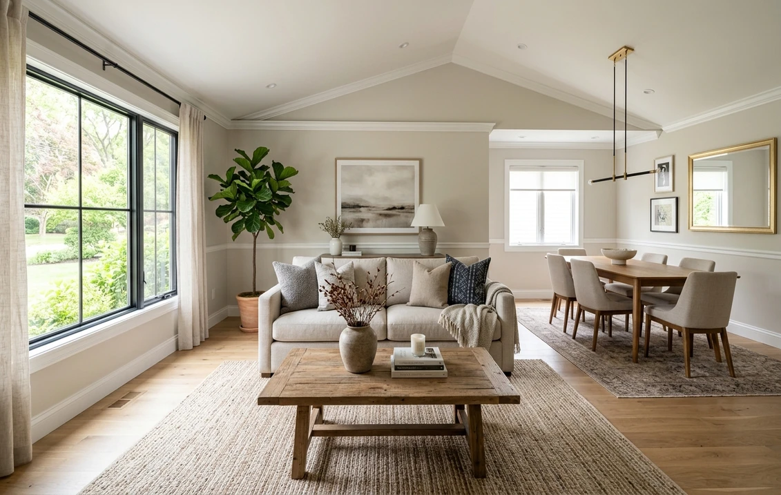
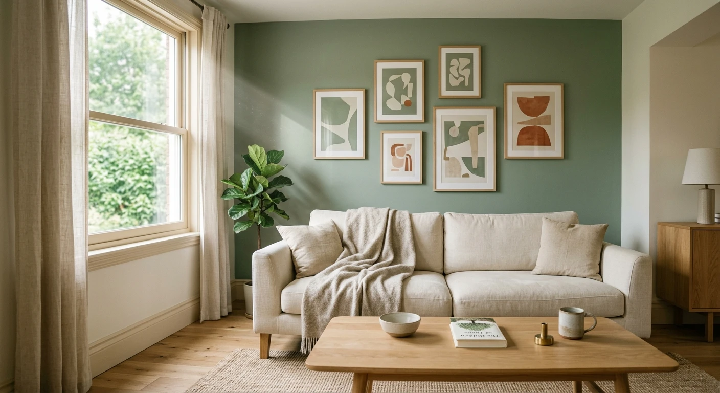
Wall art for living room walls: gallery vs. single statement
The living room is where art and paint matter most because it is the wall people see first. Two situations, two different paint decisions.
The gallery wall (many frames)
A salon-style cluster of mismatched frames needs a calm wall or the whole thing turns into visual noise. This is the one case where I push toward off-white or a very soft warm white. The wall should recede so your eye reads the arrangement, not the paint. Save the bold color for a different wall. For the rest of the room's scheme around that quiet backdrop, our roundup of the year's top living room paint colors shows how a neutral feature wall sits next to deeper accent tones.
The single statement piece
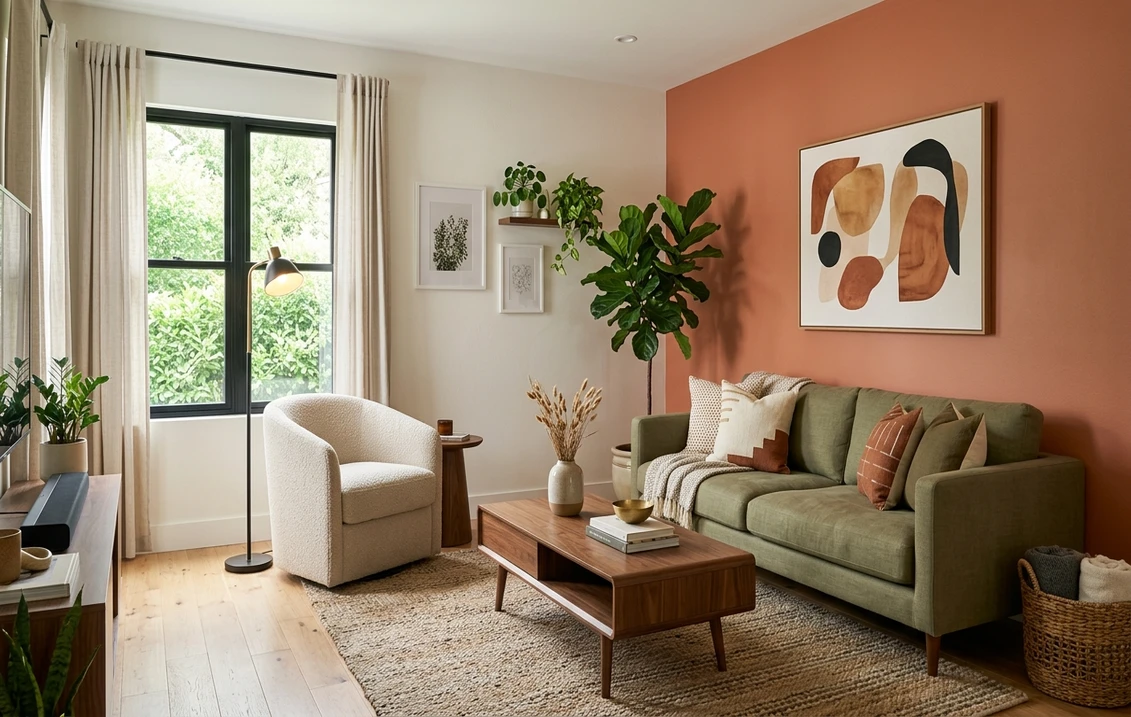
One large canvas over the sofa is the opposite play. Here a deeper wall, navy, charcoal, olive, even a moody green, frames the piece and makes it the room's anchor. Pull the wall color from a shadow tone inside the art and the painting looks like it was made for that exact spot. This is the gold-frame landscape solution: we repainted to a muted warm green drawn from the canvas, and the greens snapped back to life.
Where this does not work
Do not paint a small living room a dark statement color and then hang a busy gallery wall on it. The dark ground swallows the frames and the room feels cramped and confused. Dark walls want one confident piece, not twelve. And skip painting an accent wall to match the single loudest color in the art: a wall the same red as the poppies in your print will overwhelm the poppies. Match the quiet color, never the loud one.
Art for bedroom wall and beyond: the other rooms
The three-step read holds everywhere, but the mood target shifts by room.
- Art for a bedroom wall should sit on a low-contrast, restful backdrop. You want the piece present but soft, not shouting at you from across a dark room at night. A warm greige or muted sage behind framed botanicals reads calm. Save high-contrast pairings for the living room.
- Wall art for the kitchen fights grease, steam, and a busy backsplash, so keep it simple: one or two pieces in washable frames on a wall away from the range. A clean off-white or soft greige behind kitchen art keeps it from competing with cabinets and tile. Do not hang a gallery wall directly over a cooktop.
- Hallways and stairwells are gallery-wall territory. They tolerate a busy cluster because you move through them quickly, and a neutral, slightly warm wall holds a long run of mismatched frames together.
- Home offices can take a bolder backdrop because you are not relaxing there. A deep color behind a single graphic print reads focused on a video call.
One material note. Glossy framed glass on a high-sheen wall creates competing glare. Keep walls behind art in a matte or eggshell finish so the glazing on the art is the only thing that catches light.
See walls, frames, and finish together in one preview before you commit.
The frame is part of the equation
People obsess over the art and the wall and forget the frame, which is often the thing that ties them together or breaks them apart. The frame is a third color between the painting and the paint.
- Black frames read crisp and modern. They want a cool or neutral wall (light gray, off-white) and look heavy on a warm cream wall.
- Wood frames (oak, walnut) read warm and want a warm wall. A greige or warm white lets the grain glow. On a cool gray wall, natural wood can look orange and out of place.
- Gold or brass frames need warmth around them or they look brassy and cheap. A deep warm color (olive, warm navy, terracotta) or a warm white flatters them.
- White or no frame (canvas, gallery wrap) puts all the weight on the art-to-wall relationship, so the value gap from Step 2 matters most here.
If a single piece feels disconnected from the room, swapping the frame is cheaper than repainting and often fixes the clash on its own.
How to test the pairing before you paint
A 3-inch fan-deck chip held next to a painting tells you almost nothing about how a full wall will frame that piece. It is too small to show the value relationship or how the wall undertone shifts the art's colors across a day. Two better methods:
- Paint a large swatch beside the art. Roll a 12-by-12-inch sample on the wall right next to where the piece will hang, then prop the art against it. Check it in daylight and at night under your lamps. Watch whether the art's colors stay true or go gray and flat.
- Preview it digitally first. Upload a photo of the room with the art in place and test a couple of backdrop colors around it (a warmer one and a cooler one) before buying any sample pots. It narrows three contenders to the one worth rolling. Costing the full repaint? Our interior house painting cost guide has the numbers.
Whichever route you take, prime any patched nail holes and plan on a full second coat: a thin, streaky wall reads as a flaw the moment a frame is hung against it and the cut-in lines show.
Preview a warmer and a cooler backdrop around your art, side by side, free.
Frequently asked questions
How do I match wall art to my paint color?
Use a three-step read. First, pull a color from the art, ideally the second-most-common tone rather than the loudest, and look for a paint chip that already lives inside the piece. Second, build a value gap of at least two LRV steps between the wall and the lightest or darkest large area of the art so the piece reads as separate from the wall. Third, match the undertone: warm art on a warm wall, cool art on a cool or neutral wall.
What is the best wall color for a gallery wall of mixed frames?
A quiet off-white or very soft warm white (roughly LRV 75 and up) is the safest backdrop for a busy gallery wall. A cluster of mismatched frames already carries a lot of visual information, so the wall should recede and let your eye read the arrangement. Save a bold accent color for a single statement piece on a different wall, not a packed gallery cluster.
Should the wall match the dominant color in the art?
No. Painting a wall the same color as the loudest tone in a piece makes the two compete, and the art loses its punch. Match a supporting or shadow color from the art instead. A muted version of the painting's quietest tone makes the best wall because it echoes the palette without overwhelming the piece you are trying to feature.
What paint color works behind black-and-white photography?
A light to mid cool gray or a clean off-white gives black-and-white photography an even, undistracting ground and a modern, crisp read. Avoid a strongly warm cream behind monochrome prints, which can leave the photographs looking slightly muddy. Black frames also pair best with these cooler neutral walls rather than warm ones.
Does the picture frame color matter for the wall pairing?
Yes, the frame is effectively a third color between the art and the paint. Black frames read modern and want a cool or neutral wall; wood frames read warm and want a warm greige or warm white; gold and brass frames need warmth around them or they look brassy. If a single piece feels disconnected, swapping the frame is cheaper than repainting and often fixes the clash on its own.
Preview the backdrop on your actual walls, around your actual piece, before buying a single sample.
Disclaimer: Color and LRV references are drawn from manufacturer color data for general guidance and are not endorsements. FacadeColorizer is an independent paint visualization service and is not affiliated with, endorsed by, or sponsored by any paint manufacturer or artwork retailer. This article is about pairing wall paint with art you already own, not about selling art prints. Color reproduction on screens approximates the manufacturer's chip and the real artwork; always confirm with a manufacturer sample under your own light, beside the actual piece, before purchase. Sources: Sherwin-Williams and Benjamin Moore LRV color data 2026, museum gallery-hanging practice, designer field reports compiled by FacadeColorizer.
Trademarks mentioned (Sherwin-Williams, Benjamin Moore, Behr, Caparol, Brillux, Sto, Alpina, Valspar, PPG, Glidden, Dulux, Crown Trade, Sandtex, Farrow & Ball, Johnstone's, Leyland) are property of their respective owners. FacadeColorizer is independent and not affiliated with any of them. Nominative fair use under Lanham Act §1125.