Try it on your house

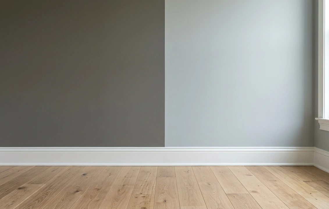
The verdict in three lines. Chelsea Gray HC-168 (LRV around 23) is the dark contender: a warm charcoal built for cabinets, islands, accent walls, and front doors.
Coventry Gray HC-169 (LRV around 48) is the light contender: a cooler, blue-leaning mid-gray made for full walls and whole rooms.
Unlike most gray duels, depth decides this one first: Coventry reflects roughly twice as much light. Undertone is only the tiebreaker, and a photo of your own room settles both.
Benjamin Moore Chelsea Gray (HC-168) and Coventry Gray (HC-169) sit right next to each other in the Historical Collection, and that numbering fools a lot of homeowners into treating them as light and dark versions of the same gray. They are not. They differ in depth by about 25 LRV points and they differ in temperature, with Chelsea leaning warm and Coventry leaning cool. That makes this duel less "which one is prettier" and more "which job does each wall need done." This head-to-head puts the numbers side by side, walks the duel room by room, and tells you exactly when each color wins. For the general method behind any two-color decision, start with our side-by-side method for comparing paint colors.
The numbers side by side
| Attribute | Chelsea Gray HC-168 | Coventry Gray HC-169 |
|---|---|---|
| Family | Warm charcoal gray | Cool, blue-leaning mid-gray |
| LRV | Around 23 | Around 48 |
| Approximate hex | #86847C | #B8BAB6 |
| Approximate RGB | 134, 132, 124 | 184, 186, 182 |
| Undertone | Warm, with a green-taupe cast that shows next to greenery or warm bulbs | Quietly blue, most visible in cool north light |
| Best role | Cabinets, islands, accent walls, doors, exteriors | Full walls in living areas, bedrooms, hallways |
| Loves | White trim, brass, natural wood, black accents | Crisp white trim, navy, marble, brushed nickel |
| Watch out for | Can feel heavy on all four walls of a small, dim room | Can read icy or clearly blue in cold northern light |
Try it on your house
No photo? Try a sample
LRV figures are drawn from Benjamin Moore's published color data. Hex and RGB are approximate digital renderings; the authoritative reference is a physical Benjamin Moore chip or sample.
Read that table once and the shape of the duel is clear. In the Agreeable Gray vs Repose Gray type of matchup, two near-identical neutrals fight over undertone. Here the LRV row does most of the work: at around 23 versus around 48, Chelsea Gray absorbs light and grounds a space, while Coventry Gray keeps a room open and airy. Hold both chips against white printer paper and the second difference appears: Chelsea shows its warm, green-taupe side, Coventry flashes quietly blue. That white-paper trick, plus the two-coat sample rule, comes straight from the comparison method in the pillar guide linked above.
Upload one photo, get a photorealistic render, then swap to Coventry Gray in one click. Free, no signup.
Room by room, exposure by exposure
Because the depth gap is so large, most rooms do not really choose between these two colors; they choose which surface gets which. Here is how the duel typically plays out across the most common situations.
| Situation | Usual winner | Why |
|---|---|---|
| Whole-main-floor wall color | Coventry Gray | At LRV around 48 it keeps connected spaces bright; Chelsea on every wall darkens the whole floor |
| Kitchen island or cabinets | Chelsea Gray | Classic charcoal cabinet move: strong contrast against white counters and walls |
| Bright south-facing living room | Coventry Gray | Warm sun tempers its blue side; the room stays light without washing out |
| North-facing room | Test both on the wall | Cool light pushes Coventry visibly blue and makes Chelsea heavier; finishes and room size decide |
| Home office or den | Chelsea Gray | Its depth gives small, purpose-built rooms a cocooning, focused feel |
| Accent wall behind a bed or sofa | Chelsea Gray | The 25-point LRV gap reads as deliberate contrast against lighter walls |
One more scenario is common: Coventry Gray wins the wall job, but still feels a touch heavy for a low-light hallway or a small bedroom. In that case the shortlist usually moves one step lighter on the same card, and that matchup has its own referee: see the Coventry Gray vs Stonington Gray verdict before you buy samples.
When to choose Chelsea Gray
- You need an anchor, not a backdrop. Kitchen islands, lower cabinets, built-ins, front doors, and accent walls are where a charcoal at LRV around 23 earns its keep.
- Your palette is warm. Natural wood, brass hardware, and cream textiles sit comfortably next to Chelsea's warm base, where a colder charcoal would fight them.
- You want drama without black. Chelsea Gray delivers strong contrast against white trim while staying softer and more forgiving than a true black.
- The room is bright and generously sized. Plenty of daylight keeps a full Chelsea room moody instead of murky.
For its lighting behavior, trim pairings, and the rooms where it shines, see the dedicated Chelsea Gray HC-168 undertone profile.
When to choose Coventry Gray
- You are painting walls, plural. Living rooms, bedrooms, hallways, and open plans need a mid-light color that holds its character all day; that is Coventry Gray's home turf.
- You like gray that reads gray-blue, not greige. If beige-leaning neutrals bore you, Coventry's cool cast gives walls a cleaner, slightly coastal presence.
- Your finishes are cool. Crisp white trim, marble or quartz, brushed nickel, and navy accents all pull in the same direction as its undertone.
- The room gets good natural light. Sun keeps Coventry balanced; in dim north rooms, sample first, because its blue side steps forward.
The full room-by-room treatment, including how blue it really gets, lives in the complete Coventry Gray HC-169 review.
Same wall, both grays, your actual light. Free render in about 30 seconds.
Frequently asked questions
What is the real difference between Chelsea Gray and Coventry Gray?
Depth first, undertone second. Chelsea Gray HC-168 is a warm charcoal with an LRV around 23, while Coventry Gray HC-169 is a cool, blue-leaning mid-gray with an LRV around 48. Coventry reflects roughly twice as much light, so the two colors do different jobs: Chelsea anchors cabinets and accent walls, Coventry carries full rooms.
Is Chelsea Gray darker than Coventry Gray?
Yes, by a wide margin. The roughly 25-point LRV gap between them is obvious on a wall, not a subtle chip-level nuance. Chelsea Gray reads as a true charcoal that grounds a space, while Coventry Gray stays in the light-to-medium band that keeps rooms feeling open.
Can I use Chelsea Gray and Coventry Gray together?
Yes, and this pair works better together than most gray duos. Because the depth gap is large, the combination reads as deliberate contrast rather than a mismatched batch: Coventry Gray on the walls with Chelsea Gray on an island, built-ins, or a single accent wall is a proven pairing. Just note the temperature difference, warm charcoal against cool mid-gray, and check both against your trim.
Which is better for a north-facing room, Chelsea Gray or Coventry Gray?
Neither wins automatically. Cool northern light pushes Coventry Gray noticeably blue and makes Chelsea Gray feel heavier and more somber. In a north-facing room, sample both on the darkest wall, or test them on a photo of that exact room, and let the fixed finishes decide: warm wood favors Chelsea, crisp white and cool stone favor Coventry.
Settle it on your photo
Chips lie, screens lie, and a charcoal that looks rich on a two-inch card can swallow a small room whole. The fastest honest answer to Chelsea Gray vs Coventry Gray is to test both on a photo of your actual space: put Coventry on the walls, drop Chelsea on the island or the accent wall, and let your own light, trim, and floor pick the winner.
1 HD render plus 3 free color variations. Start with Chelsea Gray, swap to Coventry Gray in one click.
Trademark notice. Benjamin Moore, Chelsea Gray, Coventry Gray, Stonington Gray, and Historical Color are trademarks of Benjamin Moore & Co. FacadeColorizer is an independent paint visualization service and is not affiliated with, endorsed by, or sponsored by Benjamin Moore & Co. Brand and color names are used for descriptive and editorial purposes only, consistent with nominative fair use. Hex and RGB values are approximate digital renderings; always confirm with a physical Benjamin Moore color sample before purchase. LRV figures are drawn from the manufacturer's published color data (2026).
Trademarks mentioned (Sherwin-Williams, Benjamin Moore, Behr, Caparol, Brillux, Sto, Alpina, Valspar, PPG, Glidden, Dulux, Crown Trade, Sandtex, Farrow & Ball, Johnstone's, Leyland) are property of their respective owners. FacadeColorizer is independent and not affiliated with any of them. Nominative fair use under Lanham Act §1125.