Try it on your house

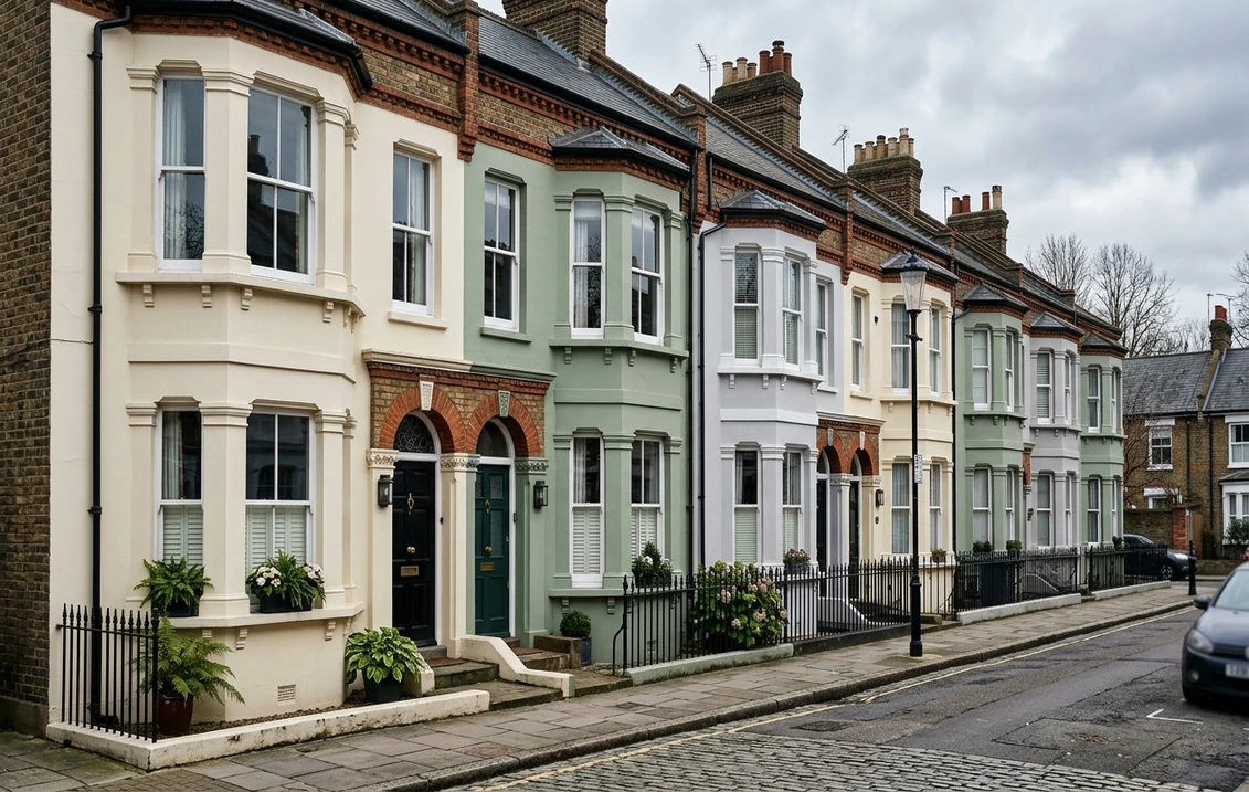
A Victorian house gives you more painted surfaces than any other British house type: rendered or stucco walls, brick that must not be painted, bargeboards, sash windows, a porch, a front door, downpipes and cast-iron railings. The combinations that work are the ones that treat those seven elements as a system, and the best guide to that system is still the one written by a conservation team. This guide builds ten combinations from two kinds of document: the Brighton & Hove supplementary planning guidance on external paint finishes and colours, which sets out the British Standard 4800 colours with historic precedent for 19th-century rendered facades, doors, windows and ironwork, and the colour pages of Farrow & Ball, quoted in the maker's own words so that every pairing can be checked.
What the conservation guidance says before any colour is chosen
Three rules in the Brighton & Hove guidance apply to Victorian houses everywhere, not only on the south coast. First, on materials: "the retention of smooth painted stucco on the Regency and early Victorian buildings is essential if the character of these buildings is to be maintained", and the modern textured or high-build coatings "are often too thick or heavy to be supported on old render and obliterate the fine lines of decorative detail". Second, on breathability: "impermeable paints and hard renders trap moisture and can cause severe damage to walls, structural timbers and interiors and should be avoided", and "two finish/top coats are always recommended". Third, on brick: "fair-faced brickwork and flint facing which were meant to be seen should never be rendered or painted over". A colour combination that paints the brick, or seals a lime-rendered wall under a plastic coating, fails before the first tin is opened. The guidance also notes that consent is needed to paint previously unpainted brick or render on listed buildings and in conservation areas with an Article 4 direction.
The 10 Victorian exterior colour combinations
Each combination names a wall colour, a joinery colour and a door colour, with the maker's own description where one exists. The Brighton & Hove list of British Standard colours recommended for painted 19th-century facades, White BS 00 E 55, Pale Pinkish Off-White 08 B 15, Pale Fawn 08 B 17, Pale Cream 10 B 15, Pale Yellowish Cream 08 C 31 and Pale Cream 10 C 31, is the historical benchmark the Farrow & Ball neutrals below are matched against.
- Cornforth White walls, Railings joinery, Studio Green door. Farrow & Ball calls Cornforth White No. 228 "the mid tone in the group of Relaxed Neutrals which are totally understated and extremely versatile", Railings No. 31 "a soft black with blue undertones", and Studio Green No. 93 "a deep, dark green" whose pigments "respond extraordinarily to all types of light" outside. The quiet London villa scheme.
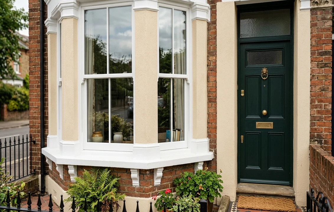
- Unpainted red brick, Off-White joinery, Card Room Green door. The brick stays bare, as the guidance insists; Off-White No. 3, "a chalky mid tone" and one of the original Farrow & Ball colours, picks out the sashes and bargeboards; Card Room Green No. 79, "a dark grey green" named after Victorian study rooms, takes the door.
- Skimming Stone walls, Strong White joinery, Railings door and ironwork. Skimming Stone No. 241 is "this stony off white" with "warm light grey undertones", and Farrow & Ball names Strong White No. 2001 as its complementary white. One dark colour for door and railings keeps the scheme calm.
- Slipper Satin walls, Wimborne White joinery, Hague Blue door. Slipper Satin No. 2004 "takes its name from the delicate colour of silk used in traditional ballet slippers" and "often reads as a pale grey chalk"; Wimborne White No. 239 is its named complementary white; Hague Blue No. 30 has green undertones that let it sit "as happily outside as it does in small dark rooms". The seaside villa.
- Shaded White walls, School House White joinery, Green Smoke door. Shaded White No. 201 is "a light grey beige, neither too warm nor too cool", with School House White No. 291 as its complementary white; Green Smoke No. 47, "a smoky green blue", has "weathered familiarity when used in exterior situations". Suits stone-dressed and sandstone frontages.
- Pale Cream stucco (BS 10 B 15), white sashes, Dark Green door (BS 14 C 39). The scheme straight from the Brighton & Hove list: a pale cream facade, windows painted white or the colour of the facade as the guidance advises, and one of its recommended door colours. For a terrace in a uniform painting scheme this is the safe answer.
- Pale Fawn stucco (BS 08 B 17), Off-White joinery, Dark Blue door (BS 18 C 39). The second guidance scheme, warmer on the wall, with the recommended dark blue on the door and black ironwork.
- Unpainted yellow stock brick, Shaded White joinery, Railings door, black ironwork. London stock brick wants a grey-leaning white on the sashes rather than a warm cream, and Railings, which Farrow & Ball recommends in Full Gloss on front doors for "a handsome and commanding entrance", on the door.
- Off-White walls, Slipper Satin joinery, Calke Green door. Two Traditional Neutrals from the same Farrow & Ball group, which the maker says "works perfectly" together, with Calke Green No. 34, "a cleaned version of a colour originally found in the breakfast room at Calke Abbey", for a country or suburban villa in a garden setting.
- Cornforth White walls, Ammonite joinery, Studio Green ironwork and door. Farrow & Ball's own scheme for Cornforth White lists Ammonite No. 274 as the trim; the Brighton guidance allows dark green BS 14 C 39 for ironwork as one of the "darker inconspicuous colours" it was historically painted in. A green-and-grey scheme for a garden-facing villa.
| House | Walls | Joinery | Door | Ironwork |
|---|---|---|---|---|
| London stucco villa | Cornforth White | Railings or Ammonite | Studio Green | Black |
| Red brick villa | Unpainted brick | Off-White | Card Room Green | Black |
| Seaside villa | Slipper Satin | Wimborne White | Hague Blue | Black or dark blue |
| Terrace in a uniform scheme | Pale Cream BS 10 B 15 | White | Dark Green BS 14 C 39 | Black BS 00 E 53 |
| Yellow stock brick | Unpainted brick | Shaded White | Railings | Black |
| Garden-facing villa | Off-White | Slipper Satin | Calke Green | Dark green |
Try it on your house
No photo? Try a sample
How to choose a scheme for your own house
Three variables decide it. The wall material: painted render or stucco takes a colour, bare brick does not, and a house with both uses the render colour only on the rendered parts. The street: the Brighton & Hove guidance notes that "a group of buildings, designed as an architectural unit, are best treated using the same colour throughout", that "contrasting colours can result in discord", and that councils enforce uniform painting schemes on named terraces and crescents, so on a terrace the question is often which door colour, not which wall colour. And the light: north-facing stucco wants the warmer of the pale creams, south-facing stucco can take the greyer stones. Our guide to the best exterior paint colours in the UK covers how each neutral behaves by aspect, and the green front door colours guide and blue front door colours guide go door by door through the makers' descriptions.
Ironwork, downpipes and gutters
The guidance is specific: railings and other architectural ironwork "was generally painted in darker inconspicuous colours", with the nearest British Standard colours Black 00 E 53, Dark Green 14 C 39, Dark Brown 10 C 39 and Dark Blue 18 B 29; "often black will be the safest colour for area and balcony railings and the most attractive choice particularly in terraced groups". Downpipes and gutters "are best painted to match the main rendered facade so that they are not obtrusive", and against brickwork "look best painted black or dark grey"; original lead rainwater pipes should stay unpainted. White railings against brick are the mistake the guidance is written to prevent.
Windows, canopies and the roofline
On sashes, the guidance says the Regency and early Victorian range was "fairly limited" and that "the safest choice and often the most attractive will be to paint windows white or the colour of the facade". Lead canopies, where painted, should "either match the main elevation or be painted grey BS 00 A 09 to match the original lead covering", because black painted canopies "tend to be overpowering". Dormers and additions above eaves level should blend with the slate: "BS 18 B 25 Dark Grey with a matt finish is most appropriate". Repainting is also the moment to remove obsolete cables and tack back loose ones, painted the background colour.
Conservation areas, listed buildings and flats
In a conservation area with an Article 4 direction, and on any listed building, the guidance warns that "the use of intense, dark or primary colours, which are gaudy or which make a dramatic change to the appearance" will "require planning permission and/or listed building consent, and will normally be resisted", and that consent is required to paint previously unpainted brick, flint or render. Many councils publish their own colour palettes; Brighton & Hove's is the model, and the local conservation team will say whether your street is in a uniform painting scheme. For a flat in a converted villa the Planning Portal's page on painting the outside of a flat explains that the rules differ from houses and that the lease and freeholder have a say. Our guides to conservation area painting rules and listed building painting rules set out when to ask first.
Paints that let a Victorian wall breathe
The guidance lists the finishes by how they behave on old render. Solvent-borne gloss paints "are not vapour permeable and can therefore trap moisture"; water-borne smooth masonry paints "are said to be more moisture-vapour permeable"; lime washes "are highly permeable, but are only appropriate on unpainted renders"; and mineral paints "have long life and high vapour permeability". On a lime-rendered Victorian wall that has never been sealed, limewash or a mineral paint keeps it that way; on a wall already under decades of masonry paint, a breathable water-borne masonry paint is the realistic choice, and the limewash vs masonry paint guide explains how to tell which wall you have. For the timber, Little Greene's Intelligent Exterior Eggshell data sheet gives the figures a decorator works to: about 12 m² per litre, two coats 16 hours apart, application above 10 degrees C on timber below 15 % moisture.
What it costs and who should do it
A Victorian villa has far more edges than a modern semi, and the quote reflects it: separate colours and products for render, joinery, door and ironwork, zinc-rich primer on the cast iron, scaffold for the bays and gables, and the preparation the guidance calls "crucial for long term durability". Our exterior house painting cost guide works through the arithmetic of a quote, from data-sheet coverage to day rates and the HSE access rules. When vetting a decorator, ask for two recent Victorian references with addresses, a trade account with the heritage brands, and experience of lime, mineral and breathable systems; a decorator who proposes a textured masonry coating on smooth stucco has not read the guidance.
Common mistakes
- Brilliant white render. The historic palette is pale cream, pale fawn and off-white; a blue-white reads as plastic against Victorian brick detail.
- Painting the brick. The guidance says fair-faced brick "should never be rendered or painted over".
- Textured or high-build coatings on stucco, which "obliterate the fine lines of decorative detail".
- White railings against brick; the historic colours are dark and inconspicuous.
- Pastel doors, too weak for the weight of a Victorian frontage; the guidance's door list is black, white, brown, red, dark green and dark blue.
- Mixing metal finishes on one door; pick brass or black and keep to it.
- Choosing from a chip. Studio Green is near-black indoors and green outside, by its maker's own account: judge it on the door, in daylight, or on a photo of the house first.
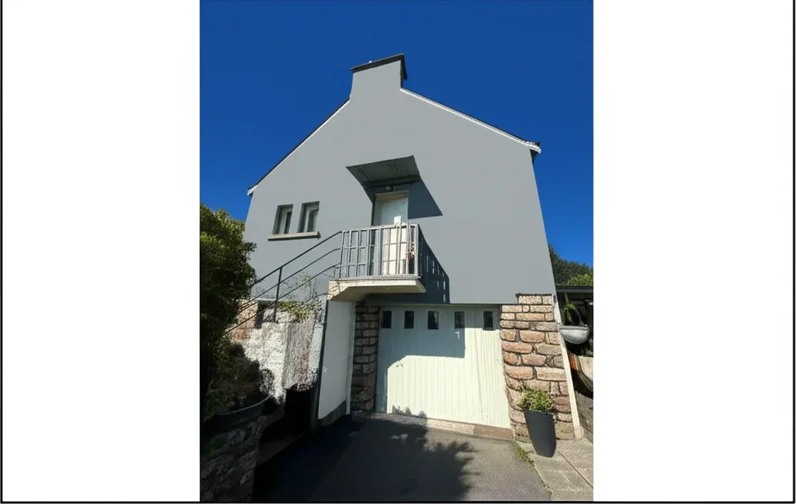
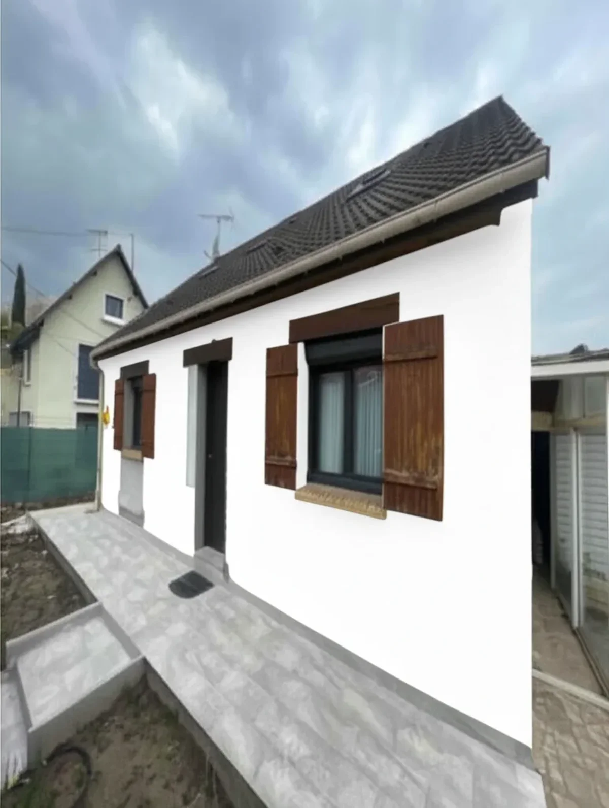
The last point is the cheapest to fix: upload a photo of the frontage to the paint visualiser, apply two of the schemes above and compare them against your own brick, slate and street before a tin is bought. For period palettes house type by house type, the Edwardian exterior colours guide and the Georgian townhouse colours guide cover the houses on either side of the Victorian era.
Sources and references
- Brighton & Hove City Council, Supplementary Planning Guidance note 2: External Paint Finishes and Colours (PDF): available finishes and breathability, British Standard 4800 colours with historic precedent for rendered elevations, doors, windows, ironwork, canopies and roofline, uniform painting schemes, consent requirements.
- Farrow & Ball colour pages: Cornforth White No. 228, Skimming Stone No. 241, Slipper Satin No. 2004, Off-White No. 3, Shaded White No. 201, Railings No. 31, Hague Blue No. 30, Studio Green No. 93, Card Room Green No. 79, Green Smoke No. 47, Calke Green No. 34: descriptions, complementary whites and scheme suggestions quoted above.
- Little Greene, Intelligent Exterior Eggshell technical data sheet (2024, PDF): coverage, coats, recoat time, application conditions for exterior joinery.
- Planning Portal, Paint the outside of a flat: how the rules for flats differ from houses.
Frequently asked questions
What colours were Victorian houses originally painted?
Should I paint the brick on a Victorian house?
What is the best colour combination for a Victorian terrace?
Which paint should go on a Victorian rendered wall?
What colour should Victorian railings and downpipes be?
Can I preview a scheme on my own Victorian house?
Trademarks mentioned (Sherwin-Williams, Benjamin Moore, Behr, Caparol, Brillux, Sto, Alpina, Valspar, PPG, Glidden, Dulux, Crown Trade, Sandtex, Farrow & Ball, Johnstone's, Leyland) are property of their respective owners. FacadeColorizer is independent and not affiliated with any of them. Nominative fair use under Lanham Act §1125.