Try it on your house

Quick answer: For north-facing rooms, lean into warm colors with a higher LRV so the cool, flat daylight cannot drain them. The safest go-anywhere picks are Benjamin Moore White Dove OC-17 (LRV about 85) for a warm white, Sherwin-Williams Alabaster SW 7008 (LRV about 82) for a soft creamy white, and Sherwin-Williams Accessible Beige SW 7036 (LRV about 58) when you want a warm greige with more depth.
North-facing rooms are the trickiest light in the house. They never catch direct sun, so the light stays cool, indirect, and flat from morning to night, which quietly drains warmth out of paint and can make a color read dull, grayer, or faintly blue on the wall. The fix is not complicated once you know the rule: choose warmer colors with a higher light reflectance value and let them push back against the cool cast. For the full room-by-room picture, start with our guide to paint colors by room orientation, then use this page to shortlist the exact shades for a north exposure.
Why north-facing light changes paint color
A north-facing window receives only ambient sky light, never the warm direct beam that south and west rooms get. That sky light is cooler in color temperature and lower in intensity, so it behaves like a soft gray filter over everything in the room. Cool undertones get amplified, warm undertones get muted, and lightness drops a touch compared with the chip you saw in the store. A crisp white can turn slightly gray, a pale gray can slide toward blue, and a beige can go flat and lifeless. The room is not doing anything wrong; the light simply subtracts warmth, so you have to add it back through the color you choose.
This is where light reflectance value (LRV) earns its keep. Because north light is dimmer, a higher-LRV color reflects more of what little light there is and keeps the space from closing in. The practical target is a warm color in the roughly LRV 58 to 85 band: high enough to stay bright, warm enough to counter the cool cast. Pair that with a genuinely warm undertone (soft yellow, a hint of gold, a warm greige) and the room reads inviting instead of cold.
The best colors for north-facing rooms
Every color below is a real, widely documented shade with a warm lean and enough reflectance to survive cool light. The LRV figures are the manufacturers' published values; treat them as accurate reference points rather than exact promises for your specific room.
| Color | Brand + code | Approx LRV | Why it works here |
|---|---|---|---|
| White Dove | Benjamin Moore OC-17 | 85 | A warm, soft white with just enough gray to avoid glare. High LRV keeps a dim north room bright while the warmth stops it from going cold. |
| Alabaster | Sherwin-Williams SW 7008 | 82 | A creamy off-white with a subtle warm base. Reads clean without turning stark or blue in flat light, so it flatters trim and walls alike. |
| Creamy | Sherwin-Williams SW 7012 | 81 | A gentle warm cream with a whisper of yellow. That soft warmth is exactly what north light strips out, so it holds its glow instead of going gray. |
| Pale Oak | Benjamin Moore OC-20 | 70 | A soft warm greige-white that adds a little depth over a pure white. Warm enough to stay cozy in cool light, light enough to keep the room open. |
| Agreeable Gray | Sherwin-Williams SW 7029 | 60 | A warm greige that leans just enough beige to resist the blue cast of north light. A forgiving neutral when a full white feels too bright. |
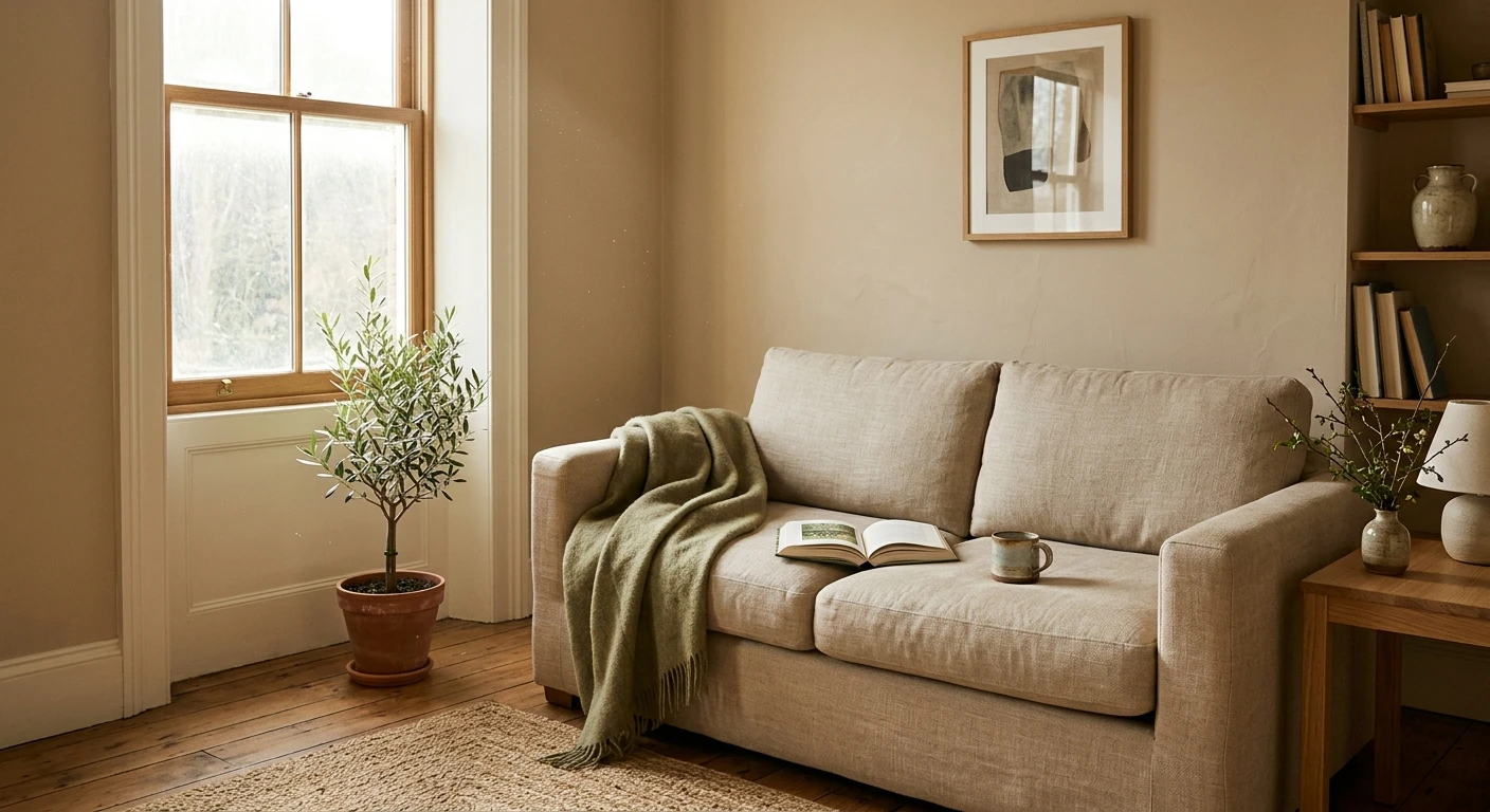
| Accessible Beige | Sherwin-Williams SW 7036 | 58 | The warmest, deepest pick here. Its clear beige base fights the cool cast head-on and gives a north room a grounded, sunlit-feeling neutral. |
Try it on your house
No photo? Try a sample
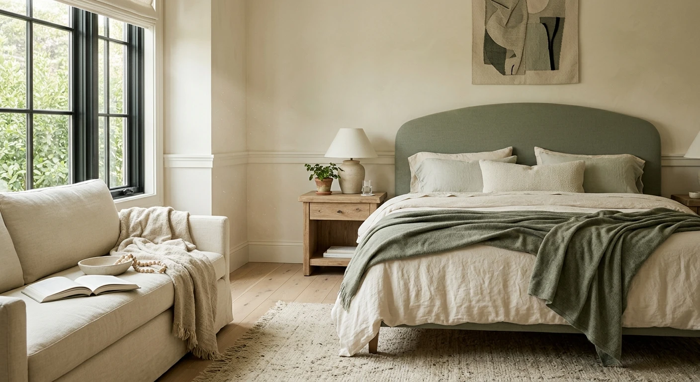
If you want more color rather than a neutral, gentle warm yellows and soft warm greens (think a muted sage or a butter-soft cream tint) also do well in north rooms because their warmth counterbalances the cool light. What matters is the undertone: warm and slightly higher in LRV wins, cool and icy loses.
Two finishing moves make any of these picks work harder in a north room. First, keep your trim and ceiling a step brighter than the walls (a warm white like White Dove OC-17 on trim against Accessible Beige walls, for example) so edges stay crisp instead of blurring into the flat light. Second, warm up your bulbs: soft-white 2700K lamps add back the warmth the daylight subtracts, while cool 4000K and up bulbs will fight your warm color and make the room feel colder after dark. The paint, the trim contrast, and the light temperature are one system, not three separate decisions.
Upload one photo and preview the shortlist on your actual walls in your actual light. Free, no signup.
Colors to avoid
A north exposure punishes anything already cool or stark. Steer clear of these in a room with no direct sun:
- Cool grays with blue or purple undertones. North light amplifies the very undertone you were hoping to ignore, so a chic gray on the chip can read cold and dingy on the wall.
- Stark bright whites. A crisp blue-white or a high-contrast pure white has no warmth to lose, so it tends to go flat and slightly gray instead of clean and fresh.
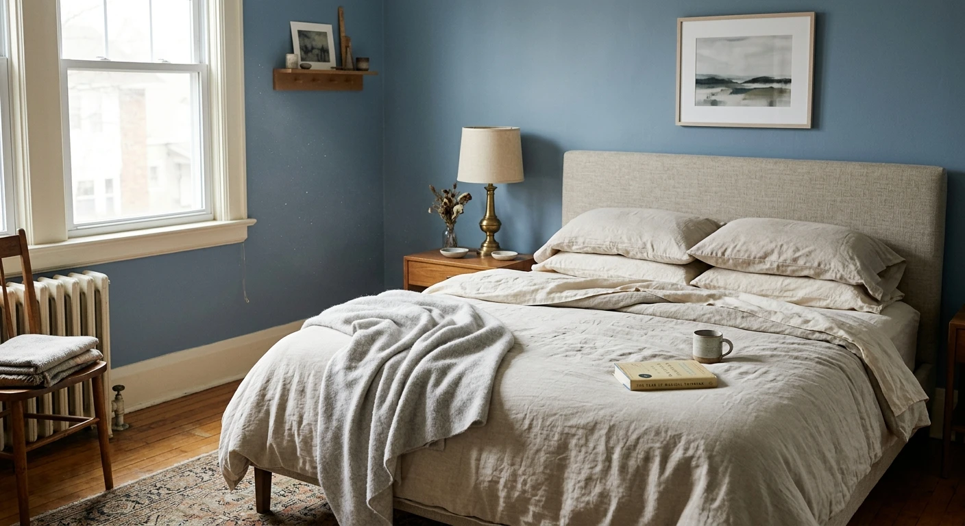
- Icy blues and cool greens. Already cool to begin with, they can look drained and lifeless once the flat north light removes what little warmth they had.
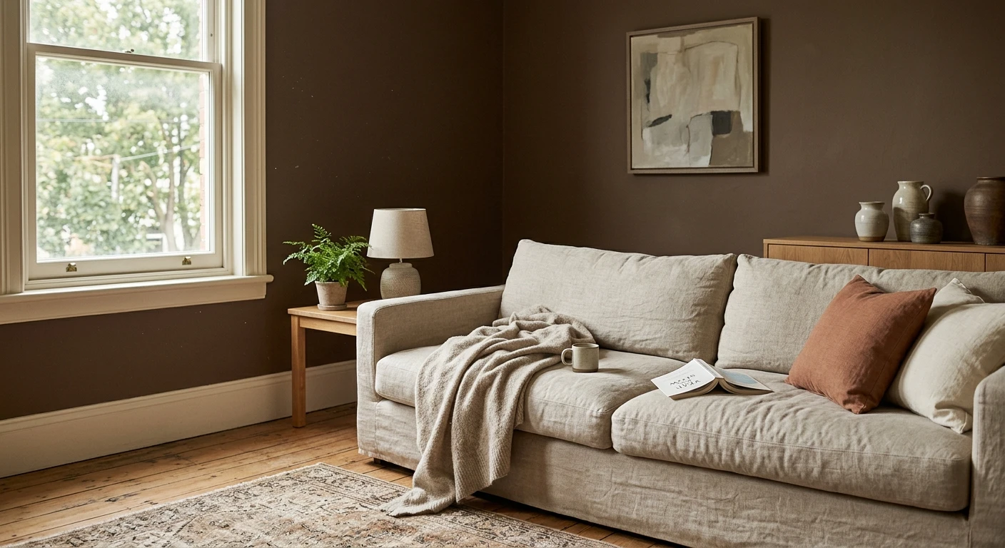
- Very dark, low-LRV colors on every wall. With little incoming light to reflect, a deep shade can make an already dim room feel closed in. Save it for an accent wall if you love it.
Here is the honest caveat: light is unpredictable, and even a perfectly chosen warm white can surprise you under your own bulbs, window size, and the color of the house next door. The only reliable test is your own room, which is exactly what our interior paint visualizer is for. Before you commit, it is also worth narrowing by finish family: see our picks for the best white paint colors for north-facing rooms and, if you still want a neutral with more depth, the best gray paint colors for north-facing rooms.
Frequently asked questions
What are the best paint colors for a north-facing room?
Choose warm colors with a higher LRV so cool north light cannot drain them. Reliable picks include Benjamin Moore White Dove OC-17 (LRV about 85) and Sherwin-Williams Alabaster SW 7008 (LRV about 82) for warm whites, Sherwin-Williams Creamy SW 7012 (LRV about 81) for a soft cream, and warm greiges like Agreeable Gray SW 7029 (LRV about 60) or Accessible Beige SW 7036 (LRV about 58) when you want more depth.
Why do colors look gray or dull in north-facing rooms?
A north-facing window only receives cool, indirect sky light and never direct sun. That light acts like a soft gray filter: it mutes warm undertones, amplifies cool ones, and lowers apparent brightness. So a white can read slightly gray, a pale gray can slide toward blue, and a beige can look flat. Adding warmth and reflectance through your color choice counteracts the effect.
Should you use warm or cool colors in a north-facing room?
Warm colors, almost always. North light is inherently cool and flat, so warm whites, creams, and warm greiges push back and keep the room inviting. Cool grays, icy blues, and stark blue-whites tend to go lifeless because the light removes the little warmth they have and emphasizes their cool undertone.
Can you use white in a north-facing room?
Yes, as long as it is a warm white rather than a stark blue-white. A soft warm white like White Dove OC-17 or a creamy white like Alabaster SW 7008 stays bright thanks to a high LRV while its warmth stops the room from reading cold. Because light is unpredictable, preview any white on a photo of your own room before buying.
1 HD render plus 3 free color variations.
Color names and codes are trademarks of their respective owners (Sherwin-Williams, Benjamin Moore, Behr). FacadeColorizer is an independent AI visualization tool and is not affiliated with them. LRV and hex values are approximate; the authoritative reference is a physical paint sample viewed in your own light.
Trademarks mentioned (Sherwin-Williams, Benjamin Moore, Behr, Caparol, Brillux, Sto, Alpina, Valspar, PPG, Glidden, Dulux, Crown Trade, Sandtex, Farrow & Ball, Johnstone's, Leyland) are property of their respective owners. FacadeColorizer is independent and not affiliated with any of them. Nominative fair use under Lanham Act §1125.