Try it on your house

Quick answer: For a west-facing room, cool and balanced colors hold up best because they counter the strong orange light at sunset. The most reliable picks are Sherwin-Williams Sea Salt (SW 6204, a soft green-gray), Sherwin-Williams Repose Gray (SW 7015, a balanced greige), and Benjamin Moore Gray Owl (OC-52, a cool blue-gray). Soft greens, blue-grays, and true greiges stay calm from the dim morning light through the warm evening.
West-facing rooms have a split personality. In the morning they get cool, flat, slightly blue light, and by late afternoon they fill with warm, golden, sometimes almost orange light as the sun drops toward the horizon. A paint color that looks perfect at 10 am can glow a completely different shade at 6 pm. That evening swing is the single biggest thing to plan for, and it is why the same beige that reads crisp in one room can look peachy in another. This guide is part of our larger look at paint colors by room orientation, focused here on the west-facing case.
Why west-facing light changes paint color
Light direction changes how a color reads because it changes both the amount of light and its color temperature through the day. A west-facing window points away from the sun in the morning, so the room borrows cool, indirect, bluish light that can make warm neutrals look slightly gray and flat. Then everything reverses at sunset: the low sun shines straight through that same window and floods the room with warm, orange-tinted light for an hour or two. Warm colors get warmer, and colors with a yellow or red base can tip toward peach, gold, or orange. Cool and balanced colors, by contrast, only warm up a little and stay readable.
This is also where light reflectance value (LRV) matters. West rooms are dim in the morning and bright at night, so a mid-to-high LRV (roughly 55 to 65) keeps the space from feeling gloomy early in the day, while a lower LRV can look wonderfully rich in the warm evening light but muddy at breakfast. The takeaway: pick your undertone to survive the sunset, and pick your LRV to survive the dim morning.
The best colors for west-facing rooms
These colors share one thing: a cool or neutral base that balances the orange evening light instead of amplifying it. Soft greens, blue-grays, and true greiges all qualify. Approximate LRVs are shown to help with the morning brightness question.
| Color | Brand + code | Approx LRV | Why it works here |
|---|---|---|---|
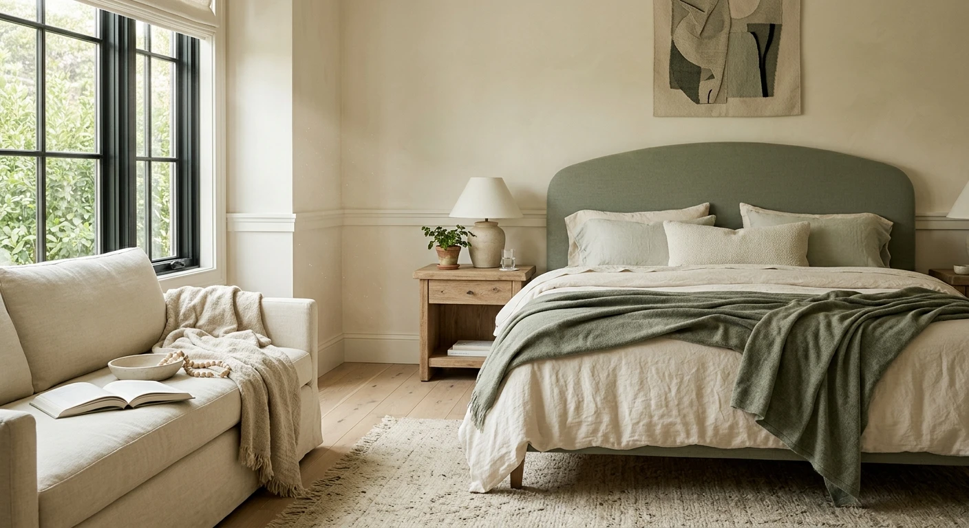
| Sea Salt | Sherwin-Williams SW 6204 | ~63 | Green-gray with a whisper of blue. The cool base absorbs some of the evening warmth, so it reads calm and spa-like from morning to night. |
| Repose Gray | Sherwin-Williams SW 7015 | ~58 | A true, slightly cool greige. The sunset warms it just enough to feel soft without pushing it toward pink or orange. |
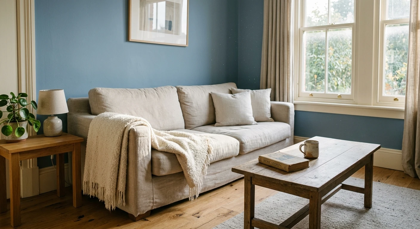
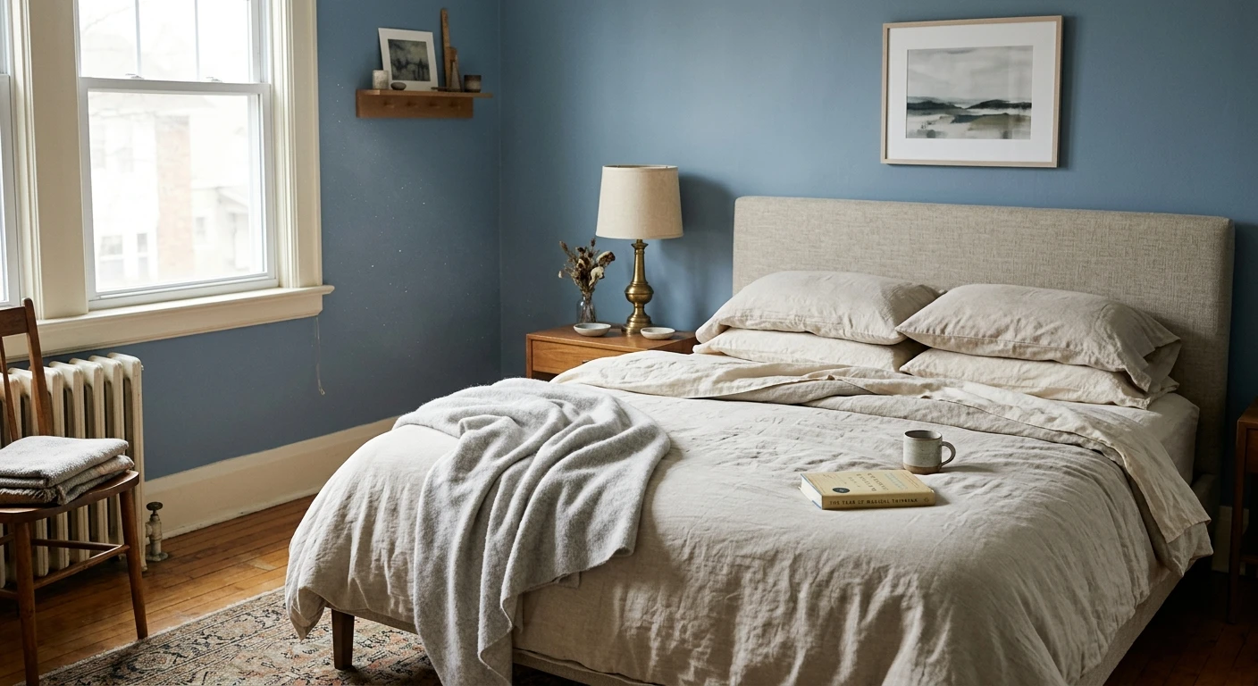
| Gray Owl | Benjamin Moore OC-52 | ~60 | Light blue-gray greige. Its cool undertone balances the orange light rather than magnifying it, and the higher LRV keeps mornings bright. |
| Quiet Moments | Benjamin Moore 1563 | ~63 | Soft gray-blue-green. Holds its cool character in dim morning light and gains a gentle glow at sunset without going muddy. |
| Oyster Bay | Sherwin-Williams SW 6206 | ~44 | A deeper gray-green for a moodier west room. The mid LRV means it deepens beautifully in evening light instead of washing out. |
| Evergreen Fog | Sherwin-Williams SW 9130 | ~30 | Gray-green sage. A dramatic choice that leans into the warm evening light and looks richest exactly when the sun is low. |
Try it on your house
No photo? Try a sample
A quick note on how to use this list: the greiges and blue-grays (Repose Gray, Gray Owl) are the safe, low-risk options that flatter almost any west room. The greens (Sea Salt, Quiet Moments, Oyster Bay, Evergreen Fog) are where west-facing light really shines, because the touch of extra warmth at sunset makes a cool green feel alive rather than cold. If you want cozy, go darker (Oyster Bay, Evergreen Fog). If you want airy, stay in the 58 to 63 LRV band.
Upload one photo and preview the shortlist on your actual walls in your actual light. Free, no signup.
Colors to avoid
Nothing on this list is truly forbidden, but these are the shades that get thrown off most by the orange sunset light. If you love one of them, at least test it on the wall at 6 pm before you buy a gallon.
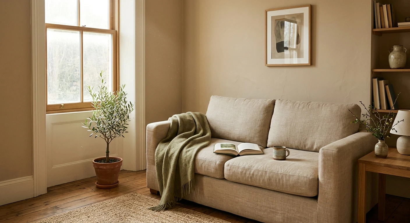
- Warm, yellow-based beiges (for example Sherwin-Williams Accessible Beige, SW 7036, LRV ~58): pleasant at midday, but they can tip toward orange or dirty gold once the evening light arrives.
- Bright and golden yellows: already warm on their own, they can look almost fluorescent in the low sun and overwhelm a room after 5 pm.
- Terracottas and warm clay tones: the orange sunset doubles down on the orange pigment, which can read heavy and one-note in the evening.
- Warm, yellow-based whites (for example Sherwin-Williams Alabaster, SW 7008, LRV ~82): lovely at noon, but they drift to cream or peach at sunset. If you want a soft white here, lean cooler and more neutral.
- Peachy or apricot pinks: predictably intensify under warm light and can look sunburned by dinnertime.
Here is the honest part: light is unpredictable, and no chart can promise how a color will land in your exact room. Wall height, floor color, trees outside the window, and your bulbs all shift the result. The only reliable preview is to see the shortlist on a photo of your own space, in your own light, which is exactly what our interior paint visualizer does before you spend a cent on samples. It also helps to compare orientations side by side: the same greige behaves very differently in east-facing rooms, which peak with cool morning light, and in south-facing rooms, which stay bright and warm most of the day.
If you do go on to buy physical samples, test them the west-facing way. Paint two coats on a large poster board rather than straight onto the wall, so you can move it around, and look at it three times: mid-morning in the cool light, mid-afternoon, and again right at sunset (around 6 pm in summer, earlier in winter). The sunset check is the one most people skip, and it is exactly the one that catches an orange glow before it ends up on all four walls. Move the board near the window and then to the opposite wall, because a color right beside the glass catches far more warm light than the same color across the room.
Frequently asked questions
What are the best paint colors for a west-facing room?
Cool and balanced colors hold up best because they counter the strong orange light at sunset. Reliable picks include Sherwin-Williams Sea Salt (SW 6204), Sherwin-Williams Repose Gray (SW 7015), and Benjamin Moore Gray Owl (OC-52). Soft greens, blue-grays, and true greiges stay calm from the cool morning light through the warm evening.
Why do west-facing rooms look orange in the evening?
West-facing windows catch the low sun at the end of the day, so the room fills with warm, orange-tinted light for an hour or two before dark. That light layers onto your paint and pushes warm colors further toward peach or orange, while cooler colors simply warm up a little and stay readable.
Should I avoid warm colors in a west-facing room?
Not entirely, but be careful. Beiges, yellows, and terracottas can glow orange once the sunset light hits them. If you love a warm neutral, choose one with a gray or green base rather than a yellow base, and always test it on your own wall at sunset before you commit.
What is the best white for a west-facing room?
Pick a white with a slightly cool or neutral base so it does not turn cream or peach in the evening. A soft gray-white or a balanced white works better here than a warm, yellow-based white. Sample it on the wall and check it at 6 pm, because a white that looks crisp at noon can go warm at sunset.
1 HD render plus 3 free color variations.
Color names and codes are trademarks of their respective owners (Sherwin-Williams, Benjamin Moore, Behr). FacadeColorizer is an independent AI visualization tool and is not affiliated with them. LRV and hex values are approximate; the authoritative reference is a physical paint sample viewed in your own light.
Trademarks mentioned (Sherwin-Williams, Benjamin Moore, Behr, Caparol, Brillux, Sto, Alpina, Valspar, PPG, Glidden, Dulux, Crown Trade, Sandtex, Farrow & Ball, Johnstone's, Leyland) are property of their respective owners. FacadeColorizer is independent and not affiliated with any of them. Nominative fair use under Lanham Act §1125.